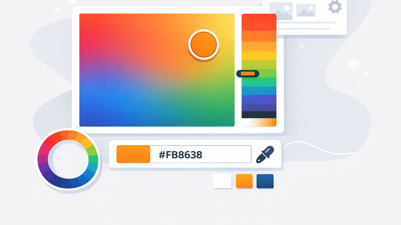
A hex color picker is one of the fastest ways to convert visual inspiration into repeatable design decisions. Whether you’re working on a brand system, a UI mockup, a social post template, or an interior mood board, the ability to sample colors from a photo and capture them as HEX codes helps you stay consistent across tools and teams.
But “tap a pixel, copy the code” isn’t the whole story. Photos contain lighting shifts, compression artifacts, and subtle gradients that can make sampled values unreliable if you don’t follow a method. This guide walks through a practical, photo-to-palette workflow that designers and decorators can use to extract accurate HEX colors, refine them into a functional palette, and apply them in real projects.
What a hex color picker actually does (and what it doesn’t)
When you sample a point in an image, a hex color picker reads that pixel’s RGB value and converts it into a HEX string like #2F6DA8. That is objective data from that exact pixel—yet your intent is usually broader:
- You want the material color (paint, fabric, product) rather than the highlight or shadow.
- You want a dominant color family rather than a one-pixel anomaly.
- You want colors that work together in a palette, not just “exist” in the photo.
So the real skill is choosing where to sample and how to turn samples into a usable system.
Before you pick: prepare the photo for reliable sampling
The quality of your palette starts with the quality of your source. A few quick checks make your hex color picker results more trustworthy:
- Avoid screenshots of compressed images when possible. Use the original photo or a high-resolution version.
- Watch for colored lighting (sunset warmth, neon, indoor tungsten). If lighting is part of the vibe, keep it; if you want “true” object color, try a more neutral photo.
- Prefer images with clear surfaces (walls, textiles, product packaging) over busy textures when you need clean, brand-ready values.
- Zoom in before sampling. Compression artifacts can create tiny blocks of unexpected color around edges.
Rule of thumb: Sample from flat midtones, not from highlights (too bright) or shadows (too dark). Midtones usually represent the “real” perceived color best.
How to sample like a pro with a hex color picker
Instead of grabbing one value and calling it done, use a repeatable sampling pattern. This reduces error and gives you options when you build the palette.
1) Sample three points per “color”
If you want the blue of a chair, don’t sample once—sample three nearby pixels:
- One in the midtone area
- One slightly lighter
- One slightly darker
Then choose the one that best matches your intent (often the midtone). The other two can become tints/shades later.
2) Avoid edges and specular highlights
Edges often contain anti-aliasing and color bleed (especially around hair, leaves, or product cutouts). Specular highlights (shiny reflections) can be near-white and shift your palette toward washed-out tones.
3) Capture a balanced set: neutrals + accents
A functional palette usually needs more than “the pretty colors.” Use your hex color picker to deliberately collect:
- 1–2 neutrals (off-white, warm gray, charcoal)
- 1 main color (brand or dominant tone)
- 1–2 supporting colors (secondary hues present in the photo)
- 1 accent (a small but high-impact color like coral, teal, mustard)
From sampled codes to a usable palette (refine, don’t just collect)
Raw samples often need small adjustments to behave well in real layouts. This is normal—photos are not color systems. After sampling, refine with these steps:
Step A: Remove near-duplicates
If two HEX codes are visually indistinguishable, keep one. Near-duplicates clutter palettes and confuse teams.
Step B: Normalize extreme saturation
Phone photos can produce oversaturated colors (especially greens and blues). Slightly reducing saturation can make palettes easier to use for backgrounds and large areas.
Step C: Check value (lightness) spacing
Palettes work better when they include a range of lightness: a light background, a midtone, and a dark anchor. If everything is midtone, nothing stands out.
A simple palette blueprint (with a table you can copy)
Use this template to turn photo samples into roles. Roles matter because they connect color to usage: backgrounds, text, buttons, trim, etc.
| Role | What to sample | Typical use |
|---|---|---|
| Base Light | Bright neutral (wall, sky haze, paper) | Backgrounds, negative space |
| Base Dark | Deep neutral (shadowed fabric, hair, charcoal) | Text, outlines, contrast anchor |
| Primary | Dominant subject color | Key UI elements, hero areas |
| Secondary | Supporting hue in the scene | Sections, cards, supporting graphics |
| Accent | Small, vivid highlight color | CTAs, highlights, badges |
Accessibility and readability: don’t skip contrast checks
A palette can look great and still fail in real use if text becomes hard to read. Once you’ve chosen your HEX codes, do a quick contrast sanity check—especially for text on backgrounds.
Even without a dedicated checker, you can catch many issues by ensuring you have:
- One very light neutral and one very dark neutral
- At least one color that can serve as a readable text color
- Accent colors reserved for small areas, not long paragraphs
Apply your palette in real projects (web, graphics, interiors)
Extracting colors is only valuable if you can apply them consistently. Here are practical ways to use your hex color picker results across common workflows.
For web/UI: store colors as CSS variables
Once your palette roles are set, define them as variables so you can reuse them everywhere. Here’s a simple snippet you can paste into a stylesheet:
:root {
  --base-light: #F4F1EA;
  --base-dark:  #1F2328;
  --primary:    #2F6DA8;
  --secondary:  #7A8F6B;
  --accent:     #E07A5F;
}

body {
  background: var(--base-light);
  color: var(--base-dark);
}

.button-primary {
  background: var(--primary);
  color: var(--base-light);
}
For graphic design: create a “swatch discipline”
In tools like Illustrator, Figma, Canva, or Procreate, create swatches named by role (Base Light, Primary, Accent) rather than “Blue 1.” This makes it far easier to update later without hunting through layers.
For interior design: translate HEX into paint/material decisions
HEX is a digital representation, so don’t expect a perfect one-to-one match with paint chips or fabrics. Instead:
- Use your HEX palette as a direction (warm vs cool, muted vs vivid).
- Compare multiple paint chips under the room’s lighting.
- Keep one consistent neutral to tie the room together.
Common mistakes when using a hex color picker (and how to fix them)
Mistake 1: Sampling from shadows
Symptom: Everything turns muddy or too dark.
Fix: Re-sample from midtones or use the three-point sampling method and select the most “true” value.
Mistake 2: Building a palette with no neutrals
Symptom: Designs feel loud and cluttered.
Fix: Add a warm light neutral and a deep neutral. Neutrals are what make accent colors feel intentional.
Mistake 3: Picking too many colors
Symptom: Inconsistent visuals across pages or posts.
Fix: Limit your core palette to 5–7 colors (including neutrals). Create tints/shades of the same colors rather than adding new hues.
Mistake 4: Trusting a single photo too much
Symptom: Palette doesn’t generalize when applied elsewhere.
Fix: Cross-check with 2–3 related photos (same brand shoot, same room, same product line) to confirm the palette is stable.
A quick 10-minute checklist you can reuse
- Choose a high-quality photo and zoom in.
- Use a hex color picker to sample midtones (3 points per target).
- Collect: 2 neutrals, 1 primary, 1–2 secondary, 1 accent.
- Remove near-duplicates and overly saturated outliers.
- Assign roles and verify you have light/dark range.
- Test legibility: dark-on-light and light-on-dark.
- Export/save swatches with role-based names.
Final thought: your palette should describe intent, not just pixels
The best results come when you treat the hex color picker as a starting point. Sampling gives you honest data; your job is to shape it into a system that supports readability, hierarchy, and mood. With a repeatable workflow—midtone sampling, role assignment, and contrast checks—you can turn almost any photo into a palette you’ll actually want to use.
If you prefer doing this on iPhone or iPad, an app like Color Viewfinder can help you sample HEX values quickly and organize them into exportable palettes.
