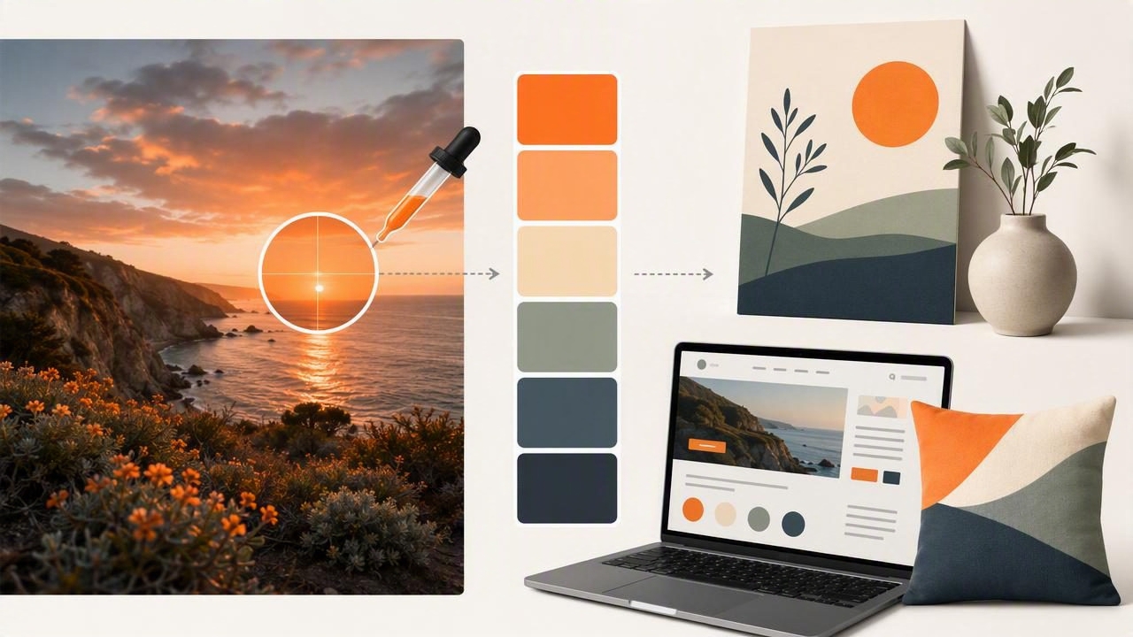
A color palette from a photo can give a design project an immediate sense of mood, cohesion, and direction. Instead of choosing colors from a blank canvas, you begin with a real visual reference: a landscape, textile, room, product image, editorial photograph, or piece of art.
Photos contain far more color information than most projects need, however. A sunset may include dozens of orange, pink, purple, and blue variations. A living-room photo might contain subtle warm whites, wood tones, dark shadows, and small accent colors that are easy to overlook. The goal is not to copy every pixel. It is to identify the colors that carry the image’s visual character and turn them into a useful, repeatable system.
This guide explains how to extract, evaluate, and use a photo-based palette for graphic design, web design, interior planning, and other creative projects.
Why Create a Color Palette From a Photo?
A photograph already has a built-in color relationship. Its hues were influenced by lighting, materials, composition, camera settings, and the subject itself. Sampling from that image can help you create a palette that feels naturally connected rather than randomly assembled.
Photo-based palettes are especially useful when a project needs to communicate a specific atmosphere:
- Calm and natural: coastal images, misty forests, stones, linen, and soft daylight.
- Warm and welcoming: sunlit interiors, terracotta, timber, autumn leaves, and candlelight.
- Bold and energetic: city scenes, neon signage, sports photography, or colorful fashion images.
- Elegant and restrained: architecture, monochrome product photography, marble, and muted editorial images.
For designers, extracting color values also creates a practical bridge between inspiration and implementation. A sampled blue can become a HEX code for a website, an RGB value for a presentation, or a reference point when building a broader digital design system.
Start With the Right Reference Photo
The quality of your source image affects the usefulness of the palette. Choose a photo with an intentional visual mood and enough color variation to support your project. A low-resolution image can still be inspiring, but compressed images may create inaccurate or overly simplified color samples.
Before extracting colors, ask these questions:
- What feeling do I want the final project to communicate?
- Which colors are dominant, and which ones are only small accents?
- Is the image influenced by unusual lighting, such as a colored sunset or indoor bulbs?
- Will the palette be used on screens, in a room concept, or across both?
- Do I need a light background color, a dark text color, and one or two accents?
A strong source photo does not have to be highly saturated. In fact, photos with subtle tonal differences are often excellent for sophisticated palettes. A neutral image of sand, clay, shadows, and dried grass might produce a flexible collection of cream, taupe, brown, charcoal, and muted olive.
Identify the Five Roles in a Practical Palette
Rather than collecting every attractive color in an image, assign each chosen color a role. This makes the palette easier to apply consistently.
| Palette role | Purpose | Typical use |
|---|---|---|
| Dominant color | Sets the overall visual mood | Large backgrounds, walls, hero sections |
| Secondary color | Supports the dominant color | Cards, furnishings, illustrations, sections |
| Accent color | Draws attention in small areas | Buttons, links, cushions, labels, calls to action |
| Light neutral | Adds breathing room and contrast | Page backgrounds, whitespace, trim, surfaces |
| Dark neutral | Provides structure and readability | Text, outlines, shadows, navigation, hardware |
A five-color palette is often enough for a complete creative direction. You can add tonal variations later, but starting small prevents the visual system from becoming unfocused.
A Concrete Example: Turning a Coastal Photo Into a Digital Palette
Imagine a photograph of a cloudy shoreline. The largest areas are pale sand and blue-gray water. There is a dark rock formation in the foreground, sea grass with a muted green cast, and a small strip of warm peach light near the horizon.
Instead of extracting fifteen similar blues and grays, reduce the image to five functional colors:
Sand background:  #E7DDCE
Water blue-gray:  #7B9299
Sea grass green:  #89916D
Horizon peach:    #D5A18C
Rock charcoal:    #30383A
This collection retains the image’s quiet coastal quality while providing enough contrast for an interface, mood board, or presentation. The sand color can act as a page background, charcoal can handle body text, blue-gray can define panels, peach can highlight primary actions, and green can appear in secondary visual details.
For a simple website implementation, the colors could be organized as reusable CSS variables:
:root {
  --background: #E7DDCE;
  --primary: #7B9299;
  --secondary: #89916D;
  --accent: #D5A18C;
  --text: #30383A;
}
The important part is not the exact codes. It is the relationship: a pale warm neutral, cool middle tone, organic secondary shade, restrained warm accent, and dark grounding color.
Sample Colors Intentionally, Not Randomly
When using a color picker or color extraction tool, sample broad, meaningful areas first. Select the main sky, wall, fabric, foliage, or surface rather than a tiny edge where several colors blend together. Fine details may be visually interesting, but they can produce colors that are difficult to use elsewhere.
Take samples from these image areas:
- Large surfaces: These usually reveal the dominant and secondary colors.
- Deep shadows: They can provide a more natural alternative to pure black.
- Light highlights: These often become better background neutrals than plain white.
- Small points of interest: Flowers, signage, textiles, or reflected light can suggest accent colors.
- Transitional areas: Use these carefully, since blur and mixed lighting can create muddy values.
Inspect each sample in multiple formats when possible. HEX and RGB values are useful for digital design, while HSL and HSB can make it easier to understand why a color feels muted, bright, light, or dark. For example, two colors may have similar hues but very different saturation and brightness, making one better for a background and the other better for an accent.
Refine the Palette for Contrast and Usability
An extracted palette may look beautiful beside the original photo but perform poorly in real layouts. The most common issue is insufficient contrast. A pale gray-green heading on a beige background may match the photo perfectly while remaining hard to read.
Test the palette in context before finalizing it. Create a quick layout with a background, headline, paragraph text, button, border, and small label. If two colors blend together at normal viewing size, adjust the lightness or choose a darker neutral from the source image.
Use inspiration as a starting point, not a restriction. A palette should preserve the character of the photo while serving the needs of the finished design.
For digital work, reserve the darkest color for important text or high-contrast interface elements. Use accent colors sparingly so they retain their visual impact. If every element is colorful, none of them feels like an accent.
Using a Photo Palette in Interior Design
Interior designers and decorators can also use a color palette from a photo as a planning reference. A photograph of a favorite hotel lobby, garden, artwork, or travel destination can inform a room’s balance of neutrals, materials, and accents.
For example, a photo featuring cream plaster walls, walnut furniture, olive leaves, and rust-colored ceramics could become:
- Cream for walls or large textiles
- Walnut brown for wood furniture or dark accents
- Olive for plants, cushions, or artwork details
- Rust for decorative objects, throws, or a focal accessory
Keep in mind that a screen sample is a digital color reference, not a guaranteed match for paint, fabric, flooring, or printed materials. Surface texture, sheen, surrounding colors, natural light, and artificial light can all change how a color appears in a real room. Always compare physical material samples in the intended space before making a final purchase or installation decision.
Common Mistakes to Avoid
- Using too many colors: Begin with three to five core colors, then add variations only when needed.
- Copying lighting artifacts: Colored lighting may be part of the photograph, not the subject’s actual local color.
- Ignoring neutrals: A palette needs visual rest areas, especially in web pages and rooms.
- Making every color an accent: Define hierarchy so attention goes where it matters.
- Skipping contrast checks: Attractive colors still need readable text and clear UI states.
- Expecting physical accuracy: Digital HEX, RGB, HSL, and HSB values should not be treated as exact paint or print specifications.
Make the Palette Reusable
Once you have refined your palette, save each color with a meaningful name and role. Labels such as “Coastal Sand Background” or “Olive Secondary” are more useful than anonymous swatches. If you collaborate with others, include the HEX values and a short note about intended usage.
For example, a lightweight palette reference might include the color code, role, and usage rule:
#E7DDCE — Background — Use for large light surfaces
#30383A — Text — Use for body copy and strong contrast
#D5A18C — Accent — Use for primary highlights only
This small amount of documentation helps preserve consistency when the palette appears across social graphics, web pages, slide decks, mood boards, and interior concept boards.
Bring Photo Inspiration Into a Clear Color System
The best photo palettes do more than reproduce attractive colors. They translate an image’s atmosphere into a usable visual language with hierarchy, contrast, and purpose. Choose a meaningful source image, identify dominant and supporting hues, extract a focused selection, and test it in the real context where it will be used.
For iPhone and iPad users who want to inspect colors directly from images, Color Viewfinder’s guide to creating a color palette from a photo explains how to sample image colors and work with values such as HEX, RGB, HSL, and HSB for creative projects.
