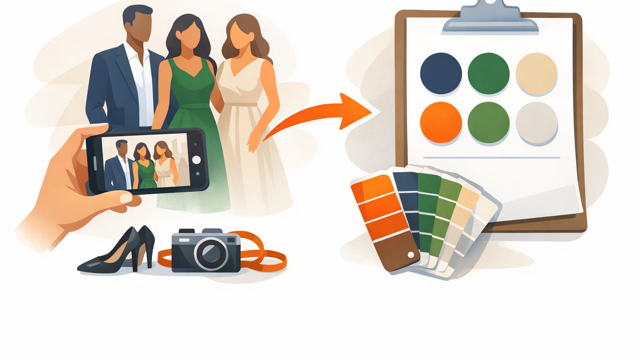
When an event is coming up fast, décor decisions can feel impossible: signage, florals, table linens, digital invites, social graphics, even lighting gels. The quickest way to make everything look intentional is to pick a tight color palette and use it consistently. If you don’t have a brand guide, a venue mood board, or time for a full design process, there’s a surprisingly reliable shortcut: build a last minute event palette from guest attire.
Why guest outfits? Because they already represent the vibe of the event (formal, playful, monochrome, bold), they’re seasonally appropriate, and they often reflect the “unspoken dress code” better than any Pinterest board. With a few outfit photos, you can extract a palette that feels natural, cohesive, and aligned with what people will actually wear in the room.
What you’ll need (and what you don’t)
- 3–10 outfit photos (screenshots from RSVPs, a group chat, or recent outfit pics)
- A way to sample colors (a digital color picker or palette extractor)
- A simple rule set to turn raw colors into a usable palette
You don’t need professional photography, perfect lighting, or a graphic design background. The goal is not “museum accuracy”—it’s repeatable consistency across event touchpoints.
Step 1: Curate the right outfit photos
Not all photos make good palette sources. Pick images that reflect fabric and styling choices rather than extreme filters or nightclub lighting.
Photo selection checklist
- Prefer daylight or neutral indoor lighting (near a window is ideal).
- Avoid heavy color casts (deep blue LED lighting will skew everything).
- Look for large color areas (a blazer, dress, scarf) rather than tiny patterns.
- Include accessories (ties, handbags, jewelry) to capture accent colors.
Design shortcut: If you only have one or two images, add one “texture” photo (a close-up of fabric, leather, or metallic) to introduce a believable accent color.
Step 2: Identify repeating hues (the fastest path to cohesion)
Before you sample anything, scan the photos and write down what you see repeating. You’re looking for patterns like:
- Neutrals: black, charcoal, navy, cream
- Warm accents: terracotta, burgundy, gold
- Cool accents: teal, emerald, lavender
If 60–80% of outfits lean neutral with one or two standout colors, your palette should follow the same logic. This is the core of turning guest attire into an event-ready color system.
Step 3: Sample colors and keep only what you’ll actually use
Sampling can produce dozens of swatches, but most events only need 5–7 colors. More than that becomes hard to apply consistently across florals, menus, place cards, backdrops, and digital assets.
A practical target: 6 colors
- Primary dark (text, outlines, contrast)
- Primary light (backgrounds, negative space)
- Secondary neutral (paper tone, linen tone, UI surfaces)
- Accent 1 (hero color for focal points)
- Accent 2 (supporting accent, smaller coverage)
- Metallic / “spark” (gold/silver-like, used sparingly)
Step 4: Assign roles to your palette (so it doesn’t fall apart)
Colors without roles lead to chaos. Assigning roles turns a nice-looking set of swatches into a usable system that vendors and collaborators can follow.
| Palette Role | Best Sources in Attire | Where to Use at the Event |
|---|---|---|
| Primary Dark | Black suit, navy blazer, dark shoes | Typography, signage headers, outlines, QR codes |
| Primary Light | White shirt, cream dress, pale blouse | Paper backgrounds, table cards, negative space |
| Secondary Neutral | Beige trench, taupe knit, grey slacks | Linens, menus, envelopes, UI panels |
| Accent 1 | Bold dress, tie, statement bag | Florals focal blooms, hero banner elements, ribbons |
| Accent 2 | Pattern highlight, lipstick, pocket square | Icons, small motifs, wax seals, secondary blooms |
| Metallic / Spark | Jewelry, watch, belt buckle | Foil details, cutlery cues, tiny highlights (5% max) |
Step 5: Fix the two most common “attire palette” problems
Problem A: Everything is too dark (or too black)
If many guests wear black, your extracted palette can become heavy. The fix: add two light values—a warm off-white and a soft neutral—so your designs can breathe.
- Keep black/charcoal as your Primary Dark.
- Add a Primary Light that is not pure white (e.g., ivory).
- Add a Secondary Neutral (e.g., warm grey) for depth.
Problem B: Colors clash because lighting changed
Outfit photos often vary in lighting temperature. If one image is warm and another is cool, the same “white shirt” may sample as yellowish in one photo and bluish in another. Fix it by standardizing:
- Choose a single anchor neutral (your preferred “paper white”).
- Re-sample accents from photos taken in similar lighting.
- When in doubt, keep accent colors slightly muted—muted tones cooperate better under mixed venue lighting.
Step 6: Validate contrast for readability (quick and non-negotiable)
Even beautiful palettes fail when signage or menus are hard to read. Do a fast contrast check before you send anything to print.
Rule of thumb
- Use Primary Dark text on Primary Light backgrounds for most copy.
- Reserve accent-on-accent combinations for large elements only (not body text).
If you want a quick programmatic check in web workflows, you can compute relative luminance and contrast ratio. Here’s a compact JavaScript snippet you can paste into a console and test two HEX colors:
function hexToRgb(hex) {
  const h = hex.replace('#','');
  const bigint = parseInt(h.length === 3 ? h.split('').map(c => c+c).join('') : h, 16);
  return { r: (bigint >> 16) & 255, g: (bigint >> 8) & 255, b: bigint & 255 };
}

function luminance({r,g,b}) {
  const srgb = [r,g,b].map(v => {
    const c = v/255;
    return c <= 0.03928 ? c/12.92 : Math.pow((c+0.055)/1.055, 2.4);
  });
  return 0.2126*srgb[0] + 0.7152*srgb[1] + 0.0722*srgb[2];
}

function contrastRatio(hex1, hex2) {
  const L1 = luminance(hexToRgb(hex1));
  const L2 = luminance(hexToRgb(hex2));
  const [light, dark] = L1 > L2 ? [L1, L2] : [L2, L1];
  return (light + 0.05) / (dark + 0.05);
}

console.log(contrastRatio('#111827', '#F8F5F0'));
For printed materials, aim for strong contrast (commonly 4.5:1 or higher as a digital baseline), and remember that textured paper and dim lighting reduce legibility.
Step 7: Turn your palette into a “vendor-friendly” spec
A palette only helps if people can apply it. Create a one-page spec you can share with your printer, florist, venue, and anyone making digital assets.
Include these fields for each color
- Name (e.g., “Midnight Navy”, “Champagne Cream”)
- HEX (best for digital)
- RGB (useful for screens and some print pipelines)
- Usage role (Primary Dark, Accent 1, etc.)
- Coverage guidance (e.g., Accent 1 = 10–15%)
A simple coverage ratio keeps everything cohesive. A reliable starting point is:
- 70% lights + neutrals
- 20% darks
- 10% accents (combined)
Worked example: from outfits to a cohesive palette
Imagine you have six guest outfit photos:
- Black dress + gold jewelry
- Navy suit + white shirt
- Emerald satin slip dress
- Cream blouse + camel coat
- Charcoal slacks + blush top
- Burgundy tie + grey suit
From those, your role-based palette might look like:
- Primary Dark: deep navy/charcoal (for text)
- Primary Light: warm cream (for backgrounds)
- Secondary Neutral: camel/taupe (for paper/linen tone)
- Accent 1: emerald (hero color in florals or signage)
- Accent 2: burgundy or blush (small highlights)
- Spark: muted gold (foil, hardware, tiny details)
Notice what we did: we didn’t try to include every color in every pattern. We extracted the repeatable story the outfits were already telling.
Common questions
Should I match colors exactly?
No. Exact matching is fragile (lighting and materials vary). Aim for close-enough families: “warm cream,” “deep navy,” “muted emerald.” Your designs will look more consistent in real life.
What if guests wear lots of different colors?
Use attire to identify neutrals and then pick one accent that appears most often. If nothing repeats, choose a single accent that flatters the venue (greens for garden venues, terracotta for warm interiors) and use attire-derived neutrals to ground it.
How many accents are too many?
For last-minute execution, keep it to 1–2 accents. If you add a third accent, you’ll need stricter rules about where each one can appear.
Final checklist: your last-minute palette in 20 minutes
- Collect 3–10 outfit photos with decent lighting.
- Note repeating neutrals and one standout hue.
- Sample colors and trim to 5–7 swatches.
- Assign roles (Primary Dark/Light, neutrals, accents, spark).
- Check readability (contrast) for signage and menus.
- Export/share a one-page palette spec with HEX/RGB and usage rules.
If you prefer building palettes directly from photos on iPhone or iPad, a tool like Color Viewfinder can help you extract consistent HEX/RGB values quickly—then the real win is applying the role system above so your event looks cohesive everywhere.
