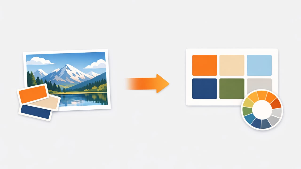
A photo color palette is one of the fastest ways to turn inspiration into something you can actually design with—whether you’re creating a brand mood board, planning an interior refresh, designing UI, or building social templates. But there’s a catch: colors pulled from photos can be misleading. Lighting, camera processing, and even compression can shift values enough to make your final design feel “off.”
This guide walks through a reliable, repeatable workflow for turning any photo into a usable palette: how to sample, how to correct common photo biases, how to choose the “right” number of colors, and how to export values for web, print, and real-world materials.
Why photo-based palettes often fail (and how to prevent it)
When you sample colors from an image, you’re not sampling “true pigment” or “true paint.” You’re sampling pixels after a chain of decisions:
- White balance (warm indoor lighting vs. cool daylight)
- Exposure and contrast (highlights clipped, shadows crushed)
- Camera color science (different phones render greens and reds differently)
- Compression (JPEG artifacts introduce small color shifts)
- Screen display (brightness, True Tone/night mode, calibration)
The goal isn’t perfect scientific accuracy; it’s design reliability. A good palette should behave consistently when applied to backgrounds, text, accents, and materials.
Step 1: Start with the right photo (it matters more than the tool)
If you have control over the source image, a few quick choices improve your palette dramatically:
- Prefer natural, even light: near a window, overcast daylight, or diffused lighting reduces harsh color casts.
- Avoid heavy filters: Instagram-style filters can flatten midtones and distort hue relationships.
- Use the highest quality file available: less compression means cleaner sampling.
- Include neutrals if possible: a white wall, gray object, or black element gives you anchors for backgrounds and typography.
If you can’t control the image (e.g., a screenshot or old photo), you can still build a strong palette—you’ll just rely more on refinement steps later.
Step 2: Decide what the palette is for (brand, UI, room, artwork)
A palette that looks beautiful as swatches may fail in real use if you don’t define intent. Before sampling, choose one primary use case:
- UI / graphic design: needs clear roles (background, surface, text, accent) and strong contrast.
- Interior design: needs material-aware neutrals and “volume” colors that work across large surfaces.
- Illustration / art: may prioritize hue harmony and controlled value ranges.
This decision influences how many colors you keep and how you “translate” photo colors into practical picks.
Step 3: Sample strategically (don’t just tap the most obvious color)
When extracting from a photo, sample areas that represent stable, intentional color, not noisy or reflective pixels.
What to sample
- Midtones on objects (less glare than highlights, more reliable than shadows)
- Large flat areas (walls, fabrics, skies, paper)
- Edges with care (avoid anti-aliasing and compression fringing)
What to avoid
- Specular highlights (shiny reflections read as “color,” but won’t translate)
- Deep shadows (often tinted by environment and camera processing)
- Skin and wood (for neutrals) unless you specifically want those undertones
Rule of thumb: If a sampled color changes a lot when you tap nearby pixels, it’s probably not a stable palette candidate.
Step 4: Build a “working set” of 8–12 colors first
Even if your final palette will be 4–6 colors, start with a larger set. A good working set includes:
- 2–3 neutrals (light, mid, dark)
- 2–4 supporting colors (secondary hues and softer tones)
- 1–2 accents (high chroma “pop” colors)
- 1 anchor color (the most “identity-defining” hue)
This gives you options when you later assign roles and refine for contrast.
Step 5: Correct the two biggest photo problems—lighting cast and value range
Most photo palettes fail because of (1) unwanted warmth/coolness from lighting and (2) not enough separation between light and dark values.
Fix a color cast (warm or cool bias)
If everything in the photo looks slightly orange (typical indoor light) or slightly blue (shade/daylight), you can compensate by adjusting sampled colors in HSL/HSB space:
- Hue: nudge a few degrees if a “neutral” looks tinted (e.g., beige that should be gray)
- Saturation: reduce saturation for neutrals and background colors
- Brightness/Lightness: increase for backgrounds, decrease for text/anchors
Ensure a usable value range
For real projects, you typically need at least:
- One very light color (background)
- One very dark color (text/contrast)
- One mid color (surfaces, secondary text, borders)
If your photo is moody and dark, your “light” may not be light enough. It’s normal to create a lighter tint of the same hue for backgrounds.
Step 6: Reduce to a final palette by assigning color roles
Instead of picking your “favorite five,” choose colors that each have a job. Here’s a simple role-based system that works for UI, branding, and many decor mood boards:
| Role | Purpose | Typical traits |
|---|---|---|
| Background | Largest area; sets overall mood | Very light or very dark, low saturation |
| Surface | Cards, panels, secondary areas | Close to background, slightly more contrast |
| Primary text/anchor | Legibility and structure | Very dark (or very light on dark themes), low-to-mid saturation |
| Secondary | Supporting elements | Midtones; complements the anchor |
| Accent | Buttons, highlights, focal points | Higher saturation; used sparingly |
This approach is what makes a photo color palette feel “designed” rather than “sampled.”
Step 7: Check contrast and accessibility (especially for digital)
A palette can be aesthetically perfect and still fail if text disappears on backgrounds. For digital projects, test key pairs:
- Primary text on background
- Primary text on surface
- Accent on background (for buttons)
If you need a quick heuristic without tools: if two colors look similar in a grayscale view, they’re likely too close in luminance. Consider darkening the anchor or lightening the background.
Step 8: Export in practical formats (HEX, RGB, HSL) and name consistently
Once your palette is stable, export values in formats your workflow needs:
- HEX for web and most design handoff
- RGB for digital production and some motion tools
- HSL/HSB for systematic adjustments (tints/shades)
Naming is underrated. Even simple names reduce mistakes: Background-50, Surface-100, Anchor-900, Accent-500.
Example: turn a palette into CSS variables
If you’re building a site or UI theme, you can convert your palette into CSS custom properties:
:root {
  --color-bg: #F5F1EA;
  --color-surface: #FFFFFF;
  --color-anchor: #1F2933;
  --color-secondary: #6B7C85;
  --color-accent: #C56B4A;
}

body {
  background: var(--color-bg);
  color: var(--color-anchor);
}

.button-primary {
  background: var(--color-accent);
  color: #FFFFFF;
}
Even if your exact HEX values differ, this structure makes a photo-based palette actionable.
Step 9: Translate photo colors to real materials (for interiors and print)
For interiors, paint and textiles rarely match a sampled HEX exactly. Use your palette as a direction:
- Match undertones: is the neutral warm (yellow/red) or cool (blue/green)?
- Compare in the same lighting: daylight vs. evening changes everything.
- Scale matters: a saturated accent that looks great as a small photo detail may overwhelm a full wall.
For print, remember that screens are emissive (RGB) and print is reflective (CMYK). If printing is critical, do a proof and expect to adjust saturation and deep darks.
Common mistakes to avoid
- Keeping too many similar midtones: you lose hierarchy and everything blends together.
- Using the brightest color everywhere: accents should be rare to stay effective.
- No true neutral: adding one calm neutral often makes the entire palette feel more premium and usable.
- Sampling from shadows/highlights: you inherit lighting artifacts instead of object color.
A quick checklist for a “ready-to-use” photo color palette
- Do you have at least one light, one mid, and one dark?
- Are your neutrals actually neutral (not accidentally tinted)?
- Is there a clear accent color used sparingly?
- Do key text/background pairs have strong contrast?
- Are your exported values and names consistent?
If you can answer “yes” to most of these, your palette is ready for real design work—not just a pretty swatch strip.
Tools: what to look for when extracting colors on mobile
If you build palettes from photos often, prioritize tools that let you:
- Sample precisely (zoom/targeted picking)
- View multiple color models (HEX, RGB, HSL/HSB)
- Save and rearrange palettes with different layouts
- Export in formats that match your workflow
If you prefer doing this on iPhone or iPad, a dedicated palette extractor like Color Viewfinder can make the capture-to-export step faster while keeping values consistent.
