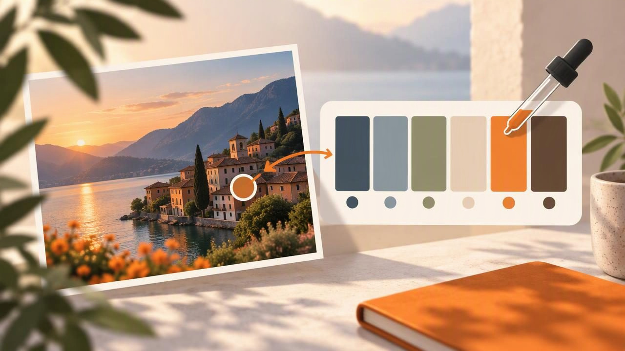
A photograph can hold the beginnings of a thoughtful design palette: the soft neutral of a ceramic cup, the rich green of a leaf, or a warm accent in a tiled wall. Turning those impressions into a palette from a photo gives you specific colors to explore in a website, mood board, illustration, or room concept.
The useful part is not simply collecting the most noticeable colors. A good palette has a purpose, includes colors that work together, and is recorded in values you can reuse. This guide walks through a practical workflow, from choosing an image to checking and exporting color codes, while explaining why a photo’s colors are references rather than guaranteed matches to real materials.
Start With a Photo That Supports Your Goal
Choose an image for its colors and the feeling you want to carry into your project. A photograph with a few clear color areas is often easier to work with than a crowded scene full of tiny details. Look for a useful mix of dominant colors, quieter supporting tones, and perhaps one accent that draws the eye.
For example, imagine a still life with a cream ceramic cup, olive leaves, a terracotta tile, and a dark wooden surface. It suggests a warm, natural direction. If you are designing a calm café menu, the cream and olive might form the foundation, with terracotta as an accent. If you are making a bold poster, you could give the terracotta more prominence.
Use an image you have permission to use, especially if the finished work will be published or sold. Also consider whether the photograph reflects the intended setting. A heavily filtered travel image may inspire a graphic palette, but its colors may not represent the actual landscape or materials accurately.
Extract More Than the Obvious Colors
When you sample an image, start with the colors that define its overall impression. Then look for supporting shades that can make a palette more flexible. A landscape might offer a large field of blue, a muted green, a pale sky tone, and a small warm highlight. A product photograph might contain the product’s main color, a background neutral, and a shadow tone.
Try gathering more candidates than you expect to use. You can narrow them down after seeing them together. A sample from a broad, evenly colored area may be more useful than one from a tiny detail, where neighboring pixels, texture, reflections, or compression can change the apparent color.
For the imagined still life, an illustrative first set might be:
- Warm cream:
#E8DDC8for a light background or open space. - Olive green:
#68734Bfor a grounded supporting color. - Terracotta:
#B86649for a warm accent. - Deep brown:
#49372Dfor text, outlines, or visual weight.
These HEX values are examples for explaining palette roles, not measured results from a particular photograph. Your sampled values will depend on the actual image, its lighting, and the precise area you select.
Shape the Palette Around Color Roles
A set of swatches becomes easier to use when each color has a job. Instead of treating every extracted color as equally important, decide which one should dominate and which ones should support it. A simple starting structure is a light background, a primary color, a secondary color, and a small accent. You may also want a dark color for text or strong contrast.
| Palette role | Typical use | Question to ask |
|---|---|---|
| Base | Large backgrounds or open areas | Does it leave enough room for other elements? |
| Primary | Main brand, illustration, or room color | Does it express the intended mood? |
| Support | Secondary sections and details | Does it sit comfortably beside the primary? |
| Accent | Buttons, highlights, or small decorative touches | Does it stand out without taking over? |
| Dark or light neutral | Text, borders, and contrast | Is essential content easy to see? |
These roles are a planning aid, not a fixed formula. A poster may use a strong accent across a large area, while a quiet interior concept may rely mostly on neutrals. The aim is to make deliberate choices rather than include every color the image contains.
Inspect HEX, RGB, HSL, and HSB Values
Color values let you record and reuse a sample in different design tools. HEX codes are compact and commonly used in web design, such as #68734B. RGB describes a color through red, green, and blue channel values. HSL represents hue, saturation, and lightness; HSB represents hue, saturation, and brightness.
These formats describe color in different ways, but none changes the source image or guarantees how a color will appear on every screen. HSL and HSB can be especially helpful when you want to think about whether a color is more muted, vivid, light, or dark. RGB and HEX are convenient when entering values into compatible software. Keep the original value alongside any adjusted version so you can distinguish the photo sample from your design decision.
After recording a candidate, view it beside the other swatches. A color that looked appealing in the photograph may feel too bright or too subdued when isolated. You can choose a nearby variation for the design, but treat that as an intentional adjustment—not as a more accurate reading of the photo.
Check the Palette in Its Intended Context
Swatches are only a starting point. Put the colors into a small mockup before committing to them. For a menu, try a page background, a heading, body text, and one button. For an illustration, block in large areas before adding details. For an interior concept, create a simple mood board showing how the colors relate to furnishings, finishes, and available light.
Check readability wherever text or essential information appears. A palette can look harmonious while still producing low contrast between text and its background. Use a contrast-checking method appropriate to your project, and do not assume that a dark-looking swatch will automatically make small text readable. Adjust the design or select another color if important content is difficult to distinguish.
It also helps to view the palette at the scale where it will be used. A bright accent that works in a small icon may feel overwhelming across a large wall or page background. Conversely, a subtle shade may disappear in a small interface element. Test proportions as well as individual colors.
Understand What a Photo Palette Cannot Tell You
A sampled digital color is affected by the conditions captured in the image. Lighting direction, time of day, shadows, reflections, camera processing, white balance, filters, and display settings can all influence what you see. A glossy surface may reflect nearby colors, while a textured surface can contain many slightly different tones. Sampling a different area—or viewing the image on another display—may lead to a different reading.
That makes a photo palette valuable for visual inspiration and digital design, but not a reliable promise of a physical result. A HEX value does not identify an exact paint color, and it cannot guarantee a printed match. Paint and print depend on their own materials, processes, profiles, and viewing conditions. If you need a physical match, use the appropriate manufacturer or print-provider process and review a real sample or proof.
Keep this limitation in mind when sharing palettes with clients or collaborators. Describe sampled colors as digital references, and note any adjustments you made. This sets clear expectations while preserving the creative value of the original image.
Save and Export Colors for the Next Step
Once you have a focused set, save the values with a useful name and a little context. A label such as “olive leaf” is easier to understand later than “green 2.” Record the image or project it came from, the intended role of each color, and whether a value is a direct sample or a variation you created.
Choose an export format based on the software or handoff. ASE can help transfer swatches into compatible design applications; JSON and CSV are useful structured formats for data or documentation; CSS can make values convenient for web projects. Before relying on an export, check that the receiving tool supports the format and that the values and labels are present as expected.
For an iPhone or iPad workflow, Color Viewfinder offers photo color extraction and palette tools, with HEX, RGB, HSL, and HSB values and export options. Its guide to creating a color palette from a photo provides a related walkthrough. Use extracted colors as starting points, then judge the palette in the context of your own creative project.
Make the Palette Useful, Not Just Accurate
The best palette from a photo is not necessarily the one with the greatest number of samples or the closest visual resemblance to every pixel. It is the set that helps you make consistent design choices. Choose a purposeful image, collect a few promising colors, assign them roles, inspect their values, and test them where they will actually appear. Keep the limits of image-based color in view, especially when a project moves from screen to physical materials.
With that approach, a photograph can become more than a reference: it can be a practical color starting point for a design system, mood board, illustration, or room concept—one you can revisit, refine, and share.
