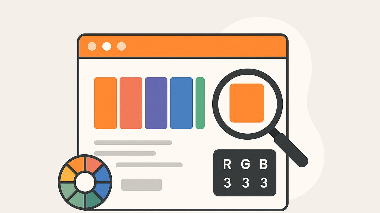
Whether you are a UI designer, brand strategist, photographer, or interior decorator, the right color scheme app can turn inspiration into publish‑ready palettes. Yet not all tools are created equal. Accuracy varies, algorithms differ, and workflows range from simple to pro‑grade. This guide explains how color scheme apps work, what to evaluate before you commit, and how to test accuracy yourself so you can consistently produce palettes that look great on screens and in print.
What a Color Scheme App Actually Does
A color scheme app helps you discover, refine, and export color palettes. The best tools let you sample colors from photos, apply harmony rules (analogous, complementary, triadic, monochromatic), convert between models (HEX, RGB, HSL, HSB), and test accessibility. They should preserve color fidelity across devices and exports, offer layout options for presenting palettes, and fit cleanly into your workflow from exploration to delivery.
In practice, a color scheme app typically provides these capabilities:
- Extract colors from images with reliable sampling and clustering.
- Generate harmony palettes from a base color or brand hue.
- Convert color formats: HEX, RGB, HSL/HSB, and sometimes CMYK.
- Preview colors against UI components, typography, or room mockups.
- Export palettes to formats you actually use (ASE, ACO, SVG, CSS, JSON, PNG, PDF).
Key Features to Evaluate Before You Choose
1) Sampling and Extraction
Sampling determines how faithfully the app captures pixels. Look for options such as:
- Sample size: Median or average over an area reduces noise; single‑pixel picks can be misleading.
- Edge handling: Smart sampling avoids anti‑aliasing artifacts on borders and text.
- Scaling: Downscaling with correct gamma preserves perceived color when analyzing large photos.
2) Palette Algorithms
Apps use various approaches to find dominant colors:
- K‑means clustering: Finds representative colors but may miss small accents.
- MMCQ (Median Cut): Fast quantization that performs well on photos with varied tones.
- Histogram/Mode: Simple and fast; best for flat graphics and logos.
- Harmony rules: Build coherent schemes from a single seed color based on color wheel geometry.
3) Color Management
Color accuracy depends on color spaces and profiles. A reliable color scheme app should:
- Assume or respect embedded profiles (sRGB, Display P3) and convert correctly.
- Handle gamma properly so averages and blends match perceived results.
- Offer consistent output (e.g., converting camera profiles to sRGB unless you choose otherwise).
4) Editing and Layout
Look for local adjustments (tint, temperature, saturation) and tools to reorder, lock, or nudge hues, plus layouts that show colors in context: UI components, poster blocks, or interior swatches. Context helps you judge contrast and hierarchy.
5) Accessibility and Contrast
As color accessibility becomes standard, your app should compute WCAG contrast ratios and simulate color vision deficiencies. Pair suggestions and warnings speed up iteration and reduce risk.
6) Export and Collaboration
From CSS variables for web to ASE for Adobe apps, export formats matter. Shareable links and image exports are essential for stakeholders who do not use design software.
How Palette Extraction Works (with a Tiny Code Example)
At the heart of many color scheme apps is clustering: grouping similar pixels and picking a representative centroid per cluster. Here is a minimal Python example using k‑means to extract a palette from an image. It is not production code, but it shows the idea:
# pip install pillow scikit-learn numpy
from PIL import Image
import numpy as np
from sklearn.cluster import KMeans

def extract_palette(path, k=5):
    img = Image.open(path).convert('RGB')
    # Downscale for speed while keeping color variation
    img = img.resize((min(800, img.width), min(800, img.height)))
    data = np.asarray(img)
    pixels = data.reshape(-1, 3)
    # Convert to linear-ish space for better clustering
    pixels_lin = np.power(pixels / 255.0, 2.2)
    kmeans = KMeans(n_clusters=k, n_init=5, random_state=42)
    kmeans.fit(pixels_lin)
    centers_lin = kmeans.cluster_centers_
    centers = np.clip(np.power(centers_lin, 1/2.2) * 255, 0, 255).astype(int)
    # Return HEX strings
    return ['#%02x%02x%02x' % tuple(c) for c in centers]

print(extract_palette('photo.jpg', k=5))
Notes: real apps add profile handling, improved initialization, outlier rejection, accent weighting, and quantization safeguards to avoid muddy results.
How to Test a Color Scheme App for Accuracy
Before you trust a tool, run quick, repeatable tests:
- Known swatches: Load an image of verified color chips (e.g., #FF0000, #00FF00, #0000FF, #808080). Sample each. The readout should match within a small delta (e.g., ±1–2 per RGB channel).
- Gradients: Sample across a smooth gradient to see if the app introduces banding or shifts when downscaling.
- Edges and text: Sample near boundaries to check if anti‑aliasing skews values. A larger sample or median should stabilize results.
- Profile awareness: Open the same image saved as sRGB and Display P3. If your device supports P3, the app should either honor the profile or convert consistently to your chosen working space.
- Repeatability: Pick the same spot multiple times. Values should be consistent unless lighting or sampling size changes.
Accessibility: Fast Checks That Prevent Rework
Color alone should not convey critical meaning, and text must meet contrast guidelines. WCAG recommends a minimum contrast ratio of 4.5:1 for normal text and 3:1 for large text. Many color scheme apps compute contrast for you, but it helps to understand the math.
# WCAG contrast ratio for sRGB colors
# color as (R, G, B) in 0-255

def rel_luminance(c):
    def f(u):
        u = u / 255.0
        return (u/12.92) if u <= 0.04045 else ((u+0.055)/1.055) ** 2.4
    R, G, B = c
    return 0.2126*f(R) + 0.7152*f(G) + 0.0722*f(B)

def contrast_ratio(c1, c2):
    L1, L2 = rel_luminance(c1), rel_luminance(c2)
    L1, L2 = max(L1, L2), min(L1, L2)
    return (L1 + 0.05) / (L2 + 0.05)

# Example
print(contrast_ratio((34,34,34), (255,255,255)))  # ~13.0
High contrast improves readability for everyone, not just users with low vision.
When you build palettes, validate key pairings (body text vs. background, button text vs. button fill, alerts vs. surfaces). If your color scheme app supports color vision deficiency simulation, preview at least protanopia and deuteranopia to confirm that states and categories remain distinguishable.
Pro Workflows with a Color Scheme App
1) Branding and Identity
- Start with a base hue from existing visuals or a mood board.
- Generate harmonies: complementary for high energy, analogous for calm coherence.
- Lock your primary color, then nudge supporting hues for contrast and hierarchy.
- Create tints/shades of the primary for depth across touchpoints.
- Export a master palette (ASE/ACO) and a developer‑friendly JSON or CSS tokens file.
2) UI/UX Design
- Extract colors from a product screenshot to align with existing visuals.
- Define semantic roles: primary, secondary, success, warning, destructive, background, surface, outline, text.
- Run contrast checks for core text sizes; adjust lightness in HSL to reach AA/AAA.
- Export CSS variables or design tokens, e.g.:
:root {
  --color-bg: #0b0b0f;
  --color-text: #ffffff;
  --color-primary: #5f8cff;
  --color-primary-contrast: #0b0b0f;
  --color-success: #22c55e;
}
3) Interior and Decor
- Sample colors from room photos taken in neutral lighting.
- Create a scheme with 1 dominant, 2 subordinate, and 1 accent color.
- Check L* (lightness) steps to ensure wall, trim, and furniture contrast.
- Export a labeled PDF swatch sheet for clients and contractors.
Performance, Privacy, and Reliability
- On‑device vs. cloud: On‑device processing is fast, private, and works offline. Cloud processing may enable heavy algorithms but can raise privacy considerations.
- Battery and speed: Efficient quantization and careful resizing keep extraction snappy even on large photos.
- File handling: The app should preserve metadata when needed and avoid unexpected recompression that alters color.
- Versioning: Being able to save and iterate on palette versions prevents losing experiments.
Feature Evaluation Table
| Feature | Why it matters | What to check |
|---|---|---|
| Sampling controls | Stabilizes values and avoids edge artifacts | Area/median sampling, zoomed picker, pixel grid |
| Color models | Different tasks need different models | HEX, RGB, HSL/HSB; optional CMYK for print |
| Accessibility tools | Prevents costly rework late in the process | WCAG contrast, CVD simulation, pair validation |
| Harmony generators | Faster exploration with coherent results | Analogous, complementary, triadic, monochrome |
| Exports | Fits your delivery pipeline | ASE/ACO, CSS/JSON/SVG, PNG/PDF sheets |
| Color management | Ensures fidelity across devices | sRGB/P3 handling, profile conversion |
| Organization | Scales to many projects | Folders, tags, names, versioning |
Practical Tips for Better Palettes
- Work in HSL for nudging: Small changes in lightness and saturation are more intuitive than manipulating RGB channels.
- Create semantic scales: For primary/secondary/neutral, define 10‑step scales (50–900) so designers and developers speak the same language.
- Mind neutral anchors: A stable gray or off‑white anchors vivid accents; tune neutrals by adding a hint of brand hue.
- Test on devices: Compare results on at least one standard‑gamut screen (sRGB) and one wide‑gamut screen (P3) if available.
- Label everything: Names like "Primary 600" beat unnamed swatches when teams scale.
Common Pitfalls and How to Avoid Them
- Overfitting to a photo: Palettes that mirror a single image can lack versatility. Extract, then refine with harmony rules and contrast targets.
- Ignoring lighting: Photos with heavy casts (tungsten, fluorescent) distort color. Use neutral lighting or white‑balance first.
- Too many colors: Limit the core palette to 5–7 colors; use tints/shades for range.
- Underestimating contrast: Colorful UI without contrast harms usability. Verify key pairs early.
A Quick Checklist for Choosing a Color Scheme App
- Does it provide reliable sampling (area/median) and zoomed picking?
- Can it extract from photos and also generate harmony palettes?
- Are HEX, RGB, HSL/HSB supported with accurate conversions?
- Does it handle sRGB and P3 images consistently?
- Can I preview contrast and simulate color vision deficiencies?
- Are exports available in the formats my team uses?
- Does it organize palettes with names, tags, and versions?
- Is processing on‑device and does it respect privacy?
Conclusion
The best color scheme app balances accuracy, intelligent generation, and workflow fit. Prioritize reliable sampling, clear color management, accessible pairings, and exports that match your pipeline. Test with known swatches, validate contrast early, and use harmony rules to evolve beyond a single reference photo. If you work on iPhone or iPad and want a focused tool for extracting HEX/RGB/HSL/HSB from photos and exporting polished palettes, take a look at Color Viewfinder as one option to add to your toolkit.
