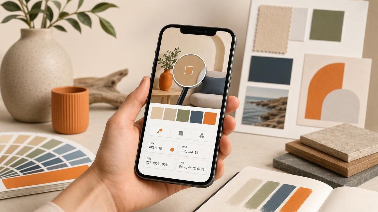
A good ios color picker app does more than “grab a color.” It helps you translate real-world inspiration—photos, textures, rooms, packaging, artwork—into usable color decisions that stay consistent across screens, print, and materials. The difference between a palette that feels professional and one that falls apart is often workflow: how you sample, how you validate values, and how you export colors for the tools you actually use.
This guide breaks down what to look for in an iOS color picker, how to sample accurately, and how to turn a photo into a palette you can confidently apply in graphic design, UI, branding, or interior design.
What an iOS color picker app should do (beyond picking a HEX)
Most people start with HEX because it’s common in web design. But reliable palette work benefits from multiple color models, repeatable sampling, and practical export options. When evaluating an app, prioritize capabilities that reduce guesswork:
- Multiple color formats: HEX, RGB, HSL/HSB (handy for adjustments and harmony).
- Precision sampling: zoomed loupe, pixel-level selection, and stable readouts.
- Palette building: save sets, name swatches, reorder, and lock key colors.
- Export workflows: formats for CSS, design tools, images, or shareable palettes.
- Consistency helpers: ability to compare colors, detect near-duplicates, and keep a baseline neutral.
“Color sampling isn’t a single click—it’s a process of separating light, material, and intention.”
Accuracy starts with the photo: the 5 biggest sampling pitfalls
Even the best picker can’t fix a misleading image. Before you blame the tool, check these common issues that skew sampled values:
- Mixed lighting: warm indoor bulbs + daylight creates gradients that aren’t “real paint colors.”
- Auto white balance: phones neutralize color casts differently per shot, altering the palette.
- Compression and filters: social media uploads and edits can shift saturation and contrast.
- Texture and specular highlights: glossy surfaces include bright reflections that aren’t the base color.
- Shadows: sampling shadowed areas often produces muddy, cooler values than intended.
Practical fix: sample “clusters,” not single pixels
Instead of choosing one pixel, sample several nearby points on the same surface (e.g., five points on a wall) and pick the median-looking value. A strong ios color picker app makes this easy by letting you repeatedly sample and compare swatches quickly.
Know your numbers: HEX vs RGB vs HSL/HSB (and when each matters)
Different formats are useful at different stages—capture, refinement, and implementation. Use this table as a quick decision guide.
| Format | Best for | Why it helps | Common pitfall |
|---|---|---|---|
| HEX (#RRGGBB) | Web/UI implementation | Copy-paste friendly, widely supported | Hard to “reason about” adjustments |
| RGB (0–255) | Screen-based work, dev handoff | Direct channel control; matches digital displays | Small tweaks can feel non-intuitive |
| HSL (Hue/Sat/Light) | Palette refinement | Lightness control is great for tints/shades | High saturation at different lightness can surprise |
| HSB/HSV (Hue/Sat/Bright) | Quick harmony exploration | Brightness aligns with many creative workflows | Not a perfect proxy for perceived luminance |
A reliable workflow: from photo to palette you can actually use
If you want repeatable results (especially across projects), follow a structured process. This keeps your palette from becoming a random pile of “pretty colors.”
Step 1: Define the palette’s job
Write one sentence describing how the palette will be used. Examples:
- UI palette: needs accessible contrast and a limited number of roles (background, text, accent).
- Brand palette: needs recognizable anchors and controlled variation.
- Interior palette: needs undertone consistency and material awareness (paint vs fabric vs wood).
Step 2: Pick 1–2 anchor colors first
Anchor colors are the “identity” of the palette. Sample the most distinctive hue(s) from the photo (the tile, the artwork, the hero object). Save them and don’t change them until the end.
Step 3: Build supporting neutrals
Neutrals make palettes usable. Sample:
- one light neutral (paper/paint/sky highlight)
- one mid neutral (stone/wood/cloth)
- one dark neutral (shadowed wood/metal/ink)
In many projects, neutrals do the heavy lifting—anchors are accents.
Step 4: Control value steps (light-to-dark)
Many “photo palettes” fail because all colors sit at the same lightness. Use HSL/HSB readouts to ensure you have a range. As a quick guideline:
- Background colors: higher lightness / lower saturation
- Text colors: very dark or very light, minimal chroma
- Accents: higher saturation, mid lightness
Step 5: Remove duplicates and near-duplicates
If two swatches are almost the same, keep the one that plays better with your neutrals. The goal is a small set of distinct roles, not a long list of similar shades.
How to sanity-check your palette (without extra tools)
You can do basic validation right on iOS with a few practical checks:
1) Contrast reality check
For UI and graphic design, ensure you have at least one very dark and one very light swatch. If everything looks mid-tone, readability will suffer.
2) Undertone check for interiors
When sampling walls, floors, and fabrics, compare each neutral against a known “true” reference (like pure white #FFFFFF or near-black #111111). If your “white” reads pink, green, or blue, you’ve discovered an undertone you must design around.
3) The grayscale test
Ask: if you remove hue entirely, do you still have hierarchy? A palette that works in grayscale usually works better in practice because value structure is sound.
What to look for in exports: make the palette easy to implement
A palette that can’t leave the app cleanly becomes friction. Look for export options that match your workflow—especially if you collaborate with developers, printers, or clients.
- CSS variables for web handoff
- ASE/ACO-like compatibility (or simple copy lists) for design tools
- Image palette sheets for presentations and mood boards
- Multiple layout options (swatches, strips, grids) depending on audience
Here’s a simple way to turn a sampled palette into usable CSS variables for quick prototyping:
:root {
  --color-bg: #F6F2EA;
  --color-surface: #E2D7C6;
  --color-text: #1D1B16;
  --color-muted: #6B6258;
  --color-accent: #D96B4C;
  --color-accent-2: #2F6F73;
}

body {
  background: var(--color-bg);
  color: var(--color-text);
}

.button {
  background: var(--color-accent);
  color: var(--color-bg);
}
Mini comparison checklist: choosing the right iOS color picker app
If you’re evaluating options, use this quick checklist. The more boxes you can tick, the more reliable your results will be.
- Sampling precision: zoom/loupe, stable readout, easy resampling
- Color models: HEX + RGB + HSL/HSB available instantly
- Palette management: save, rename, reorder, and lock swatches
- Export: copy formats (HEX/RGB), palette images, share options
- Customization: multiple palette layouts for different presentations
- Speed: minimal taps from photo to saved palette
- Offline-friendly: works without needing cloud processing
Example: turning one photo into three different palettes
One photo can yield multiple valid palettes depending on the goal. Suppose you have a beach photo with sand, teal water, coral umbrella, and slate rocks:
- UI palette: choose sand as background, slate as text, teal as primary accent, coral as secondary accent.
- Brand palette: choose teal as primary brand color, coral as “energy” accent, and keep neutrals minimal.
- Interior palette: prioritize undertones—sand for wall paint direction, slate for metal/fixtures, teal for textiles.
The app’s job is to extract accurate starting points; your job is to assign roles and control contrast.
When a photo-based palette should be adjusted (and why that’s normal)
It’s common to tweak sampled colors. Photos capture lighting conditions, not “true” material color. Adjustments are especially expected when:
- you need accessible contrast for text and UI components
- print output looks duller than screen (CMYK limitations)
- paint chips shift under different bulbs (metamerism and undertones)
- brand colors need consistency across many mediums
Keep the photo-derived palette as your inspiration, then refine values to meet real constraints.
Final takeaway
The best ios color picker app is the one that supports a repeatable workflow: precise sampling, multiple color formats, easy palette management, and exports that drop cleanly into your next step—whether that’s CSS, a design tool, or a presentation board. When you pair those features with smart sampling (avoid highlights, watch undertones, build neutrals), photo-based palettes become a dependable design asset instead of a one-off experiment.
If you’re looking for an iPhone/iPad tool that focuses on extracting HEX and building shareable palettes with multiple layout options, Color Viewfinder is one example to explore.
