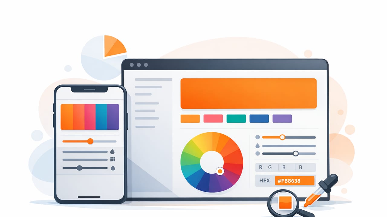
A color palette app can be the difference between a mood board that looks “close enough” and a palette that stays consistent across screens, print, and real-world materials. Whether you’re designing a brand identity, building a UI theme, planning a room refresh, or crafting social graphics, the goal is the same: capture colors accurately, refine them intentionally, and reuse them reliably.
This guide breaks down the features that matter most, a practical end-to-end workflow, and a few quality checks (like contrast and lighting correction) that help your palette hold up in real projects.
What a color palette app should do (beyond picking pretty colors)
Most people start with one need: “I want the colors from this photo.” A strong workflow needs more than a single eyedropper tap.
1) Accurate sampling from photos
Photo-based color extraction is powerful, but it’s also vulnerable to lighting, reflections, camera auto-adjustments, and compression. A good app should support:
- Zoomed sampling so you can target a specific pixel area (not an averaged blur).
- Multiple sample points to capture highlights, midtones, and shadows.
- Stable values (the same spot should produce repeatable results).
2) Multiple color models (HEX, RGB, HSL/HSB)
Designers often think in different color models depending on the task: HEX for UI implementation, RGB for screen work, and HSL/HSB for intuitive adjustments (like “make it slightly warmer” or “reduce saturation”). Your app should show at least HEX and RGB, and ideally HSL or HSB.
| Model | Best for | Typical use |
|---|---|---|
| HEX | Web/UI handoff | #1F2937 in CSS/design tokens |
| RGB | Screen color math | rgba(31,41,55,0.9) overlays |
| HSL | Systematic adjustments | Keep hue, tweak lightness for states |
| HSB/HSV | Intuitive tuning | Dial down brightness to reduce glare |
3) Palette organization (not just single swatches)
Real projects need sets: primary, secondary, neutrals, accents, and functional colors (success/warning/error). Look for features like:
- Palette layouts (rows, grids, dominant color sets).
- Reordering and locking swatches (so your “brand blue” doesn’t drift).
- Notes or labels (e.g., “CTA”, “Background”, “Trim paint match”).
4) Export formats that fit your workflow
Export is where many palettes fail. You don’t want to manually retype six HEX values into a style sheet or presentation deck. A practical color palette app should export in formats that match how you work:
- Text/CSV for quick copying into docs and spreadsheets.
- ASE (Adobe Swatch Exchange) for Adobe tools.
- PNG/SVG palette cards for sharing with clients or contractors.
- Design tokens (or at least structured text) for dev handoff.
A practical workflow: photo → palette → usable system
Here’s a repeatable process that works for graphic design, UI theming, and interior inspiration boards.
Step 1: Start with a “truthy” source image
If you’re photographing a real object (paint chip, fabric, tile), aim for consistency:
- Use even light (shade or diffused indoor light is usually better than harsh sun).
- Avoid reflections (tilt glossy surfaces slightly off-axis).
- Include a neutral reference if possible (white paper or a gray card nearby).
If you’re using an online image, try to choose one that’s not heavily filtered—filters can shift hue and crush shadows, creating “fake” colors that won’t reproduce well.
Step 2: Extract 8–12 candidate colors (then reduce)
Don’t aim for the final 5-color palette immediately. Start broad, then refine. Sample:
- 2–3 neutrals (backgrounds, shadows, outlines)
- 2–3 midtones (supporting colors)
- 2–3 accents (small, high-impact elements)
- Optional: 1–2 highlight colors (very light tints)
Rule of thumb: capture more colors than you need, then delete aggressively. A smaller palette is easier to apply consistently.
Step 3: Normalize the palette (fix the “photo problems”)
Photos often contain colors that are technically correct for that pixel but not useful in design. Normalize by adjusting:
- Lightness/brightness: bring backgrounds to a predictable range (e.g., avoid “almost white” that prints dirty).
- Saturation: reduce oversaturated colors that look neon on screens.
- Hue drift: correct slight green/magenta shifts introduced by lighting.
If your app provides HSL/HSB, do micro-adjustments there; it’s often faster and more intentional than nudging RGB.
Step 4: Assign roles (so the palette becomes a system)
A palette becomes usable when each color has a job. A simple role map looks like this:
- Background: the main canvas color
- Surface: cards, panels, secondary backgrounds
- Text: primary and secondary text colors
- Primary: key brand/UI action color
- Accent: emphasis, highlights, charts
- Border/Divider: lines and separators
For interior design, roles translate cleanly: walls (background), trim (border), dominant furniture (surface), textiles/art (accent), and hardware/wood tones (secondary).
Check contrast and readability (a quick accessibility pass)
Even if you’re not designing a formal UI, contrast checks prevent common issues like washed-out text on light backgrounds. At minimum:
- Ensure body text is clearly readable on your chosen background.
- Don’t rely on color alone for meaning (pair with icons, labels, or patterns).
- Test your palette in grayscale to confirm hierarchy still works.
If you want a quick manual test: create two text colors (dark and light) and pair them consistently with background/surface colors. If you frequently “guess,” your palette likely needs a stronger neutral foundation.
Turn your palette into reusable assets (CSS and design tokens)
Once your palette is stable, export it in a way that’s easy to reuse. For web projects, CSS variables are a practical middle ground between design and code.
:root {
  --color-bg: #F7F3EE;
  --color-surface: #FFFFFF;
  --color-text: #1F2937;
  --color-muted: #6B7280;
  --color-primary: #2F6F8F;
  --color-accent: #D97706;
  --color-border: #E5E7EB;
}

.button {
  background: var(--color-primary);
  color: var(--color-surface);
}

.badge {
  background: var(--color-accent);
  color: var(--color-text);
}
Even if you’re not coding, this structure helps you keep roles consistent in Figma, Keynote, Canva, or Adobe tools.
Common mistakes when using a color palette app (and how to avoid them)
Mistake 1: Sampling only the “pretty” parts of a photo
Photos often include dramatic lighting that makes colors look better than they behave in layouts. Sample neutrals and midtones too, not just saturated highlights.
Mistake 2: Skipping neutrals
Most palettes fail because they lack strong neutrals. Add at least:
- one light neutral (background)
- one dark neutral (text)
- one mid neutral (borders, secondary text)
Mistake 3: Too many similar hues
If three colors are “almost the same blue,” they won’t create clear hierarchy. Either increase separation (different lightness/saturation) or remove duplicates.
Mistake 4: Not testing in context
A palette card can look great but fail in a real layout. Paste the colors into a simple mock:
- headline + paragraph on background
- button + link states
- one chart or icon set
How to evaluate a color palette app before you commit
Many apps offer a free tier, so you can quickly validate fit. Use this checklist:
- Speed: can you extract multiple swatches in under a minute?
- Precision: can you zoom and sample accurately?
- Color models: does it display HEX + RGB + HSL/HSB?
- Palette control: can you reorder, lock, and edit swatches?
- Export: does it support the formats you actually use?
- Sharing: can you create a clean palette image for reviews?
Mini example: from a photo of a café interior to a usable palette
Imagine a photo with warm wood, off-white walls, dark metal fixtures, and a muted teal accent. A functional palette might assign:
- Background: warm off-white (walls)
- Surface: slightly brighter white (menus/cards)
- Text: deep charcoal (metal fixtures)
- Muted: warm gray (shadows/concrete)
- Primary: muted teal (brand/UI)
- Accent: amber/caramel (wood highlight)
Notice what’s missing: you might extract a bright neon sign color from the photo, but exclude it if it breaks the calm tone or causes contrast issues. The app helps you capture reality; your job is to edit it into a system.
Final takeaway
The best results come from treating your color palette app as part of a workflow: extract broadly, normalize for consistency, assign roles, test in context, and export in reusable formats. Do that, and your palettes will feel intentional—not accidental—and will translate cleanly across devices, print, and physical materials.
If you’re looking for an iOS option that focuses on extracting HEX colors from photos and organizing them into exportable palettes, Color Viewfinder is one tool you can explore.
