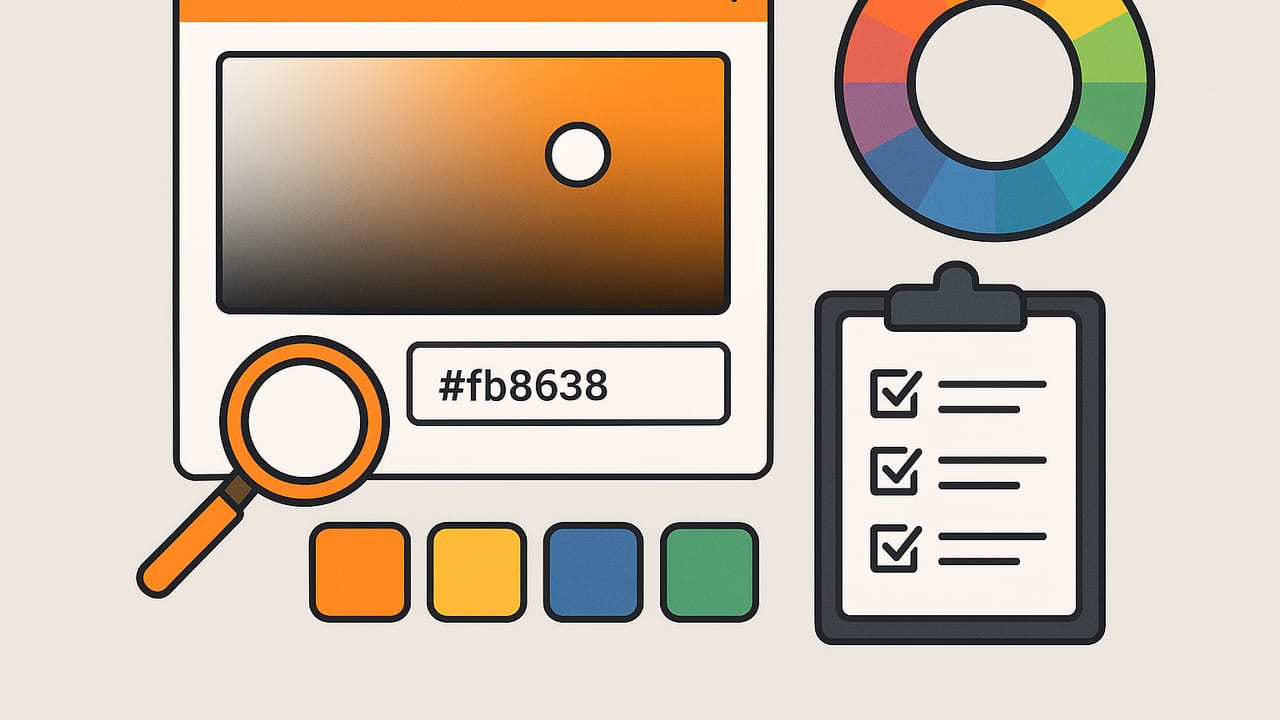
A great color picker app is more than an eyedropper. It’s a toolkit for capturing, organizing, testing, and exporting colors across devices, mediums, and workflows. Whether you design interfaces, decorate interiors, illustrate, or build brand systems, picking the right tool saves hours and improves consistency. This guide explains what to look for, how to test accuracy, and how to integrate a color picker app into real projects—without turning your creative process into guesswork.
Why a color picker app matters
Color choices affect usability, mood, and conversion. Inconsistent or inaccessible color usage can break brand trust and make interfaces harder to use. A well-chosen color picker app helps you:
- Capture real-world inspiration quickly (from photos, screens, or camera).
- Convert between color models reliably (HEX, RGB, HSL/HSB, and beyond).
- Build and manage palettes with naming, notes, and versioning.
- Check accessibility (contrast ratios) before committing to a scheme.
- Export to formats your tools understand (CSS, SVG, JSON, ASE, GPL, PDF).
Key features to look for in a color picker app
Use this checklist to evaluate any color picker app. The goal is reliable, repeatable results with minimal friction.
- Sampling precision: Pixel-perfect sampling with adjustable radius (1px average vs 3×3/5×5). A magnifier or loupe helps avoid aliasing issues when grabbing colors from screens or photos.
- Color models: Must support HEX, RGB, and HSL/HSB at minimum. Nice-to-haves include LAB/OKLCH for perceptual editing and CMYK estimates for print handoff.
- Palette creation: Group colors into palettes, name swatches, sort by hue/value/chroma, and generate tints/shades or harmonies (complementary, triadic, analogous).
- Photo and camera capture: Extract dominant colors and fine-grain swatches from photos. Useful for interiors, branding from product shots, or UI themes from reference imagery.
- Accessibility tools: WCAG 2 contrast checking (AA/AAA), simulation for light/dark modes, and previews on real UI elements or text sizes.
- Export formats: CSS variables, Tailwind or JSON tokens, SVG swatches, Adobe ASE, GIMP GPL, PNG/JPG swatch sheets, and PDF palettes for client approvals.
- Layout and preview: Palettes in grid, row, poster, or storyboard layouts. Helpful for presenting options to stakeholders.
- Performance and accuracy: Color-managed rendering, support for wide-gamut displays (Display P3), and correct conversions between profiles.
- History and versioning: Undo/redo, palette versions, and audit trails for team workflows.
- Privacy and offline use: On-device processing for photos; no forced cloud uploads. Export control is critical for client confidentiality.
- Pricing model: Core features should be accessible without subscriptions; advanced features can be add-ons. Ensure exports you need aren’t paywalled in a way that blocks delivery.
Mobile vs. desktop vs. browser: which color picker app fits?
- Mobile (iOS/Android): Best for camera capture and photo-based palette creation. Ideal for interior design, brand discovery in the field, and social content. Watch for wide-gamut support and accurate photo processing.
- Desktop apps: Excellent for screen sampling, plugin ecosystems (Figma, Sketch, Adobe), and large-canvas previews. Look for OS-level pickers and monitor calibration.
- Browser extensions: Great for web designers who need instant sampling on live sites. Prioritize extensions that show contrast ratios and copy in multiple formats with one click.
Feature matrix: what to test and why it matters
| Feature | Why It Matters | What to Test |
|---|---|---|
| Average sampling radius | Reduces noise from textured photos or anti-aliased edges | Compare 1px vs 5×5 on gradients and noisy images |
| Color models | Prevents rounding errors and supports pro workflows | HEX ↔ RGB ↔ HSL conversions; verify parity with a trusted calculator |
| Palette tools | Faster iteration and better organization | Create tints/shades; sort by hue/chroma; rename and reorder |
| Accessibility checks | Meets WCAG 2 AA/AAA for text and UI | Test 14px/16px body text and small labels against backgrounds |
| Exports | Seamless handoff to code and design tools | Export CSS variables, JSON tokens, and ASE; re-import without loss |
| Color management | Consistent colors across profiles and displays | Check sRGB vs P3 rendering; verify embedded profiles in exports |
| On-device privacy | Protects client imagery and IP | Toggle airplane mode; ensure full functionality offline |
Accuracy basics: color spaces, profiles, and displays
Not all colors are visible or reproducible on every device. Accuracy depends on the color space and whether your color picker app respects profiles.
- sRGB: The web default. Safe for cross-platform consistency.
- Display P3: Wider gamut common on modern phones and tablets; captures more saturated greens/reds. Great for vibrant imagery, but be careful when exporting to sRGB environments.
- Profiles and conversions: When converting P3 photos to sRGB HEX, the app should apply proper profile transforms, not naive channel mapping.
Practical tips for reliable sampling:
- Disable True Tone/Night Shift and any blue-light filters while sampling to avoid display tinting.
- Use averaged sampling on noisy textures (wood, fabric, foliage) for representative colors.
- When matching print, remember screen-to-paper differences. For critical print work, LAB/OKLCH editing and a profiled workflow (or a spectrophotometer) is recommended.
Accessibility: contrast checking that’s actually useful
A color picker app should compute relative luminance and report contrast ratios with clear AA/AAA pass/fail states. Here is a minimal, standards-based way to calculate contrast for HEX colors:
// WCAG 2 contrast ratio for two HEX colors
function hexToRgb(h) {
  const r = parseInt(h.slice(1, 3), 16);
  const g = parseInt(h.slice(3, 5), 16);
  const b = parseInt(h.slice(5, 7), 16);
  return [r, g, b];
}

function srgbToLinear(c) {
  c /= 255;
  return c <= 0.03928 ? c / 12.92 : Math.pow((c + 0.055) / 1.055, 2.4);
}

function relLuminance([r, g, b]) {
  const R = srgbToLinear(r);
  const G = srgbToLinear(g);
  const B = srgbToLinear(b);
  return 0.2126 * R + 0.7152 * G + 0.0722 * B;
}

function contrastRatio(hex1, hex2) {
  const L1 = relLuminance(hexToRgb(hex1));
  const L2 = relLuminance(hexToRgb(hex2));
  const [light, dark] = L1 > L2 ? [L1, L2] : [L2, L1];
  return (light + 0.05) / (dark + 0.05);
}

// Example: contrastRatio('#1a1a1a', '#ffffff')
Use your app to preview contrast on real components: buttons, badges, links, form labels, and small UI text. Check both light and dark themes.
Exports that streamline handoff
The wrong export format creates friction. Look for a color picker app that can output:
- CSS variables: For web and design systems.
- Design tokens (JSON): For cross-platform theming.
- SVG swatches: For vector tools or inline graphics.
- ASE, GPL: For Adobe and open-source editors.
- PDF/PNG swatch sheets: For client reviews and print references.
Example CSS export pattern using variables and a scale:
:root {
  --brand-50:  #f5fbff;
  --brand-100: #e6f4ff;
  --brand-200: #cce9ff;
  --brand-300: #99d3ff;
  --brand-400: #66bcff;
  --brand-500: #339eff;
  --brand-600: #117fe6;
  --brand-700: #0b63b4;
  --brand-800: #084a86;
  --brand-900: #06345e;
}

.button-primary {
  background: var(--brand-600);
  color: #fff;
}
Practical workflows using a color picker app
1) Web UI palette with accessibility baked in
- Capture a seed color from a logo or screenshot.
- Generate a 50–900 scale (tints/shades).
- Use the app’s WCAG checker to pair text colors with each background step.
- Export CSS variables and JSON tokens; drop into your design system.
- Validate on actual components (buttons, links, alerts) before shipping.
2) Interior palette from a room photo
- Take a photo in consistent lighting. Turn off display tints on your phone.
- Extract dominant colors and refine using averaged sampling on walls/fabrics.
- Adjust HSL to create a calm accent scale; preview as swatches on a wall layout.
- Export a PDF swatch sheet with notes for contractors and clients.
3) Illustration: cohesive tones from references
- Import a reference image; sample skin, fabric, and background tones.
- Generate harmonies and lock key hues; create shadows by reducing lightness.
- Export ASE for your illustration app and keep JSON tokens for re-use.
A simple test plan to evaluate any color picker app
- Precision test: Sample a diagonal gradient at 10 points; confirm smooth hue/lightness changes without sudden jumps.
- Noise test: Sample a high-ISO photo with and without averaged radius; ensure averages feel representative.
- Profile test: Compare sampling the same photo saved as sRGB vs Display P3; verify converted HEX values differ as expected and exports embed the correct profile.
- Contrast test: Check 12 common text/background pairs; confirm AA/AAA labeling and edge cases (e.g., colored text on colored surfaces).
- Export/import roundtrip: Export a palette to JSON/ASE; re-import and check for value drift or lost names.
- Offline/privacy: Disable internet; ensure full functionality for photos and exports without forced cloud sign-in.
Common mistakes and how to avoid them
- Sampling from compressed screenshots: JPEG artifacts skew colors. Use lossless or average over larger radii.
- Ignoring ambient light: Real-world capture under mixed lighting can mislead. Use consistent lighting and, if possible, a gray card for reference.
- Forgetting accessibility: Designers often test headlines but forget small labels and disabled states. Always verify small text and interactive states.
- Over-reliance on HEX for print: Screen codes don’t map directly to ink. Share LAB values or Pantone matches when deliverables include print.
- Not versioning palettes: Save palette versions tied to milestones (MVP, v1.1, rebrand) to prevent silent regressions.
FAQ
Does a color picker app need OKLCH or LAB?
Not mandatory, but very helpful for perceptual adjustments. HSL can produce uneven steps; OKLCH/LAB preserve perceived differences better, especially for creating balanced scales.
How many swatches should a palette have?
For UI, a 10-step scale (50–900) per color is common. For branding, 3–6 core colors plus neutrals often suffice. For interiors, pick 3–5 harmonized colors and keep neutrals flexible.
What’s the best way to name colors?
Use semantic names (–primary, –accent, –success) for code and descriptive names (Sea Mist, Charcoal) for presentations. Many teams keep both.
Are browser extensions enough?
They’re great for web sampling, but a dedicated app often adds palette management, accessibility tools, and better exports. Many designers use both.
How do I ensure device consistency?
Work in sRGB for web consistency, verify P3 assets convert properly, and disable display tints while sampling. Consider a calibrated monitor for desktop work.
Final thoughts
The right color picker app should feel invisible: quick sampling, trustworthy values, easy palette management, and exports that drop straight into your workflow. Prioritize accuracy (profiles and conversions), accessibility tools you’ll actually use, and export formats that match your team’s stack. If you work on iPhone or iPad and want a streamlined photo-to-palette workflow with HEX, RGB, HSL, and HSB plus flexible exports, consider trying Color Viewfinder as a lightweight option.
