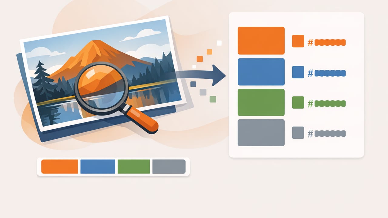
When a client says, “Make it feel like this photo,” they’re rarely asking for a literal copy—they’re asking for the color story. The fastest way to turn that story into something you can actually use in Figma, Photoshop, CSS, or a paint plan is to convert photo colors to HEX and organize them into a palette you can apply consistently.
This guide walks through a practical, accuracy-first workflow: how to sample colors from photos, what can skew your results, how to validate your picks, and how to translate a handful of sampled colors into a palette that works across digital and real-world materials.
Why HEX values are the “portable” version of a photo’s colors
Photos store color information per pixel (usually in an RGB color space). Designers and developers need a standardized way to reference specific colors—especially when collaborating. HEX is popular because it’s compact, widely supported, and maps cleanly to RGB.
| Format | What it represents | Common use | Example |
|---|---|---|---|
| HEX | RGB values written in base-16 | Web, UI design systems, CSS | #2F6FED |
| RGB | Red/Green/Blue channel intensities | Digital imaging, screen design | 47, 111, 237 |
| HSL | Hue/Saturation/Lightness | Adjusting “feel” while keeping hue | 219°, 83%, 56% |
| HSB/HSV | Hue/Saturation/Brightness | Color picking, quick brightness tweaks | 219°, 80%, 93% |
Even if you ultimately work in HSL/HSB to fine-tune relationships, HEX is often the easiest value to hand off to teammates and reuse across tools.
Before you sample: 4 factors that change the “real” color in a photo
If you’ve ever sampled a “white wall” and got a beige or blue-gray, you’ve met the reason color picking can go wrong: photos are interpretations. To get reliable HEX values, you need to understand what you’re sampling.
- Lighting temperature: Warm indoor bulbs push pixels toward yellow/orange; shade pushes blue.
- Exposure and contrast: Overexposed highlights lose detail; shadows compress colors into muddy values.
- Compression and noise: JPEG artifacts and sensor noise create speckled pixels—especially in low light.
- Material behavior: Glossy surfaces reflect surroundings; fabric and paint absorb light differently than screens.
Sample the color you want to repeat, not the color the camera happened to see in a single pixel.
A practical workflow to convert photo colors to HEX (without guesswork)
The goal is not to extract every color—it's to extract the right colors: the ones that represent the photo’s dominant tones, key accents, and neutrals.
1) Start with the highest-quality image you can
Whenever possible, work from:
- Original camera photos (not screenshots of screenshots)
- Images without heavy filters
- Well-lit shots with clear midtones
If you must use a social image, download the largest version available. Higher resolution gives you more clean pixels to sample and helps you avoid compression artifacts.
2) Decide what kind of palette you need (3–7 colors is usually enough)
A useful palette is structured. Before you pick a single pixel, define what you’re building:
- Primary: the dominant color impression (often 1–2 colors).
- Secondary: supporting colors that appear frequently.
- Accent: small but high-impact highlights (buttons, decor pops, callouts).
- Neutrals: off-whites, grays, charcoals for backgrounds and balance.
This prevents the common mistake of extracting five nearly identical midtones and calling it a palette.
3) Sample from “representative areas,” not edges or glare
To convert photo colors to HEX accurately, sample from larger regions where the color is stable:
- Avoid edges (anti-aliasing blends colors)
- Avoid specular highlights (gloss reflections skew bright)
- Avoid deep shadows (color shifts and noise increase)
If your tool allows it, sample with a slightly larger averaging radius rather than a single pixel. Averaging reduces noise and captures the intended hue more reliably.
4) Take multiple samples per “color” and choose the median
One of the simplest professional tricks: don’t trust a single sample. Take 3–5 samples within the same material/area (for example, the painted wall) and keep the one that sits in the middle—neither the brightest highlight nor the darkest shadow.
This is especially helpful for natural materials (wood, stone, skin tones) where there’s genuine variation.
5) Validate contrast and readability (especially for UI)
A palette that looks great in a photo may fail in real usage. For UI and graphic design, quickly test whether text is readable on your backgrounds and whether accents pop without vibrating.
- Check light/dark pairing: do you have at least one strong dark and one clean light?
- Check accents: do they stand out against both light and dark backgrounds?
- Check neutrals: are they actually neutral, or tinted strongly?
If a sampled “white” is actually #F2E9DF, that may be perfect—but treat it as a warm off-white, not a pure background white.
Turning extracted HEX values into a usable palette system
Once you have your HEX values, the next step is to name and organize them so they’re reusable. A palette becomes powerful when it’s consistent and communicable.
Use functional names, not “pretty names”
Names like “Ocean Mist” are fun, but they don’t help implementation. Prefer functional labels:
- Primary 500 (main brand color)
- Primary 700 (darker variant for hover/state)
- Accent 500
- Neutral 50 / 100 / 900
Even if you’re an interior designer, a functional scheme helps: Wall Base, Trim Light, Accent Pop, Wood Tone, Text Dark.
Create simple tints and shades for flexibility
A photo gives you a snapshot; design needs a range. After you pick a base HEX color, generate:
- Tints: lighter versions for backgrounds
- Shades: darker versions for depth and text
You can do this in HSL/HSB by keeping the hue stable and adjusting lightness/brightness. This keeps the palette cohesive while expanding usability.
Example: applying photo-derived HEX colors to a web style snippet
After you convert photo colors to HEX, you’ll often want to drop them into a design system quickly. Here’s a small CSS variables pattern you can reuse:
:root {
  --color-primary: #2F6FED;
  --color-primary-dark: #1E49A8;
  --color-accent: #F2B705;
  --color-surface: #F7F4EF;
  --color-text: #121212;
}

.button {
  background: var(--color-primary);
  color: white;
}

.button:hover {
  background: var(--color-primary-dark);
}

.callout {
  border-left: 4px solid var(--color-accent);
  background: var(--color-surface);
  color: var(--color-text);
}
This is where thoughtful palette structure pays off: you’re not just copying colors—you’re building a system that supports states, hierarchy, and readability.
Common mistakes when extracting HEX from photos (and how to fix them)
Mistake 1: Sampling from tiny details
Fix: Zoom in and sample from broader, flatter regions. If your tool supports it, use averaging to reduce noise.
Mistake 2: Treating shadows as “the real color”
Fix: Sample midtones. If you need a darker companion color, create a shade intentionally rather than grabbing a shadow pixel.
Mistake 3: Ending up with five similar mid-blues
Fix: Force variety by selecting roles: one primary, one accent, two neutrals, one optional secondary.
Mistake 4: Ignoring output context (screen vs print vs paint)
Fix: For print, consider CMYK conversion and proofing. For interiors, expect paint chips to shift under different lighting—test swatches in the space.
A quick checklist for reliable photo-to-HEX extraction
- Use the best-quality image available (avoid heavy filters)
- Define palette roles before sampling
- Sample midtones, avoid glare and deep shadows
- Take multiple samples and choose a representative value
- Include neutrals (light and dark) for balance
- Validate contrast and adjust with tints/shades
- Name colors by function so you can reuse them
When a mobile workflow makes sense
Many creative decisions happen away from a desk: on-site interior consults, museum visits, street photography, moodboard scouting, or quick client meetings. A mobile color extraction workflow is useful when you need to capture inspiration instantly, convert it into HEX/RGB values, and save it as a palette you can export later.
If you’re looking for an iPhone/iPad option, Color Viewfinder is one example of a tool that can extract HEX from photos and organize palettes for export—handy when your best references live in your camera roll.
