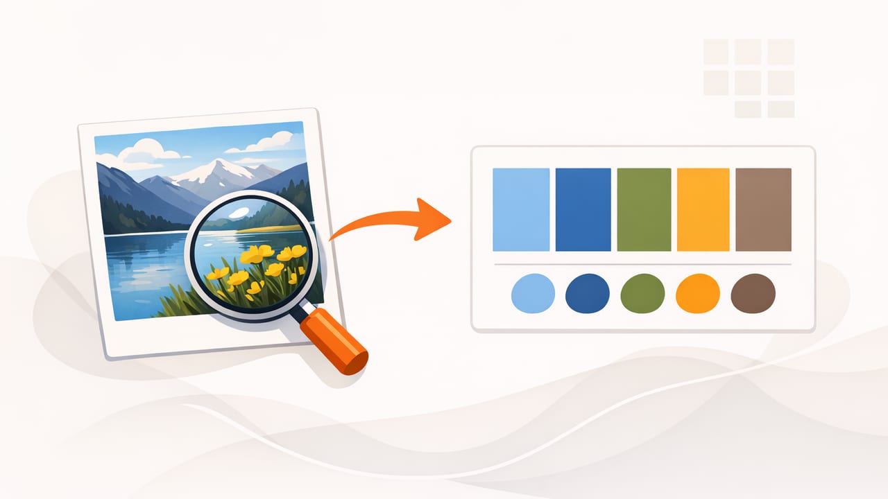
When you create a color palette from a photo, you’re borrowing harmony that already exists in the real world: a sunset gradient, a brand mood shot, a street mural, or a cozy room scene. The challenge is turning those pixels into a palette that stays consistent across tools, screens, print, and real materials.
This guide walks through a practical, repeatable workflow: choosing the right source photo, extracting colors accurately, refining the palette (so it’s not just a random set of swatches), and applying it confidently in graphic design, UI, illustration, and interior styling.
Why photo-based palettes can fail (and how to avoid it)
Photo colors are influenced by lighting, camera processing, reflections, and compression. If you sample without context, you often get:
- Too many similar midtones (everything looks muddy together).
- Colors shifted by white balance (cool shadows, warm highlights).
- Unusable neons from specular highlights or saturated LEDs.
- Inconsistent results between devices and apps.
The fix isn’t “pick better colors.” It’s using a workflow that separates capture, extract, and design intent.
Step 1: Choose the right photo for palette extraction
Not every photo is a good palette source. Look for images with clear color relationships and a readable hierarchy.
Best kinds of photos to sample
- Natural scenes with distinct foreground/background separation (beach, forest, desert).
- Styled interiors with consistent lighting and repeated materials.
- Brand photography that already reflects a deliberate art direction.
- Illustrations/posters (often the easiest: colors are flatter and cleaner).
Photos that are harder to use
- Low-light shots (heavy noise changes sampling).
- Mixed lighting (warm bulbs + daylight = unpredictable neutrals).
- Strong color casts (club lighting, neon signage, tinted windows).
- Heavily compressed screenshots (banding and artifacts).
Step 2: Prepare the photo so sampled colors are accurate
If your goal is reliable HEX values, a little prep goes a long way. You don’t need pro editing—just remove the biggest distortions.
- Crop to the relevant area so the palette reflects the mood you want (not random background clutter).
- Correct exposure so highlights aren’t blown out and shadows aren’t crushed.
- Neutralize white balance if the scene looks noticeably too yellow/blue.
- Reduce extreme vibrance if the palette is meant for UI/print (optional, but helpful).
Even small corrections can turn “almost right” colors into values you can reuse confidently.
Step 3: Extract colors: what to sample (and what to ignore)
When you create a color palette from a photo, sample with intention. Think in roles, not just pretty swatches.
A reliable 5–7 color structure
- 1–2 neutrals: background/off-white, warm gray, charcoal.
- 1 primary: the color that communicates the mood.
- 1 secondary: supports the primary without competing.
- 1 accent: high-saturation “pop” for buttons, highlights, decor accents.
- 1 deep anchor (optional): deep navy/espresso/forest for type and contrast.
Sampling tips that improve palette quality
- Avoid specular highlights (tiny bright reflections) and sample nearby diffuse color instead.
- Sample larger areas (painted walls, fabric fields, sky gradients) for cleaner values.
- Pick a “true neutral” by sampling a shadow-neutral area (but not the darkest shadow).
- Take multiple samples per role and choose the one that feels stable across the photo.
Rule of thumb: if a sampled color only looks good in one tiny spot, it’s probably not a good palette color.
Step 4: Understand color formats so the palette stays consistent
Extraction tools often show several formats. They’re all the same color, but each is useful for different tasks.
| Format | Best for | Example |
|---|---|---|
| HEX | Web/UI design, CSS, design systems | #2D6CDF |
| RGB | Screen-based work, shaders, motion, editing | 45, 108, 223 |
| HSL | Adjusting lightness for tints/shades, building ramps | 216°, 72%, 53% |
| HSB/HSV | Intuitive “brightness” tweaks; often used in pickers | 216°, 80%, 87% |
If you’re publishing on the web or handing colors to developers, HEX is the most portable. If you need systematic variations (hover states, light/dark themes), HSL is often easier to manipulate.
Step 5: Refine the palette (so it behaves like a system)
Raw extraction usually gives you “what’s in the photo,” not “what works in a design.” Refinement is where the palette becomes usable.
Make neutrals actually neutral
Many photo neutrals are slightly tinted (greenish grays, purple shadows). That can be beautiful—until it clashes with typography or product imagery. Decide whether you want:
- Clean neutrals (more flexible, more “modern UI” friendly), or
- Tinted neutrals (more atmospheric, great for editorial and interiors).
Create a light-to-dark ramp
Instead of one blue, build a small ramp: light, base, dark. This makes UI states and layout hierarchy easier.
- Light: backgrounds, subtle cards
- Base: primary elements
- Dark: text on light backgrounds, outlines, focus rings
Limit saturation for large areas
A color that looks great as a small accent can be exhausting as a full background. For large surfaces, reduce saturation and rely on contrast and texture for interest.
Step 6: Check contrast and accessibility
If your palette will be used in UI, presentations, signage, or anything text-heavy, contrast matters. At minimum, verify that your text color and background combinations are readable.
Quick practical checks
- Test dark text on light neutral and light text on deep anchor.
- Make sure your accent color still reads when used for small UI elements (icons, links).
- Don’t rely on color alone to communicate state (errors/success). Pair with icons or labels.
If a pair fails, don’t throw out the palette—adjust lightness first (often a small shift fixes readability while keeping the hue).
Step 7: Apply the palette to real projects
To keep your photo palette from drifting over time, assign roles and document them.
Example role mapping
- Background: warm off-white
- Surface: pale tint of the primary hue
- Text: deep anchor (near-black but not pure black)
- Primary action: base primary
- Secondary action: desaturated companion
- Accent: high-energy highlight
Turn extracted HEX into reusable CSS variables
This simple pattern keeps your palette consistent across pages and components:
:root {
  --bg: #F6F1EA;
  --surface: #E7EEF8;
  --text: #1E232B;
  --primary: #2D6CDF;
  --primary-dark: #1F4FA8;
  --secondary: #D08A62;
  --accent: #E24B5B;
}

body { background: var(--bg); color: var(--text); }
.button-primary { background: var(--primary); color: #FFFFFF; }
Even if you’re not coding, the same idea applies in design tools: define color styles/tokens so you stop picking “almost the same blue” repeatedly.
Common mistakes when creating a color palette from a photo
- Sampling too many colors: 20 swatches is not a palette—it’s a screenshot of your picker.
- Ignoring neutrals: most designs live and die by backgrounds and text colors.
- Using only midtones: without light and dark endpoints, layouts look flat.
- Trusting one sample point: take a few samples and choose the most stable.
- Skipping export consistency: save values in a format your workflow won’t reinterpret.
A simple checklist you can reuse
- Pick a photo with clear color hierarchy.
- Crop and correct obvious exposure/white balance issues.
- Extract 5–7 colors by role (neutrals, primary, secondary, accent, anchor).
- Refine neutrals and build a light-to-dark ramp.
- Verify contrast for key text/background pairs.
- Assign names/roles and export HEX (plus HSL if you’ll generate variants).
Closing note
When you create a color palette from a photo using roles, ramps, and contrast checks, you get the best of both worlds: inspiration from reality and the reliability of a design system. If you prefer building palettes on iPhone or iPad, an app like Color Viewfinder can help you capture HEX/RGB/HSL values and organize palette layouts for export.
