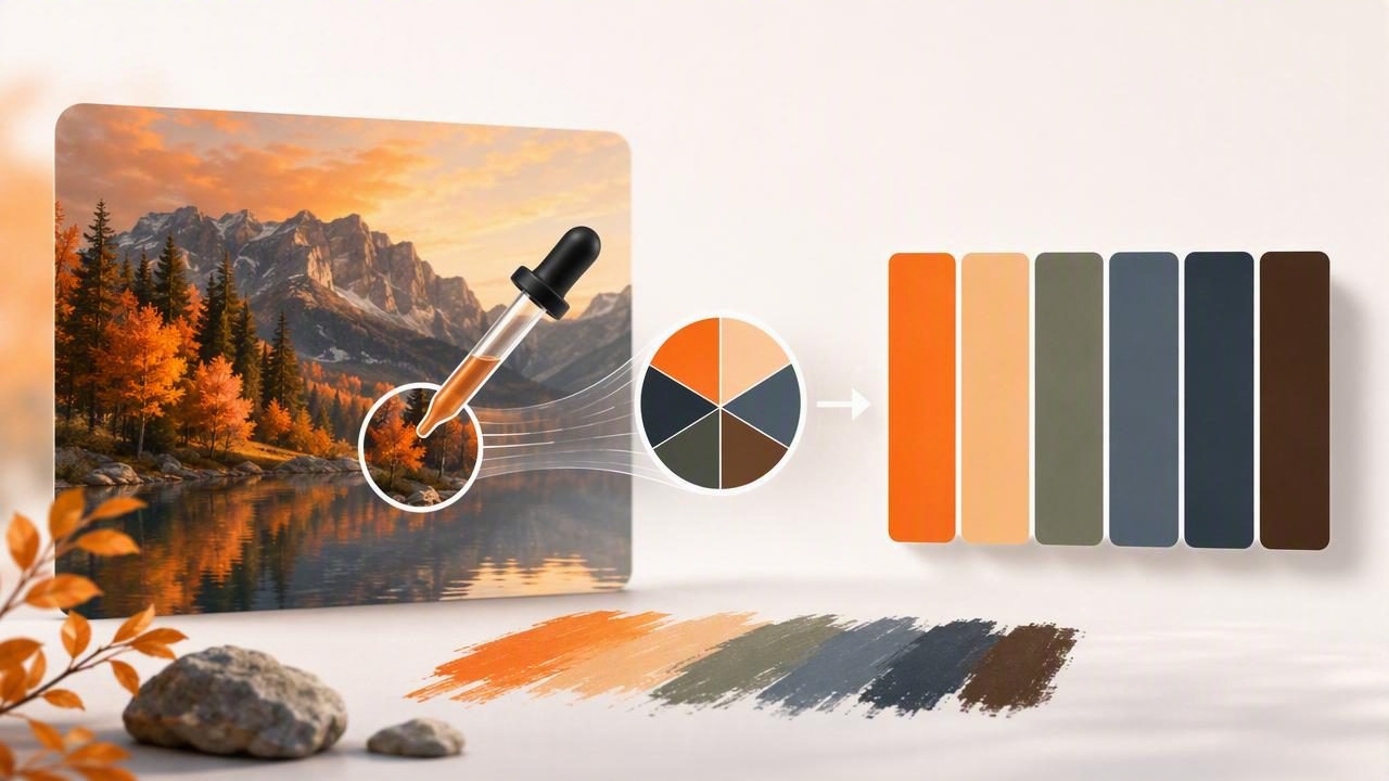
When you create a color palette from an image, you’re borrowing a real-world harmony that already “works” under natural lighting, texture, and context. That’s why photo-based palettes are so useful for brand design, UI themes, illustrations, and interior design mood boards. The challenge is that photos contain noise: shadows, highlights, lens color cast, and subtle gradients can trick you into picking colors that look great in the photo but fail in real layouts.
This guide walks through a reliable, repeatable workflow: how to sample colors, reduce them into a usable set, assign roles (background, accent, text), check contrast, and export values you can actually build with.
What “palette from an image” really means
A photo can contain thousands of distinct colors. A practical palette is a curated set (often 5–12 colors) that captures the image’s character while staying usable in design systems.
- Base colors: large-area hues (sky, wall paint, fabric, skin tones).
- Support neutrals: off-whites, warm grays, charcoals for background and text.
- Accents: small, high-impact colors (signage, flowers, product packaging).
- State/utility colors (optional): success, warning, error—derived carefully so they don’t clash.
Step 1: Choose the right reference image
Not every image is a great palette source. Use photos that match the emotional tone and usage context of your project.
Pick images with:
- Clear lighting (avoid heavy color filters unless you want that look).
- Distinct subject + background (makes base and accent selection easier).
- Readable neutrals (whites/blacks/grays that can become UI backgrounds or text).
Avoid images that:
- Are extremely under/overexposed (highlights clip to white; shadows crush to black).
- Have dramatic, mixed lighting (e.g., neon + daylight) unless your project needs it.
- Contain mostly midtones with no contrast (you’ll struggle to make text readable).
Step 2: Sample colors with intention (not randomly)
A good sampling strategy is more important than the tool. Instead of tapping everywhere, sample by surface type:
- Background planes: sky, wall, paper, tabletop.
- Primary subject: clothing, product body, main object.
- Secondary subject: supporting objects that add variety.
- Micro-accents: small saturated details (labels, petals, signage).
- Shadows and highlights: one of each can help you build depth, but don’t over-collect them.
As you sample, capture values in formats you’ll actually use: HEX for web/UI, plus HSL/HSB to adjust lightness and saturation without drifting hue.
Rule of thumb: if a sampled color is only visible in a tiny specular highlight, it probably shouldn’t be in your core palette—unless you want sparkle accents.
Step 3: Reduce to a usable palette (5–12 colors)
After sampling 15–30 candidates, reduce them. The goal is variety with control.
How to reduce without losing the vibe
- Merge near-duplicates: if two colors are close, keep the cleaner one (less muddy, less tinted by shadow).
- Prefer midtone “true” surfaces: colors sampled from evenly lit areas tend to translate best.
- Keep neutrals intentionally: one light neutral, one dark neutral, and optionally one mid neutral.
- Limit accents: 1–3 accents are usually enough for UI; 3–5 can work for illustration or interiors.
Step 4: Assign roles (so the palette works in real layouts)
Palettes fail when they’re just a list of pretty swatches. Assign each color a job. This turns “colors from a photo” into a system you can apply consistently.
| Role | What it does | Typical characteristics |
|---|---|---|
| Background | Base canvas for screens/sections | Low saturation, high lightness (or very dark for dark mode) |
| Surface | Cards, panels, content blocks | Near background but slightly higher contrast |
| Primary | Main action color (buttons/links) | Distinct hue, medium-to-high saturation |
| Secondary | Supporting actions, tags, highlights | Complementary or analogous to primary |
| Text | Body and headings | Neutral dark on light backgrounds (or neutral light on dark backgrounds) |
| Accent | Small pops: icons, badges, illustration detail | Highest saturation; use sparingly |
Step 5: Fix the common photo-to-palette problems
Problem A: “Everything looks muddy”
Photos often contain low-contrast midtones. Try:
- Increase lightness separation: ensure you have at least one very light and one very dark neutral.
- Choose a cleaner accent: sample from the most saturated object, not from shadows.
- Reduce the number of similar warm grays or similar blues.
Problem B: “It looks good in the photo but awful in UI”
That usually means the palette lacks role clarity and contrast. Make sure you’re not using a midtone as a background and another midtone as text.
Problem C: “The palette feels too bright”
Keep the hue but lower saturation (in HSL/HSB) for large surfaces. Save highly saturated colors for accents and small components.
Step 6: Check contrast (accessibility and readability)
If you’re using the palette in web/UI, contrast isn’t optional. A beautiful palette that can’t support readable text will cause constant rework.
At minimum, test:
- Body text on background and on surface colors.
- Button text on primary/secondary colors.
- Links on background and inside content blocks.
Many teams aim for WCAG contrast targets such as 4.5:1 for normal text and 3:1 for large text. If your primary color fails as a background for white text, you can often fix it by slightly darkening it (adjusting HSL lightness) while keeping the same hue identity.
Step 7: Export in formats you can build with
Once roles are assigned, export in a structure your tools and teammates can use. For digital products, CSS variables are a clean handoff format.
:root {
  --color-bg: #F6F2EA;
  --color-surface: #FFFFFF;
  --color-text: #1E1E1E;
  --color-muted: #6B6B6B;
  --color-primary: #2E6F8E;
  --color-secondary: #D19A3A;
  --color-accent: #C24B5A;
}

.button-primary {
  background: var(--color-primary);
  color: #FFFFFF;
}
For print or interior design, you may also want to store:
- RGB for general digital workflows,
- HSL/HSB for controlled adjustments,
- and optionally CMYK conversions for print (with proofing, since conversions vary).
Practical example: building a 7-color palette from one photo
Imagine a travel photo of a coastal town: pale sunlit walls, deep ocean blue, terracotta roofs, green shutters, and warm shadows. A strong 7-color set could be:
- Background: warm off-white from sunlit wall
- Surface: cleaner white (slightly brighter than background)
- Text: deep charcoal from shaded stone
- Muted: warm gray from distant haze
- Primary: ocean blue (buttons/links)
- Secondary: terracotta (highlights, chips)
- Accent: shutter green (sparingly for emphasis)
Notice what’s missing: you’re not keeping five slightly different blues from the waves. You keep the one that best represents “ocean” and supports contrast decisions.
Advanced tips for more consistent results
Use clusters: light, mid, dark
When you sample candidates, try sorting them into three buckets: lights, mids, and darks. Then choose at least one dependable neutral from each bucket. This makes UI states (hover, pressed, disabled) easier later.
Build tints and shades from one anchor hue
If you have one primary color, generate 3–6 steps by adjusting HSL lightness gradually (e.g., 15% increments). That gives you consistent borders, backgrounds, and hover states without introducing random new colors from the photo.
Watch out for white balance
Indoor photos often have warm (yellow) or cool (blue) color casts. That can be good stylistically, but if you need neutral whites/grays, sample from objects you know should be neutral (paper, true white paint) and adjust toward neutrality.
Checklist: photo to palette in 10 minutes
- Pick a clear reference image with neutrals and at least one strong accent.
- Sample by surface type (background, subject, accents).
- Collect 15–30 candidates, then merge duplicates.
- Reduce to 5–12 colors, keeping 2–3 neutrals.
- Assign roles (background, surface, text, primary, secondary, accent).
- Adjust saturation/lightness so large areas aren’t overly vivid.
- Check contrast for text and key components.
- Export in HEX + HSL/HSB; package as CSS variables or a design token list.
Final thoughts
To create a color palette from an image that holds up in real projects, treat the photo as a starting point—not a strict map. Sample intentionally, reduce aggressively, assign roles, and validate contrast. Do that, and you’ll get palettes that feel authentic (because they’re grounded in reality) and still function like a professional design system.
If you prefer doing this on an iPhone or iPad, apps like Color Viewfinder can help you sample accurate HEX/RGB/HSL values and assemble exportable palettes while you’re collecting visual inspiration.
