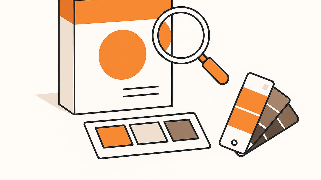
Color swatches distilled from product packaging images can supercharge e‑commerce pages, improve brand consistency, and accelerate design workflows. Whether you\u2019re building a style guide, designing variant chips for a product page, or auditing competitors\u2019 shelves, getting trustworthy colors isn\u2019t as simple as sampling a pixel. This guide covers capture, prep, extraction methods, code, and delivery formats so you can generate accurate, usable swatches from packaging photos.
Why extract swatches from product packaging images?
- E\u2011commerce UI: Display clickable swatch chips for variants or show palette strips alongside product shots.
- Brand stewardship: Confirm packaging updates align with core hues and contrast requirements.
- Design and content: Build mood boards, banners, and email templates using real-world brand colors.
- Competitive analysis: Track color trends across categories and seasons.
- Production QA: Compare vendor samples to the approved palette (on-screen soft proofing or print checks).
\u201cIf the photo is wrong, the palette will be wrong.\u201d Start with capture discipline to avoid fixing problems later.
Capture: Get the photograph right first
The biggest source of color error comes from poor lighting and reflections on glossy packaging. Follow these principles:
- Use diffuse, neutral light: A softbox or bright window light on an overcast day works. Avoid mixed color temperatures (e.g., daylight + warm lamps). Stick to 5,000\u20136,500 K.
- Kill glare: Angle the package 5\u00b0\u201310\u00b0 from the camera and use a polarizing filter. For best results, try cross-polarization: a linear polarizer on lights and a circular polarizer on the lens.
- White balance properly: Place a gray card in the first shot and set custom white balance. On phones, tap to lock WB and exposure.
- Choose a reasonable focal length: On phones, avoid the ultrawide; use the main or 2x lens to reduce distortion. On cameras, 50\u201385 mm (full-frame equivalent) is safe.
- Background matters: Use neutral mid-gray so auto-exposure won\u2019t brighten/darken the subject unpredictably.
- Shoot high resolution: More pixels give better clustering and smoother gradients. Avoid aggressive JPEG compression.
Quick capture checklist
- Neutral, even lighting (no mixed sources)
- No specular highlights on glossy areas
- Gray card shot for reference
- Main/tele lens, perpendicular framing
- High-res, minimally compressed file
Prep the image for reliable sampling
Even a perfect photo benefits from a little preparation.
- Crop to the packaging face: Exclude surroundings, hands, and props.
- Correct perspective: Use a perspective tool so edges are straight and parallel.
- Neutralize white balance: White-balance using the gray card frame, or a known neutral area of the package (avoid over-bright highlights).
- Control highlights: Create a mask to down-weight pixels with very high brightness/very low saturation (typical glare).
- Remove background: Segment the package with a quick mask; this helps clustering focus on actual design colors.
- Standardize color space: Convert to sRGB for web use. Keep a copy in a wide-gamut space if you\u2019re doing print comparisons.
- Denoise gently: A light denoise on JPEGs reduces random color speckles that confuse clustering.
Methods to generate swatches
There\u2019s no single \u201cbest\u201d method; choose based on speed, control, and accuracy needs.
| Method | How it works | Speed | Accuracy | Control | Best for |
|---|---|---|---|---|---|
| K\u2011means clustering | Groups pixels into k dominant colors | Fast | High with good masks | Medium | General packaging, quick palettes |
| Median-cut/Octree quantization | Subdivides color space to find representative colors | Very fast | Medium | Low | Thumbnails, onboard/mobile processing |
| Manual eyedropper + averaging | Sample regions and average to reduce noise | Slow | Very high (expert-driven) | High | Brand-critical hues and small variations |
Enhance any method with a mask: exclude text, pure highlights, and deep shadows. Masks help avoid white card backgrounds or glossy hotspots dominating your palette.
Code: Extract packaging swatches with Python (concise approach)
The snippet below uses OpenCV + scikit-learn to: load an image, create a simple anti-glare mask, run K-means in RGB, and export HEX swatches.
import cv2
import numpy as np
from sklearn.cluster import KMeans

# 1) Load image (BGR) and convert to RGB and HSV
img_bgr = cv2.imread('package.jpg')
img_rgb = cv2.cvtColor(img_bgr, cv2.COLOR_BGR2RGB)
img_hsv = cv2.cvtColor(img_bgr, cv2.COLOR_BGR2HSV)

# 2) Build a mask to ignore background and glare
# Keep moderately saturated colors, avoid extremes in brightness
H, S, V = cv2.split(img_hsv)
s_mask = S > 20                  # Exclude near-gray/desaturated pixels
v_mask = (V > 25) & (V < 240)     # Exclude deep shadows and highlights
mask = (s_mask & v_mask).astype(np.uint8) * 255

# Optional: clean up mask
kernel = np.ones((3,3), np.uint8)
mask = cv2.morphologyEx(mask, cv2.MORPH_OPEN, kernel, iterations=1)

# 3) Sample masked pixels
pixels = img_rgb[mask == 255].reshape(-1, 3)
# Downsample if too many pixels
if pixels.shape[0] > 100000:
    idx = np.random.choice(pixels.shape[0], 100000, replace=False)
    pixels = pixels[idx]

# 4) K-means clustering
k = 6  # number of swatches you want
kmeans = KMeans(n_clusters=k, n_init=8, random_state=42)
kmeans.fit(pixels)
centers = kmeans.cluster_centers_.astype(int)

# 5) Convert cluster centers to HEX
def rgb_to_hex(c):
    return '#%02x%02x%02x' % (c[0], c[1], c[2])

hex_swatches = [rgb_to_hex(c) for c in centers]

print(hex_swatches)
Notes:
- Increase
kfor more granular palettes; reduce if you want only core brand hues. - Adjust the saturation/brightness thresholds for matte vs. glossy packs.
- To avoid logo text bias, detect edges or text with morphological ops and subtract from the mask.
Clean and organize the palette
- Merge near-duplicates: Convert swatches to CIELAB and merge any pair with \u0394E00 < 2\u20133 (indistinguishable to most users).
- Sort by hue, then lightness: Improves readability when displaying chips.
- Keep context: Label each swatch with the region it represents if you derived it from specific panels (e.g., \u201cbrand blue: top banner\u201d).
Color accuracy and brand reality
Packaging uses inks, coatings, foils, and spot varnishes that shift color under different lighting. What you sample in a photo is a combination of pigment, surface finish, and illumination. Keep these realities in mind:
- Print vs. screen: Convert everything to a common working space (sRGB for web) to limit surprises. Avoid comparing wide-gamut swatches in P3 against sRGB product photos.
- \u0394E tolerance: For strict brand work, aim for \u0394E00 less than 3 between your extracted swatch and the official color under D50/D65 viewing conditions. This normally requires a spectrophotometer reading of the physical package, not just photography.
- Pantone mapping is approximate: Tools can suggest the nearest Pantone, but substrate and finish matter. Use Pantone Bridge or measured data for print-critical decisions.
Deliverables: formats that play nicely with your tools
After you\u2019ve got accurate swatches from product packaging images, export them in formats your team uses.
| Format | What it is | Use in |
|---|---|---|
| ASE | Adobe Swatch Exchange | Illustrator, InDesign, Photoshop |
| ACO | Adobe Color Swatch (legacy) | Photoshop |
| GPL | GIMP Palette | GIMP, some open-source tools |
| CSS variables | Code-based palette | Web apps, design systems |
| PNG/JPG chips | Visual palette strips | Docs, mood boards, CMS uploads |
Example CSS variable export:
:root {
  --pkg-brand-blue: #1b4fbf;
  --pkg-cream: #f3e6cf;
  --pkg-leaf-green: #5abf6a;
  --pkg-charcoal: #2b2d31;
  --pkg-accent-orange: #ff7a39;
}
/* Use in UI */
.badge { background: var(--pkg-brand-blue); color: white; }
SEO and UX tips for using swatches on product pages
- Descriptive labels: Pair each chip with text like \u201cBrand Blue\u201d or \u201cMatcha Green.\u201d Improves accessibility and search intent alignment.
- Accessible contrast: Ensure text on chips meets WCAG contrast minimums (4.5:1 for body text).
- Alt text and ARIA: If chips are images, include alt text (e.g., \u201cColor swatch \u2014 Brand Blue\u201d). If they\u2019re CSS backgrounds, use
aria-labelon the interactive element. - Structured data: Use schema for variants when color relates to product options, improving how search engines understand your page.
Common pitfalls and fast fixes
- Mixed lighting: The top of the box is lit by daylight; the side by tungsten. Fix by shooting under a single source or using a light tent.
- Glossy hotspots: Specular highlights skew clustering toward near-white. Use a polarization workflow and a brightness/saturation mask.
- Compression artifacts: Over-compressed JPEGs produce false color blocks. Re-export at higher quality or shoot in HEIC/RAW.
- Metallic/fluorescent inks: Camera sensors and sRGB cannot reproduce these accurately. Note the limitation and, for print-critical tasks, measure with a spectro.
- Fine text bias: Small high-contrast text can become unwanted clusters. Remove text regions with an edge or text detector before clustering.
Practical examples
Cosmetics carton (matte)
- Photograph under soft daylight, no glare.
- Mask out the white studio background.
- Cluster with k=5. You\u2019ll likely get brand pink, dark plum, warm gray, off-white, and a subtle rose accent.
- Sort by hue and label chips for the content team.
Cereal box (glossy)
- Cross-polarize lights and lens to minimize reflections.
- Use a brightness mask to suppress remaining highlights and bright specular logos.
- Cluster with k=6 and merge near-duplicates by \u0394E00 < 3.
- Export ASE for the packaging design team and CSS variables for the web team.
Quality control: are your swatches trustworthy?
- Re-shoot consistency: Repeat the extraction on a second shot. If your major swatches move significantly (> \u0394E00 5), review lighting and masks.
- Soft proof: In design apps, view your palette against simulated print conditions. Don\u2019t expect an exact match; look for relative relationships.
- Human review: A designer familiar with the brand should sign off, especially for hero colors.
Workflow summary
- Capture under clean, diffuse light with a gray card.
- Crop, correct perspective, set white balance, and create a highlight/edge mask.
- Generate swatches via K-means or manual sampling (merge near-duplicates).
- Sort and label; export ASE/CSS/PNG as needed.
- QC with a second pass and designer review.
If you\u2019re working mobile-first, subtle, accurate extraction is possible right on your phone, too\u2014just ensure your app can mask glare, display HEX/RGB/HSL, and export in common formats. A dedicated palette tool like Color Viewfinder makes this fast on iOS while keeping the core workflow free and approachable.
