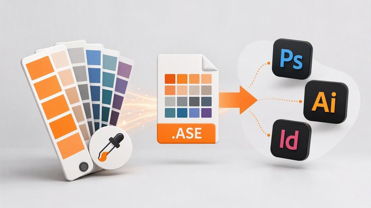
Moving a color palette from a photo, mood board, or client reference into Adobe Creative Cloud should not require manually typing HEX codes one by one. An Adobe ASE exporter makes that handoff faster by turning selected colors into an Adobe Swatch Exchange file, commonly called an ASE file.
ASE files are designed to carry color swatches between compatible Adobe applications. For graphic designers, brand teams, illustrators, interior designers creating presentation boards, and digital creators, this provides a practical path from color inspiration to a usable working palette. Instead of approximating colors after the fact, you can extract, name, organize, and import the same swatches across projects.
This guide explains how to export colors to Adobe apps with an Adobe ASE exporter, what information an ASE file contains, how to prepare a reliable palette, and how to avoid common problems with RGB, CMYK, and spot-color workflows.
What Is an ASE File?
An ASE file uses the Adobe Swatch Exchange format. It is a palette file that stores individual colors and, in many cases, color groups. Rather than being a visual image of a palette, it is structured color data that compatible applications can interpret as swatches.
Depending on the exporting tool and the destination application, an ASE palette may include values in RGB, CMYK, Gray, or LAB color modes. A well-prepared file can also preserve useful swatch names, which is especially valuable when a palette includes brand colors, materials, or specific UI roles.
| Color Format | Best Use | Typical Adobe Workflow |
|---|---|---|
| RGB | Digital graphics, web, social media, screens | Photoshop, Illustrator, XD-style interface workflows |
| CMYK | Commercial printing and print production | InDesign, Illustrator, print-ready PDFs |
| LAB | Device-independent color communication | Advanced color-managed production workflows |
| Spot Color | Special inks and precise brand reproduction | Packaging, signage, premium print work |
For most photo-based color extraction and digital design projects, RGB is the correct starting point. It reflects the way colors are displayed on phones, tablets, monitors, and web browsers. If the final asset is printed, convert and proof the palette inside the print-focused Adobe application rather than assuming an RGB sample will reproduce identically in ink.
Why Use an Adobe ASE Exporter?
An Adobe ASE exporter reduces friction in a design workflow. The main benefit is consistency: the colors sampled from an inspiration image can become the same colors used in a logo concept, brochure, presentation, digital ad, or social media graphic.
Manual copying is possible, but it introduces predictable mistakes. A designer may transpose a digit in a HEX value, forget which neutral was selected, or use slightly different colors in separate files. Exporting a palette as ASE creates one portable source of truth.
- Save time: Import several swatches at once instead of rebuilding a palette manually.
- Improve consistency: Use matching colors across Adobe documents and team deliverables.
- Preserve intent: Keep palette names such as “Warm Sand,” “Accent Coral,” or “Primary Navy.”
- Support collaboration: Share a compact palette file with colleagues, freelancers, or clients.
- Create reusable systems: Build swatch libraries for recurring brands, campaigns, rooms, or collections.
Prepare Your Palette Before Exporting
The export file is only as useful as the palette inside it. Before you create an ASE file, review the colors with the intended project in mind. A photograph can contain hundreds of subtle variations, but a functional color palette usually needs a deliberate selection rather than every pixel value.
Start With a Clear Source Image
Use a high-quality photo whenever possible. Blurry, heavily compressed, overexposed, or strongly filtered images can produce misleading samples. For example, a photo of a painted wall may include shadows, reflected window light, texture, and camera processing. Sample from several nearby points before deciding which color best represents the surface.
For brand references, use official artwork rather than a screenshot when available. Screenshots can be altered by display settings, compression, scaling, and color profiles.
Choose Colors by Role
A balanced palette often includes colors with distinct jobs. This makes the imported swatches easier to use in Adobe apps because each one has a reason to exist.
- Primary color: The dominant identity color or visual anchor.
- Secondary color: A supporting hue used for variety and hierarchy.
- Accent color: A high-attention color for calls to action or focal details.
- Light neutral: A background, paper, wall, or spacious UI color.
- Dark neutral: A color for type, outlines, contrast, or shadows.
You may need only three swatches for a focused campaign or eight to twelve for a broader identity system. Avoid exporting dozens of nearly identical colors unless the project genuinely requires a large material or illustration library.
Name Swatches Clearly
Names improve both speed and communication. “Blue 3” may be acceptable for experimentation, but it becomes confusing in a shared project. Use names that communicate either visual character or function. Examples include Brand Blue, Button Hover, Background Cream, Oak Finish, and Presentation Accent.
A simple naming convention can be:
Brand / Primary Navy
Brand / Accent Gold
UI / Surface Light
UI / Text Dark
Campaign / Spring Coral
This approach is especially helpful when multiple palettes are imported into the same Adobe document.
How to Export Colors to Adobe Apps With an Adobe ASE Exporter
The exact buttons differ between color extraction tools, but the process is generally consistent. Follow these steps to create an organized, reusable ASE palette.
- Import or capture an image. Choose a photo, screenshot, material reference, artwork, or mood board that represents your desired direction.
- Extract candidate colors. Use an eyedropper or color extraction tool to sample key areas. Check the displayed HEX, RGB, HSL, or HSB data when precision matters.
- Refine the palette. Remove duplicate swatches and colors that do not have a practical role. Adjust order so the palette reads logically.
- Name the palette and swatches. Add a project name plus readable labels for each color.
- Select ASE export. Choose Adobe Swatch Exchange as the export format, then save or share the resulting file.
- Transfer the file. Send it through Files, cloud storage, AirDrop, email, or your team workspace.
- Import into the Adobe application. Open the Swatches panel or relevant palette import command and load the ASE file.
- Test the colors in context. Apply swatches to actual text, shapes, images, or layouts before finalizing the project.
Importing ASE Swatches in Adobe Workflows
After export, the next step is making the palette available where you design. The exact menu names can vary by application version, but Adobe desktop software commonly handles ASE files through a Swatches panel menu, an “Open Swatch Library” option, or a load/import command.
In Illustrator, imported swatches are useful for vector shapes, logo explorations, icons, patterns, and illustrations. In InDesign, they can support editorial layouts, sales sheets, brochures, and presentations. In Photoshop, swatches can guide graphics, compositing, retouching accents, and digital templates.
Practical tip: Import the palette before building major artwork. Applying swatches from the beginning is cleaner than recoloring a complex file after dozens of objects have already been styled.
If you work across several Adobe documents, save the ASE file in a clearly named shared folder. That makes it easy to re-import the same approved palette when starting a new file or handing off work to another designer.
RGB, HEX, and CMYK: Avoid Color Conversion Surprises
One of the most important parts of any color export workflow is understanding that a number is not the same as a guaranteed physical appearance. A HEX value and RGB values describe screen color. They are ideal for mobile apps, websites, and digital graphics, but print uses inks and papers with a different gamut.
When an RGB palette is converted to CMYK, bright blues, greens, oranges, and neon-like accents may become less saturated. This is normal. It does not necessarily mean the ASE export failed; it means the target output device cannot reproduce every screen color.
- Use RGB/HEX as the master reference for screen-first projects.
- Convert to CMYK in a color-managed print workflow when production requires it.
- Ask the printer for its recommended ICC profile and proofing requirements.
- Review printed proofs for critical brand, packaging, or interior presentation colors.
- Use approved spot-color specifications when exact ink matching is essential.
For interior design, remember that paint, textile, wood, and tile colors are influenced by material finish and lighting. A sampled digital color is an excellent planning reference, but it should not replace physical samples in the actual room.
Common ASE Export Problems and How to Fix Them
The Imported Colors Look Different
First, check color mode and document settings. An RGB palette imported into a CMYK document may be converted automatically. Also compare displays under similar brightness settings, since an overly bright phone screen can make colors appear more vivid than a calibrated desktop monitor.
The Swatches Are Not Named Properly
Some export tools may use generic labels, while others preserve custom names. Rename swatches before export when possible. If you must rename inside Adobe, establish a convention immediately so the palette remains understandable when reused later.
The Palette Contains Too Many Similar Colors
Reduce it to the colors that serve the composition. Keep meaningful tonal steps only when you need them, such as for gradients, data visualization, shading, or a full design system. A concise palette is easier to apply consistently.
The ASE File Will Not Import
Confirm that the file was fully downloaded and has the .ase extension. Try opening or loading it from a local folder rather than a temporary email preview. If an app does not support direct ASE import in your version, use the palette’s HEX or RGB values as a fallback and rebuild the swatches manually.
Build a Repeatable Palette-to-Adobe Workflow
The strongest color workflows are repeatable. Create one folder per project and include the source image, exported ASE file, a simple palette preview, and any notes about output requirements. For client work, include approval status and a record of the intended color mode.
You can also maintain a small palette checklist:
- Is every swatch sampled from a reliable source?
- Does each color have a visual or functional role?
- Are swatches named consistently?
- Is the export mode appropriate for screen or print?
- Has contrast been checked for text and important UI elements?
- Has the palette been tested in the final design context?
Once this process becomes routine, color extraction stops being an isolated inspiration step. It becomes part of a connected system that moves from a photograph or real-world reference to polished creative work with less guesswork.
Final Thoughts
Using an Adobe ASE exporter is one of the simplest ways to carry a carefully selected palette into professional design tools. By sampling accurately, limiting the palette to purposeful swatches, naming colors clearly, and respecting the difference between screen and print color, you can make every exported palette more useful.
For designers who build palettes from photos on iPhone or iPad, a color extraction app such as Color Viewfinder can provide a convenient starting point for collecting values and exporting organized color references into a broader Adobe workflow.
