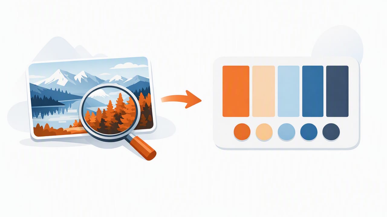
If you’ve ever tried to extract color palette from image sources like photos, illustrations, packaging, or screenshots, you’ve probably noticed the results can be messy: too many similar tones, missing neutrals, or colors that look great in a photo but fail in a UI or room. The difference between a random set of sampled pixels and a usable palette is a repeatable process.
This guide walks through a practical, designer-friendly workflow to extract colors from an image, refine them into a balanced palette, verify accessibility, and prepare export-ready values (HEX, RGB, HSL/HSB) for real projects.
Why extract a palette from an image?
Images carry built-in harmony: lighting, material, and context naturally relate colors to each other. Extracting a palette from an image is useful when you want to:
- Match a brand vibe from photography or marketing visuals.
- Build UI themes inspired by product shots, illustrations, or moodboards.
- Create interior design schemes from a room photo, fabric swatch, or art reference.
- Stay consistent across mediums (web, print, social, packaging).
Step 1: Choose the right image (it matters more than you think)
The best palette extractions start with the best source. Before sampling anything, check these factors:
- Lighting: Warm indoor light can tint everything orange; harsh daylight can wash colors out.
- Compression: Low-quality JPEGs introduce artifacts that skew colors (especially in gradients).
- Focus: Blurry images average colors together and reduce usable variation.
- Color intent: Decide whether you want “as photographed” colors (with lighting) or “material-true” colors (corrected).
Tip: If the palette needs to represent real materials (paint, fabric, product colors), start with a well-lit image and, if possible, a color-corrected reference.
Step 2: Decide what you’re extracting (palette goal)
“Palette” can mean different things depending on the project. Define the goal first, because it changes which pixels you should sample.
Common palette types
- Mood palette: 5–8 colors that capture the overall feeling (great for moodboards).
- Brand palette: 1–2 primaries, 2–4 supporting colors, and a set of neutrals.
- UI palette: neutrals + semantic colors (success/warning/error) + accent colors, tuned for contrast.
- Interior palette: dominant wall tone, secondary surfaces, trim, textiles, plus 1–2 accents.
Step 3: Sample strategically (avoid “random pixel soup”)
When people extract colors, they often tap whatever looks “pretty” and end up with five near-identical midtones. Instead, sample with intent.
A simple sampling plan (works for most images)
- Dominant color: The biggest area (background, wall, sky, main surface).
- Secondary color: The next most common surface/material.
- Accent color: Small but visually important (logo, flower, accessory, CTA-like element).
- Deep neutral: Shadow/outline color for text or contrast.
- Light neutral: Highlight/negative space color for backgrounds.
If your image is complex (street photography, busy collage), try sampling by clusters:
- Pick 2–3 colors from highlights, midtones, and shadows.
- Pick 1–2 “pop” accents from saturated objects.
Step 4: Convert raw picks into a balanced palette
Raw extracted colors often need slight adjustment. The goal isn’t to “change the image,” but to make the palette functional across different contexts (screens, print, paint, materials).
What to refine
- Value range: Ensure you have lights and darks (not just midtones).
- Saturation control: Images can contain extremely saturated pixels (specular highlights, signage). Reduce saturation for larger surfaces.
- Hue cleanup: Two colors may differ only because of lighting temperature. Decide whether to keep that nuance or unify hues.
- Neutrals: True “neutrals” in photos often have a tint (blue-gray, warm beige). That can be good—just do it intentionally.
Try this “60–30–10” check
As a quick sanity test, label your palette roles:
- 60%: dominant background/surface
- 30%: secondary surfaces
- 10%: accents (use sparingly)
If your palette has three competing “10% accents” and no calm base, it will feel chaotic in application.
Step 5: Understand color values (HEX vs RGB vs HSL/HSB)
When you extract colors, you’ll usually see multiple representations. Here’s when each is most useful.
| Format | Best for | What it tells you | Common pitfall |
|---|---|---|---|
| HEX (e.g., #2F6DAA) | Web/UI specs, design tokens | Exact sRGB color code | Not intuitive for adjusting lightness/saturation |
| RGB (e.g., 47, 109, 170) | Screen-based work, effects | Red/Green/Blue channel levels | Hard to reason about hue relationships |
| HSL | Systematic palette building | Hue + Saturation + Lightness | Lightness isn’t perceived brightness in all cases |
| HSB/HSV | Quick artistic adjustments | Hue + Saturation + Brightness | Brightness can mislead for contrast decisions |
Practical takeaway: extract in HEX/RGB (for accuracy), then refine using HSL/HSB (for control).
Step 6: Check contrast and usability (especially for UI)
An extracted palette might look perfect on a photo-based moodboard but fail in product design. Before you finalize, test contrast for key pairings:
- Text on background
- Buttons on backgrounds
- Icons over imagery
At minimum, ensure you have:
- A dark text color that works on your light neutral
- A light text color that works on your dark surfaces
- An accent that remains distinct when used for small UI elements
Quick rule of thumb for extracted palettes
If your palette comes from a low-contrast image (fog, beige interiors, pastel illustration), plan to add a purpose-built dark and light neutral to make the system usable.
Step 7: Turn the palette into repeatable design tokens
A palette becomes far more usable when you assign roles. Instead of “Blue 1, Blue 2,” name colors by function:
- --color-bg, --color-surface, --color-text
- --color-primary, --color-primary-contrast
- --color-accent, --color-border
Here’s a small example showing how extracted HEX values can become CSS variables (and instantly usable in a site or prototype):
:root {
  --color-bg: #F6F2EA;
  --color-surface: #FFFFFF;
  --color-text: #1F2328;

  --color-primary: #2F6DAA;
  --color-primary-contrast: #FFFFFF;

  --color-accent: #D96B4C;
  --color-border: #D9D2C6;
}

.button {
  background: var(--color-primary);
  color: var(--color-primary-contrast);
  border: 1px solid var(--color-border);
}
This step is where “colors from an image” becomes a system you can apply consistently across screens, components, and formats.
Common mistakes when you extract a color palette from an image
- Sampling only saturated areas: You’ll end up with accents but no usable bases or neutrals.
- Ignoring shadows and highlights: Without light/dark range, designs look flat and contrast fails.
- Trusting a single pixel: One pixel can be noise. Sample a small area and average mentally (or use tools that stabilize sampling).
- Overfitting to one photo: If the palette must support a broader brand, extract from multiple images and find the overlap.
- Not defining roles: A list of HEX codes is not a palette system.
Two mini-workflows: UI design vs interior design
UI workflow (fast and reliable)
- Extract 6–10 candidate colors from the image.
- Pick 2 neutrals (light + dark) that support typography.
- Select 1 primary + 1 accent (ensure they’re distinguishable at small sizes).
- Adjust lightness levels to create states (hover/pressed) and subtle surfaces.
- Export to HEX + define tokens.
Interior workflow (material-first)
- Extract dominant wall/background color and a secondary surface color.
- Extract 1–2 textile/feature accents (pillows, art, rug, cabinetry).
- Extract a trim/neutral and a shadow/depth tone.
- Check undertones (warm vs cool) to avoid clashes across materials.
- Document the palette with notes (finish, texture, where it’s used).
How many colors should you end with?
It depends on the project, but these ranges tend to stay manageable:
- 5 colors: minimal palette (2 neutrals + 2 brand colors + 1 accent)
- 8 colors: robust creative palette (more variation, still controlled)
- 12+ colors: only if you’re building a full design system with tints/shades
If you need more depth, generate tints and shades from your core colors rather than extracting more random ones. That keeps the system cohesive.
Export-ready checklist
Before you call the palette “done,” confirm you have:
- Final values in HEX (and RGB/HSL if you adjust often)
- Clear roles (background, surface, text, primary, accent, border)
- At least one high-contrast text/background pairing
- A saved layout (swatches) you can reuse across projects
If you prefer doing this on iPhone or iPad, an app like Color Viewfinder can help you sample colors from photos and capture HEX/RGB/HSL/HSB values in one place for later export.
