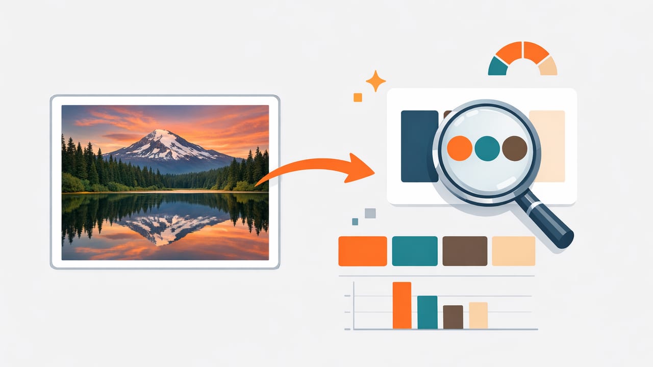
Pulling color from image files is one of the fastest ways to create palettes that feel “real.” Instead of guessing a perfect teal or warm neutral, you can sample it from a photo you love: a product shot, a travel photo, a fabric swatch, or a room interior. The challenge is that images are messy—lighting shifts, shadows distort, compression adds artifacts—and a quick pick can produce a color that looks wrong once you use it in a design system.
This guide explains how to extract reliable color from image sources, how to translate those colors into practical formats (HEX, RGB, HSL/HSB), and how to turn raw samples into palettes that work for branding, UI, and interior design.
Why “color from image” isn’t as simple as tapping a pixel
A single photo can contain thousands of near-identical color values. When you pick one pixel, you may accidentally grab a highlight, a shadow, or a compression artifact. The result: a palette that feels slightly “off” when applied to flat surfaces like websites, logos, slide decks, or paint samples.
Rule of thumb: sample with intention. Decide whether you want a material’s base color, its shadow color, or its highlight color—then pick accordingly.
Step-by-step workflow: extracting usable colors from an image
Use this workflow whenever you need dependable colors for creative projects.
1) Choose the right source image
- Prefer high-resolution images (less pixel blending, cleaner edges).
- Avoid heavy filters unless the filter is part of the desired look.
- Watch for mixed lighting (daylight + tungsten) which can skew neutrals.
- Use the original file if possible (social media uploads often compress colors).
2) Identify “anchor” colors before sampling
Before extracting color from image areas, decide what your palette needs. Most useful palettes include:
- Primary: the hero color (brand accent, feature wall color, key UI action).
- Secondary: supporting hues that harmonize with the primary.
- Neutrals: background and text-friendly shades (warm gray, off-white, charcoal).
- Status/support: optional colors for alerts, categories, or decor accents.
3) Sample from representative areas (not edges)
Edges often contain anti-aliasing (blended pixels) that distort the true color. For more accurate color from image sampling:
- Zoom in.
- Tap/click inside a flat region (midtone area if you want the “true” surface color).
- Take multiple samples from the same material and compare them.
4) De-noise your picks by averaging (quick method)
If your tool supports it, sampling a small area (rather than a single pixel) can average noise and produce more stable results. If not, you can mimic averaging by collecting 3–5 samples from the same region and selecting the median-looking value (the one that isn’t the lightest or darkest).
5) Convert samples into design-friendly formats
Most workflows end in HEX for web and RGB for digital tools, but HSL/HSB are excellent for adjusting lightness/brightness without changing the hue too much.
| Format | Best for | What to watch |
|---|---|---|
| HEX (e.g., #2F6F7E) | Web, UI specs, handoff docs | Doesn’t describe “lightness” explicitly; edits can be less intuitive |
| RGB (e.g., 47, 111, 126) | Screen-based design, motion, dev work | Harder to adjust systematically for tints/shades |
| HSL | Creating tints/shades and consistent ramps | Saturation and perceived intensity can vary by hue |
| HSB/HSV | Picking colors visually; quick brightness tweaks | “Brightness” isn’t the same as perceived luminance for accessibility |
Accuracy pitfalls (and how to fix them)
When extracting color from image sources, these issues cause most “why does it look different?” moments.
Lighting and white balance
A beige wall photographed under warm bulbs may sample as orange. If the goal is a true paint match, correct the photo’s white balance first (or sample from a known neutral area in the same lighting and compensate).
Shadows and specular highlights
- Shadows push color toward cooler/darker values—great for building shade steps, bad for defining the base color.
- Highlights often reduce saturation—useful for tint steps, not for the core swatch.
Compression artifacts
JPEG compression can create small blocks of unexpected color. If your extracted color from image looks oddly “dirty,” try sampling nearby pixels or use a higher-quality source file (PNG, HEIF/HEIC, or original camera output).
Different screens show different colors
Your phone, tablet, and monitor may display the same HEX slightly differently. For critical work, review your palette on multiple devices and under neutral ambient lighting.
Turning raw samples into a palette that actually works
Sampling is only the start. The goal is a palette that’s usable across layouts, text, backgrounds, and materials.
Create a simple palette structure
A practical structure for most projects:
- 1 primary accent
- 2 supporting accents (one warmer, one cooler, or one muted)
- 2–4 neutrals (off-white, light gray, mid gray, near-black)
- 1 contrast color for emphasis (optional)
Build tints and shades (for consistency)
Once you have a hero color from image sampling, create a small ramp so the color works in different contexts (backgrounds, borders, hover states). If you use HSL, you can keep hue relatively steady and adjust lightness gradually.
Example ramp concept (not universal, but a good starting point):
- 100 (lightest tint): backgrounds
- 300–500: UI fills, cards, secondary elements
- 700–900: text, icons, emphasis
Check contrast for accessibility (especially for UI)
If you’re using extracted colors for digital interfaces, verify contrast between text and background. A color from image may be beautiful but too low-contrast for readable typography.
As a quick checklist:
- Confirm body text is legible on the lightest background neutral.
- Confirm white text is legible on primary and secondary accents.
- Don’t rely on color alone to convey meaning (pair with icons/labels).
Practical example: from photo to web-ready CSS
Imagine you sampled a coastal photo and extracted these values:
- Deep teal: #2F6F7E
- Seafoam: #8EC9C3
- Sand: #D8C3A5
- Charcoal: #1F2A2E
- Off-white: #F6F3EE
You can translate that into CSS variables for consistent reuse:
:root {
  --color-primary: #2F6F7E;
  --color-secondary: #8EC9C3;
  --color-neutral-100: #F6F3EE;
  --color-neutral-300: #D8C3A5;
  --color-neutral-900: #1F2A2E;
}

.button {
  background: var(--color-primary);
  color: var(--color-neutral-100);
}

.card {
  background: var(--color-neutral-100);
  border: 1px solid color-mix(in srgb, var(--color-neutral-900), transparent 85%);
}
This is where “color from image” becomes a system: the palette isn’t just pretty; it’s organized and repeatable.
Interior design use case: sampling materials and balancing undertones
For interiors, extracting color from image references (rooms, tiles, upholstery, wood tones) can help you build cohesive combinations. But interiors are especially sensitive to undertones and lighting.
Tips for better interior palette extraction
- Sample neutrals from midtones (avoid bright window highlights and corner shadows).
- Separate “material color” from “light color”: a warm bulb can tint everything.
- Build a neutral ladder (light wall → trim → cabinetry → hardware) to prevent everything landing at the same visual weight.
- Cross-check with a second photo of the same material under different lighting if possible.
How many colors should you extract from an image?
When people first discover color picking, they often extract 12–20 colors—then struggle to use them. A better approach:
- For branding/UI: start with 5–9 colors (including neutrals), then expand with ramps.
- For mood boards: 8–12 can be helpful, but still assign roles (primary, support, neutral).
- For illustration: you may want more, but group them by value (lights/mids/darks).
Quick troubleshooting: when your extracted color looks wrong
- Too dull? You probably sampled a shadow or compressed area. Re-sample in a midtone region and compare.
- Too neon? Check if the source image is oversaturated or HDR-toned. Reduce saturation slightly in HSL/HSB.
- Looks good in the photo but not in your design? Photos contain context. Add neutrals, reduce the number of accents, and create tints/shades.
- Print doesn’t match screen? Convert with a print-aware workflow (CMYK profiles) and request proofs for critical jobs.
A lightweight checklist for extracting color from image files
- Start with a high-quality, minimally filtered image.
- Decide palette roles (primary, secondary, neutrals).
- Sample midtones; avoid edges, highlights, and deep shadows unless intentional.
- Take multiple samples per material; choose the most representative value.
- Convert to HEX/RGB for delivery; use HSL/HSB to build ramps.
- Validate contrast and readability for digital projects.
- Export and document the palette so you can reuse it consistently.
Conclusion
Extracting color from image references is one of the most practical ways to create palettes with personality—whether you’re designing a brand, a UI theme, or a room concept. The key is to move beyond “one tap, one color” and treat sampling as the first step in a system: choose representative areas, account for lighting, build tints and shades, and validate contrast.
If you prefer doing this on iPhone or iPad, an app like Color Viewfinder can help you sample colors quickly and view values in HEX/RGB/HSL/HSB while you build a palette.
