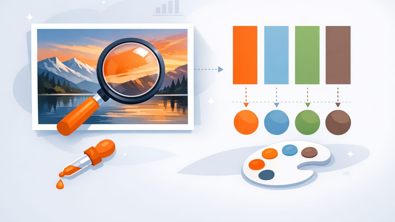
When you extract colors from photo sources—whether it’s a street scene, a fabric swatch, a product shot, or a travel snapshot—you’re doing more than “picking pretty colors.” You’re translating real-world light, materials, and mood into a repeatable set of color values (HEX, RGB, HSL/HSB) you can use across creative projects.
This guide walks through a practical workflow: choosing the right image, sampling accurately, turning raw picks into a balanced palette, and using it consistently in graphic design, UI, illustration, and interior design planning.
Why photo-based color extraction works (and when it doesn’t)
Photos are rich references because they include relationships between colors: warm highlights vs. cool shadows, saturated accents vs. neutrals, and soft gradients that suggest a cohesive theme. But the same richness creates traps:
- Lighting changes color (golden hour, fluorescent, mixed indoor lighting).
- Camera processing (HDR, night mode, filters) can skew hues.
- Compression and low resolution can blur subtle color boundaries.
Rule of thumb: Extract from a photo to capture the feel, then refine for accuracy and usability.
Step 1: Pick a photo that will produce stable colors
If you want reliable results, start with a good source image. Here’s what to look for:
- Even lighting: Avoid strong color casts unless that cast is part of the intended mood.
- Sharp focus on the material or surface you care about (paint, textile, packaging).
- Minimal filters: Social filters often shift skin tones, whites, and shadows.
- Include a neutral reference when possible (white paper, gray card, or a known neutral object).
Quick pre-check: are the “whites” actually white?
Before sampling, zoom in on areas that should be neutral (a white wall, a gray sidewalk). If the “neutral” area looks tinted (greenish, yellow, blue), your extracted palette will inherit that tint. That can be great for mood boards, but risky for production color specs.
Step 2: Extract colors from photo (sampling strategy)
Most color pickers let you tap to sample pixels, but a single pixel is rarely representative. Use a sampling strategy that accounts for texture and noise:
- Sample multiple points on the same object (e.g., 3–5 taps on a wall paint area).
- Avoid edges where two colors blend (anti-aliasing creates “in-between” colors).
- Check highlight and shadow separately—then decide which you want to represent the material.
- Favor midtones for “true” material color; highlights/shadows are mostly lighting.
Common sampling mistake: picking the “brightest” version
When people extract colors from a photo for branding or UI, they often choose the most saturated highlight. In real usage, that color can feel neon or overbearing. Midtone sampling usually gives a color that behaves better in print, on screens, and in large areas.
Step 3: Understand the color values you’re collecting
Once you sample colors, you’ll typically see values like HEX, RGB, HSL, or HSB/HSV. They’re not competing formats—they’re different ways to describe the same color.
| Format | Example | Best for | Practical note |
|---|---|---|---|
| HEX | #2F6B5A | Web/UI handoff | Compact and widely used in design systems |
| RGB | 47, 107, 90 | Screen-based work | Helpful for understanding brightness and channels |
| HSL | 162°, 39%, 30% | Palette tuning | Great for adjusting lightness/saturation systematically |
| HSB/HSV | 162°, 56%, 42% | Visual selection | “Brightness” is intuitive for quick tweaks |
Step 4: Turn raw picks into a balanced palette (the 60–30–10 method)
Photo extraction often produces too many similar midtones or too many “accent-like” colors. A simple way to organize your picks is the 60–30–10 distribution:
- 60% base: background neutrals and supporting colors
- 30% secondary: mid-saturation colors that define the mood
- 10% accent: high-contrast or saturated pops used sparingly
How to choose your base colors from a photo
Look for the largest color areas in the image: sky, wall, floor, clothing, background bokeh. These are often low-to-mid saturation and work well as bases. Even if your end goal is vibrant, a strong palette needs neutrals to “hold” the accents.
Create a “neutral ramp” for flexibility
For UI and graphic design, a palette becomes more usable when it includes a small ramp of neutrals (e.g., 3–5 steps from dark to light). You can derive this from one sampled neutral by adjusting lightness while keeping hue and saturation low.
Step 5: Validate contrast and accessibility (especially for UI)
If the palette is going into an interface, presentation, or signage, contrast matters as much as aesthetic cohesion. At minimum, test:
- Text on background (dark text on light, and light text on dark)
- Accent on base (buttons, links, highlights)
- State colors (hover/pressed/disabled) if you’re building a system
Even when you love the extracted colors, you may need to darken a background or desaturate an accent to keep text legible. This is normal; it’s the refinement step that turns inspiration into production.
Mini checklist: palette usability
- Do you have at least one dark and one light neutral?
- Do accents remain distinct in grayscale (value contrast)?
- Are any colors too similar when placed side-by-side?
- Will the palette work in both small UI elements and large fills?
Step 6: Apply the palette in real projects (examples)
Example A: Web/brand palette from a lifestyle photo
Say you sampled these colors from a café photo: a deep green tile, warm wood, off-white ceramic, and a coral accent. You can convert them into a small system:
- Base: Off-white and charcoal (for backgrounds and text)
- Secondary: Deep green and warm wood (for sections and UI surfaces)
- Accent: Coral (for CTAs, highlights, badges)
Then define tokens for consistent usage:
:root {
  --color-bg: #F6F1E8;
  --color-text: #1F2426;
  --color-surface: #2F6B5A;
  --color-secondary: #B07A4A;
  --color-accent: #E56A5D;
}

body {
  background: var(--color-bg);
  color: var(--color-text);
}

.button-primary {
  background: var(--color-accent);
  color: #FFFFFF;
}
Example B: Interior mood board from a room snapshot
For interiors, extracted colors are especially helpful for coordinating paint, textiles, and decor. But instead of using the exact sampled values as “paint matches,” treat them as directional targets:
- Sample wall color, floor tone, and a key fabric.
- Identify the dominant undertone (warm vs. cool).
- Build a palette that includes 1–2 neutrals, 1 main color, and 1 accent.
- Compare to real material samples under your room lighting.
Step 7: Export and keep consistency across tools
After you extract colors from photo references, the biggest risk is losing consistency when moving between apps (design tool, notes, presentation, paint store reference). A few best practices help:
- Name your colors by role (Base 01, Surface, Accent) instead of “Green 1.”
- Store the values in at least two formats (HEX + HSL/HSB) for easy tweaking.
- Capture context: keep the source photo with the palette so you remember the intended mood.
- Version your palettes: an “Inspiration” set and a “Production” set (refined for contrast/print).
Troubleshooting: why extracted colors look “wrong”
Problem: The palette looks muddy
- Cause: Sampling mostly shadows or low-light areas.
- Fix: Re-sample midtones; raise lightness slightly; add one clean neutral.
Problem: Colors clash outside the photo
- Cause: The photo’s lighting unified the scene, but your design uses flat colors.
- Fix: Reduce saturation variance; align hues (e.g., warm all neutrals slightly).
Problem: Accent color dominates everything
- Cause: Accent is too bright/saturated for large areas.
- Fix: Create a “soft accent” variant by lowering saturation or increasing lightness.
A practical 10-minute workflow summary
- Choose a well-lit, minimally filtered photo.
- Sample 8–12 points (avoid edges; prefer midtones).
- Group picks into base/secondary/accent using 60–30–10.
- Create a small neutral ramp (3–5 steps).
- Test contrast for text and key UI elements.
- Export/save values (HEX + HSL/HSB) and name by role.
If you prefer doing this on iPhone or iPad, a dedicated color-extraction app can speed up sampling, formatting, and exporting—Color Viewfinder is one option that helps capture HEX/RGB/HSL/HSB values directly from photos and organize them into palettes.
