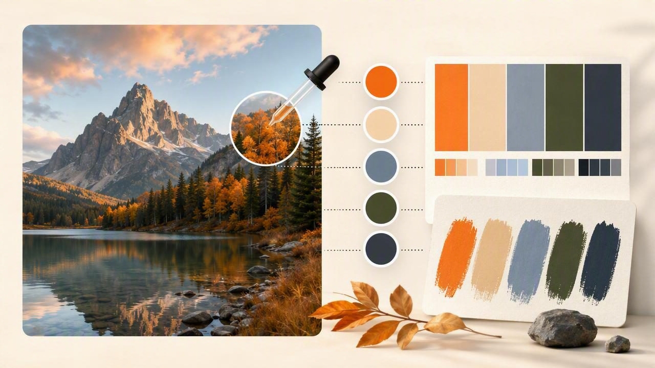
Learning how to extract colors from a photo is one of the fastest ways to turn visual inspiration into a practical palette for graphic design, interior design, branding, websites, and personal creative projects. A photograph can contain a carefully balanced combination of warm neutrals, saturated accents, soft shadows, and bright highlights that would be difficult to recreate by guessing.
Whether your reference image is a coastal landscape, an editorial photograph, a café interior, a product flat lay, or a piece of artwork, color extraction helps you identify the actual digital values behind the look. Instead of saying a wall is “dusty blue” or a headline color is “deep green,” you can work from defined HEX, RGB, HSL, or HSB values.
This guide explains a reliable process for sampling colors from images, choosing the colors that matter, and adapting a photo palette for real design decisions.
What Does It Mean to Extract Colors From a Photo?
Color extraction is the process of sampling individual pixels or areas in an image to identify their color values. Depending on the tool and workflow, those values may appear as:
- HEX: A six-character web color code, such as
#2F5D62. - RGB: Red, green, and blue channel values, such as
47, 93, 98. - HSL: Hue, saturation, and lightness values that can be helpful when adjusting a palette.
- HSB/HSV: Hue, saturation, and brightness values, often useful for comparing intensity and brightness.
A photo may contain thousands or millions of distinct pixel colors. The goal is not to save every variation. The goal is to identify a manageable set of colors that communicates the image’s visual character and supports your intended project.
Why Extract Photo Colors Instead of Choosing Them by Eye?
Choosing colors by eye is useful in early ideation, but it can introduce inconsistency. Screens, ambient light, image compression, and perception all affect how a color appears. Sampling gives you a reference point that can be copied into design software, CSS files, presentation templates, or documentation.
Extracting colors from a photo is especially helpful when you want to:
- Build a brand mood board from a reference image.
- Create a website palette inspired by a product or location.
- Find accent colors for social graphics.
- Document visual references during an interior design project.
- Create illustration palettes from travel, nature, or photography.
- Maintain consistent colors across multiple creative files.
It also makes collaboration easier. A note such as “use the dark teal from the reference photo” is open to interpretation. A value such as #2F5D62 is more specific.
A Practical Method to Extract Colors From a Photo
The strongest photo palettes are intentional. Follow these steps rather than sampling random pixels across an image.
1. Start With a High-Quality Reference Image
Use the clearest version of the photo available. A low-resolution screenshot, heavily compressed social image, or image under unusual colored lighting may produce misleading samples. This does not mean the image cannot be useful; it simply means you should treat the values as visual references rather than absolute color specifications.
Look for an image with a clear overall mood. A foggy forest image may suggest muted blue-greens and soft grays, while a bright market scene may contain energetic reds, yellows, and cobalt accents.
2. Identify the Image’s Color Roles Before Sampling
Before opening a color picker, look at the image as a composition. Most useful palettes include several roles:
- Dominant color: The color that occupies the most visual space.
- Supporting color: A secondary tone that reinforces the dominant color.
- Dark neutral: A shadow, charcoal, brown, or deep tone for contrast.
- Light neutral: A background-like color for breathing room.
- Accent color: A smaller, more noticeable color that creates focus.
This approach helps you build a palette that is useful in a layout. It also prevents an overly literal result where every sampled color has similar brightness or saturation.
3. Sample Large, Even Areas First
Start by sampling broad areas with relatively consistent lighting: a painted wall, sky, fabric, tabletop, leaves in the distance, or a large object. Avoid beginning with tiny details, glossy highlights, image noise, and sharp edges. Those areas may be visually interesting, but they are less likely to represent the image’s core palette.
When a surface has texture, take several samples nearby. A wooden table, for example, may contain warm brown base tones, darker grain, and pale reflections. Choose the value that best represents the role you need in your design rather than assuming one pixel defines the material.
4. Capture Values in the Format Your Project Uses
Use the color notation that fits the destination of your palette. For websites and digital interfaces, HEX is convenient. For CSS, RGB and HSL can also be useful. For visual comparison and refinement, HSL or HSB makes it easier to see whether two colors differ mainly in hue, saturation, lightness, or brightness.
| Format | Best use | Example |
|---|---|---|
| HEX | Web design, UI handoff, quick copying | #D99B72 |
| RGB | Digital design settings and CSS | 217, 155, 114 |
| HSL | Adjusting lightness and saturation | 22°, 57%, 65% |
| HSB | Comparing brightness and intensity | 22°, 48%, 85% |
5. Reduce the Palette to Five or Six Intentional Colors
A photo can inspire a large palette, but a working palette usually needs fewer colors. For most projects, begin with five colors: one dark, one light, two middle tones, and one accent. Add a sixth color only if it serves a clear function.
For example, a photo of terracotta pottery on a faded blue table might produce this starting palette:
Deep teal:       #244B52
Faded blue:      #7499A2
Clay terracotta: #BF6548
Warm sand:       #D8C39F
Soft ivory:      #F2EBDD
This is more useful than capturing twelve nearly identical orange-brown shades. The reduced palette preserves the atmosphere while giving you enough contrast to build a composition.
Concrete Example: Turning a Travel Photo Into a Website Palette
Imagine a travel photograph showing a whitewashed building, a blue door, sunlit stone, and a small pot of orange flowers. At first glance, the photo seems to contain only white and blue. A more careful extraction reveals a more flexible system.
- Sample the darkest part of the blue door for a reliable dark color.
- Sample a midtone from the door rather than using the brightest reflective area.
- Sample the warm stone for a neutral background alternative.
- Sample the shadowed stone for body text or borders.
- Sample the flowers for a controlled call-to-action accent.
The result might look like this:
- Primary:
#285B73 - Secondary:
#78A7B7 - Background:
#EFE7D8 - Text and border:
#5F5A50 - Accent:
#C96942
In a website layout, use the light stone color for the page background, the deep blue for headings and navigation, and the orange only for a primary button or key link. The palette is inspired by the photo, but it is organized for interface hierarchy rather than copied indiscriminately.
How to Improve a Photo Palette for Real Design Use
A palette extracted from a photo is a starting point, not a finished system. Images often contain colors that look beautiful together in context but fail in a user interface, printed graphic, or room plan.
Check Contrast Before Using Text Colors
Do not assume a dark-looking sampled color will provide readable text on a light sampled background. Check contrast using an accessibility checker when creating websites or digital products. If contrast is insufficient, darken the text color, lighten the background, or reserve the combination for decorative uses.
Keep Accent Colors Limited
Highly saturated colors draw attention quickly. In a photograph, a bright red flower may occupy only one percent of the frame. If that same red appears in every button, heading, icon, and card, it can overpower the design. Use extracted accents in proportion to their intended emphasis.
Create Tints and Shades When Needed
Once you have a key extracted color, build lighter and darker variations for practical use. For instance, a primary blue may need a hover state, a subtle background tint, and a darker text-safe variant. Keep the hue direction consistent so the expanded palette still feels connected to the original image.
Common Mistakes When Extracting Colors From Images
- Sampling only the brightest pixels: Highlights can be affected by glare and may not represent the object’s local color.
- Ignoring shadows: Shadow colors often provide the dark neutrals that make a palette usable.
- Using too many similar colors: Reduce duplicates and keep each color tied to a role.
- Forgetting the project context: A cinematic palette may need adjustment for a readable dashboard or presentation.
- Treating screen values as paint formulas: Digital color values are not guaranteed physical paint matches or print-accurate specifications.
Important Limitations of Photo Color Extraction
Color extraction is valuable, but it has limits. Camera sensors, white balance, editing filters, display calibration, ambient light, and image compression can all change the colors you see and sample. A color from a sunset photo may be influenced as much by the camera’s processing as by the scene itself.
For interior design, extracted values can help communicate mood and compare references, but they should not be used as a promise that paint, fabric, wood, or other physical materials will match exactly. For print work, consult proofs, material samples, and the relevant production specifications.
Build a More Useful Mobile Color Workflow
A mobile workflow makes it easier to capture inspiration when you encounter it. Save the image, sample key areas, name the colors by role, and keep the values with the project notes. If you need a portable method for selecting and documenting image colors, Color Viewfinder’s guide to using a HEX color picker from a photo explains how to inspect photo-based color values for creative reference.
The best result is not merely a collection of attractive swatches. It is a deliberate color palette that preserves the feeling of your source image while giving every color a practical job in your design.
