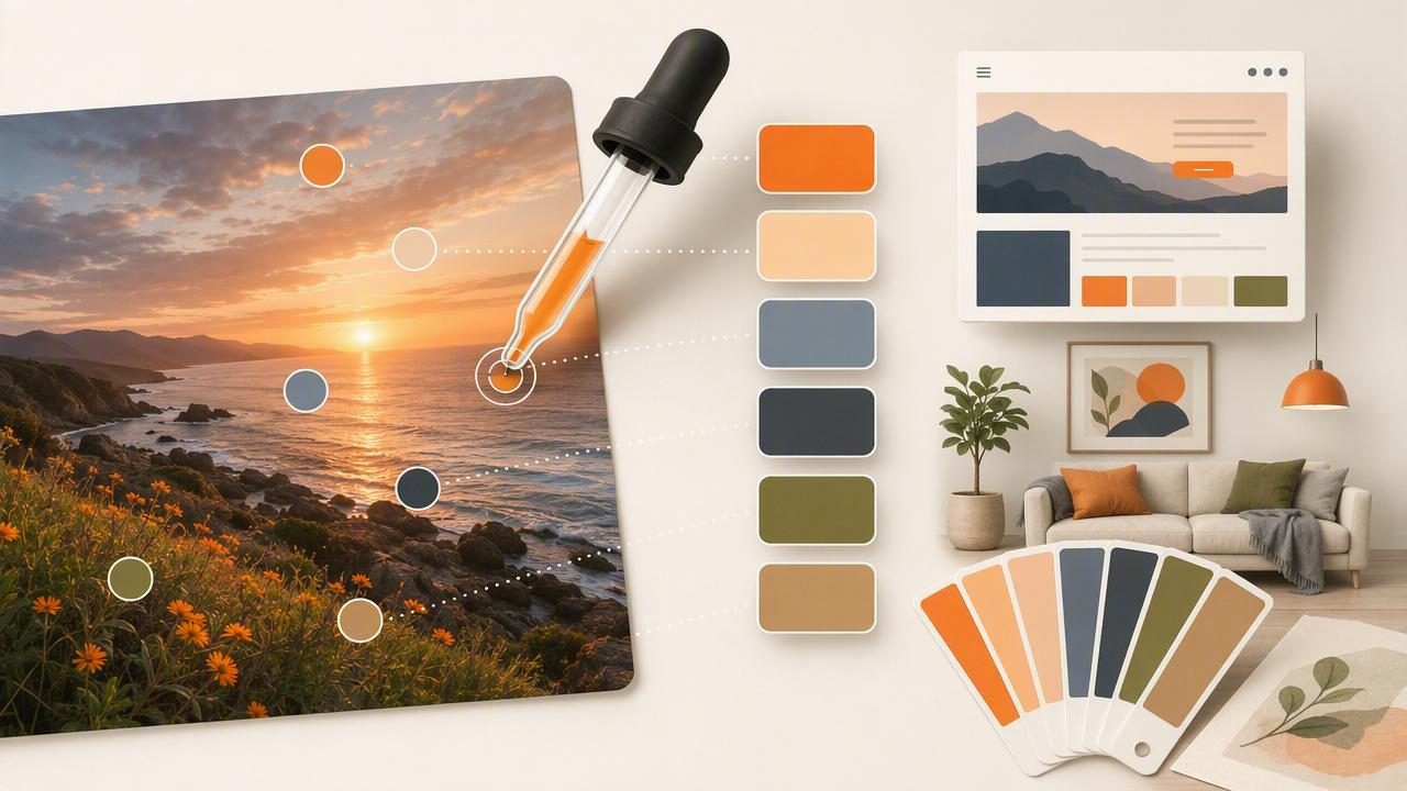
When you see a color combination you love—on a café wall, a product package, a sunset photo, or a room tour on social—you can turn that moment into a repeatable palette. The practical skill behind that is learning how to extract hex color from photo accurately and then translate those samples into a small set of colors that actually work in real design.
This guide walks through a reliable workflow for sampling colors from photos, validating them, and converting them into palettes you can use in graphic design, UI, branding, and interior design. You’ll also learn the common mistakes that make sampled colors look “off,” plus a simple system for organizing and exporting your colors.
What “HEX color” means (and why you should care)
HEX is a compact way to describe a color for digital screens using red, green, and blue channels. A HEX code looks like #1F6FEB. Designers use HEX because it’s:
- Precise: one exact value can be shared across tools and teams.
- Portable: works in CSS, design systems, and most visual tools.
- Fast: easy to copy, paste, and store.
But HEX is only one representation. When you extract a color from a photo, you’re sampling pixels from an image that may be compressed, filtered, or influenced by lighting—so the key is not just getting a HEX code, but getting a useful one.
Before you sample: what affects color accuracy in photos
If you’ve ever tried to extract a color and wondered why it doesn’t match what you saw, it’s usually due to one (or more) of these issues:
- Lighting and white balance: warm indoor lighting shifts everything toward yellow/orange; shade can push colors blue.
- Reflections and glare: glossy surfaces create bright highlights that pollute your sample.
- Compression artifacts: screenshots and social media images can introduce blocky pixel noise.
- Camera processing: HDR, sharpening, and automatic contrast can change midtones.
- Background influence: edges and gradients mix neighboring colors—especially on small details.
Rule of thumb: sample from a clean, flat area of color—not from edges, highlights, or shadows—then validate with a second sample nearby.
A practical workflow to extract HEX color from photo (without surprises)
1) Choose the right image
Start with the highest-quality version you can find. If you have control of the photo, prioritize:
- Natural light or consistent lighting
- Minimal filters
- Sharp focus on the area you want to sample
- Less compression (original file over a social screenshot)
2) Decide what you’re sampling for
A palette for a landing page is different from a palette for a living room. Before you sample, define the intent:
- Brand/UI: you need stable midtones and accessible text/background pairs.
- Illustration/graphic: you may want more saturated “hero” colors.
- Interior: you’ll want paint-like midtones and softer neutrals; avoid bright highlights.
3) Sample multiple points per “same” color
Photos contain variation—grain, texture, lighting shifts—so sampling once is risky. For each intended color, sample 3–5 nearby points in the same region and compare the results. If the codes vary widely, you’re likely sampling a gradient or textured area. Move to a flatter area and try again.
4) Create a small palette (not a rainbow)
Most usable palettes are 5–8 colors:
- 1–2 neutrals (backgrounds)
- 1 primary (brand/anchor)
- 1 secondary (support)
- 1 accent (sparingly)
- Optional: 1–2 text/outline shades
If you extract 20 colors, you’ve collected pixels—not a system. A system repeats.
5) Normalize the palette (tiny adjustments that make it usable)
After you extract HEX codes, do quick normalization:
- Reduce near-duplicates: if two colors differ only slightly, keep the better one.
- Check saturation: photos often produce overly saturated samples; reduce saturation for UI backgrounds.
- Balance lightness: ensure you have at least one dark and one light anchor for contrast.
Common sampling mistakes (and how to fix them)
Mistake: Sampling the brightest highlight
Fix: highlights are reflections of the light source, not the base color. Sample midtones instead.
Mistake: Sampling near an edge
Fix: edges blend pixels (anti-aliasing). Zoom in and sample from the center of a flat region.
Mistake: Using the extracted color as-is for backgrounds
Fix: backgrounds typically need lower saturation and slightly higher lightness for readability.
Mistake: Ignoring context
Fix: test the palette in a simple layout (headline, body text, buttons). Colors behave differently in isolation vs. combinations.
HEX vs RGB vs HSL/HSB: which should you use?
You can store colors as HEX, but for editing and palette refinement, HSL/HSB is often easier because it separates lightness/brightness from saturation.
| Format | Best for | Why it helps after photo sampling |
|---|---|---|
| HEX | Sharing + implementation | Copy/paste into CSS, design tokens, dev handoff |
| RGB | Screen-based precision | Direct representation of pixel channels |
| HSL | Adjusting palettes | Quickly lighten/darken while keeping hue consistent |
| HSB/HSV | Tuning “vividness” | Useful for dialing back photo-derived saturation |
Accessibility check: make sure your colors can be read
One reason photo-based palettes fail in UI is contrast. Even beautiful colors can be unreadable when used for text. A fast workflow is:
- Pick a light background and a dark text color from your extracted set (or create a darkened variant).
- Test contrast with a checker (WCAG).
- If it fails, adjust lightness first, then saturation.
As a practical guideline, keep a near-black and near-white in your system even if they aren’t directly sampled from the photo.
Turn extracted colors into a mini design system (copy/paste ready)
Once you’ve selected your final palette, name it by function (not just by appearance). This makes it reusable across projects and easier to communicate.
Example: turn a photo-inspired palette into CSS variables:
:root {
  --color-bg: #F6F2EA;
  --color-surface: #FFFFFF;
  --color-text: #1E1E1E;
  --color-primary: #2F6F73;
  --color-secondary: #C97B63;
  --color-accent: #F0C24B;
}

.button {
  background: var(--color-primary);
  color: var(--color-surface);
}
If you work in interior design, the same idea applies: label by use—Wall, Trim, Cabinet, Accent—then map the extracted colors to paint swatches or materials that match your lighting conditions.
Practical examples: sampling for different creative projects
Example A: Web/brand palette from a travel photo
- Sample: sky midtone (primary), ocean (secondary), sand (background), shadowed rock (text), sunlit detail (accent).
- Normalize: reduce saturation for backgrounds; ensure text contrast.
- Output: 6 colors + 2 neutrals.
Example B: Interior mood palette from a room photo
- Sample: wall midtone (not the brightest area), sofa fabric midtone, wood tone, metal/fixture tone, a small decor accent.
- Normalize: avoid glare on glossy paint; sample away from windows.
- Output: 5 colors + warm/cool neutrals for flexibility.
Checklist: the fastest way to extract a reliable palette
- Use the best-quality image available (avoid heavy compression).
- Sample midtones, not highlights or deep shadows.
- Take multiple samples per color and choose the most representative value.
- Limit the palette to 5–8 colors with clear roles.
- Adjust in HSL/HSB to balance lightness and saturation.
- Test combinations in a simple layout (or a room mockup).
- Export in the format your workflow needs (HEX, RGB, ASE, CSS variables).
Tools: what to look for in a color extraction workflow
Whether you use desktop software or a mobile app, prioritize tools that make it easy to:
- Zoom and sample precisely (pixel-level control matters)
- View multiple color models (HEX + RGB + HSL/HSB)
- Save and organize palettes (by project/client/room)
- Export in practical formats (copy HEX quickly, share palettes, or export files)
If you prefer working on iPhone or iPad, an app like Color Viewfinder can streamline the “photo to palette” step by extracting HEX and related values instantly and letting you arrange/export palettes for your next project.
