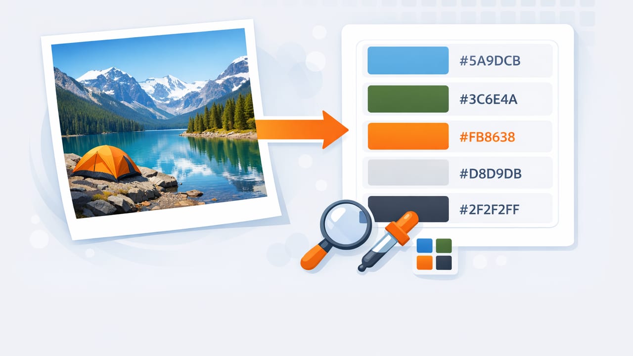
When you extract hex colors from photo references, you’re turning real-world inspiration into repeatable design decisions. Whether you’re working on a mobile UI, a brand moodboard, or an interior refresh, the goal isn’t just “get a hex code”—it’s to capture reliable color values and shape them into a palette that holds up across screens, print, and materials.
This guide focuses on a practical, tool-agnostic workflow for color extraction: what to sample, how to avoid common accuracy traps, and how to turn sampled colors into palettes you can actually use in graphic design, interior design, and creative projects.
Why photo-based color extraction is trickier than it looks
A photo is not a neutral record of color. It’s a combination of:
- Lighting (warm bulbs vs. daylight can shift everything)
- Camera processing (HDR, “vivid” modes, white balance)
- Compression (social media uploads can alter tones)
- Display differences (your screen’s calibration affects what you see)
That’s why accuracy comes from a workflow—not from a single tap. The checklist below helps you capture colors that remain consistent when you apply them later in a design system, a paint selection, or a digital product.
Checklist: how to extract HEX colors from photo references reliably
1) Start with the best source image you can get
Better input produces better palettes. Aim for:
- Original photos rather than screenshots of screenshots
- High resolution (more pixels = cleaner sampling)
- Minimal filters (avoid heavy Instagram edits when possible)
- Neutral lighting if you’re sampling for real-world materials
If you’re sourcing inspiration online, download the largest available version and avoid images that look overly sharpened or posterized.
2) Identify what kind of colors you need (base vs. accent vs. neutrals)
Before sampling, decide what you’re trying to build:
- Brand/UI palette: needs clear roles (primary, secondary, background, text, states)
- Interior palette: often needs a dominant neutral plus a few supporting tones
- Illustration/creative palette: may prioritize mood and harmony over neutrality
This matters because it changes where you sample. For example, a sunset photo might yield stunning accents, but poor neutrals for backgrounds or walls.
3) Sample multiple points per “color” to avoid pixel noise
A common mistake: sampling a single pixel and treating it as the truth. Real objects have texture, shadows, and highlights. Instead:
- Sample 3–6 points in the same area.
- Ignore extreme highlights and deep shadows at first.
- Choose a value that represents the midtone of that area.
This approach reduces “one-off” values caused by glare, fabric weave, or camera noise.
4) Watch for lighting bias (warm/cool) and correct for it
If the whole image is warm (golden-hour lighting) or cool (overcast), your sampled hex codes will inherit that cast. That may be desirable for moodboards, but it can distort practical decisions like:
- paint selection
- product color matching
- brand color specifications
When accuracy matters, test this quick sanity check: sample something that should be neutral (a white wall, gray concrete, a black shirt). If it comes out noticeably tinted, assume the entire palette is shifted.
Rule of thumb: if your “white” samples as beige or blue-gray, treat your palette as “lighting-influenced,” not “material-true.”
5) Capture a balanced set: light, mid, dark, and accent
A usable palette usually includes:
- 1–2 light neutrals (backgrounds, negative space)
- 1–2 midtones (surfaces, secondary blocks)
- 1–2 dark tones (text, anchors, contrast)
- 1–3 accents (CTAs, highlights, decor pops)
Even if the photo is colorful, you’ll get more flexibility by including neutrals that “hold” everything together.
6) Convert or record multiple formats (HEX is only one view)
HEX is common for digital design, but HSL/HSB can be more intuitive for adjustments (like making a color slightly darker or less saturated). Keep at least HEX + HSL for iterative work.
| Format | Best for | What it looks like |
|---|---|---|
| HEX | UI specs, CSS, design handoff | #2F6FED |
| RGB | Screen-based adjustments, some tools/plugins | 47, 111, 237 |
| HSL | Systematic tweaking (lightness/saturation) | 219°, 82%, 56% |
| HSB/HSV | Artist-friendly edits, brightness control | 219°, 80%, 93% |
7) Test contrast early (especially for UI and graphics)
A palette can be beautiful but unusable if text disappears on backgrounds. After you extract colors, do a quick contrast pass:
- Try your darkest tone as text on your lightest neutral.
- Try white text on your primary accent.
- If both fail, adjust lightness (HSL) or swap roles (use the accent for borders, not text).
If you’re designing for accessibility, use a contrast checker in your design tool or browser workflow to validate key combinations.
8) Normalize the palette: remove near-duplicates and define roles
Photo sampling often produces several colors that are effectively the same. Consolidate:
- Group similar colors (e.g., three slightly different tans).
- Keep the most versatile version (usually the midtone).
- Name colors by role, not by vague labels.
Role-based naming examples:
- Background / Surface / Border
- Text Primary / Text Muted
- Primary / Secondary / Accent
- Success / Warning / Error (for UI states)
Example: turn extracted HEX values into a reusable mini design system
Once you’ve sampled and cleaned up your palette, put it somewhere reusable. Here’s a simple CSS variables snippet you can paste into a project or share with a developer:
:root {
  --color-bg: #F6F2EA;
  --color-surface: #FFFFFF;
  --color-text: #1F2430;
  --color-text-muted: #5B6577;

  --color-primary: #2F6FED;
  --color-secondary: #17A398;
  --color-accent: #F28F3B;

  --color-border: #E4DED3;
}

body {
  background: var(--color-bg);
  color: var(--color-text);
}

.button-primary {
  background: var(--color-primary);
  color: #FFFFFF;
}
This doesn’t lock you into a rigid system—it simply ensures your extracted colors become consistent building blocks.
Photo sampling tips for interior design and decor
Interior projects add an extra layer: materials reflect light differently than screens. Use these practices when extracting colors for paint, textiles, or finishes:
- Prefer daylight photos for “true” material reads.
- Sample midtones on walls and fabrics; avoid bright glare.
- Extract a neutral anchor first (floor, wall, large furniture), then accents.
- Expect translation: a hex code is a starting point for paint matching, not a final spec.
If you’re trying to match a specific real object (like a sofa), take multiple photos in different lighting and compare the extracted values. If the hex shifts dramatically, the material is highly reflective or the lighting is dominating the color.
Common mistakes when you extract hex colors from photo references
Mistake 1: Sampling from compressed images
Some platforms introduce color banding or subtle hue shifts. If you see blocky gradients (especially in skies), look for a higher-quality source.
Mistake 2: Treating shadows as separate palette colors
Shadows often add blue/green casts. Unless you’re intentionally building a moody palette, keep your “core” colors in the midtone range and generate darker variants later.
Mistake 3: Choosing too many accents
Palettes feel cohesive when accents are limited. If everything is an accent, nothing is. For most projects, 1–3 accent colors are plenty.
Mistake 4: Skipping naming and roles
A folder full of hex codes without context is hard to apply consistently. Naming by role makes the palette usable across tools, teams, and revisions.
How to choose a color extraction tool (quick criteria)
You can extract colors with many design tools and mobile apps. Prioritize tools that make it easy to:
- sample precisely (zoom, loupe, tap-and-hold)
- save multiple swatches into a palette
- view values in HEX + RGB + HSL/HSB
- export in formats you actually use (ASE, PNG swatches, text lists, etc.)
Mobile-first workflows are especially helpful when your inspiration comes from the real world (storefronts, nature, textiles, paint chips) and you want to capture colors on the spot.
Final takeaway: aim for “useful” accuracy, not perfect sampling
To extract hex colors from photo sources effectively, think like a designer: capture a representative set, correct for obvious lighting bias, remove duplicates, and define roles. The result is a palette that can power layouts, brand elements, UI components, or decor decisions—without falling apart when you apply it in the real world.
If you prefer building palettes on iPhone or iPad, an app like Color Viewfinder can help you sample colors and keep HEX/RGB/HSL values organized while you iterate.
