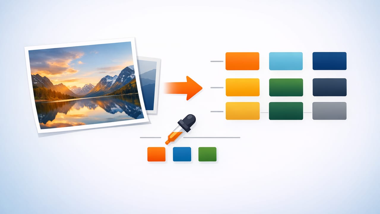
When you extract HEX colors from photo references, you’re doing more than “picking nice colors.” You’re translating real-world lighting, materials, and mood into a set of repeatable values you can use in UI, branding, illustrations, or interior design plans. The trick is accuracy: photos can lie (white balance, compression, shadows), and a sloppy sampling method often produces palettes that feel “off” once you apply them.
This guide walks through a dependable, designer-friendly workflow to pull usable HEX codes from images, refine them into a balanced palette, and validate them for real use.
What it means to extract HEX colors from a photo
A HEX color is a six-digit code (like #3A7BD5) representing red, green, and blue channels. When you sample a pixel in a photo, you’re capturing the RGB value at that point and converting it into HEX (and often other formats like HSL/HSB).
However, photos contain:
- Lighting gradients (sunlight vs shade) that shift color dramatically.
- Reflections (especially on glossy surfaces) that skew samples.
- Camera processing (HDR, filters, noise reduction) that alters true color.
- Compression artifacts that create “fake pixels,” especially in JPEGs.
The goal is not to capture every pixel color—it’s to capture a representative set of colors you can reuse consistently.
Step-by-step workflow: from photo to usable HEX palette
1) Start with the right image
Your palette quality is limited by your photo quality. Use the highest-resolution source you can, ideally:
- Natural light (or evenly lit studio shots for products)
- Minimal filters (avoid heavy presets that crush shadows or oversaturate)
- Low compression (PNG, HEIC, or high-quality JPEG)
Tip: If you’re working from screenshots or social images, expect more artifacts. You can still extract colors, but you’ll need extra cleanup.
2) Identify the “palette intent” before sampling
Ask what you’re building:
- Brand palette: needs clear roles (primary, secondary, neutral, accent).
- UI theme: needs contrast-friendly text and accessible states.
- Interior palette: needs material awareness (paint vs fabric vs wood).
- Illustration/print: needs predictable reproduction and consistent saturation.
This intent determines how many colors you need and how you’ll refine them later.
3) Choose sampling zones (don’t click randomly)
Instead of grabbing the first “pretty” pixel, create a quick mental map:
- Dominant base (largest area, often background or main surface)
- Secondary support (next-largest, usually mid-tone)
- Accent (small but high attention: signage, flowers, buttons, trim)
- Neutrals (whites, grays, near-blacks for spacing and typography)
Sample each zone multiple times (3–6 samples), then choose a representative value (often a mid-point sample, not the brightest highlight or darkest shadow).
4) Avoid common pixel traps
When you extract HEX colors from photo imagery, these traps cause the most “why does it look wrong?” moments:
- Highlights: specular shine reads whiter and cooler than the material.
- Deep shadows: usually shift cooler and more saturated than expected.
- Edges: anti-aliasing blends two colors, creating a third “fake” color.
- Noise: one pixel may be an outlier—sample a small cluster instead.
5) Convert and label your colors by role
Once you have candidate HEX values, name them based on function, not subjective adjectives. For example:
- Primary: used for key actions or brand header
- Secondary: supports primary in components
- Accent: sparingly for emphasis
- Neutral-900 / Neutral-50: text and backgrounds
This labeling prevents “palette drift” when you hand off to teammates or revisit the project later.
Refining: how to turn raw samples into a cohesive palette
Normalize lightness (most palettes fail here)
Raw photo samples often cluster too closely in lightness, which makes UI and layouts feel flat. A useful refinement is to create a lightness ladder for neutrals and a controlled range for color roles.
Practical approach:
- Pick a neutral background (very light or very dark, depending on theme).
- Pick a neutral text that passes contrast (more on this below).
- Adjust your primary/secondary colors so they don’t sit at the same lightness.
Watch saturation: photos can be “too real”
Real-world scenes often contain extremely saturated micro-areas (LED lights, glossy packaging, flowers). These can overpower a design system. If the accent color looks loud, keep the hue but reduce saturation slightly for everyday UI use.
Keep hue relationships intentional
If you want harmony, check the palette against common relationships:
- Analogous (neighbors on the color wheel): calmer, cohesive
- Complementary (opposites): energetic, high contrast
- Split complementary: balanced energy without harshness
A photo gives you mood; your palette needs structure.
Quality checks: accessibility and consistency
Check text contrast (minimum viable)
If you’re using extracted colors for UI or marketing graphics, contrast matters. As a baseline, aim for WCAG contrast targets:
- 4.5:1 for normal body text
- 3:1 for large text (roughly 18pt+ regular or 14pt+ bold)
If your primary color fails as a background for white text, you can:
- darken the primary slightly
- use dark text instead of white
- reserve the color for borders, icons, or accents
Validate across screens
Colors shift between devices. If possible, preview your palette on:
- a phone screen (high brightness, small UI elements)
- a calibrated monitor (design work)
- a warm display (many laptops skew warm)
Troubleshooting table: why extracted HEX values look wrong
| Problem | Likely cause | Fix |
|---|---|---|
| Palette looks “muddy” in design | Samples taken from shadows or compressed JPEG blocks | Resample mid-tones; increase image quality; avoid darkest areas |
| Accent color is neon and distracting | Sampled from a tiny saturated highlight | Keep hue, reduce saturation; sample a larger, more typical area |
| Neutrals look tinted (green/blue/pink) | White balance or color cast in the photo | Pick a neutral reference point; adjust neutral hue toward gray |
| Two colors are almost identical in UI | Similar lightness values despite different hues | Increase lightness separation; create a deliberate scale |
| Brand color prints differently than expected | RGB vs print gamut differences | Convert to CMYK for print workflows and adjust with proofing |
Practical output: turn your extracted HEX values into usable assets
Create a simple CSS color system
Once you’ve extracted and refined your colors, define them as variables so they stay consistent across files and components:
:root {
  --color-primary: #2F6F8E;
  --color-secondary: #E3A23B;
  --color-accent: #C94F5D;

  --neutral-50: #F7F7F6;
  --neutral-200: #D9D7D3;
  --neutral-900: #1B1C1E;
}

.button {
  background: var(--color-primary);
  color: var(--neutral-50);
}
Palette checklist for handoff
- List HEX (and RGB/HSL if your team prefers)
- Assign roles (primary/secondary/accent/neutrals)
- Include contrast notes (which text color to use on each)
- Export swatches in formats your tools support (ASE, CSV, SVG, PNG)
Interior design note: materials change the meaning of HEX
If you’re extracting colors for interiors, remember that paint, fabric, wood, and tile reflect light differently. A HEX code is still useful for direction and coordination, but always validate with real-world samples:
- Compare against paint decks or manufacturer swatches
- Check colors in morning and evening light
- Account for surrounding colors (floors, trim, large furniture)
A repeatable mini-workflow (quick version)
- Pick a high-quality photo with minimal filters.
- Decide palette intent (brand/UI/interior).
- Sample 3–6 points per zone (base/secondary/accent/neutrals).
- Avoid highlights, deep shadows, and anti-aliased edges.
- Normalize lightness and tame extreme saturation.
- Check contrast for text and UI states.
- Export and document the palette with roles.
Choosing a tool to extract colors (what to look for)
Whether you use a desktop design app, a browser tool, or a mobile picker, prioritize:
- Multiple color formats (HEX, RGB, HSL/HSB)
- Palette organization (reorder, label, lock colors)
- Export options for your workflow
- Fast sampling (zoom, precision picking, multiple swatches)
If you prefer doing this on iPhone or iPad, an app like Color Viewfinder can help you extract HEX values from photos quickly and assemble them into exportable palettes.
