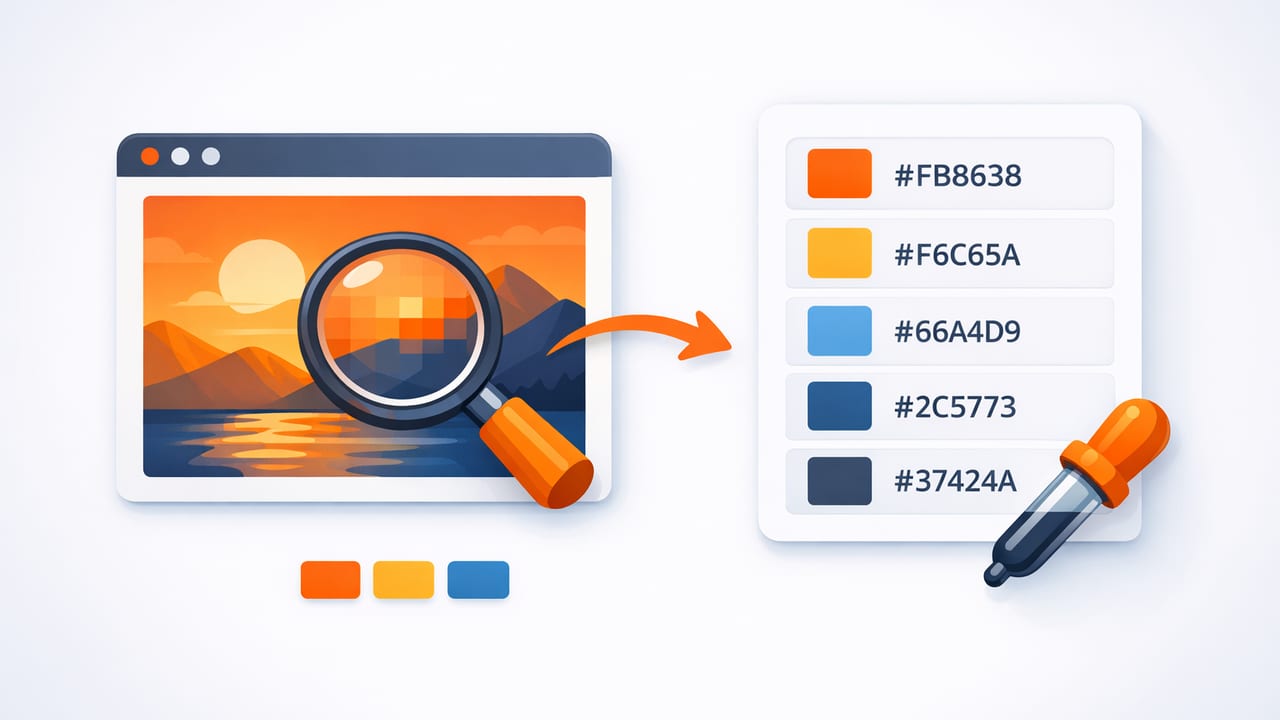
When a photo has “the perfect blue” or a room inspiration image nails the exact warm neutral you want, it’s tempting to eyeball it and move on. But small color mismatches compound quickly: a website feels off-brand, a social template looks inconsistent, or a paint/decor plan drifts away from the reference. A repeatable method to extract HEX colors from images helps you capture what you see and reuse it with confidence across tools and mediums.
This guide breaks down an accurate, practical workflow for sampling colors from images, validating your picks, building usable palettes, and applying them in graphic design, UI, and interior/decor planning.
What it means to “extract HEX colors from images”
Most digital images are made of pixels. Each pixel has color data—commonly in RGB (red, green, blue). A HEX color is simply a compact text representation of RGB values, written like #2F6BFF. When you extract a HEX code from a photo, you’re sampling specific pixels (or an averaged area) and converting the underlying RGB to HEX.
Why HEX is so widely used
- Portable: Works in web design, many design tools, and code.
- Precise: A single string represents an exact RGB value.
- Easy to store/share: Simple to paste into brand docs and style guides.
Common accuracy traps (and how to avoid them)
Color picking seems straightforward, but images rarely contain a single “true” color. Here are the issues that typically cause inaccurate results when you extract HEX colors from images.
1) Lighting, shadows, and reflections
A “white wall” in a photo may contain blue-gray shadow, warm highlights, and reflected colors from nearby objects. If you sample a highlight, you’ll get a much lighter HEX than the midtone that actually reads as the wall color.
Fix: Sample multiple points (shadow, midtone, highlight) and select the most representative midtone for your base palette.
2) JPEG compression and noise
Compressed images introduce artifacts: neighboring pixels may vary by a few values even in visually flat areas. If you pick a single pixel, your HEX may be slightly “off.”
Fix: Use a picker that supports averaging (sampling a small area), or manually sample 5–10 nearby points and choose the median-like value.
3) Color profiles and display differences
Some images embed color profiles (like Display P3). If your workflow silently converts between color spaces, the picked values can shift.
Fix: Keep your workflow consistent: use the same device/app for sampling, and verify in your final destination (web, print, or paint matching) before committing.
4) Transparent overlays and filters
Social posts and mockups may include semi-transparent overlays. Sampling the “background” actually samples the blended result.
Fix: If you need the original color, find the unfiltered source image or remove overlays when possible. Otherwise, accept the blended HEX as the color you want to reproduce.
A reliable workflow to extract HEX colors from images
This method works whether you’re building a brand palette, matching UI to photography, or pulling inspiration colors for decor mood boards.
Step 1: Start with the best image you can
- Prefer high-resolution images (more pixels = cleaner sampling).
- Choose images with natural lighting when matching real-world materials.
- Avoid screenshots of screenshots (each re-save adds compression and shifts).
Step 2: Identify roles before you pick colors
Instead of grabbing random attractive colors, decide what you need:
- Base: the main neutral/background (often 1–2 colors).
- Primary: the dominant brand/accent color.
- Secondary: supporting accents.
- Text/contrast: dark and light options that stay readable.
This prevents a common mistake: extracting five vivid accents and forgetting a usable neutral foundation.
Step 3: Sample deliberately (not randomly)
When you extract HEX colors from images, use a consistent sampling approach:
- Sample midtones for “true” surface color (avoid extreme highlights/shadows).
- Take multiple samples per target area (3–10 points).
- Prefer area averaging on textured surfaces (fabric, foliage, stone).
Tip: If two sampled HEX values are very close (e.g.,
#C9C5BCvs#CAC6BD), treat them as the same color and keep the one that fits your palette structure.
Step 4: Build a “palette ladder” (tints and shades)
A single HEX isn’t enough for most real projects. Create related steps for UI states, typography, and depth:
- Tints: mix the color toward white for backgrounds.
- Shades: mix the color toward black for hover/active states.
- Muted variants: reduce saturation for more flexibility.
This ladder approach turns one extracted color into a usable system.
Step 5: Validate with contrast and context
Colors that look great in a photo can fail in real layouts. Validate quickly:
- Check text contrast on light/dark backgrounds.
- Preview colors next to each other (some combinations create vibration or muddiness).
- Test on multiple screens if the project is digital.
HEX, RGB, HSL, and HSB: when each format helps
HEX is perfect for transfer, but other models are better for editing. Here’s a quick reference.
| Format | Best for | What to watch |
|---|---|---|
| HEX (#RRGGBB) | Sharing, web/CSS, documentation | Harder to “reason about” adjustments |
| RGB (0–255) | Screen-based accuracy, pixel sampling | Not intuitive for harmonies |
| HSL (Hue/Sat/Light) | Creating tints/shades, balancing lightness | Perceptual uniformity isn’t perfect |
| HSB/HSV (Hue/Sat/Bright) | Quickly matching “brightness” impressions | Brightness ≠ perceived luminance |
Practical examples: using extracted HEX codes
Example 1: Turn a photo palette into web design tokens
Once you’ve selected 5–8 core colors and created a ladder for your primary color, convert them into CSS variables (design tokens). This makes consistency easy across pages and components.
:root {
  --color-bg: #F7F3EE;
  --color-surface: #FFFFFF;
  --color-text: #1E1E1E;
  --color-muted: #6B6B6B;

  --color-primary-500: #2F6BFF;
  --color-primary-600: #2456D6;
  --color-primary-700: #1C42A8;

  --color-accent-500: #FFB000;
}

.button {
  background: var(--color-primary-500);
  color: #FFFFFF;
}

.button:hover {
  background: var(--color-primary-600);
}
Example 2: Create a decorator-friendly palette from an inspiration photo
For interiors, you usually want a dominant neutral, a supporting neutral, and 1–3 accents. When sampling:
- Extract neutrals from midtone wall/floor areas.
- Extract accents from textiles/art (but also sample a muted version for larger surfaces).
- Keep a “dark anchor” color for contrast (wood tone, charcoal, deep navy).
Then, take your extracted HEX colors and compare them against physical swatches under the lighting where they’ll be used. The HEX is a strong starting point; real-world materials always require a final check.
How many colors should you extract?
It depends on the project, but these ranges work well:
- UI/brand starter palette: 6–10 colors (plus tints/shades for primary)
- Social template set: 5–7 colors (high contrast, bold accents)
- Interior mood board: 4–6 colors (2 neutrals, 1 anchor dark, 1–2 accents)
If you extract too many colors, you’ll struggle to maintain hierarchy. If you extract too few, you’ll lack flexibility for states, depth, and typography.
Quality checklist: before you finalize your palette
- Consistency: Do your chosen colors represent the image’s overall feel, not just tiny details?
- Balance: Do you have neutrals, a dark anchor, and 1–2 accents?
- Contrast: Can you set readable text on your backgrounds?
- Redundancy: Remove near-duplicates unless you need subtle steps.
- Portability: Store values as HEX and optionally as RGB/HSL for editing.
Frequently asked questions
Is the HEX from an image always the “real” color?
It’s the real color of the pixels in that file, which may differ from the real-world object due to lighting, camera settings, editing, and compression. It’s still extremely useful—just validate if you’re matching physical materials.
Should I sample a single pixel or an area?
Single-pixel sampling is best for flat UI screenshots and vector-like images. Area averaging is better for photos, textures, and anything noisy or compressed.
How do I keep palettes consistent across projects?
Save your extracted colors in one “source of truth” (a style guide, token file, or palette library) and always copy values from there—don’t re-sample the same image repeatedly.
Closing thought
A good color palette isn’t just a handful of attractive swatches—it’s a reusable system built from accurate sampling, thoughtful roles, and simple validation. With a deliberate process, you can extract HEX colors from images and turn inspiration into consistent design decisions.
If you prefer doing this directly on iPhone or iPad, an app like Color Viewfinder can help you sample and organize palette values quickly while you’re working from photos.
