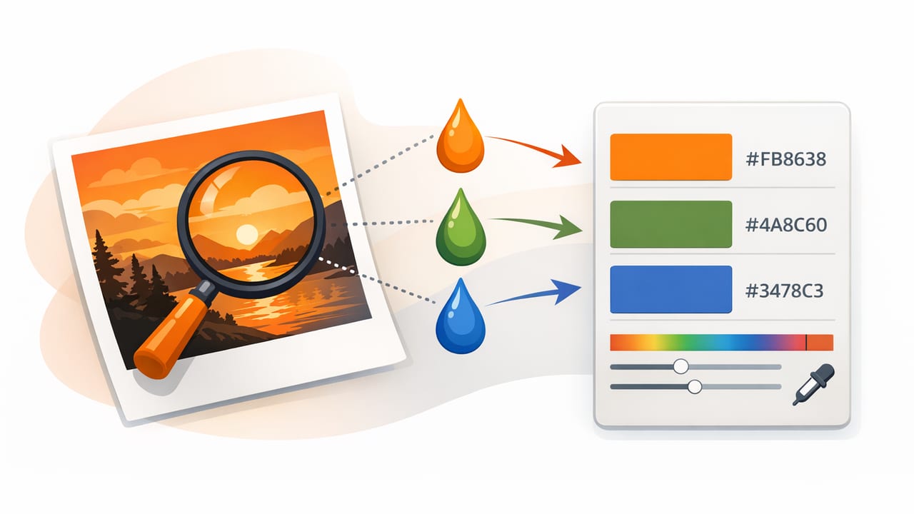
When you extract HEX colors from photos, you’re not just “picking a color”—you’re translating real-world light into digital values that need to stay consistent across screens, layouts, and sometimes print. That translation is where most problems happen: the same wall paint looks warmer in one photo, cooler in another; a “black” shirt samples as navy; a neutral background becomes greenish. Those aren’t random glitches—there are predictable reasons, and you can work around them.
This guide focuses on accuracy: how to sample colors in a way that produces reliable HEX codes and palettes you can actually use in graphic design, interior design mockups, UI themes, mood boards, and brand exploration.
Why extracted HEX colors often look “wrong”
A HEX code (like #2F6F8E) is a compact way to represent an RGB color for digital use. A photo, however, contains pixels shaped by the camera, lighting, edits, compression, and display. When you extract HEX colors from photos, you’re sampling a pixel that may not reflect the object’s “true” color—only how it was captured.
Common causes of mismatch include:
- White balance: indoor tungsten light warms everything; shade cools everything.
- Mixed lighting: daylight + warm lamps create multiple color casts in one image.
- Auto HDR / processing: phones boost saturation and contrast, shifting midtones.
- Compression artifacts: JPEG blocks can introduce color noise around edges.
- Reflections: glossy surfaces “borrow” colors from nearby objects.
- Shadows and highlights: sampling a shadow gives a different color than the base material.
Rule of thumb: In photos, “color” is usually a range. Your job is to sample a representative value—not a random pixel.
Step-by-step: a reliable workflow to extract HEX colors from photos
This workflow works whether you’re building a 3–5 color brand palette, matching an interior paint vibe, or pulling UI colors from a product shot.
1) Start with the best source image you can
Higher quality input makes color sampling easier and more consistent.
- Prefer original photos (camera roll exports) over screenshots of social media.
- Avoid heavy filters if you want “true-to-life” color.
- Use even lighting where possible—soft daylight beats harsh spotlights.
2) Decide what “accurate” means for your project
Accuracy depends on your goal:
- Brand/mood palette: you want a cohesive impression, not literal paint-match accuracy.
- Interior coordination: you want stable neutrals plus a few accents that won’t shift wildly.
- UI/graphic design: you want usable, accessible colors that work across components and states.
3) Sample from midtones first (not highlights or shadows)
Midtones tend to reflect the object’s perceived color better than extremes. If you sample a highlight on a ceramic mug, you may pick up the light source (often bluish daylight or warm indoor light). If you sample a shadow, you’ll often get a cooler, duller version of the base color.
Practical technique: zoom in, find a smooth area with minimal texture, and avoid edges where compression and color fringing happen.
4) Take multiple samples per “color” and average mentally
Even when a surface looks uniform, pixels vary. Instead of grabbing one HEX code and committing to it, sample 3–6 points across the area. If the values are close, pick a middle option; if they vary a lot, that area may be affected by lighting or texture—and you may need to sample elsewhere.
5) Build a palette with roles, not just swatches
A usable palette typically includes:
- Base neutral (background, negative space)
- Secondary neutral (panels, cards, trim)
- Primary color (dominant brand/accent)
- Secondary accent (supporting accent)
- Dark value (text, contrast, grounding)
When you extract HEX colors from photos with these roles in mind, you’re less likely to end up with five equally loud colors that fight each other.
Common pitfalls (and how to fix them)
| Pitfall | What happens | Fix |
|---|---|---|
| Sampling edges | Fringing/compression produces odd, “dirty” colors | Sample from flat midtone areas; zoom in to avoid borders |
| Picking highlights | Colors skew toward the light source (often too blue/too warm) | Choose midtones; compare several points across the object |
| Mixed lighting | Same surface yields different HEX values in different regions | Sample only from areas under the same light; consider correcting white balance |
| Over-saturated results | Palette looks louder than the scene felt | Reduce saturation slightly (HSL/HSB) for a more usable palette |
| Neutrals turn green/purple | Gray walls or whites pick up color casts | Look for a known neutral reference; adjust tint or sample a different area |
Make extracted colors more usable: quick adjustments that preserve the vibe
After you extract HEX values, small, controlled adjustments can turn “photo-accurate” into “design-accurate.” Two adjustments are especially helpful:
Adjust lightness for hierarchy
If your palette colors are all mid-value, layouts feel flat. Create a light version for backgrounds and a dark version for text/anchors. Even simple steps like ±10–20 in lightness can improve usability.
Control saturation to avoid neon accents
Phone photos can over-saturate. If an accent color feels too intense in your design, lower saturation slightly while keeping hue stable. This maintains the relationship to the original photo but improves readability and polish.
Check contrast (especially for UI and text)
Color picking is only half the job. If you’re using extracted colors in interfaces, posters, menus, or slides, contrast determines whether the palette works.
A quick practice:
- Pick your text color (often near-black, not pure black).
- Test it on your lightest background color and your midtone panels.
- If contrast is weak, darken text or lighten the background (don’t just “hope it’s fine”).
If you want a practical way to standardize usage, map extracted colors to CSS variables:
:root {
  --color-bg: #F4F1EA;
  --color-surface: #E6DFD2;
  --color-primary: #2F6F8E;
  --color-accent: #D08A4B;
  --color-text: #1E1E1E;
}

body {
  background: var(--color-bg);
  color: var(--color-text);
}

.button-primary {
  background: var(--color-primary);
  color: #FFFFFF;
}
Case example: extracting a palette from an interior photo
Imagine a living room photo with a beige wall, warm wood floor, a deep blue sofa, and a terracotta vase. Here’s how to extract HEX colors from photos in a way that leads to a functional palette:
- Wall (neutral base): sample a midtone area away from windows and lamp pools.
- Floor (secondary neutral): sample wood in a region without glare; avoid knots and edges.
- Sofa (primary): sample fabric midtones (not seams or highlights) to avoid texture bias.
- Vase (accent): sample a consistent face of the vase; avoid shadow gradients.
- Anchor dark: sample a shadowed but not crushed area (e.g., a dark frame) or set a controlled near-black manually.
Result: you get colors that still feel like the space, but behave predictably in a mood board, a presentation slide, or a product mockup.
Advanced tips for more consistent sampling
Use a neutral reference when available
If the photo contains a white sheet of paper, a gray card, or a known neutral object, sample it. If it reads slightly yellow/blue/green, that’s a clue that the entire photo has a color cast. Correcting the cast (even roughly) before sampling can dramatically improve results.
Be wary of “almost grayscale” areas
Near-grays are where color casts hide. Two grays that look identical can sample as #B9B7B0 (warm) vs #B1B7BB (cool). If your palette needs a clean neutral, consider nudging saturation down and aligning hue subtly.
Extract dominant colors, then refine
Many palettes fail because they treat all extracted colors equally. A better approach is to identify:
- Dominant: the color covering the most area
- Supporting: secondary areas that balance the dominant
- Accent: small, high-attention pops
Then refine each into a role-based palette (background, surface, primary, accent, text).
Export and reuse: keep your palette consistent
Once you have your set of HEX values, store them somewhere you’ll actually reuse: a design system page, a notes template, a swatch file, or exported palette formats that your tools can import. Consistency is what turns “color picking” into a repeatable design process.
If you prefer doing this on iPhone or iPad, tools like Color Viewfinder can help you sample and organize colors quickly from photos and export palettes in practical formats.
