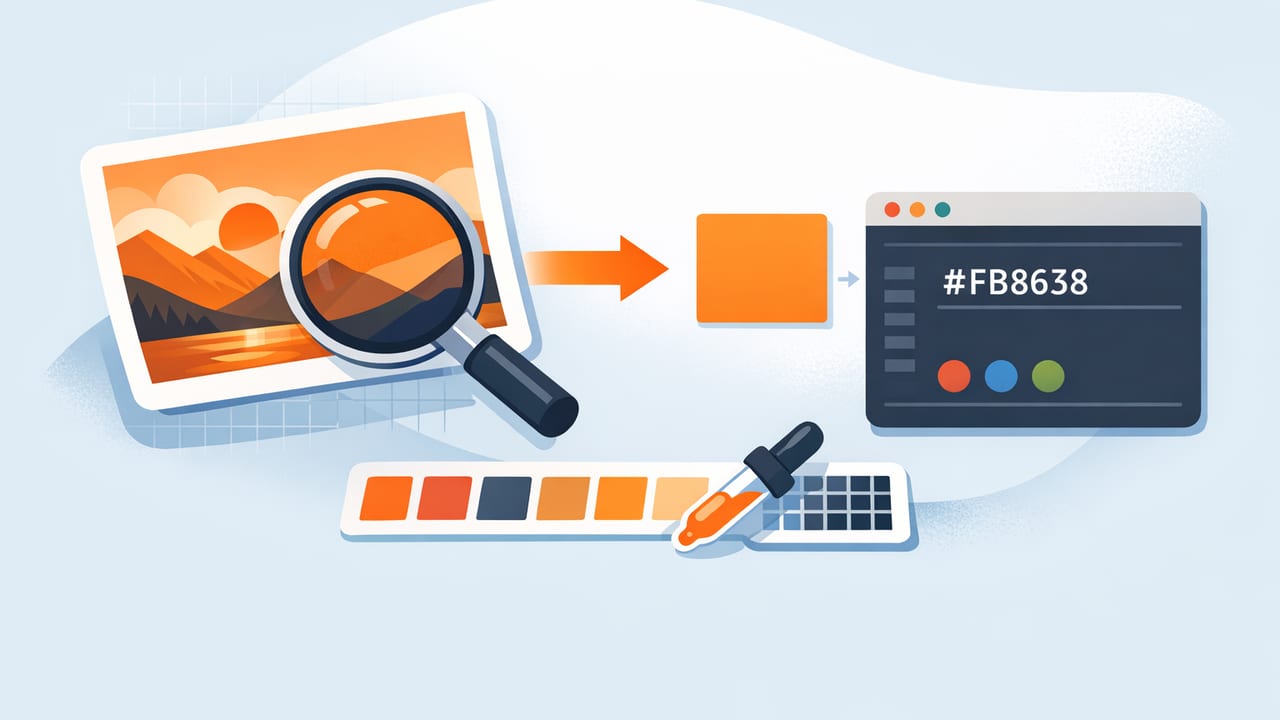
Pulling color from photography sounds simple: click a pixel, copy a HEX code, and you’re done. In practice, it’s easy to end up with “almost right” colors that drift across screens, print, and real-world materials. If your goal is to extract hex from image assets for a brand system, UI kit, illustration, or interior mood board, you’ll get better results with a repeatable method that accounts for lighting, compression, and context.
This guide walks through a practical workflow to extract accurate HEX values, convert them into a balanced palette, and apply them consistently in digital and physical design. You’ll also learn what can go wrong (and how to fix it) so your palettes stay stable from concept to final.
What “HEX from an image” really means
A HEX color (like #2F6BFF) represents an RGB value (red/green/blue) used by screens. When you sample a pixel in an image, you’re capturing the pixel’s RGB value at that exact coordinate, then translating it into HEX.
The catch: that pixel may be influenced by factors that don’t reflect the “true” object color—shadows, reflections, camera white balance, JPEG artifacts, or color profiles. Good color extraction is less about finding a single perfect pixel and more about capturing representative colors that match your design intent.
Before you sample: choose the right image
Your palette quality depends heavily on your source image. If you’re extracting colors for branding or UI, prioritize images with cleaner lighting and less color noise.
- Prefer high-resolution images (more pixels = smoother gradients, less compression).
- Avoid heavy filters unless the filter is part of the intended aesthetic.
- Watch for mixed lighting (e.g., daylight + warm indoor bulbs) which can shift neutrals.
- Use RAW or PNG when possible; JPEG introduces artifacts that can skew sampling.
“Color picking isn’t about capturing what the camera saw—it’s about capturing what your audience should feel.”
A reliable workflow to extract HEX from image (without surprises)
1) Define your palette roles first
Don’t start sampling randomly. Decide what you need the colors to do. Common roles include:
- Primary (brand/UI anchor color)
- Secondary (supporting accent)
- Background (light or dark base)
- Surface (cards, panels)
- Text (high-contrast readable color)
- Highlight (CTAs, links, emphasis)
This turns extraction into a goal-driven process: you’re sampling to fill roles, not collecting a jar of random pixels.
2) Sample from “flat” areas, not edges
Edges contain anti-aliasing (blended pixels) and reflections, which often produce off values. When sampling:
- Zoom in to at least 200–400%.
- Pick from the middle of a colored region.
- Take 3–5 samples in that area and compare.
If the values vary a lot, the surface isn’t uniform (or lighting is uneven). In that case, you’ll want an average or a “median-looking” pick rather than a single pixel.
3) Capture a small set of candidates, then curate
A common mistake is trying to extract a full palette in one pass. Instead, grab candidates and curate them like you would type styles.
- Start with 8–12 sampled colors.
- Group them by similarity (blues together, neutrals together).
- Choose 4–6 final palette colors that cover your roles.
Most design systems don’t need 20 photo-derived colors. They need a few dependable ones that work in combinations.
4) Normalize: adjust brightness and saturation intentionally
Photo colors are often too saturated for UI backgrounds, or too muddy for icon accents. After you extract HEX values, normalize them using HSL/HSB adjustments:
- Reduce saturation for backgrounds and large surfaces.
- Increase contrast for text and buttons.
- Keep hue stable while adjusting lightness (helps preserve “identity”).
This is not “cheating”—it’s turning a photo sample into a functional palette.
Common problems when you extract HEX from image files
Problem: The color looks different in another app
This often comes from color management and profiles. Some apps interpret embedded profiles differently.
- Try converting the image to sRGB before sampling.
- Test the extracted HEX in your target environment (Figma, Sketch, CSS, print proof).
Problem: Your sampled color is “too dark” or “too warm”
You probably sampled a shadow or a reflection. Sample from the brightest, least reflective area of the object—or take several samples and choose a representative mid-tone.
Problem: JPEG noise creates weird one-off HEX values
Highly compressed images can cause pixel-level color speckling. Solutions:
- Use a higher-quality source.
- Sample multiple pixels and choose a stable middle value.
- Prefer broad, smooth areas over textured regions.
HEX vs RGB vs HSL/HSB: when to use what
HEX is perfect for storage and handoff, but editing a palette is often easier in HSL/HSB.
| Format | Best for | Example | Tip |
|---|---|---|---|
| HEX | Sharing, CSS, design tokens | #2F6BFF |
Great for consistency; not intuitive for edits. |
| RGB | Screen-based rendering | rgb(47, 107, 255) |
Matches how pixels are stored in images. |
| HSL | Adjusting light/dark and saturation | hsl(222, 100%, 59%) |
Use lightness for tints/shades. |
| HSB/HSV | Designer-friendly “brightness” tweaks | HSV(222, 82%, 100%) |
Useful for quickly dialing intensity. |
Turn extracted colors into a palette that actually works
After you extract hex from image samples, validate the palette with quick checks. This is where many photo palettes fail: they look nice as swatches, but fall apart in layouts.
1) Check contrast for readable text
If you’re designing interfaces, ensure text is readable on your chosen backgrounds. A fast heuristic:
- Use a very dark neutral for text on light backgrounds.
- Use an off-white (not pure white) for text on dark backgrounds.
- Don’t rely on saturated colors as text colors unless contrast is proven.
2) Add neutrals derived from the photo
Neutrals are the glue. Instead of defaulting to pure gray, sample subtle neutrals from the image (stone, fabric, sky haze), then adjust them slightly to serve as backgrounds and surfaces.
3) Build a tint/shade ramp from your primary
A single extracted primary color becomes more usable when you create a ramp (light to dark). This supports states (hover, active), depth, and hierarchy.
/* Example: simple CSS tokens from an extracted primary (#2F6BFF) */
:root{
  --primary-100: #EAF0FF;
  --primary-200: #C9DAFF;
  --primary-300: #9FBCFF;
  --primary-400: #6F97FF;
  --primary-500: #2F6BFF; /* extracted */
  --primary-600: #2457D6;
  --primary-700: #1C42A8;
  --primary-800: #152F78;
}
You can generate these by adjusting lightness/brightness while keeping hue consistent, then fine-tuning saturation so the ramp feels natural.
Practical examples: photo-to-palette for different creatives
Graphic design: poster or social template
- Extract 1 bold accent (headline color).
- Extract 1 dark neutral (body text).
- Extract 1–2 background tones (from sky, wall, paper, etc.).
- Normalize saturation so the accent stands out without vibrating.
Interior design: room palette from a reference photo
- Sample large “mass” colors: walls, flooring, major furniture.
- Sample 1–2 accent colors: pillows, art, plants, ceramics.
- Expect real materials to differ—use extracted HEX as a starting point, then match to paint/fabric swatches under your room lighting.
Product or ecommerce: consistent catalog backgrounds
- Sample background neutrals from your best-performing hero image.
- Create a controlled neutral ramp for different product categories.
- Use the same background token across listings to reduce perceived color drift between SKUs.
A quick checklist for accurate color extraction
- Start with a clean image (high res, minimal compression).
- Convert to sRGB if colors shift between tools.
- Sample from flat regions, not edges or highlights.
- Take multiple samples and choose a representative value.
- Assign roles (primary, background, text, accent).
- Normalize in HSL/HSB for usability.
- Validate contrast before committing to UI usage.
- Export consistently (store HEX in design tokens or a palette file).
How to keep palettes consistent across devices and collaborators
Even when you extract the right HEX codes, team workflows can introduce inconsistencies. A few habits prevent palette drift:
- Use named tokens (e.g.,
primary-500,surface-100) instead of “that blue.” - Centralize the palette in one source of truth (design system file, tokens repo).
- Avoid re-sampling the same photo repeatedly; reuse the original extracted values.
- Document intent: note where a color is used and why (accent only, backgrounds only, etc.).
Wrap-up
To extract hex from image files effectively, treat color picking as a workflow—define roles, sample carefully, curate candidates, then normalize and validate for real-world use. The result is a palette that feels true to the original photo while behaving reliably in layouts, UI components, and mood boards.
If you prefer doing this directly on iPhone or iPad, an app like Color Viewfinder can help you sample colors and export palette values in common formats for quick handoff.
