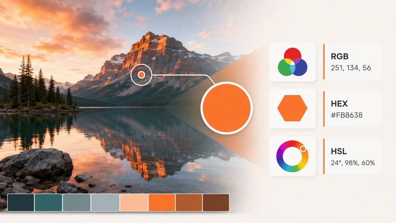
A photograph can be an excellent starting point for a color palette. A sunset may suggest a warm brand direction, a tile pattern can inform an interior scheme, and a product image can provide colors for a website or presentation. However, visual inspiration becomes much more useful when you can turn it into precise color data.
Learning how to extract RGB HEX HSL values from an image helps you move from “that blue looks right” to a reusable, documented color choice. Instead of approximating shades manually, you can inspect a specific pixel or area of a photo and record the values needed for digital design work.
This guide explains how photo color extraction works, what RGB, HEX, and HSL values mean, how to sample colors carefully, and how to use the results in graphic design, web design, interior planning, and other creative projects.
What Does It Mean to Extract Color Values From a Photo?
Color extraction is the process of identifying a color within an image and translating it into a numerical format. Digital photos are made from pixels, and each pixel contains color information. A color picker or palette tool reads that information and displays it as values such as RGB, HEX, HSL, or HSB.
For example, a muted teal pixel from a coastal photograph might be represented as:
RGB: 52, 122, 130
HEX: #347A82
HSL: 186°, 43%, 36%
All three formats describe the same digital color. The best one to use depends on the project and the software or platform where the color will be applied.
Extracting values from a photo is especially helpful when you want to:
- Build a cohesive color palette from visual inspiration.
- Use image-based colors in a website or app interface.
- Create social media graphics with a consistent mood.
- Document colors for a client presentation or design brief.
- Compare a dominant color with lighter, darker, warmer, or cooler variations.
- Share exact digital color references with collaborators.
RGB, HEX, and HSL: What Is the Difference?
Before you extract color values, it helps to know what each format communicates. They are different ways of describing color for screens and digital design systems.
| Format | Example | Best Use |
|---|---|---|
| RGB | rgb(52, 122, 130) | Digital graphics, image editing, interface tools |
| HEX | #347A82 | CSS, web design, design handoff, quick copying |
| HSL | hsl(186, 43%, 36%) | Adjusting hue, saturation, and lightness intentionally |
| HSB/HSV | hsb(186, 60%, 51%) | Visual color adjustments in many design applications |
RGB values
RGB stands for red, green, and blue. Each channel usually ranges from 0 to 255. A value of rgb(0, 0, 0) is black, while rgb(255, 255, 255) is white. Mixing different amounts of red, green, and blue creates the color visible on a screen.
RGB is useful when working with digital image editors, UI tools, and software that requires individual channel values. It is a practical format for understanding the technical makeup of a sampled color.
HEX values
A HEX code is a six-character hexadecimal version of RGB. The code #347A82, for instance, contains three pairs: 34 for red, 7A for green, and 82 for blue. HEX is popular because it is compact, easy to copy, and widely supported in CSS and web-based design workflows.
If you are building a website, a HEX value can be placed directly into a stylesheet:
:root {
  --coastal-teal: #347A82;
  --soft-sand: #E9D8B9;
}

.button {
  background-color: var(--coastal-teal);
  color: #FFFFFF;
}
HSL values
HSL stands for hue, saturation, and lightness. Hue identifies the color family on a 360-degree wheel, saturation describes intensity, and lightness indicates how dark or light the color appears.
HSL is often easier to adjust creatively. If a teal is too dark for a background, you can preserve its hue and saturation while raising its lightness. This makes HSL valuable when developing color scales, hover states, tinted backgrounds, or related palette variations.
How to Extract RGB, HEX, and HSL Values Step by Step
- Choose a high-quality source image. Use a photo with enough detail and reasonably balanced lighting. Compressed screenshots, heavily filtered images, and very dark photos can make subtle colors harder to inspect.
- Identify the area you want to sample. Decide whether you need the color of a fabric, a wall, a flower, a logo detail, or a background. Sampling with a clear purpose prevents an unfocused palette.
- Use a color picker to inspect the image. Move the picker over the target area. Many tools show a magnified view, which makes it easier to select one pixel rather than a neighboring edge or shadow.
- Record more than one value. Copy the HEX code for web work, keep RGB for software that uses channels, and note HSL if you expect to create lighter or darker variants.
- Sample supporting colors. Extract a small group of colors rather than relying on one isolated shade. Look for a dominant color, a neutral, a light tone, a dark tone, and an accent.
- Test the colors in context. A color that looks appealing in a photograph may need adjustment when used as text, a background, or a button.
A Practical Example: Building a Palette From a Café Photo
Imagine you have a photo of a café interior with terracotta walls, pale wood tables, leafy plants, and dark charcoal fixtures. Rather than extracting every visible shade, select a focused set of five colors that represent the image’s overall feeling.
| Palette Role | Sample HEX | Potential Use |
|---|---|---|
| Terracotta | #B85C42 | Primary accent, callout, decorative shape |
| Warm cream | #F3E9D7 | Background or spacious canvas color |
| Natural wood | #B98C5D | Secondary accent or illustration detail |
| Plant green | #4F6B4B | Supporting accent, icon, or label |
| Charcoal | #2E2D2B | Body text, borders, or high-contrast structure |
This palette can guide a menu layout, a mood board, a social template, or a small business website. The image supplies the emotional direction, while the extracted values make the colors practical to reuse.
How to Sample Colors More Accurately
A single photo can contain thousands or millions of colors, so careful selection matters. The goal is not necessarily to capture every pixel exactly. It is to identify useful colors that reflect the visual direction of the image.
- Avoid hard edges. Pixels at the boundary between two objects may contain blended or anti-aliased colors.
- Sample the middle of a surface. For a wall, fabric, or sky, sample away from strong highlights, deep shadows, and reflections.
- Check nearby pixels. Sample several points in the same area to see whether the color is stable or affected by texture and lighting.
- Consider the image’s lighting. Warm indoor bulbs, sunset light, and camera filters can shift the apparent color significantly.
- Use a limited palette. Five to eight intentional colors are generally easier to apply than a long, unstructured list.
Important limitation: Color values extracted from a photo describe the digital pixels in that photo. They do not guarantee a physical paint match, fabric match, or print result because materials, lighting, screens, printers, and color profiles can all change appearance.
Using Extracted Colors in Different Creative Projects
Graphic design
Use photo-based palettes to establish hierarchy in posters, presentations, packaging concepts, and social graphics. Assign each color a role: background, text, primary accent, secondary accent, and neutral. This makes the palette easier to apply consistently.
Web and UI design
HEX values are useful for CSS, while HSL can simplify systematic adjustments. Always test text contrast against its background. A beautiful sampled color may not provide sufficient readability when used for small text or essential interface controls.
Interior design planning
Photo extraction can help create a digital mood board from furniture, architecture, landscapes, or textiles. Treat the resulting codes as visual references for planning and communication, not as guaranteed specifications for paint or material purchasing.
Keep Your Color Data Organized
Once you extract RGB, HEX, and HSL values, save them with clear names. Generic labels such as “Blue 1” become confusing quickly. A descriptive label like “Harbor Teal,” “Muted Clay,” or “Soft Linen” makes the palette more memorable while the numerical values preserve precision.
A useful palette record includes:
- The color name and role.
- HEX, RGB, and HSL values.
- The source image or project name.
- Notes about intended usage, such as background, text, or accent.
- Any contrast or accessibility considerations.
Turn Photo Inspiration Into Usable Color Decisions
When you extract color values from a photo, you create a bridge between inspiration and implementation. RGB helps with digital channel values, HEX provides quick web-ready codes, and HSL makes intentional adjustments easier. Together, these formats give you a flexible foundation for creative projects.
For an iPhone or iPad workflow, Color Viewfinder’s guide to picking HEX colors from a photo offers additional context for inspecting image colors and turning them into reusable palette references.
