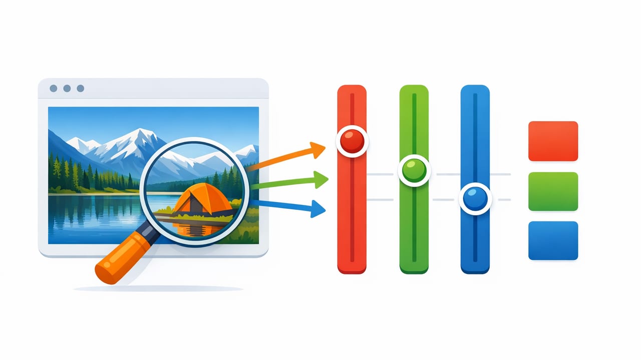
If you’ve ever tried to extract RGB values from a photo and felt like the numbers changed every time you tapped a different pixel, you’re not imagining things. Photos are affected by lighting, camera processing, compression, reflections, and even the screen you’re viewing them on. The good news: you can still pull reliable RGB values and build a usable palette—if you follow a repeatable workflow.
This guide walks through a practical, designer-friendly process for sampling colors from images, verifying them, and converting them into formats you can use across graphic design, UI work, illustration, or interior design mood boards.
What “RGB values from a photo” actually represent
RGB values in a digital image are the color channel intensities stored per pixel—typically three numbers from 0 to 255 (Red, Green, Blue). When you sample a pixel, you’re not sampling the “real-world paint color” or “fabric dye” directly; you’re sampling:
- Light captured by the camera sensor (in a specific lighting situation)
- Camera processing (white balance, tone mapping, sharpening, HDR)
- Image encoding (JPEG compression, color profiles)
- Display interpretation (your device screen and its calibration)
That doesn’t make RGB sampling useless—it just means you should treat sampled RGB as a design starting point and validate it before standardizing it into a palette.
Before you sample: prepare the photo for consistent results
1) Use the best source image available
Whenever possible, sample from:
- Original photos (not screenshots of compressed images)
- High-resolution files (more pixels = more stable sampling)
- Less compressed formats (HEIC/PNG tends to preserve detail better than low-quality JPEG)
2) Watch for lighting traps
Lighting is the #1 reason extracted values look “wrong.” Avoid sampling from:
- Specular highlights (shiny glare on objects)
- Deep shadows (crushed blacks and noise)
- Gradient edges where the color changes rapidly
- Strong color casts (warm tungsten, green fluorescent)
Tip: If the object is matte and evenly lit, your RGB sample will be far more stable than if it’s glossy or backlit.
3) Understand that the “true color” is often an average
Most real surfaces aren’t a single flat color—fabric weave, wall texture, and camera noise create micro-variation. A more reliable approach is to sample several nearby points and compute an average (or choose the median value).
Step-by-step: how to extract RGB values from a photo
- Zoom in to reduce accidental sampling of adjacent pixels.
- Select a representative area—a mid-tone region with minimal glare and minimal shadow.
- Sample multiple points (3–7 taps) within the same surface.
- Record the values and compare them for consistency.
- Choose a final RGB by either:
- Using the median per channel (often best for noisy photos), or
- A simple average per channel (good for clean images).
- Convert to HEX (and optionally HSL/HSB) for broader workflow compatibility.
- Validate by placing the color next to the original photo in a mockup or palette board.
RGB, HEX, HSL, HSB: which format should you store?
When you extract RGB values from a photo, you’ll often want additional formats depending on your workflow (web, print-ish previews, UI systems, interior mood boards). Here’s a quick comparison:
| Format | Looks like | Best for | Common pitfall |
|---|---|---|---|
| RGB | rgb(34, 120, 210) | Screen-based work, image sampling, UI implementation | Hard to “think in” for harmony and lightness adjustments |
| HEX | #2278D2 | Web design, CSS tokens, quick sharing | Not intuitive for adjusting saturation/lightness |
| HSL | hsl(210, 70%, 48%) | Creating variants (tints/shades), color systems | Perceptual uniformity isn’t perfect across hues |
| HSB/HSV | hsb(210, 84%, 82%) | Picking “vibrant” colors, quick brightness tweaks | Easy to over-saturate without realizing it |
How to convert extracted RGB to HEX (and why you should)
HEX is a compact way to store the same RGB values and is widely used in design tools and CSS. If you sample RGB from a photo, converting to HEX makes it easier to share and reuse consistently.
Conversion formula
Each RGB channel (0–255) becomes a two-digit hexadecimal number (00–FF). For example: R=34 → 22, G=120 → 78, B=210 → D2, resulting in #2278D2.
JavaScript snippet
function rgbToHex(r, g, b) {
  const toHex = (n) => n.toString(16).padStart(2, '0');
  return `#${toHex(r)}${toHex(g)}${toHex(b)}`.toUpperCase();
}

rgbToHex(34, 120, 210); // "#2278D2"
Accuracy checklist: why sampled RGB values vary (and how to fix it)
1) White balance shifts
If the photo is warm (yellow/orange cast) or cool (blue cast), your sampled RGB will reflect that. To reduce the problem:
- Prefer photos shot in neutral daylight
- If editing, apply a neutral white balance before sampling
- Sample a known neutral object (white paper/gray card) to gauge the cast
2) HDR and aggressive phone processing
Phones often boost contrast and saturation, especially in HDR scenes. This can push colors beyond what you’d pick manually. Consider sampling from a version with reduced “pop” (lower contrast/highlights).
3) JPEG artifacts and edge pixels
JPEG compression creates blockiness and ringing around edges. If you sample near boundaries (like text on a background), you can pick up blended pixels that don’t represent either surface. Fix: sample from larger flat areas, not edges.
4) Display differences
Sampling numbers is consistent, but your perception of the color changes between devices. If the palette matters across a team, validate on at least two screens (e.g., phone + laptop).
Practical example: extracting a palette from one photo
Imagine you’re building a palette from a living room photo: a navy sofa, warm oak floor, off-white wall, and a brass lamp.
- Navy sofa: sample mid-tone fabric (avoid seams and highlights). Take 5 samples, choose the median RGB.
- Oak floor: avoid glossy reflections; sample between plank highlights.
- Off-white wall: sample away from corners (corners are darker) and away from windows (color cast).
- Brass lamp: metals are tricky—sample a mid-tone area, not the bright specular highlight.
Once you have 4–6 “base” colors, create functional roles:
- Primary (dominant color)
- Secondary (supporting color)
- Accent (small, high-attention color)
- Neutrals (background and text pairings)
Make your extracted colors usable: tints, shades, and contrast
Raw extracted RGB values are often too literal. Designers typically create variants to make a palette flexible.
Create tints and shades
After you extract RGB values from a photo, generate:
- Tints (mix with white) for backgrounds
- Shades (mix with black) for depth and hierarchy
Check contrast (especially for UI and text)
If you’re using sampled colors for interface design or any text-on-color situation, test contrast ratios. A gorgeous photo-derived palette can fail readability if you don’t adjust lightness.
Rule of thumb: keep at least one very dark neutral and one very light neutral in any palette so you can maintain hierarchy and legibility.
Best practices for saving and sharing sampled RGB values
- Name colors by role (e.g., “Primary / Navy 600”) instead of only by what they are (“Sofa Blue”).
- Store multiple formats: RGB + HEX at minimum; add HSL/HSB if you frequently tweak.
- Keep the source photo alongside the palette so you can re-check context later.
- Document where you sampled (e.g., “wall mid-tone, away from window”).
Troubleshooting: quick fixes when your extracted RGB looks wrong
The color looks too dull
- You may have sampled a shadowed area—sample a brighter mid-tone.
- Increase saturation slightly in HSL/HSB rather than forcing a new hue.
The color looks too neon
- You may have sampled a highlight or an oversharpened edge pixel.
- Try sampling a larger matte region and use the median value.
The palette doesn’t feel cohesive
- Limit your palette to 5–8 key colors.
- Unify lightness levels: create a consistent set of steps (e.g., 100/300/500/700).
Tools: what to look for in a color extraction workflow
Whether you sample on desktop or mobile, the most helpful features for extracting RGB values reliably include:
- Zoomed sampling for precision
- Multiple color formats (RGB, HEX, HSL, HSB)
- Palette layouts to compare colors side-by-side
- Export options (for design systems, swatches, or sharing)
If you prefer sampling on iPhone or iPad, an app like Color Viewfinder can streamline extracting values and organizing them into palettes you can reuse across projects.
Use the workflow above regardless of tool: sample intentionally, validate in context, and standardize your final palette.
