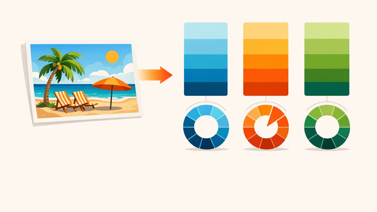
Beach photos are a cheat code for color harmony. Even casual snapshots tend to include a naturally pleasing gradient—sky to horizon to water to shoreline—plus accents like umbrellas, towels, and beachwear. That makes them perfect when you want to find analogous hues from vacation beach pictures and build palettes that feel calm, coastal, and cohesive.
This guide explains what “analogous” really means, how to extract color reliably from real photos (not just “whatever looks nice”), and how to turn those hues into usable palettes for design, interiors, social posts, and brand systems.
Analogous palettes don’t shout. They flow. That’s why beach scenes—already full of soft transitions—are ideal source material.
What are analogous hues (and why beaches make them easy)?
Analogous hues are colors that sit next to each other on the color wheel—typically within a range of about 30° to 90° of hue. Instead of high contrast (like complementary colors), analogous palettes emphasize smooth transitions and a shared “temperature.”
Beach pictures usually contain a natural analogous run such as:
- Blue → blue-green → green (sky, water, shallow shoreline)
- Yellow → yellow-orange → orange (sunlight, sand, warm reflections)
- Blue → violet-blue → violet (evening sky, shadows, dusk)
The goal isn’t to use every color in the photo. The goal is to pick a single “hue neighborhood” and then build a palette with a few supporting values (lighter/darker versions) so it’s usable across layouts.
Step 1: Choose the moment you want the palette to feel like
Before sampling any pixels, decide what you want the palette to communicate. Two photos of the same beach can produce wildly different schemes depending on time of day and exposure.
- Midday bright: cleaner blues, higher saturation, sharper contrasts
- Golden hour: warmer sand tones, peach highlights, softer shadows
- Overcast/coastal fog: muted blue-grays, low saturation, minimal contrast
Write a one-line intent (it helps you avoid random sampling): “Calm, airy coastal for a wellness landing page” or “Warm, nostalgic beach trip for a scrapbook spread”.
Step 2: Pick a hue lane (don’t sample everywhere)
To find analogous hues from vacation beach pictures, you need to avoid mixing hue families. A common mistake is sampling sand (orange) plus ocean (cyan) plus a red umbrella—those are not analogous, and the palette becomes chaotic.
Choose one lane:
- Coastal cool: cyan → teal → sea-green
- Sun-washed warm: butter yellow → sand → soft terracotta
- Dusk drift: periwinkle → indigo → violet-gray
If your beach picture includes a strong accent (like coral swimwear), you can still keep the palette analogous by making that accent a tint or shade within the same hue lane (for example, coral becomes a low-saturation peach if your lane is warm).
Step 3: Sample correctly—avoid highlights and deep shadows
Real-world photos have lighting artifacts that can trick your palette:
- Specular highlights (sun glitter on water) often read as near-white and skew your palette toward washed-out values.
- Deep shadows (under umbrellas, rocks) skew blue/purple and may not represent the “true” local color.
- Auto HDR can create halos that aren’t present to the eye.
Instead, sample from midtones where color is stable:
- For ocean: sample areas without sun sparkles, about 1/3 down from the horizon.
- For sand: sample flat regions with minimal footprints and minimal glare.
- For sky: sample away from the sun and away from the very top edge (which may be over-saturated by phone processing).
Step 4: Build a 5-color analogous palette (most useful format)
A practical analogous palette usually needs:
- 1 anchor color (your main hue)
- 2 supporting neighbors (adjacent hues)
- 1 light neutral (background-friendly, often sand/sky tint)
- 1 dark neutral (text/contrast, often deep ocean/shadow)
This produces harmony without sacrificing usability. Many “pretty palettes” fail because they have no reliable dark value for typography.
Example: “Coastal Cool” from a typical beach shot
Imagine a photo with pale sky, turquoise shallows, deeper teal water, and cool-toned shadows in sand. A usable analogous set could look like:
- Anchor: Teal water
#1FA6A1 - Neighbor 1: Cyan shallows
#4CC7D6 - Neighbor 2: Sea green
#2FBF8F - Light neutral: Hazy sky
#D9F0F4 - Dark neutral: Deep water
#0B3B46
Notice how the neutrals still belong to the same temperature family—cool and airy—so the palette stays cohesive.
Quick reference table: beach elements and likely hue ranges
| Photo element | Typical hue direction | Sampling tip | Example HEX |
|---|---|---|---|
| Clear sky | Blue to cyan | Sample away from sun glare | #9AD7F5 |
| Horizon haze | Blue-gray | Pick midtone haze, not pure white | #B7C9D3 |
| Shallow water | Cyan to aqua | Avoid sparkles; sample flat ripples | #4CC7D6 |
| Deep water | Teal to blue-green | Sample where water is least reflective | #0B3B46 |
| Dry sand | Yellow to yellow-orange | Avoid overexposed sun patches | #E6D3A8 |
| Wet sand | Muted warm brown | Sample near waterline gradients | #BFA57C |
Step 5: Confirm “analogous” using HSL (not just HEX)
HEX is great for implementation, but to validate an analogous palette you should look at Hue in HSL/HSB. Two colors can look related yet be farther apart in hue than you expect (especially when saturation is low).
A simple rule of thumb:
- Pick an anchor hue (e.g., 190° for teal).
- Keep other palette hues within about ±30° of that anchor for a tight analogous scheme.
- Let lightness vary more than hue (that’s what makes it usable for UI and layouts).
Mini-check in code (optional)
If you want a quick way to sanity-check hue distance, here’s a small Python snippet that converts HEX to HSL and prints hue values:
import colorsys

def hex_to_hsl(hex_color):
    hex_color = hex_color.lstrip('#')
    r = int(hex_color[0:2], 16) / 255.0
    g = int(hex_color[2:4], 16) / 255.0
    b = int(hex_color[4:6], 16) / 255.0
    h, l, s = colorsys.rgb_to_hls(r, g, b)
    return (h * 360, s * 100, l * 100)

palette = ["#1FA6A1", "#4CC7D6", "#2FBF8F", "#D9F0F4", "#0B3B46"]
for c in palette:
    h, s, l = hex_to_hsl(c)
    print(c, "Hue:", round(h), "Sat:", round(s), "Light:", round(l))
In a well-behaved analogous set, the hues for the core colors cluster closely (your neutrals may drift slightly, especially if they’re desaturated).
Step 6: Create variations for real projects (tints, shades, and roles)
One palette is rarely enough. You usually need a small system: background, surface, border, text, and accent states. Keep the hue lane consistent and create:
- Tints (add white / increase lightness) for backgrounds and cards
- Shades (add black / decrease lightness) for headers and text
- Muted versions (reduce saturation) for large UI areas
Practical role mapping (example):
- Background: light neutral (sky tint)
- Primary: anchor teal
- Secondary: neighbor cyan
- Success/info: sea green neighbor
- Text: dark neutral (deep water)
Common mistakes when you try to find analogous hues from vacation beach pictures
- Sampling JPEG artifacts: zoom in and avoid edge halos around objects.
- Accidentally building a complementary palette: sand (orange) + water (cyan) is often near-complementary. Beautiful, yes—but not analogous.
- Ignoring white balance: if the photo is too warm/cool, correct it first or sample from a version with more neutral balance.
- No contrast planning: a palette of five midtones is hard to use. Include at least one very light and one very dark value.
Workflow: from beach photo to palette in under 10 minutes
- Pick one photo that matches your intent (midday, golden hour, fog).
- Decide your hue lane (cool coastal, warm sand, dusk).
- Sample 8–12 candidates from midtones (sky/water/sand within the lane).
- Narrow to 3 core hues that sit close together on the hue wheel.
- Add 2 neutrals (light + dark) that match the palette temperature.
- Assign roles (background, primary, secondary, text).
- Export or document HEX plus HSL/HSB for easier editing later.
When to break the rules (strategic accents)
Analogous palettes can feel too quiet in certain contexts (CTA buttons, posters, event flyers). If you need a focal point, you can add one controlled accent outside the lane—just keep it intentional:
- Use a beach umbrella color as a single CTA, while everything else remains analogous.
- Keep accent usage under 5–10% of the layout area.
- Make sure the accent still matches the photo’s mood (avoid neon if the photo is muted).
Final tip: make your palette traceable
When your palette comes from a memory, it’s valuable to keep a reference back to the source: note the location, time of day, and the specific areas sampled (e.g., “water midtone near shoreline”). This helps you recreate variations later and keeps your color decisions grounded in something real—not arbitrary.
If you prefer doing this on iPhone or iPad, a photo color picker like Color Viewfinder can help you sample and organize values (HEX/RGB/HSL/HSB) quickly, then export palettes when you’re ready to use them.
