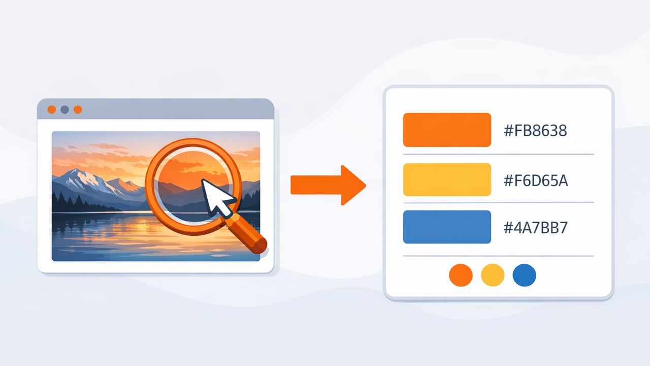
Whether you’re designing a logo, matching a paint swatch, or building a UI theme, being able to find color codes from image files is one of the fastest ways to move from inspiration to execution. The challenge is that images often contain lighting shifts, compression artifacts, and subtle gradients—so “picking a color” can produce results that don’t match what you intended.
This guide walks through a practical, designer-friendly method to extract dependable color values (HEX, RGB, HSL/HSB), turn them into a palette, and apply them consistently across digital and physical projects.
What “color codes” actually mean (and when to use each)
When people say “color code,” they usually mean HEX (like #2F6FED). But you’ll also see RGB, HSL, and HSB/HSV. Each format is useful for different tasks.
| Format | Example | Best for | Watch out for |
|---|---|---|---|
| HEX | #2F6FED |
Web/UI specs, brand guidelines | Not intuitive for adjusting brightness/saturation |
| RGB | rgb(47, 111, 237) |
Screen-based color, dev handoff | Harder to edit by “feel” |
| HSL | hsl(219, 84%, 56%) |
Systematic palette building, tints/shades | Perceptual steps aren’t always uniform |
| HSB/HSV | hsb(219, 80%, 93%) |
Picking “vivid” colors, brightness control | Can diverge from print/paint expectations |
In most workflows, you’ll extract a few colors as HEX/RGB, then switch to HSL/HSB to refine a coherent palette.
Before you sample: set yourself up for accurate results
If you want to reliably find color codes from image sources, start by controlling the input. A tiny bit of prep dramatically improves accuracy.
1) Choose the right image (quality matters)
- Prefer high-resolution images over thumbnails. Small images can blur edges and shift color.
- Prefer PNG (or high-quality JPEG). Aggressive JPEG compression adds artifacts that confuse sampling.
- Avoid screenshots of compressed video when possible (streaming compression can shift tones).
2) Watch for lighting and white balance
Photos are not “pure color” records. Lighting temperature (warm indoor bulbs vs. cool daylight) and camera white balance can bias everything. If your goal is paint or material matching, try sampling from a photo taken in neutral daylight or compare multiple photos of the same object.
Rule of thumb: sample color from the area that represents the material’s “local color,” not from highlights, shadows, or specular reflections.
3) Calibrate expectations across screens
Even when you perfectly extract HEX values, different displays render color differently. For brand and UI work, consistency comes from using the same defined values everywhere. For interior and print, use extracted colors as a starting point, then validate with physical samples or print proofs.
A step-by-step method to find color codes from an image
Here’s a workflow you can use with any photo color picker tool or design program that supports sampling.
Step 1: Identify what you’re actually trying to capture
Most images contain multiple “layers” of color. Decide which category you need:
- Dominant colors: the big shapes and background tones (great for theming).
- Accent colors: small, high-contrast details (great for CTAs, highlights).
- Neutral supports: off-whites, grays, near-blacks (great for typography and spacing).
Step 2: Sample from multiple points, then average mentally (or by tool)
If you click a single pixel, you might capture noise or compression artifacts. Instead:
- Sample 3–7 points in the same region.
- Compare the values: are they close, or all over the place?
- If they vary, the region likely contains gradient/light falloff—move to a flatter area.
Many tools offer a “magnifier” and allow sampling a small area; this typically yields more stable results than a single pixel pick.
Step 3: Capture a small palette, not just one color
A usable palette usually includes:
- 1 primary (brand or dominant)
- 1 secondary (supporting hue)
- 1 accent (contrast/pop)
- 2–3 neutrals (background, surface, text)
This prevents the common issue where you extract a gorgeous color but have no supporting neutrals to make it work in real layouts.
Step 4: Sanity-check contrast (especially for UI)
For interfaces, color isn’t just aesthetics—it’s readability. After you find color codes from image samples, test at least these pairs:
- Text on background
- Button text on button fill
- Links on background
If contrast is weak, don’t abandon the color—adjust lightness (HSL) or brightness (HSB) while keeping hue consistent.
Common pitfalls (and how to fix them)
Pitfall: Sampling from highlights and shadows
Highlights are often tinted toward the light source (warm bulbs) and shadows toward ambient light (cool window light). Fix: sample from mid-tones and compare multiple points.
Pitfall: Edges and anti-aliasing
On logos and typography, edges contain blended pixels for smoothness, producing “in-between” colors. Fix: sample from the flat interior area, not the boundary.
Pitfall: JPEG banding and color noise
Compression can add subtle blocks of unexpected color. Fix: use higher-quality images or average across an area.
Pitfall: Transparent pixels
Some PNGs include transparency, and a picker may show composite colors depending on background. Fix: place the image on a solid background before sampling, or ensure your tool reports true pixel color.
Turn extracted colors into a system (not a random set)
After you find color codes from image sources, the next step is making them consistent and reusable.
1) Normalize your neutrals
Real-world photos often contain “dirty” neutrals (gray that leans green or magenta). That may look natural in a photo but messy in a UI. Consider creating:
- Neutral-0: background (near-white)
- Neutral-900: text (near-black)
- Neutral-100/200: borders and surfaces
2) Create tints and shades from your primary color
Using HSL/HSB, keep the hue similar while adjusting lightness/brightness. This gives you hover states, subtle backgrounds, and accessible variants.
3) Name colors by role (not by description)
Instead of “OceanBlue” and “SkyBlue,” use role-based names like:
- Primary, PrimaryHover, PrimarySubtle
- Surface, SurfaceAlt, Border
- Text, TextMuted
This makes it easier to swap colors later without rewriting every usage.
Export and use your colors (CSS example)
Once you’ve confirmed your palette, store it in a format that’s easy to reuse. Here’s a simple approach using CSS variables (design tokens):
:root {
  --color-primary: #2F6FED;
  --color-primary-hover: #245BD0;
  --color-accent: #F05A28;

  --color-bg: #FFFFFF;
  --color-surface: #F5F7FB;
  --color-border: #D7DCE5;

  --color-text: #121826;
  --color-text-muted: #4B5565;
}

.button {
  background: var(--color-primary);
  color: var(--color-bg);
  border: 1px solid var(--color-border);
}

.button:hover {
  background: var(--color-primary-hover);
}
If you’re working in tools like Figma, Sketch, or Adobe apps, the same idea applies: define styles/tokens once, then apply by role.
Examples: using image-based color picking in real projects
Graphic design (poster, social, brand moodboards)
- Extract 6–10 colors from a reference photo.
- Keep 2–3 as “hero” colors; turn the rest into neutrals or subtle backgrounds.
- Check how colors reproduce when exported (some neon-like colors clip on print).
Interior design (matching textiles, paint, decor)
- Sample fabric mid-tones, not sheen highlights.
- Create a palette that includes warm and cool neutrals to balance the room.
- Use extracted HEX/RGB as a guide, then validate with physical swatches.
Product/UI design (apps, dashboards, websites)
- Start with a photo that captures the desired “feel.”
- Extract a primary, then build a scale (50–900) using lightness steps.
- Run contrast checks before locking the system.
A quick checklist for dependable color picking
- Use a high-quality image (avoid tiny thumbnails).
- Sample mid-tones, not highlights/shadows.
- Pick multiple points in the same area.
- Build a palette (primary, secondary, accent, neutrals).
- Validate contrast for readable UI.
- Export as tokens (CSS variables, styles, swatches).
Final thoughts
The best results come when you treat image sampling as a starting measurement—then refine into a palette that’s consistent, accessible, and easy to reuse. With a repeatable workflow, you can confidently find color codes from image references and turn inspiration into a practical color system.
If you prefer doing this on iPhone or iPad, a dedicated color extraction app (such as Color Viewfinder) can speed up sampling, palette building, and exporting while you work from real-world photos.
