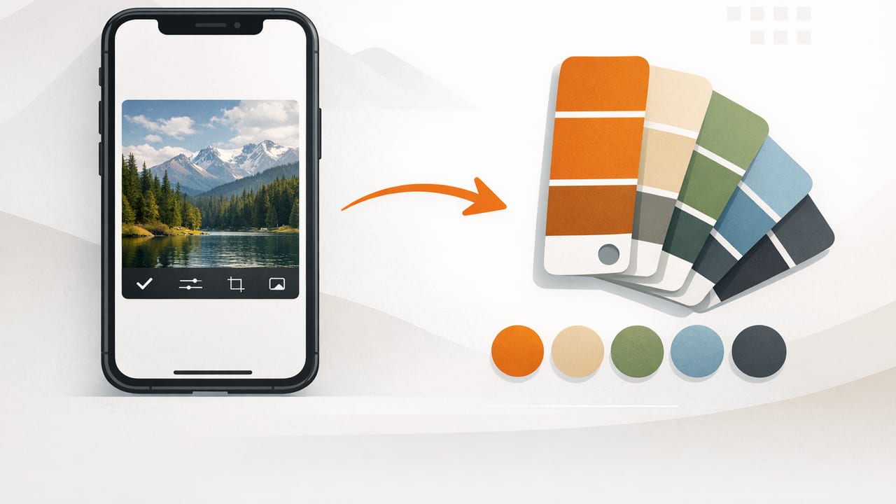
If you’ve ever tried to generate palette from photo iPhone for a logo, a room refresh, or a social template, you know the frustrating part isn’t finding one nice color—it’s turning a whole image into a usable palette. Photos contain thousands of pixels, mixed lighting, shadows, and reflections. Without a workflow, you end up with random swatches that don’t match the mood you saw in the scene.
This guide walks through a reliable, repeatable process: capturing a better source photo, extracting accurate color values (HEX/RGB/HSL/HSB), refining the palette for real design work, and exporting it in a format you can use across tools.
Why photo-based palettes often fail (and how to fix it)
Most “photo palette” attempts fail for one of these reasons:
- Bad lighting: warm bulbs, tinted windows, and mixed light sources shift colors.
- Too many similar midtones: your palette becomes five versions of the same beige.
- No hierarchy: there’s no clear primary, secondary, accent, and neutral.
- Uncontrolled contrast: colors look great together but fail for text legibility.
The fix is simple: treat palette generation like a mini design project—capture intentionally, sample with purpose, then edit for function.
Step 1: Capture (or choose) a photo that’s worth sampling
Your palette can only be as good as the input image. Before you extract colors, pick a photo with a clear “color story.”
Quick capture checklist on iPhone
- Prefer even lighting: cloudy daylight is ideal for realistic color.
- Avoid heavy filters: Instagram-style filters bake in color casts that may not translate to your project.
- Tap to set focus/exposure: reduce blown highlights that wash out lighter colors.
- Get close to the subject: less background noise = cleaner palette.
If you’re working from an existing image (Pinterest, a brand photo, a screenshot), choose the highest-quality version you can find. Compression artifacts can create “fake” edge colors that pollute your palette.
Step 2: Decide what the palette is for (so you sample the right way)
Before sampling anything, define the job your palette must do. This changes which pixels you should pick.
- Brand/graphic design: prioritize a distinct primary, a high-contrast text color, and 1–2 accents.
- Interior design: prioritize paint-like midtones, warm/cool balance, and a stable neutral.
- UI or templates: prioritize contrast ratios, readability, and consistent states (hover/active).
A good rule: a “pretty” palette is not automatically a “usable” palette.
Step 3: Extract colors with intention (not just auto-pick)
Most tools can auto-generate a palette, but you’ll get better results if you guide the sampling. Aim for a balanced set of roles:
- Primary: the dominant, most recognizable color.
- Secondary: supports the primary without competing.
- Accent: small doses, high energy (buttons, highlights, decor pops).
- Neutral light: backgrounds, negative space.
- Neutral dark: text, outlines, grounding contrast.
When sampling from the photo, avoid extreme highlight glare and deep shadow areas first. Sample from “representative” mid-areas where the material color is clearer.
Micro-technique: sample clusters, not single pixels
If your tool allows it, sample from a small area (or take multiple samples near each other) and choose the value that best represents the surface. Single pixels can be corrupted by noise or reflections—especially on fabric, foliage, or glossy objects.
Step 4: Understand the color values you’re collecting (HEX vs RGB vs HSL/HSB)
When you generate a palette from a photo on iPhone, you’ll usually see several color models. Here’s how to use them without getting lost:
| Model | Best for | What to watch out for |
|---|---|---|
| HEX (#RRGGBB) | Web design, sharing exact colors | Not intuitive for adjusting lightness/saturation |
| RGB (0–255) | Digital graphics, UI, video | Hard to tweak “warmth” or “mutedness” directly |
| HSL (Hue/Sat/Light) | Refining palettes; making lighter/darker variants | Lightness shifts can change perceived saturation |
| HSB/HSV (Hue/Sat/Brightness) | Choosing accents; controlling vividness | Brightness isn’t the same as perceived luminance |
Practical takeaway: extract in HEX/RGB for accuracy, then edit in HSL/HSB to build a coherent system.
Step 5: Refine your palette so it works everywhere
After extraction, do a quick cleanup pass. This is where “random swatches” become a real palette.
1) Remove duplicates and near-duplicates
If two colors differ only slightly (e.g., two similar warm grays), keep the one that plays nicer with your primary. A palette of five almost-identical tones is hard to use.
2) Balance warm vs cool
Photos often lean warm (indoor lighting) or cool (shade/overcast). If everything feels too yellow or too blue, gently adjust one neutral to bring balance back.
3) Build tints and shades (so you have flexibility)
Design systems usually need lighter and darker variants. Even for decor mood boards, having a “soft background” version helps. You can create variants by adjusting Lightness (HSL) or Brightness (HSB) while keeping hue stable.
4) Check contrast for text and UI
If the palette will be used for text, buttons, labels, or overlays, contrast matters. A quick sanity check:
- Pick your dark neutral and light neutral first.
- Ensure your primary can work as a background with readable text on top.
- Reserve low-contrast color pairs for large areas, not small typography.
Rule of thumb: If you have to squint to read it, the contrast isn’t strong enough for real use.
Step 6: Turn the palette into something you can actually use (export formats)
Once your palette is refined, export it in a format that fits your workflow. Common needs include:
- HEX list for web, developers, and quick sharing
- ASE (Adobe Swatch Exchange) for Adobe apps
- PNG/SVG palette cards for mood boards and presentations
- CSS variables for websites and design systems
Example: CSS variables from a photo-based palette
Here’s a simple way to operationalize your palette in a web project:
:root {
  --color-primary: #2F6F8E;
  --color-secondary: #D7A35C;
  --color-accent: #C4433C;
  --color-neutral-100: #F5F2ED;
  --color-neutral-900: #1E1E1E;
}

body {
  background: var(--color-neutral-100);
  color: var(--color-neutral-900);
}

.button {
  background: var(--color-primary);
  color: var(--color-neutral-100);
}

.button--accent {
  background: var(--color-accent);
}
Even if you’re not coding, thinking in “roles” (primary, accent, neutrals) makes your palette easier to apply in Canva, Figma, Procreate, or slide decks.
Common troubleshooting when you generate a palette from a photo on iPhone
Problem: “The colors look muddy compared to the photo”
- Try sampling from brighter midtones (avoid shadows).
- Increase saturation slightly on the accent color only.
- Add one crisp neutral (near-white or near-black) to restore clarity.
Problem: “Everything is too similar—no pop”
- Identify the smallest but most vivid detail in the photo (a sign, flower, lipstick, tile) and use it as an accent.
- Push hue slightly (5–15°) on the accent to separate it from the primary.
Problem: “The palette doesn’t match across screens”
- Work from the original image (not a screenshot of a compressed version).
- Keep brightness adjustments conservative; extreme tweaks magnify display differences.
- Test the palette on at least two devices (or in a couple apps) before finalizing.
A fast checklist you can reuse every time
- Choose a high-quality photo with clear lighting.
- Define the purpose (brand, room, UI, artwork).
- Extract colors by role: primary, secondary, accent, light neutral, dark neutral.
- Remove duplicates; balance warm/cool.
- Create 1–2 lighter/darker variants.
- Check basic contrast for readability.
- Export in the formats you’ll actually use.
Choosing an iPhone palette tool: what features matter most
Different apps emphasize different parts of the workflow. If your main goal is to generate a palette from a photo on iPhone and reuse it across projects, prioritize:
- Accurate sampling (magnifier/zoom and stable readings)
- Multiple color models (HEX, RGB, HSL, HSB)
- Palette organization (reorder, lock colors, label roles)
- Export options (shareable text, swatch formats, palette images)
- Layout views that help you judge harmony and contrast quickly
If you want a simple, photo-first workflow that focuses on extracting values and assembling palettes on iOS, Color Viewfinder is one option to explore at the end of your tool comparison.
