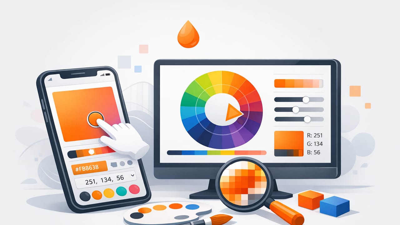
Picking color from a photo sounds simple: tap the pixel, copy the HEX code, use it in your project. In practice, it’s easy to end up with colors that look “off” once they land in a logo, website UI, mood board, or interior scheme. The reason is that photos are not neutral measurements of color—they’re interpretations shaped by lighting, camera processing, reflections, and screens.
This guide explains how to get more accurate, more usable color values from photos using a color picker app. You’ll learn what affects color accuracy, how to sample correctly, how to sanity-check your picks, and how to convert a handful of taps into a palette you can actually design with.
Why colors from photos often look wrong
Before talking tools, it helps to understand what you’re measuring. When you sample a pixel, you’re sampling the final rendered image—not the “true” paint, fabric dye, or printed ink. These are the most common reasons photo-picked colors drift from reality:
- Lighting temperature: Warm indoor bulbs push everything toward orange/yellow; shade pushes toward blue.
- Mixed lighting: Window light + overhead light creates multiple color casts in one scene.
- Auto white balance (AWB): Cameras “correct” the scene, sometimes aggressively.
- Exposure and HDR: Brightening shadows and compressing highlights changes perceived saturation.
- Specular highlights and reflections: Glossy surfaces borrow colors from their surroundings.
- Compression and sharpening: JPEG artifacts and edge enhancement can introduce false colors.
- Display differences: Your phone, tablet, and monitor may show the same photo differently.
The goal isn’t perfect scientific colorimetry. The goal is repeatable, design-ready picks that behave predictably across digital and print workflows.
What to look for in a color picker app
A good color picker app does more than show a HEX code. These features make photo sampling more accurate and more useful:
- Magnified sampling loupe: Lets you avoid edges, noise, and compression artifacts.
- Multiple color models: HEX/RGB for digital, plus HSL/HSB for adjusting hue and saturation intentionally.
- Palette building: Save multiple picks into a coherent set (not just one-off colors).
- Export formats: PNG/SVG for sharing, ASE for Adobe workflows, or simple text/CSV for handoff.
- Stable picking on-device: Smooth, responsive sampling makes it easier to capture consistent values.
Step-by-step workflow: extract colors that hold up in real projects
1) Choose the right photo (or take a better one)
If you control the photo, you control the output quality. Even small improvements here reduce “mystery shifts” later.
- Prefer soft, even lighting: Overcast daylight or diffused window light is easier to sample than direct sun.
- Avoid mixed lighting: If possible, turn off interior lights when using daylight, or block daylight when using warm lamps.
- Reduce reflections: For glossy surfaces, change the angle slightly so you’re not sampling glare.
- Use a neutral reference (optional but helpful): A gray card or even a white sheet of paper can help you judge whether the photo is warm/cool.
Practical rule: If the photo looks “moody” and warm, your sampled palette will too. That might be desirable—just don’t confuse it with the object’s true base color.
2) Sample the midtone, not the highlight or shadow
Most materials have a highlight (brighter, less saturated) and a shadow (darker, often cooler). If you sample either, you’ll get a color that doesn’t represent the material well.
- Best target: a midtone area with visible texture and minimal shine.
- Avoid: blown-out highlights (nearly white), deep shadows (nearly black), and edges where two colors blend.
If you need a robust color, take 3–5 samples across the surface and choose the value that feels most “central.” Many designers treat this like averaging without doing math.
3) Capture a small set of roles, not random colors
Palettes work when each color has a job. When you pick from photos, it’s tempting to grab every attractive pixel. Instead, pick with intention:
- Base: the dominant background or material color.
- Secondary: a supporting color that pairs with the base.
- Accent: a small, high-contrast color for calls-to-action or focal points.
- Neutral(s): off-white, warm gray, cool gray, near-black—critical for spacing and readability.
This structure works for UI design, brand systems, illustrations, and interior concepts. The photo provides inspiration; the roles make it usable.
How to sanity-check your picks (the fast way)
Check contrast for text and UI
A palette can be beautiful and still fail in practical layouts. Do a quick contrast check between your background and text candidates. If you don’t want a full accessibility deep dive, use a simple heuristic:
- Light background: keep body text near-black (not pure black unless you want a harsh look).
- Dark background: keep body text near-white (not pure white if you want softer contrast).
- Accent buttons: test the accent against both background and text colors.
If your accent is too close in brightness to the background, it won’t “pop” even if the hue differs.
Look at HSL/HSB to see what’s really happening
HEX is great for exactness but not for intuition. HSL/HSB helps you understand why a pick feels wrong:
- Hue: is it drifting warm/cool compared to what you intended?
- Saturation: camera processing can oversaturate; lowering saturation often makes palettes more flexible.
- Lightness/Brightness: small shifts can improve contrast without changing the “character” of the color.
HEX vs RGB vs HSL/HSB: when each value is useful
| Model | Best for | What to watch out for |
|---|---|---|
| HEX (e.g., #2F6F8E) | Web/UI specs, dev handoff, design tokens | Not intuitive for adjusting hue/saturation |
| RGB (e.g., 47, 111, 142) | Screen-based work, gradients, image workflows | Small numeric changes can be hard to predict visually |
| HSL | Systematic palette tuning, tints/shades | Perceptual uniformity isn’t perfect; still great for quick iteration |
| HSB/HSV | Illustration and creative adjustments | Brightness can be misleading vs perceived lightness |
Turn photo colors into a reusable palette (and keep it consistent)
Create tints and shades intentionally
One photo-derived HEX value rarely gives you enough range for real layouts. You usually need a small ramp: lighter tints for backgrounds, midtones for surfaces, and darker shades for borders and text.
A practical method:
- Pick a base color from the photo.
- Create 2 lighter tints by increasing lightness (or reducing saturation slightly).
- Create 2 darker shades by decreasing lightness (and often reducing saturation a little).
This yields a “family” that still feels like the photo, but behaves like a design system.
Example: store your palette as CSS variables
If your end goal is a website or app UI, translating your picks into tokens prevents drift and makes collaboration easier.
:root {
  --color-base:   #2F6F8E;
  --color-base-1: #3B7F9F; /* lighter */
  --color-base-2: #4B93B3; /* lightest */

  --color-ink:    #0F172A;
  --color-paper:  #F7F4EF;

  --color-accent: #E07A3F;
}

.button {
  background: var(--color-accent);
  color: var(--color-paper);
}
Even if you’re not coding, this mindset (naming colors by role) makes palettes easier to apply in Figma, Adobe apps, Canva, or presentation tools.
Common mistakes when using a color picker app (and how to avoid them)
Mistake 1: Sampling on the edge of two colors
Edges often contain anti-aliasing or compression noise—pixels that are blends of both colors. Use the magnifier and sample a clean interior area instead.
Mistake 2: Picking only saturated “pretty pixels”
Real projects need neutrals and supporting tones. If your palette has five saturated colors and no quiet backgrounds, it will feel chaotic fast.
Mistake 3: Treating the first pick as final truth
Photo sampling should be the start of the process. After you capture values, do small adjustments in HSL/HSB to improve contrast, reduce oversaturation, or align hues.
Mistake 4: Ignoring context
A color that looks perfect on a photo thumbnail may look wrong at full-page scale, next to typography, or under different device brightness. Always preview your palette in a simple layout.
Interior design vs graphic design: different goals, same sampling principles
Photo-based color picking works across creative disciplines, but success criteria differ:
- Interior design: you often want undertone accuracy (warm vs cool) and coordination with existing finishes. Sample midtones and compare multiple photos taken in different lighting.
- Graphic/brand design: you often want reproducibility and strong contrast for accessibility. Build ramps, define roles, and test palette combinations in UI components.
In both cases, a color picker app is most powerful when it helps you move from “inspiration” to “system.”
A quick checklist for better photo-to-palette results
- Use a well-lit, minimally filtered photo.
- Sample midtones; avoid glare and deep shadow.
- Take multiple samples and choose a representative value.
- Build a palette with roles: base, secondary, accent, neutrals.
- Check contrast and adjust saturation/lightness if needed.
- Save/export in a format your workflow actually uses.
Final thought
A color picker app can be one of the fastest ways to translate real-world inspiration into digital color systems—if you treat photos as a starting point, not a lab instrument. By choosing better source images, sampling the right areas, and converting picks into roles and ramps, you’ll get palettes that look cohesive on screens, in print, and in presentations.
If you’re looking for an iOS/iPadOS tool that extracts HEX/RGB/HSL/HSB values from photos and helps you organize and export palettes, Color Viewfinder is one option to explore.
