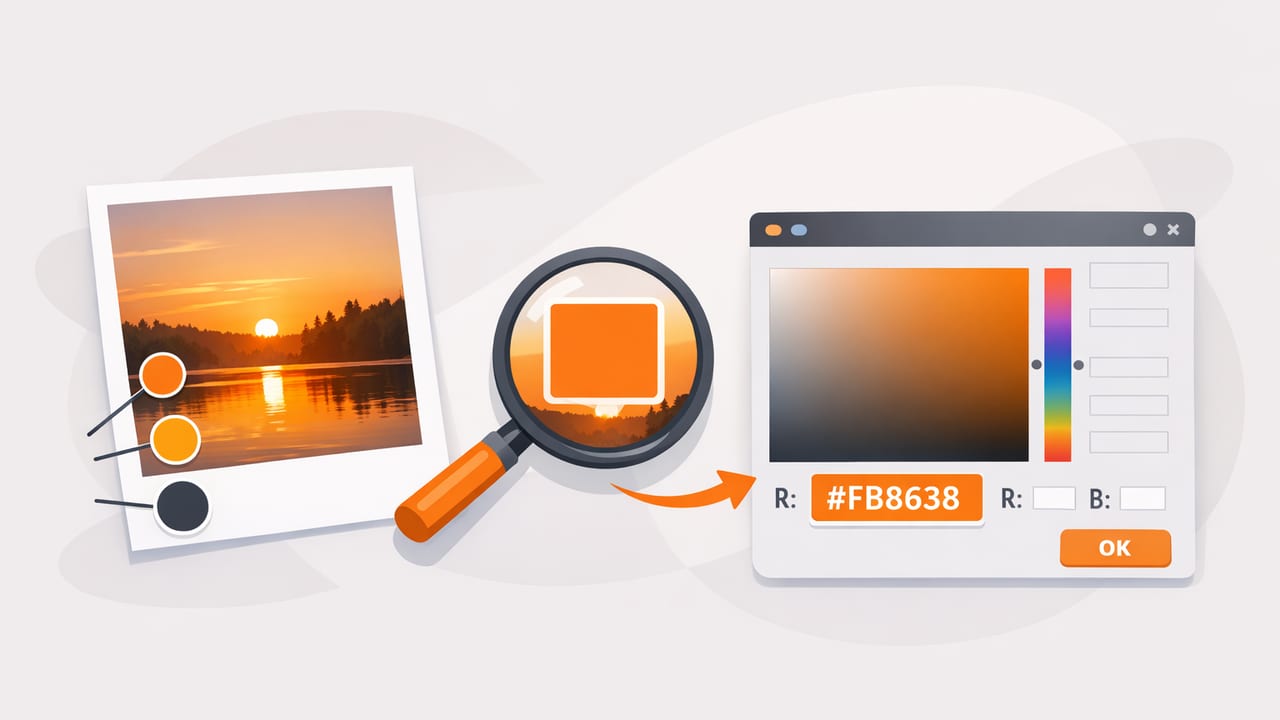
When you want a palette that feels real (and not like another template), pulling colors from photography is one of the fastest ways to get there. The challenge is accuracy: the same object can look warmer, cooler, brighter, or darker depending on lighting, camera processing, reflections, and compression. This guide shows a practical, repeatable way to get hex color from photo sources with fewer surprises, plus how to turn those samples into a palette you can actually use in a design system, a brand board, or an interior mood board.
What HEX color codes actually represent
A HEX code is a compact way to store an RGB color using hexadecimal notation. For example, #1F2A44 means the color is made from three channels: red, green, and blue. Most digital design tools accept HEX because it is short, easy to copy, and unambiguous.
However, a camera photo is not a single, fixed truth. Your phone applies automatic processing (white balance, tone mapping, sharpening, noise reduction), and those decisions affect the pixel values you sample. That is why accurate results depend more on workflow than on any single tool.
Before you sample: what makes photo colors inaccurate
If you have ever sampled a wall paint color and ended up with a HEX that looks wrong on screen, it usually comes down to one (or more) of these factors:
- Lighting temperature: warm indoor bulbs push colors toward yellow/orange; shade pushes toward blue.
- Mixed light sources: window daylight plus overhead bulbs creates inconsistent color across the same surface.
- Specular highlights: glossy surfaces create bright reflections that are not the material color.
- Shadows: darker areas shift saturation and perceived hue.
- Auto white balance and HDR: phones adjust color dynamically, sometimes per area of the image.
- Compression: heavily compressed images can introduce banding and color shifts.
A step-by-step workflow to get HEX color from photo reliably
Use this workflow whether you are sampling a poster, fabric, packaging, a landscape, or a room photo.
1) Start with the best source image you can
- Prefer original photos over screenshots from social apps (which often compress and alter colors).
- Use good light: soft daylight is usually the most neutral. Avoid strong color casts.
- Turn off filters and avoid portrait enhancements or beauty modes that can shift tones.
- Stabilize exposure if possible (tap-and-hold exposure lock on many camera apps) so the camera does not re-interpret the scene.
2) Decide what you are sampling: material color vs. lighting mood
There are two valid goals, and they produce different HEX codes:
- Material sampling (what the object is): you want to minimize lighting effects and sample midtones.
- Mood sampling (what the photo feels like): you intentionally include the warm/cool cast and contrast.
Write your goal down before you start. It prevents endless tweaking later.
3) Sample multiple points, not one pixel
One pixel is rarely representative. Instead:
- Pick a target area (for example, a wall, a brand mark, a sweater fabric).
- Sample 5 to 10 points across that area, avoiding highlights and deep shadows.
- Compare the values and choose a median-like result (or average them if your tool supports it).
This reduces the chance that you captured a reflection, noise, or an edge artifact.
4) Capture a balanced palette: base, accents, neutrals
If your end goal is a usable palette (not just a list of pretty colors), sample with intent:
- 1 to 2 base colors: dominant midtones that can cover large areas (backgrounds, walls, sections).
- 2 to 3 accents: saturated or distinctive colors for CTAs, decor highlights, or headings.
- 2 to 3 neutrals: off-whites, warm grays, charcoal, near-black. These make palettes functional.
5) Validate on a neutral background
After sampling, place the colors on both white and dark gray backgrounds. Colors can look very different depending on surroundings (simultaneous contrast). If an accent looks too neon on white, consider sampling a slightly darker nearby pixel cluster or reducing saturation in HSL/HSB.
Quick reference: when to use HEX vs RGB vs HSL vs HSB
| Format | Best for | Why it helps |
|---|---|---|
| HEX | UI specs, handoff notes, CSS | Compact, copy/paste friendly |
| RGB | Digital imaging, precise channel edits | Matches how screens emit light |
| HSL | Making tints/shades systematically | Easier to adjust lightness consistently |
| HSB/HSV | Picking color families quickly | Intuitive brightness and saturation control |
Common mistakes (and how to fix them)
Mistake: sampling from highlights
Symptom: the HEX is too pale or washed out. Fix: sample midtones, not the brightest pixels. Highlights often include the light source color (and reflections), not the object.
Mistake: sampling from shadow edges
Symptom: colors come out muddy or gray. Fix: avoid edges where anti-aliasing and shadow gradients change pixels rapidly.
Mistake: expecting paint accuracy from a photo
Symptom: the HEX looks right on screen but does not match real paint. Fix: treat photo-derived HEX as a direction. For physical products, confirm with manufacturer swatches or a color matching service.
Mistake: building a palette with no neutrals
Symptom: the palette is pretty but unusable for layouts. Fix: always extract at least one light neutral and one dark neutral from the photo (or add them deliberately).
Turn sampled colors into a usable system
Once you have 6 to 10 samples, reduce them into roles. This makes the palette easy to apply consistently across screens or rooms.
- Primary: the most recognizable brand or focal color.
- Secondary: supports primary and adds variety.
- Background: light neutral (or dark neutral for dark mode).
- Surface: cards, panels, trims (usually slightly different from background).
- Text: near-black or near-white for readability.
- Accent: limited-use highlight for emphasis.
Good palettes are not just collections of colors. They are decisions about contrast, hierarchy, and repetition.
Accessibility check: do your HEX pairs have enough contrast?
If your colors are going into UI or anything that must be readable, contrast matters. A quick process:
- Test text color against background color using a contrast checker (WCAG guidance is a common baseline).
- If contrast is low, do not immediately change hue. First, adjust lightness/brightness in small increments.
- Create two versions of the same color: accent (original) and accent-strong (darker for text or buttons).
This approach preserves the photo inspiration while making the palette functional.
Optional: convert sampled RGB values to HEX (tiny code helper)
Some tools show RGB first. If you ever need a quick conversion, here is a simple JavaScript snippet:
function rgbToHex(r, g, b) {
  const toHex = (n) => n.toString(16).padStart(2, '0');
  return '#' + toHex(r) + toHex(g) + toHex(b);
}

// Example:
// rgbToHex(31, 42, 68) returns '#1f2a44'
For design work, keep in mind that rounding can slightly change results if your RGB values are not integers.
Practical examples: using photo-derived HEX in real projects
Example 1: brand mood board from packaging
Sample the dominant label color as primary, a secondary from a small graphic element, and two neutrals from the background material. Then create one darker variant of the primary for buttons and headlines. This keeps the brand consistent while ensuring readable UI.
Example 2: interior palette from a room photo
Sample a wall midtone for base, a wood tone for warmth, a textile accent for personality, and a shadow-neutral for trim or metal finishes. If the room is shot at sunset, decide whether you want that warmth in the palette (mood sampling) or whether you want to neutralize it (material sampling).
FAQ: getting HEX colors from photos
How many colors should I extract from one photo?
Start with 6 to 10. Then reduce to 4 to 6 roles. Too many extracted colors can look like noise rather than a system.
Why does the sampled HEX look different in another app?
Color management and display differences matter. Two devices can show the same HEX differently due to calibration, True Tone-like features, or display profiles. For critical work, test on multiple screens.
Can I trust a HEX sampled from a social media image?
You can use it for inspiration, but expect compression and color shifts. If accuracy matters, try to find the original upload or a higher-quality source.
Putting it all together
To get hex color from photo sources accurately, focus on three things: capture a clean image, sample multiple midtone points, and convert the raw samples into a small set of roles with contrast checks. That workflow gives you colors that feel grounded in the real world while still behaving well in design systems and layouts.
If you prefer doing this directly on iPhone or iPad, an app like Color Viewfinder can help you sample colors from photos and organize them into palettes for export.
