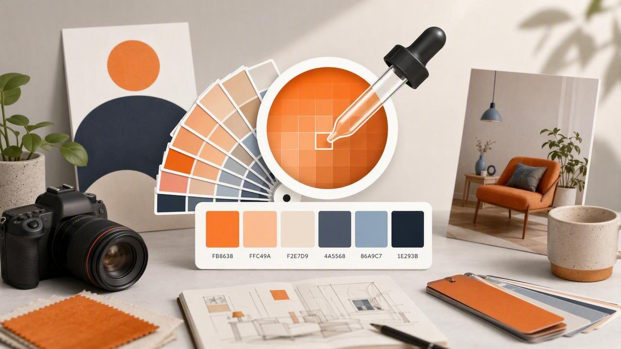
Color inspiration can appear anywhere: in a painted wall, a fabric sample, a product package, a sunset, or a photo saved to your phone. The challenge is turning that visual inspiration into a portable color reference you can use later in graphic design, interior design, branding, or other creative projects.
A HEX color finder makes this process faster and more reliable. Instead of trying to remember a shade or estimate it by eye, you can sample colors from an image, save their digital values, organize them into a palette, and share them with collaborators. The result is a repeatable color workflow that travels with you.
This guide explains how to get portable color references with a HEX color finder, which color values to save, how to avoid sampling errors, and how to turn everyday images into practical design tools.
What Is a Portable Color Reference?
A portable color reference is a saved color record that can be accessed outside the original source. Rather than relying on a physical object, a screenshot, or your memory, you keep the color as a digital value and a visual swatch.
For example, if you see a muted green tile in a café, a portable reference may include:
- A photo showing the tile in context
- A sampled color swatch
- A HEX value such as #6F7B67
- RGB, HSL, or HSB values for design software
- A descriptive label such as sage tile, north wall
- Notes about lighting, finish, brand, or location
This information is useful because color is rarely used in isolation. A swatch without context can be misleading, especially when you revisit a project days or weeks later. Saving both the color value and its source gives you a more dependable reference.
Why HEX Values Work So Well for Color References
HEX is a compact color notation used widely in web design, user interface design, graphic design, and digital creative work. A six-character HEX code represents the red, green, and blue components of a screen color.
#RRGGBB
#C86B52
In the example above, C8 represents red, 6B represents green, and 52 represents blue. Because the format is easy to copy, paste, save, and share, it is ideal for portable references.
| Color Format | Best Use | Example |
|---|---|---|
| HEX | Web, UI, digital handoff, quick sharing | #C86B52 |
| RGB | Screen-based design and software controls | 200, 107, 82 |
| HSL | Adjusting hue, saturation, and lightness | 13°, 52%, 55% |
| HSB/HSV | Visual color selection and brightness adjustments | 13°, 59%, 78% |
Although HEX is especially useful for digital work, saving multiple color formats gives your reference more flexibility. A graphic designer may need HEX for a website, while an interior designer may find HSB or HSL easier when comparing the brightness and intensity of paint, furniture, and textiles.
How to Get Portable Color References Step by Step
1. Capture a Clear Source Image
Start with the best image you can obtain. Take a photo in even lighting, avoid heavy filters, and make sure the object fills enough of the frame for accurate sampling. If possible, photograph the same surface from more than one angle or at different times of day.
Lighting changes how colors appear. Warm indoor bulbs can make whites look yellow, while shaded outdoor light can make neutral materials appear blue or gray. A color extracted from a photo is a valuable visual reference, but it is not always a guaranteed match for physical paint, fabric, or print.
2. Sample More Than One Point
Do not assume that one tap produces the complete answer. Textured, reflective, and natural materials often contain several related colors. Wood grain, stone, woven fabric, and shadows can all affect the sampled value.
Sample at least three areas when working with a complex surface:
- Highlight: the brightest visible area
- Midtone: the most representative main color
- Shadow: the darkest area or natural depth
This produces a more useful palette than a single isolated color. It also helps you distinguish the actual material color from a temporary lighting effect.
3. Choose the Representative HEX Color
For most projects, the midtone is the best primary reference. It usually reflects the color people perceive as the object’s overall color. Save the highlight and shadow colors as supporting swatches, particularly when you want to recreate depth in a digital illustration, presentation, or interior mood board.
If the image includes visible glare, avoid sampling directly from it. Bright reflections may be nearly white regardless of the material beneath them. Likewise, avoid deep cast shadows unless the shadow color itself is relevant to the project.
4. Name Every Swatch Clearly
A collection of unlabeled HEX codes becomes difficult to use very quickly. Give each saved reference a name that explains where it came from and how it may be used.
- Terracotta vase — main tone — #B86149
- Living room rug — warm beige — #C9B69B
- Brand inspiration — deep navy — #1F3557
- Kitchen tile — cool sage — #778274
A good label reduces guesswork when you are building color palettes later. For professional work, add a project name, room name, client name, or date when appropriate.
5. Save Colors as a Small, Purposeful Palette
Portable references are most useful when they are organized. Instead of saving dozens of unrelated swatches, build compact palettes around a clear visual purpose. A five-color palette is often enough for a first concept.
A practical palette structure includes:
- One dominant color
- One or two supporting colors
- One neutral
- One dark contrast color
- An optional accent color
This approach works for website mockups, social media templates, room concepts, packaging ideas, and presentation decks. It also makes it easier to see whether a sampled color belongs in the final design or simply served as inspiration.
Use Context to Make Color Extraction More Accurate
Color extraction tools can identify pixel values accurately, but the pixels in a photo are affected by camera settings, image compression, white balance, and surrounding colors. For that reason, a HEX color finder should be treated as a starting point for visual decision-making rather than a substitute for physical verification.
Helpful rule: Use extracted HEX values for digital consistency, then verify important physical color decisions with real-world samples.
This distinction matters most in interior design. If you are selecting wall paint, upholstery, flooring, or cabinetry, use your extracted palette to communicate mood and direction. Then compare paint chips, material samples, and finishes in the actual space before purchasing.
For graphic design, the workflow is often more direct. A sampled HEX value can move from a photo into a design file, website stylesheet, or digital brand board with minimal translation. Still, review the color on the intended screen and consider accessibility before finalizing it.
Build a Portable Reference Library for Different Projects
A color library becomes more powerful when it is organized by use case. Create separate folders, albums, or palette groups instead of keeping every extracted color in one long list.
For Graphic Design
Group colors by client, campaign, brand direction, or season. Include primary, secondary, neutral, and accent colors. If you work across web and print, note that screen HEX values may need CMYK or Pantone conversions for production.
For Interior Design
Organize by room, finish, or material type. Keep palettes for paint, flooring, metals, textiles, wood tones, and decorative accents. Include photos that show the material in its environment so you can compare undertones more effectively.
For Personal Creative Projects
Create quick collections for travel photos, nature references, wardrobe ideas, illustration prompts, and event styling. Over time, these saved palettes can reveal preferences you may not notice otherwise, such as a consistent attraction to dusty blues, warm neutrals, or high-contrast combinations.
Check Contrast Before Using Sampled Colors in Digital Design
A beautiful extracted color is not automatically suitable for text, buttons, or interfaces. When a palette will be used on a website, app, or digital document, test contrast between foreground and background colors.
For instance, light gray text on a pale beige background may match an elegant photo reference but remain difficult to read. Use a darker text color, increase contrast, or reserve subtle colors for decorative areas rather than essential information.
Consider these quick checks:
- Can body text be read comfortably at normal size?
- Are buttons visually distinct from their backgrounds?
- Do links remain identifiable without relying only on color?
- Will the palette still work on bright and dim screens?
Portable color references should support both visual style and practical usability.
Common Mistakes to Avoid
- Sampling filtered images: Social media filters can substantially alter the original color.
- Ignoring white balance: A camera may shift a neutral surface toward blue, yellow, green, or magenta.
- Saving only a HEX code: Keep the source photo and a descriptive label as well.
- Using too many colors: A smaller palette is easier to apply consistently.
- Assuming screen color equals physical color: Always verify paint, print, and material selections in person.
Make Color Inspiration Available Wherever You Work
The real advantage of a portable color reference is continuity. You can notice a color in the real world, capture it immediately, and bring it into your next project without losing the original idea. Whether you are planning a room, designing a logo, creating a mood board, or collecting visual inspiration, saved HEX values turn fleeting observations into usable assets.
A dedicated mobile color extraction tool can simplify this process by letting you sample colors from photos, view HEX, RGB, HSL, and HSB values, and export organized palettes. For iPhone and iPad users, Color Viewfinder is one option for building and carrying those references from inspiration to project work.
