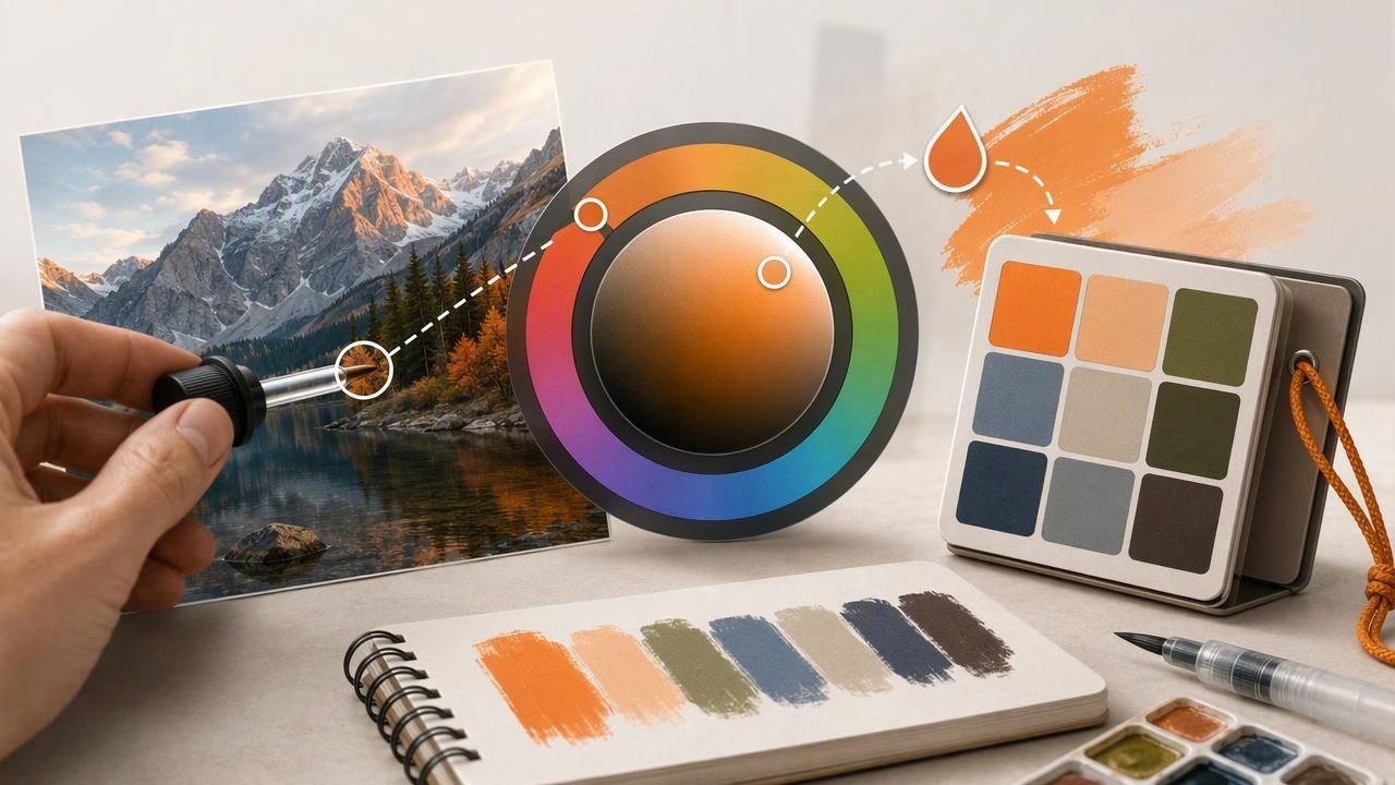
Creative work rarely happens in one place. A graphic designer may spot an inspiring storefront on the way to work, while an interior designer may need to match a fabric swatch during a client visit. In both cases, remembering a color by eye is unreliable. A portable system for capturing, organizing, and sharing color information makes it easier to turn visual inspiration into a usable design decision.
Learning how to get portable color references with an HSB color picker helps you record colors in a format that is easy to understand, compare, and reuse. Instead of saving a photo and hoping to identify the right shade later, you can sample the image, save exact values, and build a palette that travels with you from the field to your desktop workflow.
Why Portable Color References Matter
A portable color reference is more than a screenshot or a collection of saved images. It is a documented color record that includes measurable values such as HSB, HEX, RGB, or HSL. These values make a color repeatable across digital mockups, social graphics, presentations, mood boards, and other creative projects.
Without a portable reference, teams often describe colors using vague language: “warm blue,” “soft green,” or “a little more muted.” Those descriptions can be useful at the concept stage, but they do not provide enough precision for production. A saved HSB value gives collaborators a shared starting point and makes later adjustments easier to explain.
Good color documentation turns a fleeting visual observation into a repeatable design asset.
Portable references are especially valuable when you work across locations, devices, and disciplines. You can capture a wall color on-site, refine the palette on an iPad, and share values with a graphic designer or client without relying on memory alone.
Understanding HSB for Practical Color Sampling
HSB stands for Hue, Saturation, and Brightness. It describes color in a way that often feels more intuitive than RGB because it separates the basic color family from its intensity and lightness.
- Hue identifies the color family on a 0–360 degree wheel, such as red, blue, green, or orange.
- Saturation measures the strength of the color from 0% gray to 100% vivid color.
- Brightness measures how light or dark the color appears from 0% black to 100% full brightness.
For example, a muted teal and a vivid turquoise may have similar hue values but very different saturation levels. An HSB color picker lets you see that relationship immediately. This makes HSB particularly helpful when you want to preserve the mood of a color while making intentional adjustments for a layout, room scheme, or brand system.
HSB is sometimes called HSV, with “Value” used in place of “Brightness.” The names vary by software, but both models describe color through hue, saturation, and a lightness-related third value. Always check how your chosen design tool labels and converts the values before final production.
What Makes a Color Reference Truly Portable?
Portability is not only about using a phone. A useful color reference should be easy to retrieve, clear enough to interpret, and flexible enough to export or recreate in other tools. When evaluating a mobile app or color workflow, look for these essentials:
- Image-based sampling: Capture colors from photographs, screenshots, artwork, or camera images.
- Multiple color formats: Keep HSB alongside HEX and RGB so the reference works in different environments.
- Palette organization: Group related colors by project, client, room, campaign, or theme.
- Visual context: Save the original source image or a note explaining where the sample came from.
- Export options: Move palettes into design software, share a file, or send values to collaborators.
A single sampled color is useful, but a palette is usually more valuable. Color relationships determine whether a scheme feels calm, energetic, elegant, balanced, or visually confusing. Save surrounding colors from the source image so you can preserve those relationships later.
A Step-by-Step Workflow for Capturing Color on the Go
1. Start with a strong source image
Take a sharp, evenly lit photograph whenever possible. Reflections, shadows, compressed images, and extreme camera filters can alter the sampled result. If you are photographing a physical object, take several images from slightly different angles and compare the values. The goal is not always to find one mathematically perfect pixel; it is to identify a dependable color range.
2. Sample more than one point
Natural materials and printed surfaces rarely have one uniform color. Wood grain, textiles, painted walls, flowers, and even flat digital gradients can contain subtle variation. Sample a highlight, middle area, and shadow area. This gives you a more realistic reference and prevents you from selecting an accidental glare spot or dark edge.
3. Record HSB, then save HEX and RGB
Use HSB to evaluate the personality of the color. Ask whether the hue is correct, whether the saturation fits the intended mood, and whether brightness will work against nearby colors. Then save the HEX value for web and interface work and RGB values for many screen-based design tools.
| Color Format | Best Use | Example |
|---|---|---|
| HSB | Comparing hue, intensity, and brightness | H 196°, S 58%, B 72% |
| HEX | Web design, CSS, and digital handoff | #4A9BB8 |
| RGB | Screen-based graphics and image editing | RGB 74, 155, 184 |
| HSL | CSS adjustments and color-system exploration | HSL 196, 44%, 51% |
4. Add a meaningful label
Labels prevent your palette library from becoming a list of anonymous swatches. Use names that explain the color’s role or origin, such as “Hotel lobby brass,” “Spring campaign background,” “Client kitchen tile,” or “Ocean reference - midtone.” Include a short note when lighting conditions or material finish could affect the sample.
5. Build a usable palette around the key color
After sampling a hero color, add neutrals, supporting tones, and contrast options. A practical portable palette often includes a dominant color, a secondary color, one or two accents, a light neutral, and a dark neutral. This gives you enough flexibility to begin a composition without creating an overly rigid system.
Using HSB Values to Adjust a Palette Intentionally
The major advantage of HSB is that it helps you edit colors without losing sight of what changed. Rather than randomly dragging sliders, modify one attribute at a time and compare the result.
- Lower saturation to make a vivid reference feel more refined, natural, or understated.
- Raise brightness for a softer background color or reduce it for stronger visual weight.
- Shift hue slightly to create a related supporting color while maintaining a cohesive palette.
For example, imagine you capture a bright terracotta tile. Its original HSB value might be H 15°, S 76%, B 82%. For a large background area, reducing saturation to 45% can create a quieter clay tone. For small buttons, headings, or decorative accents, the original saturated sample may remain more effective.
This approach is useful because color does not exist in isolation. A color that looks balanced on a phone screen may appear overpowering when used across an entire webpage or large interior surface. Portable references provide the starting data; thoughtful testing determines the final application.
Common Color Sampling Mistakes to Avoid
Even the best color picker cannot completely solve issues created by poor source material or inconsistent output conditions. Avoid these common mistakes when collecting portable color references:
- Sampling highlights: Bright reflections can produce washed-out values that are not representative of the actual material.
- Ignoring display differences: Phone, tablet, and desktop displays can show the same color differently because of brightness settings and color profiles.
- Using a photo as physical paint proof: A digital sample is an excellent guide, but it is not a replacement for physical paint, textile, or print testing.
- Saving only one format: HSB is excellent for adjustment, but HEX and RGB are often needed for implementation.
- Forgetting accessibility: Check contrast before using sampled colors for text, controls, and essential information.
For digital interfaces, test foreground and background combinations early. A beautiful low-contrast palette can still be difficult to read. Consider a darker or less saturated variation of the sampled hue when the original does not provide enough contrast.
Turning Saved Colors Into Design-Ready Assets
Once you have collected a palette, convert it into a simple specification that can be used in a project. For web work, HEX values can be stored as CSS custom properties:
:root {
  --ocean-mid: #4A9BB8;
  --sand-light: #E8DDCC;
  --charcoal: #263238;
}
For interior design, a palette sheet can include a source photo, the HSB and RGB values, a material note, and a space for physical sample references. For graphic design, add each swatch to a document library and note its intended function, such as background, headline, accent, or border.
Keep one master version of each palette and update it only when changes are approved. This small habit prevents different team members from working from slightly different blues, greens, or neutrals.
A Simple Portable Color Reference Checklist
- Capture the source image in good lighting.
- Sample multiple areas rather than one isolated pixel.
- Save HSB values for intuitive editing and comparison.
- Store HEX and RGB values for production handoff.
- Label each color with its project role or source.
- Group swatches into palettes, not disconnected collections.
- Test contrast, materials, and final output before approval.
Make Color Inspiration Easier to Reuse
Portable color references help creative professionals move from observation to action. With an HSB color picker, you can capture a color wherever inspiration appears, understand how its hue, saturation, and brightness work together, and turn the result into a flexible palette for graphic design, interior design, and other creative projects.
For designers who want to sample colors from photos and keep HSB, HEX, RGB, and HSL values together, Color Viewfinder offers a practical way to create organized palettes on iPhone and iPad.
