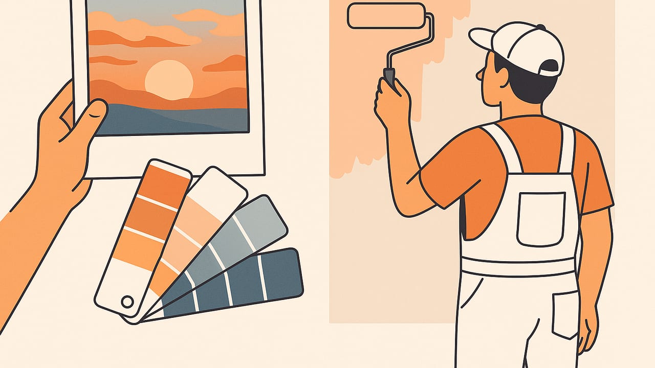
Turning a favorite photograph into a room palette is one of the quickest ways to make a space feel intentional and personal. The challenge: your camera, screen, paint fan decks, and real walls all describe color differently. This guide shows you how to reliably match wall paint to photo palette by calibrating your image, extracting dependable colors, converting to comparable values, selecting paint equivalents, and testing in real light so the final room looks like the picture in your head.
1) Prepare the photo so its colors are trustworthy
Every accurate match starts before you even pick colors. If the source image is biased—warm indoor bulbs, intense evening shadows, or a filter—the resulting paint will be off. Calibrate first:
- Choose the right photo: Prefer images shot in soft daylight (avoid harsh noon sun or mixed lighting). Skip heavy filters or strong HDR that crush shadows/highlights.
- Correct white balance: If possible, edit the photo to neutralize color cast. Use a gray card reference when available; otherwise, use a neutral area (white shirt, paper, cloud) to balance.
- Work in sRGB: Many phones use wide-gamut P3. Convert exports to sRGB so color pickers and paint tools compare apples-to-apples.
- Mind exposure: Bring mid-tones into a realistic range. Overexposed whites or underexposed shadows skew the palette.
Pro tip: If the photo includes a known color (like a paint chip or a gray card), sample it and adjust the image until it reads the expected value. This quick calibration improves every subsequent match.
2) Extract a balanced palette from the photo
The goal is not to pull every pixel, but to capture the structure of the color story: one or two dominant hues, a supporting secondary, a grounding neutral, and optional accents.
- Dominant base: The color that covers the largest area in the photo (e.g., sky blue, sandstone beige). This is often your wall color candidate.
- Secondary hue: A nearby large area that complements the base (e.g., sea green, warm terracotta).
- Neutral anchor: A gray, off-white, taupe, or charcoal that stabilizes the palette and can serve as trim, ceiling, or cabinetry.
- Accent(s): The small pop colors—coral, mustard, olive—that appear in details or decor rather than large surfaces.
Use a color picker that samples an average over a small radius (e.g., 5–15 px) to avoid noise. Take multiple samples across the same region and average their values to smooth out gradients and texture.
3) Convert colors into comparable values
Paint brands catalog colors numerically. To compare a photo color to a paint swatch, describe the color in formats that map well to human perception and paint libraries:
- HEX/RGB: Good for digital sampling and initial matching.
- HSL/HSB: Helpful for adjusting lightness or saturation to match sheen and lighting.
- CIELAB (L*a*b*): Perceptual space used to compute Delta E (difference). Crucial for precise matching.
- LRV (Light Reflectance Value): Indicates how light/dark a paint appears on walls; not directly equal to RGB brightness, but related.
| Representation | What it tells you | When to use |
|---|---|---|
| HEX / RGB | Device color values (sRGB) | Sampling from photos; quick digital comparisons |
| HSL / HSB | Hue + lightness/brightness + saturation | Tuning perceived light/dark and intensity |
| CIELAB | Perceptually uniform color space | Calculating Delta E to rank closest paint matches |
| LRV | How much light a paint reflects (0–100) | Predicting wall impact in real rooms and lighting |
Quick code: Estimate relative luminance as a proxy
LRV is lab-measured, but you can estimate perceived brightness from sRGB. Use this only as a planning aid; confirm with brand LRV.
// JavaScript: HEX to relative luminance (WCAG Y), an LRV-adjacent proxy
function hexToRelLuminance(hex){
  const m = hex.replace('#','');
  const r = parseInt(m.substring(0,2),16)/255;
  const g = parseInt(m.substring(2,4),16)/255;
  const b = parseInt(m.substring(4,6),16)/255;
  const lin = c => (c <= 0.04045) ? c/12.92 : Math.pow((c+0.055)/1.055, 2.4);
  const R = lin(r), G = lin(g), B = lin(b);
  // Weighted luminance (sRGB, D65)
  return 0.2126*R + 0.7152*G + 0.0722*B; // 0–1; multiply by 100 for percentage
}
4) Find the nearest paint swatches
There are three reliable routes for turning digital colors into physical paint candidates:
- Brand lookup tools: Many paint brands offer digital color finders where you enter HEX/RGB and get the nearest swatches. Treat results as shortlist, not final truth.
- Fan decks and physical chips: The gold standard. Use your extracted palette as a target and visually compare under the same lighting as your room.
- Third-party libraries: Some design tools include large swatch sets and allow Delta E sorting in LAB.
| Paint brand | What to look for | Notes |
|---|---|---|
| Sherwin-Williams | Online color matcher, LRV published per color | Good data and broad neutral range |
| Benjamin Moore | Digital fan deck, LRV and undertone notes | Watch undertones (green, pink, violet) in grays |
| Behr | Color finder and sample sizes | Useful for big-box availability and testing |
| Dulux | Regional libraries, visualizer apps | Check regional formula differences |
Use Delta E to rank candidates
Once you convert your photo colors to LAB, compute Delta E (preferably ΔE2000) against paint swatches. Lower numbers mean closer matches:
- ΔE ≤ 1.0: nearly indistinguishable in controlled conditions
- ΔE 1–2: very close; often acceptable
- ΔE 2–6: noticeable difference; may still work on walls
- ΔE > 6: clearly different
Even with a low ΔE, finish and lighting can shift appearance on walls. Always test paint in your space.
5) Account for real rooms: light, sheen, and scale
Why does the same color look different on a wall than on your phone? Three reasons:
- Light direction and color: North-facing rooms run cooler; incandescent bulbs warm things up. Measure at different times of day.
- Sheen: Higher sheen (eggshell, satin) increases perceived brightness and may emphasize undertones. Flats mute reflections.
- Scale: A small chip looks darker; a full wall looks lighter. Many designers select a paint that’s a notch darker than the chip if they want the wall to feel like the photo’s mid-tone.
6) Practical workflow: from photo to wall paint
- Choose the photo you truly love and lightly correct white balance and exposure.
- Extract 5–7 colors: 1–2 dominant, 1 secondary, 1–2 neutrals, 1–2 accents. Average your samples.
- Convert to sRGB HEX/RGB and also to LAB if your tool supports it.
- Estimate LRV/brightness to decide which palette colors can live on large surfaces (walls/ceilings) versus accents.
- Preselect 3–5 paint candidates per target hue using brand matchers or a fan deck.
- Order chips or buy sample pots for the top 2–3 per color.
- Paint 2'×2' swatches on the actual wall (or on large boards) in at least two spots in the room.
- Evaluate morning, midday, evening under your actual lighting. Note shifts and undertones.
- Adjust lightness/saturation based on what you see: step up/down a strip or pick a neutral with the right undertone.
- Finalize finish (matte/eggshell/satin) to match durability and desired visual effect.
- Lock in supporting colors (trim, ceiling, accent wall) using your neutral and accent picks.
- Document the palette with both digital values and final paint codes for future reference.
7) Example: From beach photo to serene bedroom
Imagine a coastal photo with warm sand, muted teal water, soft sky, and driftwood accents. Extracted HEX values (sRGB):
- Sand beige (dominant wall candidate): #D5C5AA
- Sea teal (secondary, accent or cabinetry): #6BA4A0
- Sky soft blue (ceiling or secondary wall): #BFD6E6
- Driftwood gray-taupe (trim/doors): #9A9085
- Shell white (ceiling/trim): #F3F0E9
Process:
- Convert these to LAB and query paint libraries; shortlist two sand-beige paints with ΔE2000 under ~3.
- Check brand LRVs; aim for a wall LRV around 55–65 to keep the bedroom airy like the photo.
- Sample two teals: one slightly grayer to avoid oversaturation in evening lamplight.
- Test swatches in the room. If the sand reads too yellow at night, step slightly cooler (less red in LAB or a grayer beige).
- Finalize: sand on walls, shell white on ceiling/trim, driftwood on doors, teal as accent textiles or a feature cabinet.
Result: The room echoes the photo’s calm, with colors tuned for your light rather than your screen.
8) Common pitfalls and quick fixes
- Problem: Wall looks greener than expected. Fix: Check bulb temperature (try 3000–3500K), choose a neutral with a different undertone (shift toward red or blue in LAB), or drop sheen.
- Problem: Accent feels too loud. Fix: Reduce saturation (HSB -10 to -20%), choose a grayer version from the fan deck, or use it in smaller doses (pillows, art).
- Problem: Neutral turns pink/purple at dusk. Fix: Select a neutral with a green or yellow bias; test at multiple times of day.
- Problem: Digital match doesn’t translate. Fix: Always sample real paint; aim for ΔE closeness but prioritize in-room perception.
9) FAQ
What’s the fastest way to match wall paint to a photo palette?
Extract 5–7 colors from the photo, convert to sRGB, use a brand matcher to shortlist, then immediately paint 2'×2' test swatches of your top two candidates. Decide after viewing morning/evening.
How do I choose which photo color becomes the wall?
Pick the dominant mid-tone that occupies the most area in the image, has a comfortable LRV (roughly 45–70 for living spaces), and supports your room’s light level.
Is an exact match realistic?
On a full wall, an “exact” digital-to-paint match is rare due to light, sheen, and scale. Aim for perceptual harmony rather than numeric identity.
Do I need LAB and Delta E to succeed?
No, but they help you compare systematically. If you don’t use LAB, rely on careful sampling, brand LRVs, and thorough in-room testing.
10) Key takeaways
- Calibrate your photo and work in sRGB before sampling.
- Build a structured palette: dominant, secondary, neutral, accents.
- Translate to LAB when possible and use ΔE to shortlist paints.
- Expect adjustments for light, sheen, and scale; test large swatches.
- Document both digital values and final paint codes for future projects.
If you’re working on iPhone or iPad and want a quick way to extract HEX, RGB, HSL, and HSB from photos and export tidy palettes, the app Color Viewfinder can simplify the early steps—leaving your time for fan decks, samples, and the creative decisions that make a room sing.
