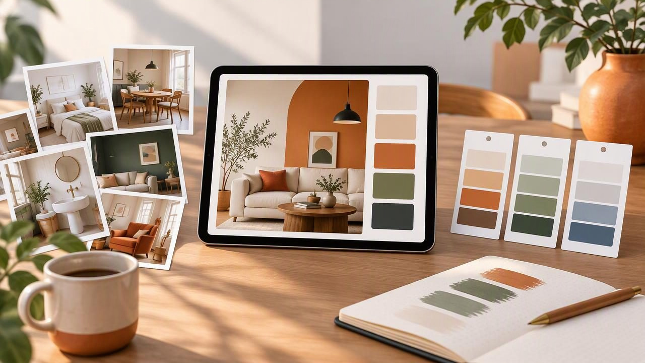
A room photo can inspire an entire decorating plan, but a camera roll full of attractive rooms, fabrics, and materials is difficult to use when it is time to make decisions. An interior color palette app can help turn selected images into practical color references by extracting colors and displaying their values. The key is pairing color extraction with a simple system for sorting, labeling, and comparing what you find.
This guide walks through a repeatable way to organize visual inspiration for interior design. You will learn how to choose useful images, build palettes around a room’s purpose, record color codes, and understand what a digital palette can—and cannot—tell you.
Why organize visual inspiration around color?
Inspiration gathering often starts broadly: a blue kitchen, a warm living room, a particular wood finish. But saved images can contain many colors competing for attention. Extracting a small selection of colors makes it easier to spot recurring preferences and describe a direction to someone else.
A palette also gives each image a more useful role. One photo might suggest the overall mood, another may show a wall-and-trim relationship, and a close-up could inform an accent color. Keeping those roles clear prevents a beautiful reference from being mistaken for a complete room plan.
- Find patterns: Notice whether your saved rooms lean warm, cool, muted, or high-contrast.
- Compare references: Assess which images share a compatible color direction.
- Communicate ideas: Share color values alongside the photos that inspired them.
- Reduce visual clutter: Keep the images that help answer a specific design question.
Start with a question, not a folder full of photos
Before extracting colors, decide what you are trying to learn. A focused question helps you select relevant images and avoid building a large collection with no clear purpose. For example, you might be exploring a calm bedroom palette, looking for a warm neutral to balance dark flooring, or comparing accent colors for a north-facing room.
Set up a small collection for each room or decision. Use a name that explains the project and the question, such as Guest room — soft green accents or Kitchen — warm white against oak. Save only references that contribute something distinct. If several images make the same point, keep the strongest example rather than every near-duplicate.
It also helps to separate inspiration from decisions. Mark an image as a mood reference, material reference, or color candidate. A mood image may be useful because of its atmosphere even if you would not reproduce its exact colors. A material reference might show a stone surface or textile texture rather than an overall scheme.
A practical workflow for building an interior palette
- Choose a representative image. Look for a clear, well-lit photo that shows the relationship you want to study. A room image can reveal an overall balance; a close-up can be better for a fabric, tile, or decorative object.
- Extract a small set of colors. Start with a few colors that appear important instead of trying to include every shade in the image. Consider the dominant background, a supporting color, and one or two accents.
- Inspect the color values. HEX and RGB are useful for digital reference and sharing. HSL and HSB describe color through hue and variations in saturation and lightness or brightness, which can make it easier to compare related colors.
- Give the palette a useful name. Include the room, reference, or design question. Names like Living room — stone, moss, and rust are more informative later than Palette 4.
- Record the image’s role and context. Note whether it is a mood, material, or color reference, and add any observation that explains why it matters.
- Compare before you commit. Put a few palettes side by side and look for shared undertones, useful contrast, or colors that feel out of place with the project’s direction.
For a photo-based workflow, Color Viewfinder’s guide to creating a color palette from a photo explains the basic extraction process. The broader organizational system—naming, grouping, and evaluating references—can be kept in your preferred photo album, notes app, or project document.
Example: organizing a living room direction
Imagine you are planning a living room with pale oak flooring and want a relaxed scheme with a little warmth. You save three references: a room with olive-green cushions, a close-up of a rust-colored woven fabric, and a pale stone surface. Instead of treating these as one finished palette, give each image a distinct job.
- Mood reference: the room photo, showing how muted green can sit among light neutrals.
- Accent reference: the fabric close-up, suggesting a warm color for a cushion or small accessory.
- Surface reference: the stone photo, offering a neutral tone to compare with the flooring.
For a planning document, you might record an illustrative set of digital swatches like this:
| Palette role | Illustrative HEX | Planning note |
|---|---|---|
| Light neutral | #D8D0C2 | Compare with the room’s overall lightness |
| Muted green | #70775A | Possible supporting accent |
| Warm rust | #A85F43 | Use sparingly as a contrast reference |
| Deep brown | #51483D | Check against existing wood and furniture |
These values are illustrative examples, not colors measured from those reference images or recommendations for specific products. In your own project, record the codes actually extracted from your selected photos. Then add a note about how each color might function: wall, textile, trim, artwork, or another role. This keeps a digital palette connected to a real design question instead of becoming a set of attractive but context-free swatches.
Keep the collection easy to revisit
A palette is most useful when you can find it again. Choose a consistent naming pattern and apply it to images, palettes, and notes. For example, use Room — design question — reference number. A simple structure could include folders or albums for each room, with subgroups such as Mood, Materials, and Shortlist.
Store the source image with its palette whenever possible. A HEX code alone cannot show whether a color came from a wall, a shadow, a plant, or an object in the foreground. Keeping the image nearby preserves the context that helps you judge whether the extracted color is relevant.
When you are ready to share or move a palette into another workflow, export formats can make the color data easier to use. Depending on the tool, formats such as ASE, JSON, CSS, or CSV may suit different design applications or records. Keep a note of which image and palette each export belongs to, especially if you are comparing several rooms or concepts.
What a photo palette can and cannot tell you
Extracted colors are references to pixels in an image—not guarantees of how a physical material will look in your home. A photo’s lighting, shadows, camera processing, filters, and display settings can all affect the colors you see. A painted wall may photograph differently at different times of day, and a screen’s settings can shift how a swatch appears.
Use photo palettes to explore relationships and communicate a direction, not to claim an exact physical match. HEX, RGB, HSL, and HSB values describe digital color; they do not guarantee that a paint, fabric, wood finish, or printed result will match. For consequential material choices, assess actual samples in the room and under relevant lighting. Likewise, do not assume a screen preview guarantees print accuracy.
Be selective about the part of an image you sample. A tiny highlight or deep shadow may produce a color that is technically present but unhelpful as a room-wide choice. If the extracted result seems surprising, inspect the image area and consider whether it represents the surface you intended to reference.
Turn inspiration into a manageable design habit
Set aside a short review after collecting references. Remove duplicates, name the strongest images, and extract colors only from photos that answer your current question. Keep a small shortlist for active decisions and move other ideas into an archive, so exploratory images remain available without crowding the project.
Finally, revisit your shortlist as the room plan develops. A palette that felt promising at the beginning may not work alongside existing flooring, furniture, or light conditions. Treat it as a conversation starter: compare options, make notes, and update the collection as the design becomes clearer. That way, an interior color palette app supports a more organized process without replacing careful judgment about the actual room and materials.
