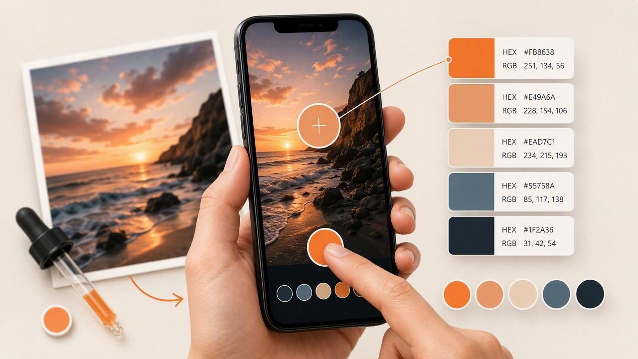
Whether you are designing a website, planning a room, creating social graphics, or refining a brand mood board, photos can be an excellent source of color inspiration. An iPhone makes it easy to capture those references wherever you find them: a painted storefront, a sunrise, a fabric swatch, a magazine spread, or a finished interior.
Learning how to pick colors from images on iPhone helps turn visual inspiration into usable color data. Instead of describing a shade as “warm green” or “soft cream,” you can identify a specific HEX, RGB, HSL, or HSB value and save it as part of a deliberate palette.
This guide explains a reliable photo-to-palette workflow, shows how to interpret the color values you find, and covers the limitations you should keep in mind before using sampled colors in a real project.
Why Pick Colors From Images on iPhone?
Images contain relationships between colors that are already working together. A photograph may reveal a balanced combination of a dominant background color, a mid-tone material, a darker contrast, and one small accent. Sampling these colors gives you a starting point that feels more connected than choosing every swatch independently.
An iPhone is particularly useful for this process because it is always nearby. You can photograph a color reference when you encounter it, inspect the image later, and organize the best colors into palettes for graphic design, interior design, or personal creative projects.
Photo color extraction is useful for:
- Graphic design: Build campaign, poster, presentation, and social media palettes.
- Web and UI design: Find inspiration for backgrounds, accents, illustrations, and interface states.
- Interior design: Document colors from furniture, tiles, textiles, art, and architectural details.
- Photography: Identify recurring tones that support a consistent visual style.
- Craft and hobby projects: Plan digital collages, invitations, mood boards, and handmade work.
Understand the Color Values You Sample
Before you start selecting pixels, it helps to know what the different color formats mean. The same sampled color can be represented in several ways, each useful in a different workflow.
| Format | What It Describes | Common Use |
|---|---|---|
| HEX | A six-character web color code, such as #C9785E. | CSS, web design, design handoff |
| RGB | Red, green, and blue light values, such as 201, 120, 94. | Digital graphics and screen-based work |
| HSL | Hue, saturation, and lightness. | Adjusting a color while preserving its basic hue |
| HSB | Hue, saturation, and brightness. | Visual color adjustment in many creative tools |
For example, a terracotta color sampled from a ceramic vase might be represented as #C9785E. Its RGB value identifies the screen-light components, while HSL or HSB can help you create a lighter or more muted variation without guessing.
A Step-by-Step Workflow for Sampling Photo Colors
1. Start with a high-quality reference image
A clean image produces more useful results. If you are taking a photo yourself, use even lighting whenever possible. Avoid heavy shadows, bright glare, tinted indoor lighting, and strong filters. These conditions can shift the appearance of a surface significantly.
For an existing image, choose the highest-resolution version available. A compressed screenshot can still provide inspiration, but it may blend subtle details or alter gradients.
2. Identify the visual purpose of the palette
Do not sample every color in the image. First, decide what you need the palette to do. A website hero section may only need four colors: a background, a text color, a primary accent, and a secondary accent. An interior mood board may need more material-specific tones, including wall, wood, textile, and metal references.
Look for these roles in the image:
- Dominant color: The most visible broad area, such as a wall, sky, or background.
- Supporting color: A secondary tone that adds depth without demanding attention.
- Dark neutral: A color for text, outlines, shadows, or contrast.
- Light neutral: A color for breathing room, backgrounds, or highlights.
- Accent: A smaller, more vivid color that creates emphasis.
3. Zoom in before choosing a pixel
When you pick a color from a photo, zooming matters. At a normal viewing size, a single point may look like a flat area even when it actually contains texture, shadow, reflection, or JPEG compression artifacts.
Zoom into the most even part of the object or surface you want to sample. For example, if you want the color of a blue chair, do not select the shiny edge, a deep seam, or a highlight. Choose a central area where the upholstery is evenly lit.
4. Take multiple samples from the same surface
One pixel is rarely the complete story. Take three to five samples across a material, then compare them. If the values are close, choose the middle option as your representative color. If they vary widely, the material may be textured, shaded, reflective, or affected by uneven light.
This approach is especially helpful for natural materials such as wood, stone, leaves, and woven textiles. Instead of treating variation as an error, use it to decide whether your palette should include a range of related tones.
5. Save colors with clear names
Raw codes are essential, but descriptive names make a palette easier to use later. Name colors by both appearance and role, such as:
Clay Accent — #C9785EFaded Sage — #98A58BCharcoal Text — #2D302EWarm Paper — #F2EBDD
Clear names reduce confusion when you revisit a project after several days or share the palette with another designer.
Concrete Example: Turning a Café Photo Into a Web Palette
Imagine you photograph a café interior with cream walls, dark wood tables, muted green seating, and a small rust-colored menu sign. The goal is to use the image as inspiration for a small business website.
After sampling several areas, you may settle on this five-color palette:
| Palette Role | Sample Color | Suggested Website Use |
|---|---|---|
| Warm background | #F2EBDD | Page background or content sections |
| Deep neutral | #342E29 | Body text, headings, and footer |
| Muted green | #87947B | Secondary buttons or illustrated details |
| Wood brown | #76523D | Borders, icons, or navigation details |
| Rust accent | #C76C4B | Calls to action and key highlights |
In a CSS file, the palette could be organized as custom properties:
:root {
  --paper: #F2EBDD;
  --ink: #342E29;
  --sage: #87947B;
  --wood: #76523D;
  --rust: #C76C4B;
}
The photo provides the emotional direction, but the final application still requires judgment. For instance, the rust accent may be visually appealing, yet it should not automatically become small body text on a cream background. Test contrast and readability before assigning colors to important interface elements.
How to Build a Better Palette, Not Just a Collection of Samples
A successful palette is not simply a list of attractive colors. Each color needs a job. Once you have sampled colors from an image, reduce the set until the group has enough variation for your project without becoming difficult to manage.
Try this simple editing process:
- Keep one or two neutrals for backgrounds and readable text.
- Select one main color that captures the image’s overall mood.
- Add one supporting color with lower visual intensity.
- Reserve one stronger accent for emphasis.
- Remove near-duplicates unless you need them for gradients or material detail.
For digital design, make variants intentionally. A pale sage may work as a background tint, while a darker green from the same family may be more suitable for a button label or icon. HSL and HSB values are useful here because they make it easier to see whether you are changing lightness, brightness, or saturation.
Common Mistakes When Picking Colors From Photos
Sampling shadows as the “real” object color
Shadows often create beautiful tones, but they are not always representative of the local color of an object. Sample both the evenly lit area and the shadow if you need a complete tonal range.
Using a highlight or reflection by accident
Glossy ceramic, glass, metal, and polished surfaces can contain bright reflected colors from nearby objects. Zoom in and inspect the region before saving a value.
Overusing saturated accents
The most vivid pixel in a photo can be tempting, but a small accent in a photograph may become overwhelming when used across an entire screen or room concept. Use saturated colors sparingly and balance them with neutrals.
Assuming a screen sample equals paint or print output
A sampled digital value is a useful visual reference, not a guaranteed physical match. Phone displays, camera processing, ambient lighting, paper stocks, inks, fabrics, and paint finishes all influence perceived color.
Important: Use photo-extracted values to communicate direction and build digital palettes. For paint, textiles, packaging, or print production, verify color with appropriate physical samples and the production process you plan to use.
Organizing and Sharing Your Sampled Colors
Once you have a refined palette, save it in a format that matches the next stage of your work. HEX codes are convenient for web projects, RGB values are widely understood in digital graphics, and HSL or HSB values support controlled adjustments. If you collaborate with other creatives, a structured palette file can also be more useful than a screenshot.
Keep the source image with the palette whenever possible. The image provides context that the numerical codes cannot: material texture, lighting, proportion, and the way colors interact in the original scene.
Make Photo Color Sampling Part of Your Creative Process
The best reason to pick colors from images on iPhone is not to copy a photograph exactly. It is to train your eye, capture inspiration in the moment, and turn visual observations into a usable system of color choices.
For a dedicated iPhone and iPad workflow, Color Viewfinder’s guide to picking HEX colors from a photo explains how to inspect image colors and work with values such as HEX, RGB, HSL, and HSB. Start with a single image, sample thoughtfully, compare related values, and build a palette where every color has a clear purpose.
