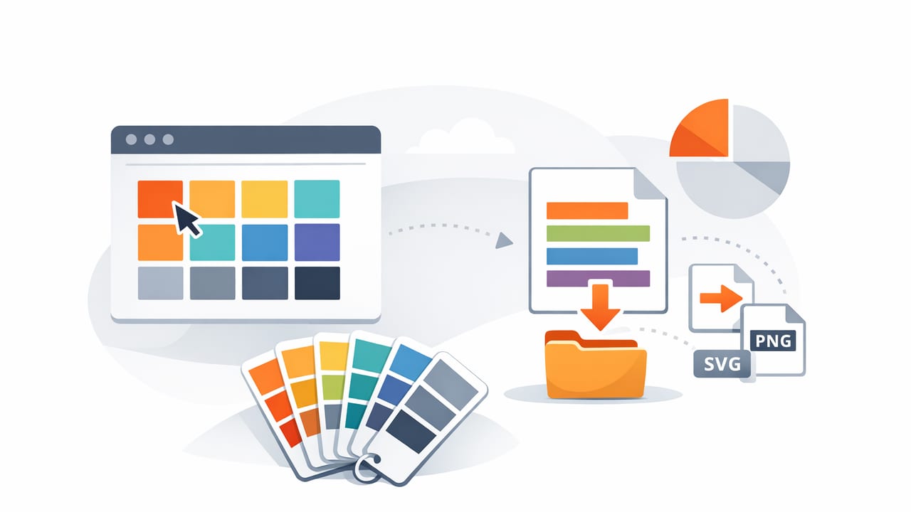
Finding great colors is only half the job. The real productivity boost comes when you can save and export color palettes in formats that drop cleanly into your tools—without losing accuracy, context, or intent. Whether you’re building a brand system, styling a mobile UI, planning an interior scheme, or preparing print artwork, exporting colors well reduces rework and keeps teams aligned.
This guide walks through a practical, tool-agnostic workflow for saving palettes, choosing export formats, naming colors, and translating a palette into design tokens. The goal: a palette you can actually reuse, share, version, and apply consistently.
What “saving a palette” really means (beyond a screenshot)
A saved palette should preserve more than pretty swatches. The best palettes capture:
- Exact values: HEX, RGB, HSL/HSB depending on where you’ll use them.
- Relationships: neutrals vs accents, ramps (tints/shades), and semantic roles (primary, surface, text).
- Context: where a color came from (photo, brand reference, material sample) and what it’s for.
- Accessibility intent: text/background pairings that meet contrast requirements.
When you save and export color palettes with this in mind, you get something that’s reliable across devices, apps, and collaborators.
Step-by-step workflow to save and export color palettes
1) Start with clean source colors
If your palette comes from a photo (a room, product, landscape, mood board), capture or select an image with:
- Neutral lighting (avoid extreme warm/cool casts when possible).
- In-focus areas for sampling (blurry regions blend colors unpredictably).
- Enough variety to support accents and neutrals.
Tip: if your image has strong lighting color (e.g., tungsten indoors), sample from “known neutrals” (white wall, gray fabric) to understand the cast before committing.
2) Extract, then curate
Auto-extraction often pulls multiple similar colors. Curating is where palettes become usable. Aim for a structure like:
- 2–4 neutrals (background, surface, border, text).
- 1–2 primaries (brand or dominant tone).
- 1–3 accents (high-energy colors for highlights and calls to action).
- Optional ramp (tints/shades of a primary for UI states).
Rule of thumb: if two swatches look the same at typical UI sizes, keep one. Reducing near-duplicates makes exporting and applying the palette much easier.
3) Choose a “master format” before exporting
To keep palettes consistent across multiple exports, pick a master representation:
- HEX is common for web/UI sharing.
- RGB is helpful for many design apps and print prep.
- HSL/HSB is best when you’ll generate variations (tints/shades) or tune saturation/brightness quickly.
Even if you export in multiple formats, having a master set prevents drift (tiny differences that appear after repeated conversions).
4) Name colors so they survive handoff
Names are not decoration—they’re the bridge between color intent and implementation. Two naming strategies are most common:
- Functional/semantic:
primary,surface,text,warning,border. - Descriptive:
ocean-600,sand-100,charcoal-900.
For product/UI work, semantic names scale better. For branding or illustration, descriptive names can be more intuitive.
5) Export in the formats your tools actually consume
This is where most palettes fail: exporting a format that looks fine, but can’t be imported cleanly where you need it. Below is a practical map of common export formats and when to use them.
| Export format | Best for | Pros | Watch-outs |
|---|---|---|---|
| ASE (Adobe Swatch Exchange) | Photoshop, Illustrator, InDesign workflows | Native Adobe compatibility, easy sharing | Not universal outside Adobe |
| GPL (GIMP Palette) | Open-source workflows, some palette tools | Simple, portable text format | Limited metadata (names/roles may be basic) |
| CSS variables | Web apps, design systems | Copy/paste into codebase, supports theming | Needs naming conventions and governance |
| JSON tokens | Multi-platform design tokens (web + iOS + Android) | Tooling-friendly, can generate multiple outputs | Requires a token structure |
| CSV | Spreadsheets, approvals, client review | Readable, easy to annotate | Not a direct import for many apps |
| PNG/PDF swatch sheet | Print, interior design presentations | Great for mood boards and stakeholder alignment | Not machine-readable; include values alongside |
Practical export examples you can reuse
Export as CSS variables (web-ready)
If your end target is a website or web app, exporting variables is often the fastest path from palette to production.
:root {
  --color-surface: #F6F2EA;
  --color-text: #1E1E1E;
  --color-primary: #2F6D7A;
  --color-accent: #E07A5F;
  --color-border: #D8D2C7;
}

.button {
  background: var(--color-primary);
  color: var(--color-surface);
}

.button--accent {
  background: var(--color-accent);
}
Tip: If you plan to support dark mode, export a second set (e.g., [data-theme="dark"]) rather than tweaking colors ad hoc later.
Export as design tokens (JSON for scale)
When you need the same palette across multiple platforms, a token export is the most future-proof way to save and export color palettes.
{
  "color": {
    "surface": { "value": "#F6F2EA" },
    "text": { "value": "#1E1E1E" },
    "primary": {
      "500": { "value": "#2F6D7A" },
      "600": { "value": "#285D68" }
    },
    "accent": { "value": "#E07A5F" }
  }
}
This structure lets you generate platform-specific outputs (CSS, Swift, Android XML) using common token build tools—while maintaining one source of truth.
How to keep exported palettes consistent (accuracy + intent)
1) Beware of color management surprises
Colors can shift depending on display profiles and file formats. To reduce surprises:
- Use sRGB values for most digital work (web/UI) unless you have a reason not to.
- For print, consult your printer about CMYK conversion and proofing; export a reference sheet with both HEX/RGB and intended CMYK conversions.
- Don’t rely on screenshots as the “source” of truth—they can compress or shift colors.
2) Export roles, not just swatches
A palette of ten pretty colors is less useful than a palette with roles. Consider exporting a “role map” alongside the colors:
- Background (page canvas)
- Surface (cards, panels)
- Text (primary, secondary)
- Primary action (buttons, links)
- Feedback (success, warning, danger)
Even if your project is interior design, roles still help: wall color, trim, floor, accent, metal, textile.
3) Save versions (so you can iterate without breaking things)
Palettes evolve. Saving versions prevents “mystery changes” and makes approvals easier. A simple approach:
- Name palettes like
projectname_palette_v1,v2, etc. - Log what changed: “Adjusted primary 500 for contrast; replaced accent for warmer tone.”
- Keep deprecated colors for a while if they’re already used in production assets.
Checklist: before you share or publish an exported palette
- Confirm contrast pairs for key combinations (text on background, buttons, links).
- Remove duplicates and near-duplicates unless there’s a clear role difference.
- Lock naming (semantic or descriptive, consistent casing and separators).
- Export at least two formats: one human-friendly (PDF/PNG/CSV) and one implementation-friendly (ASE/CSS/JSON).
- Include source notes (photo reference, brand guidelines, material sample name).
Common mistakes when you save and export color palettes
- Only exporting an image of swatches (looks nice, but can’t be imported reliably).
- Mixing color spaces unintentionally (e.g., copying values from different sources with different profiles).
- No naming convention, leading to confusion like “Blue 1,” “Blue 2,” “Blue final.”
- Ignoring states: hover/pressed/disabled colors for UI, or finish/lighting variants for interiors.
- Over-exporting: too many swatches with no roles, making decisions harder instead of easier.
Putting it all together: a simple “palette package” template
If you want a repeatable deliverable, create a small package every time you finalize a palette:
- Palette sheet (PDF or PNG) with swatches + HEX/RGB values + roles
- Implementation export (CSS variables or JSON tokens)
- App-specific export (ASE for Adobe, etc., if needed)
- Notes (source, accessibility checks, version history)
This approach makes it easy to reuse the same colors across creative projects, clients, and platforms—and it standardizes how you save and export color palettes so you spend less time rebuilding.
Final thoughts
A good palette is not just chosen—it’s captured, structured, and delivered in the right formats. When you standardize how you save and export color palettes, you turn color inspiration into a dependable system that teammates (and future you) can apply confidently.
If you prefer working from photos on iPhone or iPad, an app like Color Viewfinder can help you extract values and export palettes in practical layouts, which you can then refine using the workflow above.
