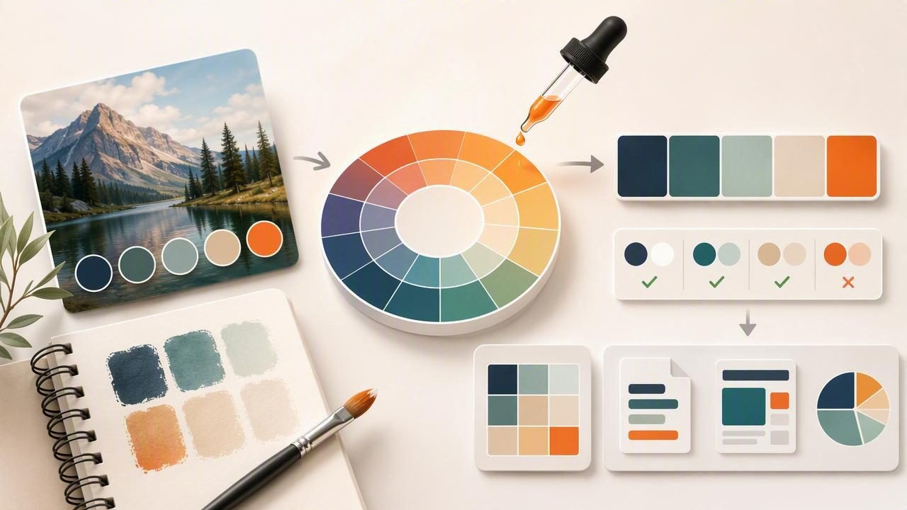
A color palette generator is one of the fastest ways to turn visual inspiration—photos, mood boards, product shots, or room images—into a set of usable colors. The problem is that “usable” rarely happens automatically. A generated palette can be beautiful but still fail in real work: poor contrast, too many similar mid-tones, no clear roles (primary vs. background), or inconsistent results across print and screens.
This guide shows a practical workflow to go from photo → extracted colors → refined palette → real design system. You’ll learn what to sample, how to organize palette roles, how to check accessibility, and how to export colors in a format that’s easy to implement in UI, branding, or interior concepts.
Why start with a color palette generator?
When you use a color palette generator to extract colors from an image, you get two big advantages:
- Speed: you can create a starting point in seconds instead of hunting for HEX values manually.
- Built-in harmony: photos already contain natural relationships (warm/cool balance, shadows, highlights, accents).
But extraction is only step one. The rest of the workflow is about turning raw samples into a structured palette that stays consistent across real layouts.
Step 1: Choose the right image (your palette is only as good as your source)
If your goal is a palette you can actually use, pick images with:
- Clear lighting: avoid extreme filters or heavy color grading unless that’s the intended style.
- Distinct color regions: big areas of sky, fabric, wall paint, packaging, etc. give cleaner samples than noisy textures.
- A visible accent color: signs, flowers, typography, accessories—something that can become a “primary” or “call to action.”
Common source mistakes
- Sampling only highlights: your palette becomes too pale and lacks depth.
- Sampling only mid-tones: everything looks muddy together and UI has no clear hierarchy.
- Using a filtered social photo: the palette may be trendy but hard to reproduce across devices.
Step 2: Extract colors with intention (don’t just accept the first palette)
Most tools will output a set of colors automatically. Instead of treating that as final, treat it as a draft. Aim to capture a balanced range:
- 1–2 neutrals (backgrounds, surfaces, whitespace): off-white, warm gray, charcoal, etc.
- 1 primary hue (brand anchor): the color that appears most intentionally in the source.
- 1 secondary hue (support): related but distinct.
- 1 accent hue (sparingly used): high attention, for highlights and CTAs.
- 1 deep tone (text/contrast): a near-black or deep chromatic that reads well.
Rule of thumb: If every swatch feels equally “loud,” the palette won’t know what to do in a real layout. Give it hierarchy.
Step 3: Organize colors by role (the part most people skip)
A generated palette becomes reliable when every color has a job. Instead of naming colors by what they are (“Blue 1”), name them by what they do (“Primary / Surface / Text”). This turns a random set of HEX codes into a small design system.
Example role map
| Role | What it’s used for | Selection tip |
|---|---|---|
| Background | Page, canvas, walls, negative space | Choose the lightest neutral; avoid pure white if the palette is warm |
| Surface | Cards, panels, secondary areas | Pick a neutral one step darker than background |
| Text | Body copy, headings | Choose the darkest tone that still matches the palette temperature |
| Primary | Buttons, links, key elements | Pick the most “intentional” color from the image, not the most saturated |
| Secondary | Supporting UI, tags, small highlights | Related hue or a calmer variant of primary |
| Accent | CTAs, badges, emphasis | Use the rarest bright color in the photo; limit usage |
This role-based approach matters for both graphic design (posters, decks, brand kits) and interior design (walls, trim, textiles, accents). Roles reduce decision fatigue and keep your output consistent.
Step 4: Refine hue, saturation, and lightness (HSL is your best friend)
Extraction tools often give accurate values that still need refinement. HSL (Hue, Saturation, Lightness) editing is an efficient way to adjust colors without “breaking” the palette.
Quick refinement checklist
- Align neutrals: if your neutrals fight each other (one is cool gray, another is warm beige), decide on a temperature and nudge them closer.
- Create a lightness ladder: you want a predictable set of light-to-dark steps (background → surface → border → text).
- Control saturation: keep most colors moderately saturated; reserve high saturation for a single accent.
- Unify hue drift: if “blue” swatches range from teal to indigo, pick the intended direction and correct the outliers.
For practical design systems, you often end up with fewer “hero colors” than the generator produces—and that’s a good thing.
Step 5: Check contrast and accessibility (especially for UI)
Many palettes look great but fail readability. If you’re using the palette for digital products, validate contrast early. At minimum, test:
- Text on background
- Text on surface
- Button text on primary
- Links on background
If contrast is weak, your best fixes usually are:
- Darken the text color (often easiest and least noticeable).
- Lighten the background/surface slightly.
- Reduce saturation on the background if it causes vibration with text.
Practical tip for “brand” colors
If your primary brand color is too light for white text, don’t abandon it. Create a primary-600 (darker) for buttons and keep the original as primary-300 for backgrounds, tags, and large fills.
Step 6: Generate variants (tints and shades) you can actually reuse
A strong color palette generator workflow doesn’t stop at 5 swatches. It produces a small set of variants so you can design components consistently.
For each key color (primary, secondary, accent), create:
- 2 tints (lighter): for backgrounds and subtle UI states
- 1 base: the extracted/adjusted core color
- 2 shades (darker): for hover states, borders, and text-on-color
Even for interiors, this maps well to main paint (base), lighter adjacent wall/ceiling (tints), and trim/accent furniture (shades).
Step 7: Export in a format your tools can use
Once your palette has roles and variants, export it in formats that match your workflow:
- HEX for web and most design tools
- RGB when you need transparency control or motion/video workflows
- HSL/HSB for systematic editing and variant creation
Example: turn your palette into CSS variables
Here’s a simple way to implement a photo-inspired palette in a web project. Replace values with your own extracted colors.
:root {
  --color-bg: #F6F1EA;
  --color-surface: #E9DED3;
  --color-text: #1F2328;

  --color-primary-300: #A8C7C5;
  --color-primary-600: #2E6F73;

  --color-accent-500: #D86B4A;
}

body {
  background: var(--color-bg);
  color: var(--color-text);
}

.button-primary {
  background: var(--color-primary-600);
  color: #FFFFFF;
}
This “token” approach is also how many design systems stay consistent across Figma, CSS, and native apps.
Two mini case studies (photo → palette → application)
Case study A: Product packaging photo for a brand kit
Source: a coffee bag photo with cream paper, deep brown typography, and a small terracotta seal.
- Background: warm cream from the paper
- Text: deep espresso brown (instead of pure black)
- Primary: muted forest green from the label
- Accent: terracotta from the seal for CTAs
Result: cohesive packaging + web landing palette where the accent is used sparingly (buttons, highlights), and the cream/brown pairing keeps readability high.
Case study B: Living room photo for an interior concept board
Source: a room photo with linen sofa, oak floor, slate cushions, and a brass lamp.
- Neutrals: linen + warm wood (dominant surfaces)
- Deep tone: slate for contrast (pillows, small decor, frames)
- Accent: brass (used as metal finish and small decor elements)
Result: a palette that avoids over-saturation, uses a deep anchor for definition, and keeps accents to materials rather than large painted areas.
Common problems (and fast fixes)
Problem: the palette looks “flat”
- Fix: add one darker shade (text/anchor) and one lighter tint (air/space). Many generated palettes over-cluster in the middle.
Problem: everything competes for attention
- Fix: reduce saturation on 2–3 colors and keep only one high-energy accent.
Problem: the palette feels random across screens
- Fix: standardize via roles and tokens, then test on at least two displays (phone + laptop). Adjust lightness more than hue.
A repeatable checklist for any color palette generator workflow
- Pick a source image with clear lighting and distinct regions.
- Extract a draft palette, then resample deliberately for neutrals + accents.
- Assign roles (background, surface, text, primary, secondary, accent).
- Refine in HSL to unify temperature and create a lightness ladder.
- Check contrast pairs you’ll actually use.
- Create tints/shades for reusable states and components.
- Export to the formats your tools and collaborators need.
Final thought
A color palette generator is best seen as a bridge between inspiration and implementation. The real upgrade happens when you add structure (roles), usability (contrast), and consistency (variants). If you like building palettes directly from photos on iPhone or iPad, Color Viewfinder is one option that helps you extract values and export palettes for design work.
