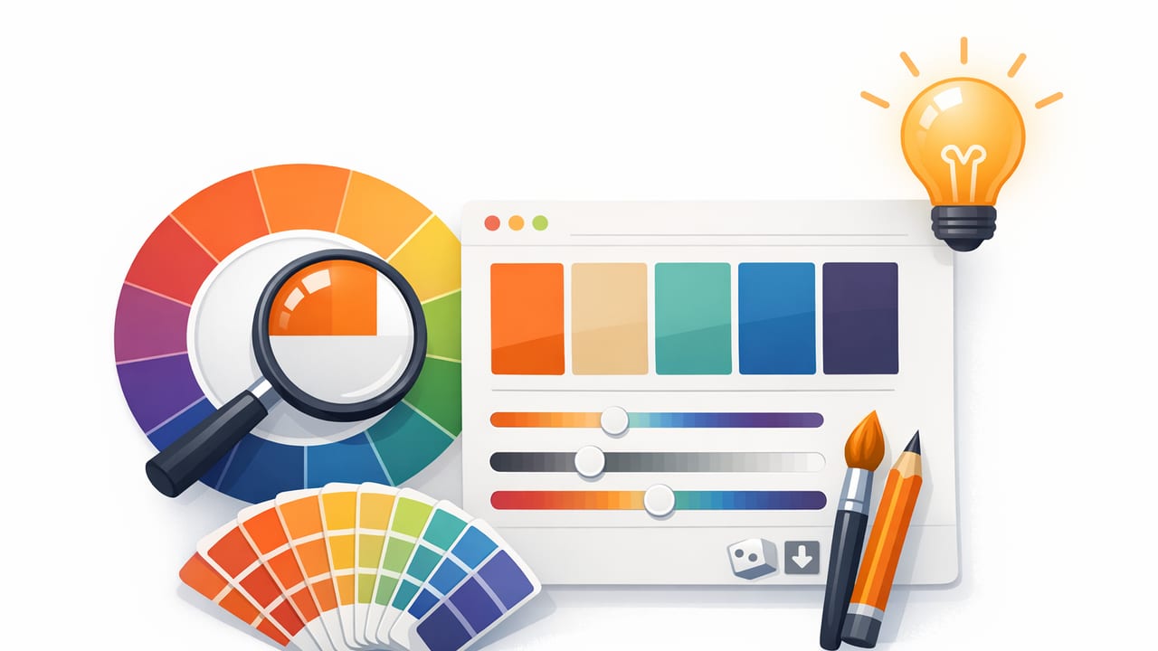
A color palette generator can do more than spit out random swatches. When you base a palette on a real photo—an interior space, product shot, moodboard image, or street photography—you get colors that already “belong together” because lighting, materials, and context have done some of the harmony work for you. The trick is turning those raw sampled colors into a usable, repeatable system you can apply across screens, print, and physical spaces.
This guide walks through a practical, design-friendly workflow: how to extract colors from images, fix common sampling problems, build a balanced palette (neutrals + accents), and prepare exports for real projects like branding, UI, and interior design boards.
What a color palette generator actually generates
Most tools that call themselves a color palette generator do one of two things:
- Algorithmic palettes: They create harmony rules (complementary, analogous, triadic) from a base color.
- Image-based palettes: They sample pixels from a photo and cluster them into dominant colors.
Both are useful, but image-based palettes are often more actionable for creative projects because they’re anchored in a real reference. The downside: photos include lighting shifts, shadows, highlights, and camera color bias—so your “palette” can be messy unless you refine it.
Step 1: Start with the right reference image
Your final palette quality depends heavily on the photo you feed the generator. Use these guidelines:
- Prioritize clean lighting: Soft daylight is easier than mixed indoor lighting (e.g., tungsten + window light).
- Choose images with material variety: A room shot with wood, fabric, paint, and metal yields a more balanced set than a close-up of a single object.
- Avoid heavy filters: Instagram-style grading can skew everything warmer/cooler and compress color range.
- Use the highest resolution available: More pixel detail improves sampling accuracy, especially on textured surfaces.
Pro tip: If you’re working from a brand photo, use an “as-shot” version before creative grading. You can always re-introduce the grade as an overlay later.
Step 2: Extract colors strategically (not randomly)
When sampling from an image, don’t rely only on “dominant colors.” Instead, extract intentionally from these zones:
- Base neutrals: walls, background surfaces, negative space, paper, concrete, skin-adjacent neutrals.
- Midtones: the “true” material color (e.g., the sofa fabric in even light rather than shadow).
- Accents: small but important pops (plants, artwork, packaging, UI highlight areas).
- Dark anchors: deep shadows or dark materials for text and contrast.
Many palettes fail because they include five mid-saturation colors and no reliable neutral or dark anchor. A good color palette generator workflow produces a palette you can actually deploy in layouts and systems.
Step 3: Clean up common photo-sampling problems
Problem: colors are “too dusty” or gray
Photos often contain atmospheric haze, lens softness, or compression that reduces saturation. If your palette looks lifeless, selectively increase saturation on accent colors while keeping neutrals calm.
Problem: highlights skew warm; shadows skew cool (or vice versa)
This is normal in real lighting. Choose midtone samples for your “true” material color, then treat highlight/shadow variants as optional tints and shades rather than separate brand colors.
Problem: you extracted five colors, but none work for text
Add a dedicated text color (near-black or near-white) that meets contrast guidelines. Don’t force your darkest photo color to do the job if it’s too chromatic.
Rule of thumb: Your palette should include at least one dependable neutral background, one text color, and one accent color before you add anything “extra.”
Step 4: Build a usable palette structure (roles beat swatches)
Instead of thinking “here are six pretty colors,” assign roles. This makes your palette reusable across different layouts and deliverables.
| Palette role | What it’s for | Typical characteristics |
|---|---|---|
| Background | Canvas, spacing, breathing room | Low saturation, high lightness |
| Surface | Cards, panels, sections | Slightly darker than background |
| Primary | Key actions/branding | Mid-to-high saturation, stable contrast |
| Secondary | Supporting actions/accents | Complementary or analogous to primary |
| Text | Headings/body copy | Near-black or near-white (usually neutral) |
| Border/Divider | Lines, separators | Low contrast relative to background |
Once roles are defined, you can expand each role into tints and shades (e.g., Primary 100–900) for UI states, print hierarchy, or room finish variations.
Step 5: Generate tints and shades (and keep them consistent)
For most projects, you’ll want a small scale of variants for at least your primary and neutral colors. A simple approach:
- Tints: mix your color with white (useful for backgrounds, hover states, large areas)
- Shades: mix your color with black (useful for active states, emphasis, depth)
If you’re working digitally, consider generating variants in HSL (adjust lightness while keeping hue stable). For print and interiors, you may also test how variants look under different lighting conditions (daylight vs warm bulbs) because perceived contrast changes.
Quick conversion snippet (HEX to RGB) for handoffs
If your color palette generator outputs HEX but a teammate needs RGB values, here’s a tiny JavaScript helper:
function hexToRgb(hex) {
  const clean = hex.replace('#', '');
  const full = clean.length === 3
    ? clean.split('').map(c => c + c).join('')
    : clean;
  const num = parseInt(full, 16);
  return {
    r: (num >> 16) & 255,
    g: (num >> 8) & 255,
    b: num & 255
  };
}

// Example: hexToRgb('#2F6FED')
Step 6: Check accessibility and legibility early
Even a gorgeous palette can fail in real use if text and UI elements don’t meet contrast requirements. At minimum:
- Test text on background combinations for contrast.
- Ensure interactive elements are not distinguished by color alone (add shape, underline, icon, or label).
- Watch mid-saturation colors on mid-lightness backgrounds—these are common contrast traps.
If you’re building a UI palette, reserve your most saturated color for small accents and calls-to-action, and rely on neutrals for large surfaces. This reduces visual fatigue and makes accessibility easier to maintain.
Step 7: Match palette choices to your project type
Graphic design and branding
- Pick one primary brand color, then use image-extracted colors as secondary accents.
- Standardize neutrals (paper white, warm gray, charcoal) so every asset feels related.
- Test in both CMYK-ish conditions (muted) and digital (bright) to avoid surprises.
UI and product design
- Define roles and scales (Primary, Neutral, Success/Warning/Error) rather than relying on “palette only.”
- Keep backgrounds and surfaces calm; use photo-derived accents sparingly.
- Create a small token set (e.g.,
--color-primary-600) for consistency.
Interior design and decorating
- Extract material-accurate midtones (paint, upholstery, wood) rather than reflections and glare.
- Build a neutral backbone (walls, large rugs, major furniture) and then add 1–2 accent families.
- Validate under real lighting: daylight, evening, warm lamps. A color that looks perfect on-screen can shift dramatically in-room.
A practical “photo-to-palette” checklist
- Choose one reference image with clear lighting and multiple materials.
- Extract 8–12 candidates (including neutrals and dark anchors).
- Reduce to 5–7 core colors by removing duplicates and near-identical hues.
- Assign roles: background, surface, primary, secondary, text, border.
- Create variants (tints/shades) for primary and neutral colors.
- Test contrast for text and key UI states.
- Export in the formats your team needs (HEX/RGB/HSL) and name colors consistently.
Common mistakes to avoid
- Over-indexing on dominant colors: the biggest color in the photo isn’t always the most useful in design.
- Too many accents, not enough neutrals: palettes need breathing room.
- Ignoring context: a palette that works for a poster may fail in UI due to contrast and repetition.
- No naming system: “Blue 1 / Blue 2” doesn’t scale. Use role-based names or a numeric scale.
When to use algorithmic harmony instead of an image
Image extraction is ideal when you have a real-world reference you want to match. But an algorithmic color palette generator is better when:
- You have a single brand color and need supporting harmonies fast.
- You’re exploring variations without committing to a specific photo.
- You need predictable relationships (e.g., complementary pairs for data viz).
A strong workflow often combines both: extract a base palette from a photo, then generate harmony options from the primary accent to expand your system while staying coherent.
Final thoughts
A color palette generator is most powerful when it’s part of a process: extract intentionally, refine for real-world use, assign roles, and validate contrast before you commit. Whether you’re designing a brand kit, a mobile interface, or an interior moodboard, the goal is the same—turn inspiring color into a consistent system you can reuse with confidence.
If you prefer building palettes directly on an iPhone or iPad, an app like Color Viewfinder can help you extract HEX/RGB/HSL values from photos and organize them into exportable palettes.
