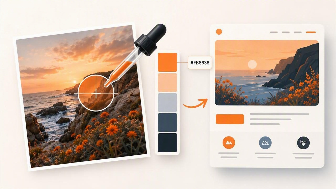
A color picker from photo can turn visual inspiration into a usable design system. Instead of guessing at colors from a travel image, product photo, interior scene, or brand mood board, you can sample pixels directly and save their values as HEX, RGB, HSL, or HSB codes.
That process is useful for web designers, graphic artists, interior designers building digital presentation boards, and anyone creating a consistent visual direction for a creative project. However, extracting colors is only the first step. A good palette must still be organized, tested for readability, and adapted to its final use.
This guide explains how to choose colors from an image, turn raw samples into a balanced web palette, and avoid common mistakes such as selecting too many similar shades or using a beautiful image color that fails as readable text.
What Is a Color Picker From Photo?
A color picker from photo is a tool that samples individual pixels or groups of pixels from an image. When you tap or click an area of a photo, the tool identifies the color and displays a numerical value such as:
- HEX: A web-friendly code such as
#D86B4A. - RGB: Red, green, and blue values such as
216, 107, 74. - HSL: Hue, saturation, and lightness values that can be useful for adjusting related shades.
- HSB/HSV: Hue, saturation, and brightness values often used when assessing how vivid or dark a sampled color is.
Photo color extraction is especially valuable because photographs contain color relationships that already feel natural. A coastal photo may provide muted blue-grays, sand neutrals, and a warm accent. A restaurant interior may suggest charcoal, cream, wood brown, and an earthy green. The image gives you more than isolated colors: it gives you a starting point for a visual mood.
Why Photo-Based Palettes Work for Design
Photos capture combinations that are difficult to invent from scratch. Light, shadow, texture, and material create subtle variations that can make a palette feel more believable and less generic. Sampling from a photo can also help a design team anchor a project in a specific reference rather than debating vague descriptions such as “warm modern” or “soft coastal.”
Still, a photo palette should not be copied without editing. Images include lighting artifacts, tiny highlights, shadows, compression noise, and colors that are visually interesting but not practical for interfaces. The goal is to use the image as a source of direction, then assign selected colors clear roles.
A Practical Example: Turning a Café Photo Into a Website Palette
Imagine you are designing a website for an independent coffee shop. Your reference photo shows a pale plaster wall, dark roasted coffee beans, terracotta cups, a muted olive plant, and soft daylight from a window.
A color picker from photo might reveal the following samples:
| Sampled Area | HEX Value | Recommended Role | Why It Works |
|---|---|---|---|
| Plaster wall | #F3E9D8 |
Page background | Creates a warm, low-contrast canvas. |
| Coffee beans | #2F211C |
Primary text and dark sections | Provides strong contrast against the light neutral. |
| Terracotta cup | #C96B4B |
Primary accent and buttons | Adds warmth and visual focus. |
| Olive leaves | #78816A |
Secondary accent | Balances the warm brown and orange family. |
| Window highlight | #FFF9EF |
Cards and elevated panels | Adds separation without introducing stark white. |
These five colors are enough to establish a flexible system. The key is not to use each color equally. The plaster tone and soft highlight should occupy most of the page, dark brown should support readable content, terracotta should guide actions, and olive should remain a restrained supporting detail.
How to Extract Useful Colors From an Image
- Choose a clear reference image. Select a photo that represents the intended mood, not merely an image with attractive individual colors. Avoid heavily filtered images when possible, since filters can distort the original relationships.
- Sample broad surfaces first. Start with walls, skies, fabric, paper, wood, or other large areas. These colors are usually more useful for backgrounds and layout foundations than tiny details.
- Look for one or two accents. Identify the strongest distinctive color in the image, such as a flower, package, garment, or painted object. This may become a button, link, label, or call-to-action color.
- Capture a dark neutral. A palette needs a dependable dark color for text, outlines, or visual structure. Sampling a deep brown, charcoal, navy, or muted black from the photo often creates a more cohesive alternative to pure black.
- Save color codes precisely. Copy HEX values for CSS and digital handoff. Keep RGB, HSL, or HSB values when you need to adjust brightness, saturation, or related shades later.
- Reduce the selection. Start with six to ten samples, then narrow the working palette to approximately three to five core colors. Too many extracted colors can make a design feel unfocused.
Assign Every Color a Job
A palette is more useful when every color has a defined function. Without roles, it is easy to overuse accents or create inconsistent page sections. For a basic website, assign colors to these categories:
- Background: The main page surface.
- Surface: Cards, navigation areas, forms, or content blocks.
- Text: Body copy and headings, usually the darkest accessible shade.
- Primary accent: Key actions, active states, and important visual emphasis.
- Secondary accent: Tags, icons, decorative elements, or less prominent interactions.
For the café example, terracotta should not appear on every heading, card, and background. It is most effective when reserved for actions that matter, such as “Order Online,” “View Menu,” or “Book a Table.” Repetition gives the accent meaning.
Turn Extracted HEX Colors Into CSS Variables
Once you have selected and named your colors, define them as CSS custom properties. This keeps the system organized and makes later changes easier.
:root {
  --color-background: #F3E9D8;
  --color-surface: #FFF9EF;
  --color-text: #2F211C;
  --color-primary: #C96B4B;
  --color-secondary: #78816A;
}

body {
  background: var(--color-background);
  color: var(--color-text);
}

.button-primary {
  background: var(--color-primary);
  color: var(--color-surface);
}
Using variables prevents a common workflow problem: manually entering slightly different versions of the same color throughout a website. It also helps designers and developers communicate using shared labels rather than long lists of unlabeled HEX codes.
Check Contrast Before Using a Sampled Color for Text
A sampled color can look excellent in a photo but perform poorly in an interface. For example, olive green may work well as an icon or decorative border, yet be difficult to read as small text against a cream background. Contrast depends on the exact pair of colors, their size, font weight, and where they appear.
Before publishing, test important text and interactive elements against their backgrounds. If an accent lacks sufficient contrast, keep the hue but adjust its lightness or darkness. For example, the original terracotta may work as a filled button with pale text, while a darker terracotta variation may be needed for text links.
Useful rule: Use photo colors for mood, but use contrast testing for decisions that affect readability and usability.
Common Color Extraction Mistakes to Avoid
Sampling highlights and shadows as main colors
Very bright reflections and deep shadows are often caused by lighting rather than the actual material color. They can be useful as supporting tones, but they may not represent the dominant visual identity of the image.
Using every color the tool finds
Automatic palettes can return many colors, including nearly identical shades. Treat those results as a collection of candidates, not a finished brand system. Consolidate similar colors and keep only the tones that serve a purpose.
Ignoring image conditions
Camera exposure, white balance, editing, and screen settings affect the color values visible in a photo. A sampled HEX code is an accurate representation of that image pixel, but it is not proof of a physical paint, fabric, or product color. It also does not guarantee how a color will reproduce in print.
Making the accent color do too much
High-saturation colors attract attention. If they are used for buttons, headings, borders, alerts, backgrounds, and decorative graphics simultaneously, the visual hierarchy disappears. Limit strong accents to the most meaningful elements.
Use a Photo Palette Beyond Websites
The same extracted palette can support many creative projects. A graphic designer might use it for social media templates and presentation slides. An interior designer might use the colors as a digital reference for a concept board. A photographer can build a consistent editing or portfolio direction around recurring hues. A content creator can coordinate thumbnail graphics, text overlays, and branded assets.
For projects that move between tools, export formats can make color handoff easier. A simple CSV is useful for documentation, CSS suits web projects, JSON can support development workflows, and ASE files can be useful in compatible creative software. Keep the original reference photo alongside your palette so collaborators understand the visual source.
Build a Better Palette From Your Next Photo
A color picker from photo is most valuable when it helps you make intentional decisions. Start with an image that reflects the atmosphere you want. Sample broad neutrals, a dark anchor, and one or two accents. Then simplify the results, assign roles, test contrast, and document the final values for your project.
For an iPhone or iPad workflow, the Color Viewfinder guide to picking HEX colors from photos explains how to inspect image colors and retain the values you need for digital palettes. The extracted codes are a strong starting point; thoughtful hierarchy and accessibility checks are what turn them into a design system.
