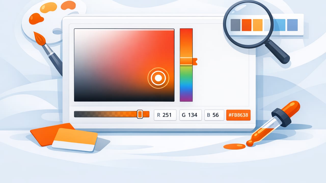
A good color picker can do more than grab a pretty HEX value from a photo. Used well, it becomes a repeatable workflow for translating real-world color (paint, fabric, packaging, nature, product photos) into reliable palettes you can use across UI design, branding, illustration, and interior mood boards.
The challenge: photos lie. Lighting, camera processing, compression, and even your screen’s calibration can shift a color enough to break consistency. This guide walks through a practical, designer-friendly workflow: how to capture better source images, sample colors accurately, build balanced palettes, and validate your choices for both digital and print outcomes.
What a color picker actually measures (and why photos can mislead)
When you sample a pixel from a photo, you’re not sampling the “true” paint color or fabric dye. You’re sampling a recording of that color after multiple transformations:
- Lighting temperature (warm indoor bulbs vs. cool daylight)
- Shadows and reflections (specular highlights can push colors toward white)
- Camera processing (auto white balance, HDR, sharpening, saturation boosts)
- Compression (JPEG artifacts can alter edge pixels)
- Display differences (your monitor or phone may be oversaturated)
That doesn’t make photo color picking useless—it just means your workflow should include a few safeguards so your palette stays stable and believable.
A reliable color picker workflow (from photo to usable palette)
1) Start with the best possible source image
If you can control the photo (rather than downloading a random image), you’ll get dramatically better results.
- Use neutral light: daylight or a consistent soft light source reduces color casts.
- Turn off heavy filters: avoid “vivid” modes that shift saturation.
- Lock exposure and white balance if your camera allows it.
- Include a neutral reference (white paper or a gray card) when possible; it helps you judge casts.
- Avoid glossy glare: reposition your angle to reduce highlights on reflective surfaces.
2) Sample multiple points, not one pixel
Colors in real materials vary. Even a painted wall has micro-shadows and texture. Instead of sampling a single pixel:
- Pick 3–5 points in the same material area (mid-tones, not highlights or deep shadows).
- Compare the values and choose the most representative mid-value.
- If your color picker supports it, sample a slightly larger region or average adjacent pixels.
This reduces the odds you’ll accidentally capture a shadow-tinted or highlight-washed version of the color.
3) Build a palette with roles (not just “nice colors”)
A useful palette assigns jobs to colors. Whether you’re designing an app UI or a living room mood board, roles keep decisions consistent.
- Base / Background: large surfaces (canvas, walls, UI backgrounds)
- Primary: the main brand or focal color
- Secondary: supporting accent
- Neutral: grays or warm neutrals for balance
- Highlight: small “spark” color for emphasis (buttons, decor accents)
A common mistake is extracting 10–12 similar colors from an image and calling it a palette. Instead, aim for 5–7 colors with clear separation in lightness and purpose.
4) Check hue and lightness with HSL (quick sanity check)
HEX is convenient for implementation, but it hides what matters for harmony: hue and lightness. After sampling, quickly review colors in HSL:
- If two colors have nearly identical lightness, they may compete rather than complement.
- If saturation is extremely high, it may be a camera boost—consider dialing it back for versatility.
- Small hue shifts can be intentional (warm vs. cool neutrals), but accidental casts should be corrected.
Color models cheat sheet (when to use which)
| Model | Best for | What it tells you | Typical output |
|---|---|---|---|
| RGB | Digital screens | Red/Green/Blue channel intensity | rgb(34, 120, 210) |
| HEX | Web/UI implementation | Compact RGB representation | #2278D2 |
| HSL | Palette tuning | Hue, Saturation, Lightness (easier to reason about) | hsl(210, 72%, 48%) |
| HSB/HSV | Creative tools | Hue, Saturation, Brightness (intuitive for adjustments) | hsb(210, 72%, 82%) |
| CMYK | Print production | Ink percentages (device/printer-dependent) | C:80 M:40 Y:0 K:0 |
In practice: extract in HEX/RGB, evaluate in HSL/HSB, and convert to CMYK only when preparing print-ready files with a specific print profile.
Avoid the most common photo color picking errors
Sampling highlights and shadows
Specular highlights are nearly white and will produce washed-out values. Deep shadows skew toward cool or warm depending on ambient light. Prefer mid-tone areas.
Trusting a single photo
If accuracy matters (e.g., matching a product color), sample from multiple photos taken under different lighting. If the color shifts drastically, you likely have a lighting issue rather than a “true” color difference.
Ignoring screen calibration
Two designers can sample the same photo and make different decisions if their displays are wildly different. For critical work, review palettes on at least two screens and avoid making final calls on a highly saturated display mode.
Validate your palette: contrast and accessibility for UI
If your palette will be used in interfaces, validate contrast before you commit. A color picker workflow is only complete if it includes readability checks.
- Test text on background combinations (especially primary on base, and white/black on primary).
- Check states: hover, pressed, disabled.
- Don’t rely on color alone for meaning (pair color with icons or labels).
Design tip: If you love a low-contrast color pairing, reserve it for large elements (cards, panels) and keep body text on high-contrast neutrals.
Turn extracted colors into reusable design tokens
Once you’ve chosen roles and validated contrast, convert your palette into a consistent token set. Here’s a simple CSS variables example you can adapt:
:root {
  --color-base: #F6F2EE;
  --color-surface: #FFFFFF;
  --color-text: #1D1D1F;

  --color-primary: #2278D2;
  --color-primary-600: #1E6AB8;
  --color-primary-700: #195A9B;

  --color-accent: #E07A2F;
  --color-neutral-500: #7A7A7A;
}

.button {
  background: var(--color-primary);
  color: #FFFFFF;
}

.button:hover {
  background: var(--color-primary-600);
}
Even if you’re not building software, this “token thinking” helps interior designers and brand designers stay consistent: base, surface, text, primary, accent, neutrals, and a small scale of tints/shades.
How to expand a palette beyond what you extracted
Photos often don’t contain enough functional steps (lighter/darker variants) for real projects. Expand intentionally:
- Create tints and shades: keep the hue stable while adjusting lightness for states and hierarchy.
- Build a neutral ramp: at least 5 steps (e.g., 100, 200, 300, 600, 900) for backgrounds and text.
- Balance warm and cool: if your base is warm, add a slightly cool neutral for contrast (or vice versa).
A practical rule: if two colors will sit next to each other frequently (text on background, button on surface), ensure they differ clearly in lightness first, then fine-tune hue/saturation.
Interior design note: matching materials is about context
For interiors, extracting colors from inspiration photos can kickstart a scheme, but materials behave differently than pixels. Paint shifts with light and finish; textiles vary by weave; wood changes with grain and stain.
Use your extracted palette to:
- Define the overall temperature (warm/cool) and contrast level
- Create a shopping shortlist for swatches
- Communicate intent with contractors or clients
Then validate with physical samples in the real room lighting. Think of the photo-derived palette as a strong hypothesis—fast to generate, easy to iterate, and great for alignment.
Quick checklist: your next color picking session
- Start with the cleanest photo you can (neutral light, minimal glare).
- Sample 3–5 points per material and choose a representative mid-tone.
- Assign palette roles (base, primary, accent, neutrals, highlight).
- Review in HSL/HSB to spot lighting casts and saturation spikes.
- Expand with tints/shades and a neutral ramp.
- Validate contrast for UI (or validate with swatches for interiors).
- Export/save as tokens so you can reuse the palette consistently.
FAQ
What is the best color picker format to export?
For web and UI, export HEX (and optionally RGB). For palette tuning, keep HSL/HSB available. For print, convert to CMYK using the target print profile.
Why do my picked colors look different in another app?
Different apps can interpret color profiles differently, and images may include embedded profiles. Also, your display settings (True Tone, Night Shift, adaptive color) can shift perception.
How many colors should a palette have?
Most practical palettes start with 5–7 core colors plus a few tints/shades. More than that can be useful, but only if each color has a clear role.
Wrap-up
A color picker is most powerful when it’s part of a system: good source images, multi-point sampling, role-based palettes, HSL sanity checks, and validation for the final medium. If you build that habit, you’ll spend less time second-guessing and more time creating cohesive, repeatable color decisions.
If you prefer doing this on iPhone or iPad, an app like Color Viewfinder can help you extract and organize HEX/RGB/HSL values from photos so you can move from inspiration to implementation faster.
