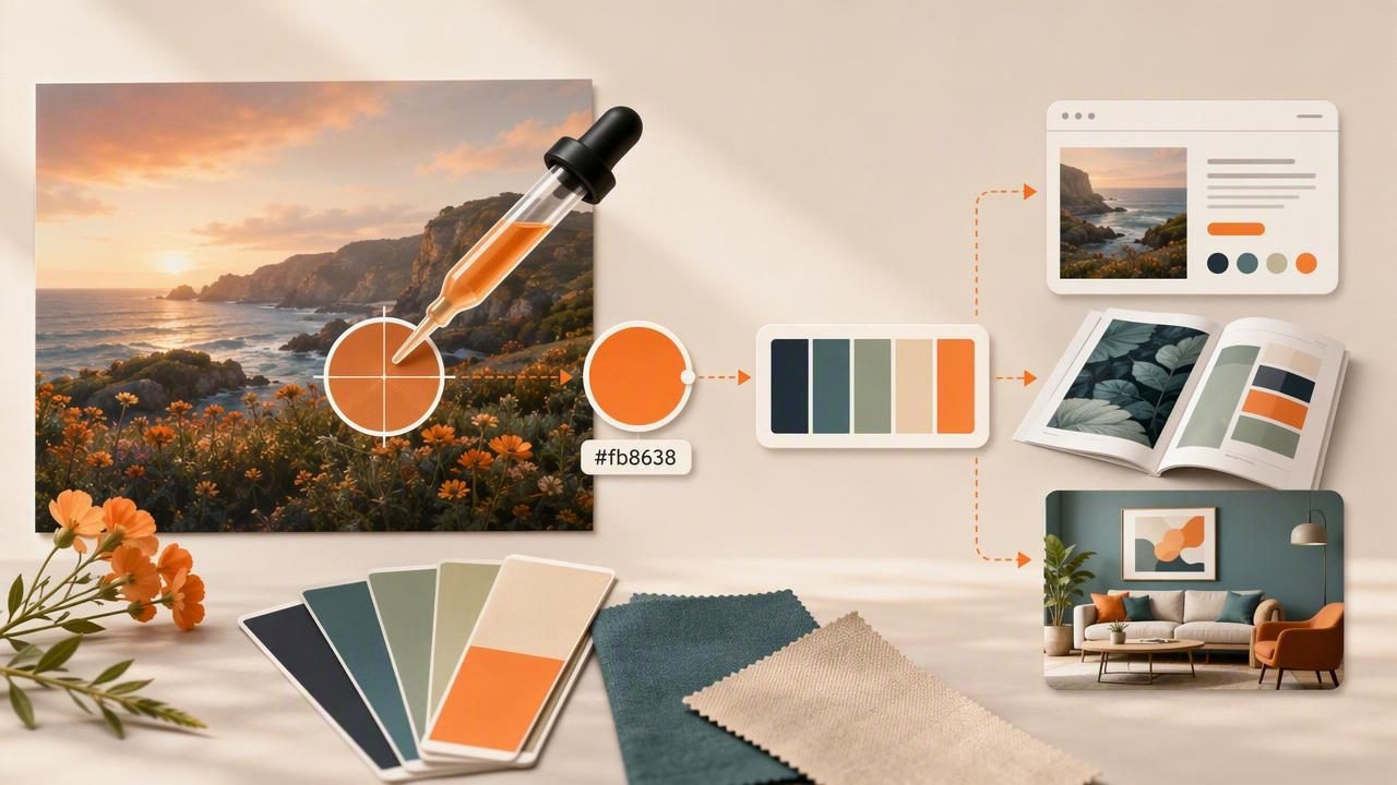
Pulling color from a photo sounds simple—tap a pixel, copy a code, done. In practice, “photo color” is messy: lighting shifts, shadows skew hue, compression adds noise, and one object might contain dozens of slightly different values. A reliable hex color picker workflow turns that mess into a palette you can confidently use across web, print, and interiors.
This guide walks through an end-to-end method: choosing the right photo, sampling accurately, organizing colors into roles, checking contrast, and exporting color values in a format your tools can reuse.
Why a hex color picker workflow matters
HEX codes (like #1F6FEB) are a practical “shared language” across modern design tools. Even if you design in HSL, work with RGB sliders, or specify paint colors, a hex-based palette helps you:
- Standardize color decisions across teams and files.
- Reduce variation caused by manual eyeballing.
- Move faster when building UI components, mood boards, or client presentations.
- Document brand color systems (primary, secondary, neutrals, accents).
Good palettes aren’t found—they’re edited. Sampling from photos is just the first draft.
Quick refresher: HEX, RGB, HSL, HSB—what’s the difference?
You can extract a color in several formats. HEX is common for web and cross-tool sharing; RGB describes light channels; HSL/HSB are often better for adjusting tone and saturation intentionally.
| Model | What it represents | Best for | Example |
|---|---|---|---|
| HEX | RGB packed into hexadecimal | CSS, design tokens, sharing | #FF6A3D |
| RGB | Red/Green/Blue channels (0–255) | Screen work, image editing | rgb(255, 106, 61) |
| HSL | Hue/Saturation/Lightness | Creating tints/shades systematically | hsl(14, 100%, 62%) |
| HSB/HSV | Hue/Saturation/Brightness | Intuitive brightness adjustments | hsb(14, 76%, 100%) |
Step 1: Pick the right photo (your palette quality starts here)
Not all images are equally “sampleable.” Before you open a hex color picker, choose a photo that supports clean extraction:
- Prefer natural, even lighting: Overcast daylight is easier than mixed indoor lighting.
- Avoid heavy filters: Instagram-style grading can push colors beyond what you’ll want in a usable palette.
- Use higher-resolution images: More pixels means more stable sampling, especially on textured surfaces.
- Watch for JPEG artifacts: Compression can create “blocky” color variations in gradients and shadows.
Pro tip: crop before sampling
If the photo contains too many competing colors, crop to the area that represents your intended mood. A focused region yields a tighter, more coherent palette.
Step 2: Sample correctly (avoid the 5 common extraction mistakes)
When you tap or drag a picker over an image, you’re selecting one pixel (or an averaged area, depending on the tool). The goal is to sample colors that represent the material, not the lighting.
Common mistakes (and what to do instead)
- Sampling highlights: Bright reflections are often near-white and not representative. Instead: sample midtones on the same object.
- Sampling shadows: Shadows add blue/gray casts. Instead: sample where the surface is evenly lit.
- Sampling textured areas: Fabric, wood, and foliage vary wildly pixel to pixel. Instead: sample multiple nearby points and average mentally (or pick the most frequent value).
- Sampling edges: Anti-aliasing blends foreground/background, creating “in-between” colors. Instead: sample away from edges.
- Trusting a single pick: One pixel is an outlier risk. Instead: collect 5–10 candidates per key color.
A simple multi-sample method
For each color you want (say, “ocean blue”):
- Take 5 samples across similar areas.
- Discard the lightest and darkest picks.
- Keep the most “typical” midtone as your base.
This takes less than a minute and drastically improves consistency.
Step 3: Turn raw picks into a usable palette (assign roles)
A palette becomes practical when every color has a job. Instead of ending up with 14 random HEX values, build a small system:
- Primary: the brand’s most recognizable color.
- Secondary: supports primary (buttons, highlights, decor accents).
- Accent: used sparingly for emphasis (CTAs, labels, small decor moments).
- Neutrals: background, surfaces, typography (usually 3–6 steps from light to dark).
- Status colors (optional): success/warning/error for UI systems.
Recommended palette sizes
- UI/brand: 8–14 colors total (including neutral scale).
- Interior mood board: 5–9 colors (1–2 anchors, 2–3 supporting, 2–4 neutrals).
- Illustration/poster: 6–12 colors (depending on style and print constraints).
Step 4: Edit in HSL/HSB (make it coherent)
Even if you extracted HEX, editing is often easier in HSL/HSB because you can:
- Unify saturation across colors so the palette feels intentional.
- Create steps (lighter/darker) for hover states, borders, and shadows.
- Correct color casts introduced by lighting (too warm/cool).
Try this quick correction pass:
- Pick your primary color as-is.
- For supporting colors, adjust saturation so none feel accidentally “louder” than the primary.
- Build a neutral ramp by keeping saturation low and spacing lightness evenly (e.g., 95%, 85%, 70%, 50%, 30%, 15%).
Step 5: Check contrast (the step most palettes skip)
If your colors will appear as text, icons, or UI elements, contrast matters for readability and accessibility. A beautiful photo-derived palette can fail instantly when applied to buttons or body text.
Fast contrast sanity checks
- Text on background: ensure dark text on light backgrounds and vice versa.
- Accent restraint: accents should pop without vibrating against their background.
- Don’t use color alone: for “error/success,” pair color with icons or labels.
If you don’t have a contrast checker handy, a practical rule of thumb is: avoid mid-tone text on mid-tone backgrounds. Push either the text darker/lighter, or shift the background.
Step 6: Name, store, and export (so you can reuse the palette)
Color systems become valuable when you can reapply them without re-sampling. Use a consistent naming convention based on roles, not vibes.
Naming convention examples
- Role-based:
primary,secondary,accent,bg,text - Scale-based neutrals:
neutral-50,neutral-100…neutral-900 - Hue + scale:
blue-500,blue-700
Example: export as CSS variables (design tokens)
:root {
  --color-primary: #1F6FEB;
  --color-secondary: #FF6A3D;
  --color-accent: #22C55E;

  --neutral-50: #F8FAFC;
  --neutral-200: #E2E8F0;
  --neutral-600: #475569;
  --neutral-900: #0F172A;
}

body {
  background: var(--neutral-50);
  color: var(--neutral-900);
}

.button {
  background: var(--color-primary);
  color: #FFFFFF;
}
This approach translates well into most workflows (web, product design systems, handoff docs) and makes palette updates painless.
Two practical examples: photo palette to real-world use
Example A: UI palette from a travel photo
Imagine a coastal photo: deep ocean, pale sky, warm sand, and a coral umbrella.
- Primary: ocean midtone (buttons, links)
- Secondary: coral (CTAs, badges)
- Neutrals: sky-to-slate ramp for backgrounds and text
- Accent: seafoam for success states or highlights
Editing focus: reduce saturation in coral slightly so it doesn’t overpower the interface, and ensure body text uses a dark neutral rather than the sampled ocean shade.
Example B: interior palette from a living room photo
Say you love a room image with walnut wood, linen sofa, olive plant, and brass lamp.
- Anchors: walnut brown + olive green
- Supports: brass/gold (used sparingly)
- Neutrals: linen, warm white, and a deeper charcoal for contrast
Editing focus: warm up neutrals so whites don’t look icy next to wood, and keep brass as an accent (not a dominant field color).
A quick checklist for better HEX picks
- Sample midtones (not highlights/shadows).
- Take multiple samples per color and choose the representative value.
- Assign roles (primary/secondary/accent/neutrals).
- Adjust saturation and lightness for cohesion.
- Sanity-check contrast for text and UI.
- Export with names so the palette is reusable.
Choosing a hex color picker tool
Any tool is viable if it supports precise sampling, multiple color formats (HEX/RGB/HSL/HSB), and a way to save or export palettes. If you prefer working from an iPhone or iPad, an app like Color Viewfinder can streamline photo sampling and palette organization while you’re on the go.
