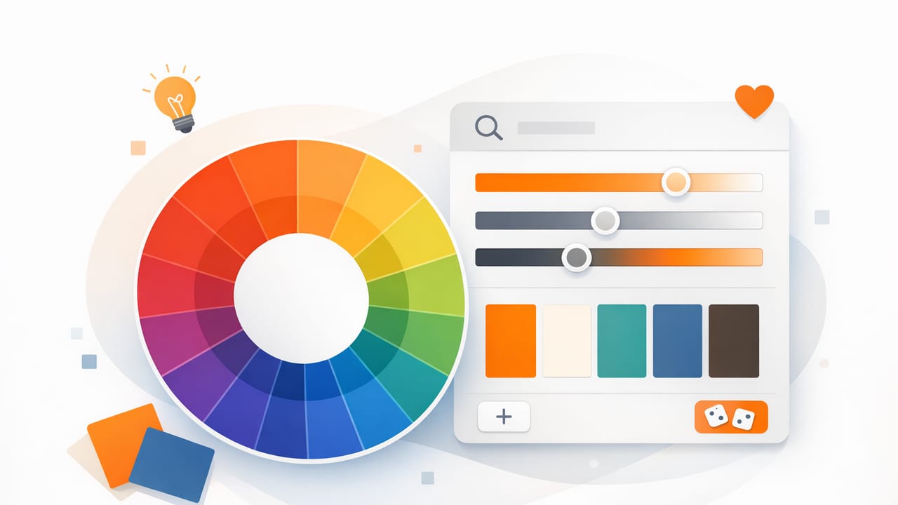
A palette generator can do more than “grab a few nice colors.” Used well, it helps you build a repeatable color system—one that stays consistent across screens, print pieces, or even a physical space like a living room. The key is knowing what to extract, what to ignore, and how to organize the results into roles (background, text, accent, etc.) rather than treating a palette like a random set of swatches.
This guide walks through a practical workflow for turning a photo into a usable palette, then refining it for real design constraints: contrast, hierarchy, mood, and consistency across materials.
What a palette generator actually does (and what it doesn’t)
Most palette tools follow the same basic approach:
- Color extraction: sampling pixels from an image to find dominant colors and/or clusters.
- Palette creation: reducing those samples into a smaller set of representative swatches.
- Color formatting: outputting values in HEX, RGB, HSL, or similar formats.
What a palette generator doesn’t do automatically is make the palette functional. A beautiful palette can still fail if:
- Text doesn’t meet contrast requirements.
- There’s no clear accent color for actions or highlights.
- The palette lacks neutrals, making layouts feel loud.
- Colors shift across devices or lighting conditions in the real world.
Step 1: Choose the right source image (your palette’s “truth”)
Your palette is only as good as the image you start with. Pick an image that matches the mood and materials of the project:
- Brand/UI: a hero photo, product shot, or campaign image with clear lighting and intentional color styling.
- Interior design: a room photo taken in neutral daylight, or a materials flat lay (fabric, wood, paint chip, tile).
- Illustration/creative projects: a reference photo with a strong focal point and a limited number of dominant hues.
Quick quality checklist
- Lighting: avoid extreme warm/cool color casts unless that’s the intended mood.
- Noise: grainy images can create “phantom colors” in extraction.
- Color variety: too much variety can dilute the palette; too little can produce a monotone set.
- Intent: choose an image that represents the project, not just something pretty.
Step 2: Extract colors with purpose (dominant vs. useful)
A common mistake is relying only on “dominant colors.” Dominant colors are often background tones (sky, wall paint, empty space). Useful palettes typically include:
- Neutrals: light and dark anchors (off-white, charcoal, warm gray).
- Mid-tones: supporting colors for sections and surfaces.
- Accents: higher-chroma colors for calls to action, highlights, décor pops.
When using a palette generator, sample from key areas of the photo:
- The subject (product, focal decor, main object)
- Shadow regions (for darker neutrals)
- Highlights (for light neutrals)
- A small saturated detail (for accent color)
A palette is a system, not a screenshot. Extraction is the starting point; organization and refinement make it usable.
Step 3: Convert swatches into “roles” (the part most people skip)
Instead of labeling colors as “Blue 1” and “Blue 2,” map them to roles. Here’s a practical role set you can adapt to UI, print, or interiors:
- Base Light: backgrounds, negative space
- Base Dark: text, outlines, anchors
- Surface: cards, panels, secondary backgrounds
- Primary Accent: buttons, focal decor element
- Secondary Accent: tags, icons, supporting decor
- Status/Utility (optional): success/warning/error equivalents
Role mapping example
Let’s say a photo gives you these extracted swatches:
- Sand (#E8DDCC)
- Charcoal (#2E2F33)
- Sea glass (#7FB7B2)
- Terracotta (#C86B4A)
- Slate (#6C7683)
You could map them like this:
- Base Light: Sand
- Base Dark: Charcoal
- Surface: Slate (tinted or lightened if needed)
- Primary Accent: Terracotta
- Secondary Accent: Sea glass
Step 4: Check harmony with a simple palette “type”
If your extracted colors feel chaotic, classify them into a harmony pattern and adjust. A palette generator gives raw material; harmony makes it cohesive.
| Palette type | What it looks like | Best for | Risk |
|---|---|---|---|
| Monochrome | One hue, multiple tints/shades | Minimal UI, calm interiors | Not enough contrast or emphasis |
| Analogous | Neighboring hues (e.g., blue–teal–green) | Natural, “designed” feel | Accents can feel too similar |
| Complementary | Opposites on the wheel (e.g., blue + orange) | Strong focal points, CTA buttons | Can look harsh if overused |
| Triadic | Three evenly spaced hues | Playful brands, illustrations | Easy to lose cohesion without neutrals |
Practical move: if you have too many competing hues, keep one as the dominant family (your “home base”), then choose one contrasting accent.
Step 5: Validate contrast (especially for UI and readable graphics)
For digital design, contrast is non-negotiable. Even if you’re not memorizing accessibility formulas, you should test these pairings:
- Text on Base Light (body copy)
- Text on Surface (cards, panels)
- Text/icon on Primary Accent (buttons)
Quick contrast heuristics
- If both colors are mid-value (neither clearly light nor dark), contrast is usually weak.
- Accents often need a darker or lighter “on-accent” text color than you expect.
- Neutrals do most of the heavy lifting: strong light + strong dark simplifies everything.
If a chosen accent fails for text, you can still keep it as a non-text accent (dividers, illustrations, soft highlights) and pick a slightly shifted variant for buttons.
Step 6: Create a scalable set (tints, shades, and tokens)
A palette generator typically outputs 5–8 colors. Real projects often need more steps: lighter and darker variants for hover states, shadows, borders, and large surfaces.
For each core swatch, generate:
- 2–3 tints (mixed with white / higher lightness)
- 2–3 shades (mixed with black / lower lightness)
- 1 desaturated version (for backgrounds or large areas)
Example: turn palette roles into CSS variables
If you’re working on a website or app UI, tokenizing colors keeps things consistent and easy to update:
:root {
  --color-bg: #E8DDCC;
  --color-text: #2E2F33;
  --color-surface: #F2EADB;
  --color-border: #D6CCBE;

  --color-accent: #C86B4A;
  --color-accent-on: #FFFFFF;

  --color-accent-2: #7FB7B2;
  --color-accent-2-on: #0B2B2A;
}

.button {
  background: var(--color-accent);
  color: var(--color-accent-on);
}
This approach also translates well to print specs or interior boards: roles become “Wall,” “Trim,” “Upholstery,” “Accent décor,” and so on.
Step 7: Export in the right format for your workflow
Once refined, export matters. Different teams and tools prefer different representations:
- HEX: common for web/UI and many design tools.
- RGB: useful for screen-based work and quick adjustments.
- HSL/HSB: best for systematic tweaking (lightness, saturation).
- Palette images (PNG/PDF): ideal for sharing with clients or contractors.
- Swatch libraries: helpful if your design software supports importable swatches.
Tip: Include names and roles in your exported palette (not just color values). “Primary Accent” communicates intent; “#C86B4A” does not.
Common palette generator mistakes (and quick fixes)
1) Too many similar mid-tones
Fix: pick one mid-tone, then deliberately add a stronger light and a stronger dark neutral.
2) Everything is saturated
Fix: keep 1–2 saturated accents, then desaturate supporting colors for backgrounds and surfaces.
3) Accents fight each other
Fix: choose a single “hero” accent and push other accents toward quieter, supportive roles.
4) Palette looks good in a strip but fails in layouts
Fix: test colors in context: buttons, headlines, background sections, and imagery overlays. A palette is proven in mockups, not swatches.
Mini workflow: from photo to a finished palette in 10 minutes
- Pick a representative photo with clean lighting.
- Use a palette generator to extract 6–8 swatches.
- Identify two neutrals (light + dark) from the set or sample them directly.
- Select one primary accent (most distinctive saturated color).
- Add one secondary accent or supporting hue (optional).
- Create tints/shades for surface, borders, and hover/active states.
- Check text contrast on base and accent colors.
- Assign roles and rename swatches accordingly.
- Export in the formats your team uses (HEX/RGB/HSL + image).
- Test in a real layout (UI screen, poster draft, or room board).
FAQ: palette generator questions designers actually ask
How many colors should a palette have?
For most projects, start with 5–7 core colors (including neutrals), then expand with tints/shades. More colors often means less consistency.
Should I extract colors from multiple photos?
Yes—if you’re building a broader system (brand or room concept). Extract from 3–5 images, then keep only the overlapping or most consistent hues.
What’s the best color format to edit a palette?
HSL/HSB is usually easiest for refinement because you can adjust lightness and saturation predictably while preserving the hue identity.
Closing thought: make palettes reusable
The best outcome of using a palette generator is not a one-off set of pretty swatches—it’s a reusable system you can apply consistently across screens, pages, or rooms. Extract with intention, define roles, validate contrast, and export in a way your workflow can actually use.
If you prefer building palettes on iPhone or iPad, tools like Color Viewfinder can help you extract HEX/RGB/HSL values from photos and organize them into shareable palettes—just remember the refinement steps above are what turn extraction into design.
