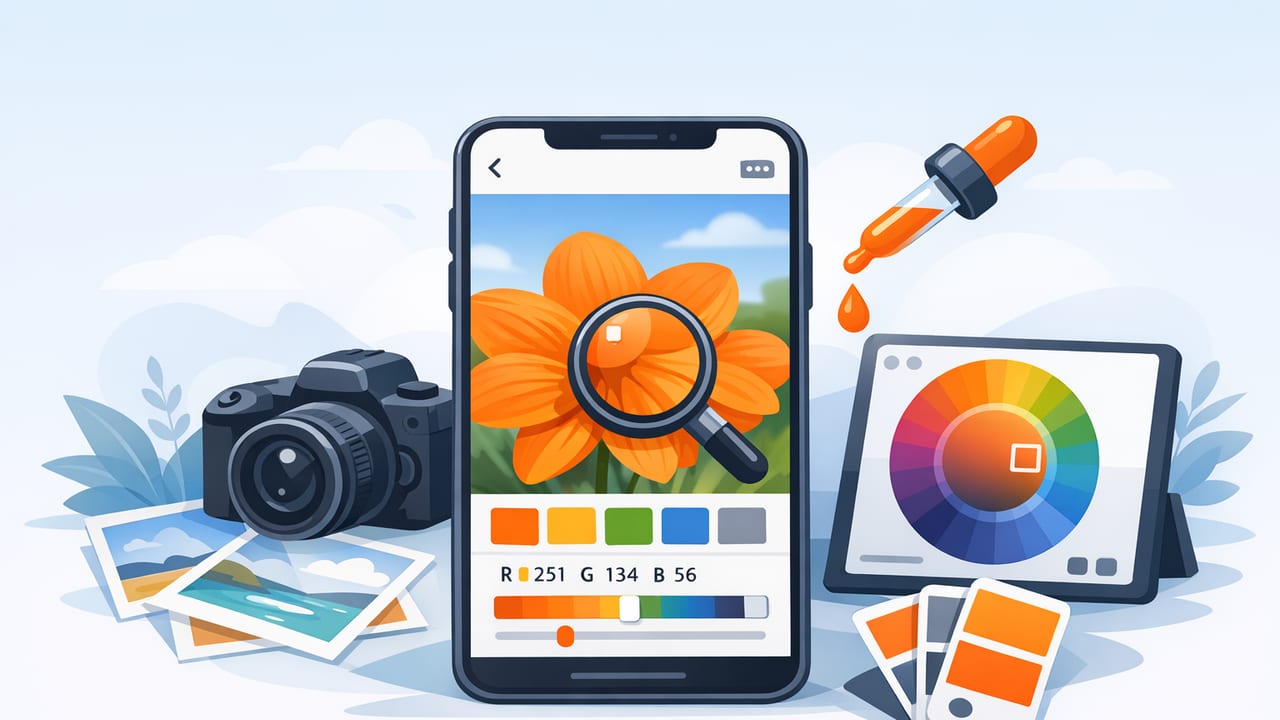
Pulling colors from a photo sounds simple: tap a pixel, copy a HEX code, done. In real projects, though, color picking can get messy fast—lighting shifts, camera processing, shadows, glossy surfaces, and screen differences can all turn “that perfect beige” into a frustrating mismatch.
This guide walks through a practical, repeatable workflow for using an app to pick colors from photos—whether you’re building a brand kit, matching paint and textiles, designing a UI, or creating social graphics. You’ll learn how to sample smarter, verify your results, turn raw picks into a usable palette, and export colors in the formats your tools expect.
Why photo-based color picking fails (and how to fix it)
When you sample a color from a photo, you’re not sampling the “true” object color—you’re sampling a rendered pixel influenced by many factors:
- White balance: Indoor lighting can push everything warm (yellow/orange) or cool (blue/green).
- Exposure and HDR: Phones brighten shadows and compress highlights, changing midtones.
- Reflections: Glossy paint, glass, and metal pick up surrounding colors.
- Compression and filters: Social apps and JPEG artifacts can shift colors subtly.
- Context: The same color looks different next to different neighbors (simultaneous contrast).
The fix isn’t “find a better magic color.” It’s using a workflow that samples consistently, averages intelligently, and turns picks into a palette with roles (background, accent, text, etc.).
Pro rule: Don’t pick one pixel and call it a day. Pick a color, then pick its “supporting cast” (light, mid, dark, accent) so the palette behaves across layouts.
Step-by-step workflow: from photo to reliable palette
1) Start with the best source image you can
Better inputs produce more stable color values. Before sampling:
- Prefer original photos over screenshots from social platforms.
- Avoid heavy filters if your goal is realism (paint matching, product colors).
- If possible, use even lighting and avoid mixed light sources (sun + warm bulbs).
- Zoom in until the area you want is mostly one material (e.g., wall paint, fabric weave).
If you’re picking from a real-world scene for interior design, take multiple photos: one close-up in shade, one in indirect daylight, and one from normal viewing distance. You’ll spot shifts and choose a more “central” value.
2) Sample the right areas (not the obvious ones)
People often tap the brightest highlight or the deepest shadow—both are extremes. For a truer base color, sample the midtone region: not the shiny spot, not the dark crease, but the flatter area in between.
- For walls: sample away from corners, baseboards, and window glare.
- For skin tones: sample cheeks or forehead midtones; avoid specular highlights.
- For products: sample the “main body” color, then sample a second point and average mentally (or use multiple swatches in your palette).
3) Capture a 5–7 color palette (not 1–2 colors)
A usable palette usually needs roles. A simple structure that works for design, decor, and content creation is:
- Background light (near-neutral)
- Background dark (for contrast)
- Primary midtone (dominant color)
- Secondary color (supporting hue)
- Accent (small, high-impact color)
- Optional: warm neutral and cool neutral
When you build this set, your colors are more likely to “travel well” from the original photo into layouts, presentations, UI screens, or mood boards.
4) Check readability and contrast early
A palette can be gorgeous and still fail in practice if text becomes unreadable. Before you commit, test at least two text-on-background pairings:
- Dark text on light background (most body copy)
- Light text on dark background (buttons, headers, overlays)
If your color picker app provides multiple color models, use that to your advantage:
- HSL/HSB: adjust lightness/brightness to create safe text backgrounds without changing the hue too much.
- RGB/HEX: keep precise values for implementation and handoff.
Color formats you’ll encounter (and when to use each)
Most tools accept several color formats. Here’s a quick reference so you export the right values for the right job.
| Format | Best for | Example | Notes |
|---|---|---|---|
| HEX | Web/UI, design handoff | #2F6F8E |
Compact, widely used in CSS and many design tools. |
| RGB | Screen-based work, fine control | 47, 111, 142 |
Great for understanding channel balance (red/green/blue). |
| HSL | Palette tuning, variants | 199°, 50%, 37% |
Lightness makes it easy to create tints/shades consistently. |
| HSB/HSV | Picking by “feel” (bright vs muted) | 199°, 67%, 56% |
Brightness is intuitive for adjusting vividness and depth. |
Turning a photo palette into a design system
Once you have your 5–7 sampled colors, the next step is to assign roles and create variants. This makes the palette usable across many screens and layouts, not just a single poster or room mood board.
1) Name colors by function, not by hue
Instead of “OceanBlue” or “SunsetGold,” consider functional names that survive brand evolution:
- Background / Surface / Canvas
- Text / Muted text
- Primary / Secondary
- Accent / Warning / Success (if applicable)
2) Create light and dark variants
From one sampled midtone, create a lighter tint and a darker shade. Using HSL/HSB can make this more controlled than guessing with RGB.
For example, if your midtone feels right but text contrast fails, keep hue and saturation similar and adjust lightness/brightness until readability improves.
3) Build a quick CSS variable kit (optional)
If you work on web projects, paste your final HEX values into CSS variables so they’re easy to reuse:
:root {
  --bg: #F6F3EE;
  --surface: #FFFFFF;
  --text: #1B1E24;
  --muted: #5B6472;
  --primary: #2F6F8E;
  --secondary: #7A8F5A;
  --accent: #D97A3A;
}

.button {
  background: var(--primary);
  color: var(--surface);
}

.badge {
  background: var(--accent);
  color: var(--text);
}
This step is also useful if you’re handing colors to a developer: role-based tokens reduce misunderstandings compared to sending a list of unnamed swatches.
Common mistakes when using an app to pick colors from photos
Mistake 1: Picking from a compressed image
JPEG artifacts can change edge colors and gradients. If a color looks “off,” try sampling from a different part of the area, or use a higher-quality original.
Mistake 2: Sampling a shadow and using it as the base
Shadows often contain color casts (blue from sky, green from foliage). Use midtones for base colors, then sample shadows separately as a “dark variant.”
Mistake 3: Building a palette with no neutrals
Neutrals (off-whites, warm grays, charcoals) are what make accent colors usable. If your palette is all saturated hues, layouts will feel noisy and text will struggle.
Mistake 4: Ignoring context and material
A sampled “white wall” might actually be slightly warm or cool depending on the room. For paint or fabric matching, treat the sampled value as a starting point and compare against physical swatches under your lighting.
Practical mini-exercises to improve your color picking
- The three-point sample: pick the same surface in three nearby spots; keep the middle value as your base and the others as variants.
- Neutral check: find one warm neutral and one cool neutral in the photo; use them as backgrounds to see which makes your accent color pop.
- Accent discipline: limit your accent color to 5–10% of the design; if everything is accent, nothing is.
What to look for in a color picker app
Not all tools make this workflow easy. Useful capabilities include:
- Multiple color models: HEX, RGB, HSL, and HSB/HSV.
- Palette layouts: so you can see colors together, not as isolated picks.
- Export options: copy values, share palettes, or export formats compatible with your tools.
- Fast sampling: responsive picking and easy zoom for precise selection.
Wrap-up: a repeatable process beats a perfect pixel
The most dependable way to pull color from imagery is to treat photo sampling as palette building, not just color grabbing. Choose better sources, sample midtones, capture a set of functional roles, verify contrast, and export in the formats you actually use. With that process, your palettes will feel consistent across devices and projects—and you’ll spend less time second-guessing values.
If you’re looking for an iPhone or iPad tool that supports fast photo sampling and palette organization with instant HEX/RGB/HSL/HSB values, Color Viewfinder is one option worth exploring.
