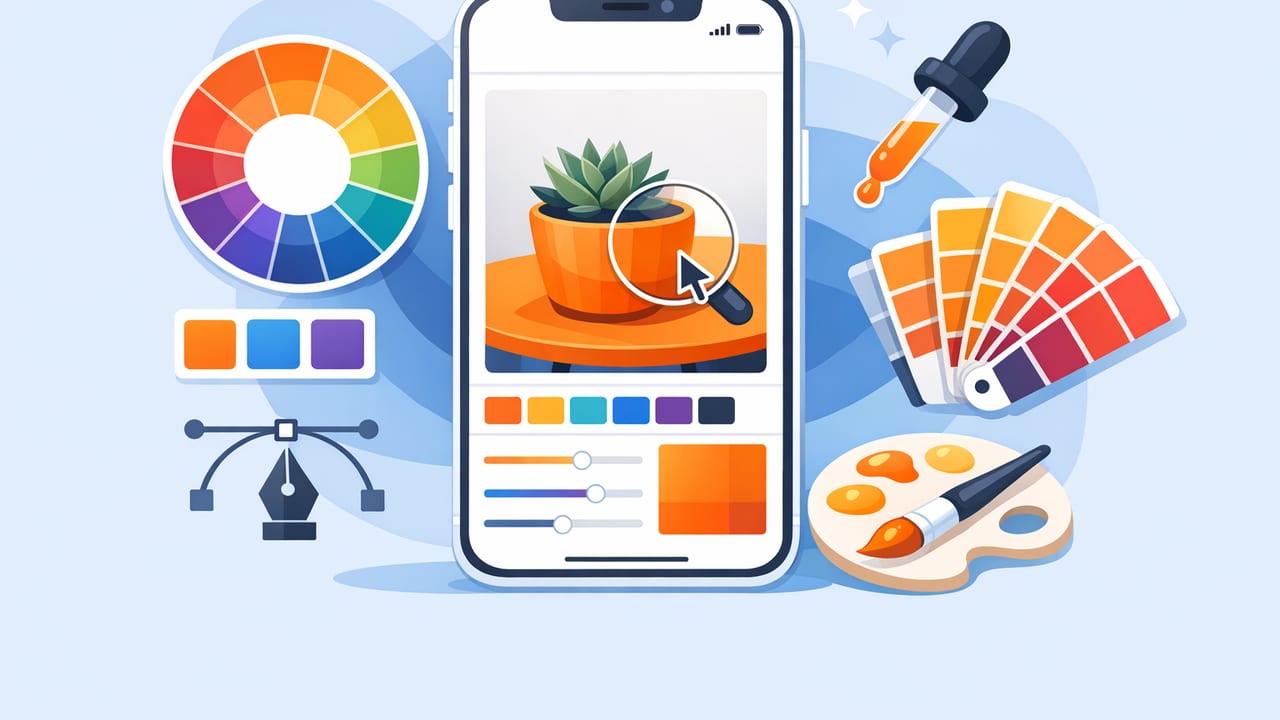
Picking color from the real world is one of the fastest ways to design palettes that feel believable: the paint color you loved in a café, the muted blues in a rainy street photo, or the warm neutrals in a fabric swatch. The challenge is translating those impressions into usable, consistent values like HEX, RGB, HSL, or HSB.
This guide explains a practical, repeatable workflow for using an iOS app to pick colors from photos—so your extracted colors are more accurate, your palette is more cohesive, and your final designs are easier to implement across web, print, and interior spaces.
What an iOS app to pick colors actually does (and what it can’t)
A color picker app typically samples pixels from an image and returns the numeric values for that pixel (or a small averaged area). It can also help you group sampled colors into a palette and export them for your tools.
It’s good for
- Capturing inspiration quickly from photos you take on-site.
- Creating palette options (neutrals + accents) from one reference image.
- Communicating color precisely to teammates or clients using codes.
It’s not a full color-management pipeline
- It won’t fully correct for mixed lighting (e.g., tungsten + daylight).
- It can’t guarantee print accuracy without calibrated monitors, profiles, and proofing.
- It can’t infer “true paint color” when glare and shadows are present—your workflow has to account for that.
Rule of thumb: treat extracted colors as a strong starting point, then refine for context—contrast, accessibility, material, and lighting.
Before you sample: set yourself up for cleaner color extraction
If you want your iPhone/iPad color picking results to be consistent, the photo matters as much as the picker.
1) Avoid extremes: harsh glare and deep shadow
Color pickers read pixels literally. A highlight on glossy paint can push values toward white; a shadow can shift a color darker and cooler. When possible:
- Move slightly to reduce reflections.
- Take a second photo from a different angle.
- For interiors, try shooting when daylight is steady (overcast is often ideal).
2) Lock exposure and focus
On iPhone, press-and-hold to AE/AF Lock (depending on your iOS version/camera app). This reduces exposure shifts between shots, which can change sampled values.
3) Include a neutral reference when possible
If you can include something that should be neutral (a gray card, white paper, or a known neutral surface), it becomes easier to judge whether the photo is too warm or too cool.
A reliable workflow: from photo to palette to usable color system
Step 1: Pick a few “anchor” colors
Start by sampling 3–5 anchors:
- Main surface (dominant background): wall, sky, fabric field.
- Secondary surface: furniture, foliage, midtone element.
- Accent: signage, trim, a single standout object.
- Dark neutral: shadow-free dark area (not pure shadow).
- Light neutral: highlight-free light area (not glare).
This is the fastest way to avoid a palette made entirely of “interesting accents” with no stable neutrals.
Step 2: Sample smart—average, don’t chase single pixels
If your app supports it, sample a small area (or sample multiple nearby points) and choose the most representative value. Single-pixel sampling is fragile: a tiny spec of noise, texture, or compression artifact can skew values.
Step 3: Validate with HSL/HSB to understand what you captured
HEX and RGB are great for implementation, but HSL/HSB make the palette easier to evaluate:
- Hue: Are your neutrals actually slightly green, red, or blue?
- Saturation: Are any colors too intense compared to the source vibe?
- Lightness/Brightness: Do you have a usable range for hierarchy?
Step 4: Build hierarchy (base, UI surfaces, accents)
Even if you’re designing a poster or a room mood board, hierarchy prevents chaos. A simple structure:
- Base neutrals (2–4 colors): background, canvas, large surfaces.
- Support colors (2–3 colors): secondary blocks, illustrations, textiles.
- Accents (1–2 colors): calls-to-action, focal points, decor highlights.
Step 5: Adjust for usability (contrast and context)
Colors that look perfect inside a photo don’t always work for text, UI components, or painted walls. Make small, intentional adjustments:
- Increase contrast between text and backgrounds.
- Reduce saturation for large surfaces (walls, backgrounds).
- Keep accents vivid, but use them sparingly.
Understanding the values you export: HEX vs RGB vs HSL/HSB
| Model | Best for | What to watch for |
|---|---|---|
| HEX (#RRGGBB) | Web/UI, sharing exact values | Doesn’t describe hue/saturation directly |
| RGB (r,g,b) | Screen design, graphics apps | Hard to reason about harmony by numbers alone |
| HSL (h,s,l) | Tuning palettes, making tints/shades | Lightness adjustments can shift perceived saturation |
| HSB/HSV (h,s,b) | Choosing colors by “brightness” feel | Bright colors can still be poor for accessibility |
Practical example: turn a photo palette into web-ready design tokens
After you extract HEX values, a simple next step is to store them as CSS variables (or design tokens) so they stay consistent across components.
/* Example design tokens from an extracted palette */
:root {
  --color-surface: #F4F1EA;
  --color-surface-alt: #E7E0D6;
  --color-text: #1E1E1E;
  --color-muted: #6B6B6B;
  --color-accent: #C45A3D;
  --color-accent-2: #2F6F8F;
}

body {
  background: var(--color-surface);
  color: var(--color-text);
}

.button {
  background: var(--color-accent);
  color: #FFFFFF;
}
Tip: if your accent color doesn’t allow readable white text, create a darker accent variant (or use dark text on a lighter accent). The goal is to preserve the inspiration while meeting real-world constraints.
Tips to get more accurate results from an iOS app to pick colors
Sample multiple points per material
Paint, fabric, wood, and stone all have variation. Pick 3–5 points and choose a value that represents the “average look,” not a knot in the wood or a shadow in the weave.
Watch for camera processing
Phone cameras apply sharpening, noise reduction, and HDR. If your photo looks “crunchy,” colors can be slightly exaggerated. When possible, use a more neutral capture mode and avoid extreme filters before sampling.
Use a consistent viewing setup
If you’re refining palettes on iPad/iPhone, reduce night-shift/true-tone shifts when doing precision work (or at least be aware they can change perceived warmth).
Build a tint/shade ladder
For UI and branding, you often need a set of steps (e.g., 100–900). Start with your extracted base color, then create lighter and darker versions in HSL/HSB while keeping hue stable.
Common mistakes (and how to fix them)
Mistake 1: Picking only the most colorful pixels
Fix: include neutrals and midtones. A strong palette usually has more quiet colors than loud ones.
Mistake 2: Using shadow pixels as “dark neutrals”
Fix: sample dark areas that are still under the same material color, not areas dominated by shadow cast. If you must sample a shadow, compare it to a midtone sample and adjust the hue back toward the midtone.
Mistake 3: Ignoring accessibility and readability
Fix: run contrast checks for text/background pairs, especially if you’re applying photo-derived colors to UI. If contrast fails, keep hue but adjust lightness and saturation until it passes.
Mistake 4: Exporting without naming or structure
Fix: name colors by role (Surface / Text / Accent) rather than by vague names. You can still add descriptive labels (e.g., “Terracotta Accent”), but role-based naming scales better.
Use cases: graphic design, interior design, and creative projects
Graphic design
- Extract a palette from a campaign photo, then tune it into a consistent system for social posts.
- Pull secondary colors from product photography to keep layouts cohesive.
Interior design
- Sample upholstery, flooring, and existing wood tones to plan paint and textiles.
- Create multiple palette options (warm vs cool) from the same room photo for client review.
Hobbies and making
- Match yarn, beads, or paper crafts to a reference image.
- Create a ‘seasonal’ palette collection from nature photos.
Checklist: a repeatable color-picking process
- Take a clean photo (steady light, minimal glare, locked exposure).
- Sample anchors first (dominant, secondary, accent, light neutral, dark neutral).
- Validate in HSL/HSB (hue drift, saturation spikes, lightness range).
- Organize by role (surface, text, muted, accent).
- Adjust for contrast and real-world usability.
- Export in the formats your workflow needs (HEX/RGB for dev, palette formats for design tools).
Final thoughts
An iOS app to pick colors is most powerful when you treat it like a measurement tool: capture inspiration quickly, then refine intentionally so the palette works in your actual medium—web, print, or physical spaces. If you build a habit around anchors, hierarchy, and light/contrast checks, you’ll get palettes that feel both authentic and functional.
If you’re looking for a simple way to extract HEX/RGB/HSL/HSB values from photos and assemble exportable palettes on iPhone or iPad, Color Viewfinder is one option to explore.
