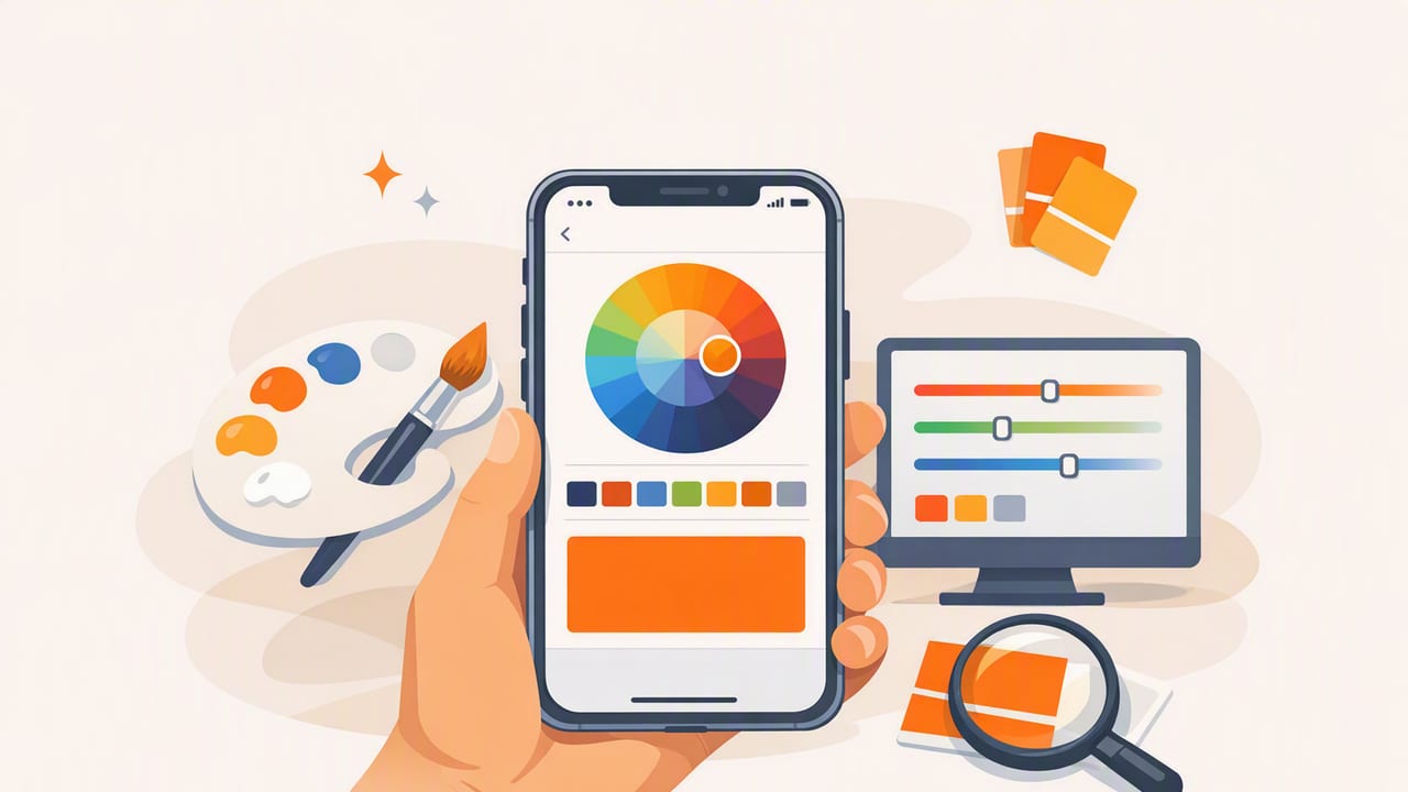
When you’re designing a logo, planning a room refresh, building a social template, or refining a UI, the fastest way to find “the right color” is often to start with a photo. A street mural, a fabric swatch, a product shot, or a screenshot can reveal a palette you wouldn’t invent from scratch.
This guide walks through a repeatable workflow for using an iphone app to pick colors from images—while avoiding common accuracy traps like bad lighting, auto-enhancement, and sampling the wrong pixel. You’ll learn how to extract usable values (HEX, RGB, HSL/HSB), build a balanced palette, and apply it consistently across creative projects.
Why pick colors from photos instead of guessing?
Photos contain real-world color relationships: highlights, shadows, neutrals, and accent hues that already “work” together. Extracting from images helps you:
- Work faster by sampling rather than iterating endlessly.
- Stay consistent across brand assets, interiors, and digital products.
- Match reality (paint, fabric, packaging) more closely than memory.
- Discover unexpected pairings that feel cohesive.
What “accurate” color picking actually means
Before the workflow, it helps to define accuracy. When you pick a color from a photo, you’re not measuring a physical object directly—you’re sampling a pixel that has already been interpreted by:
- Lighting (warm/cool, indoor/outdoor, time of day)
- Camera processing (HDR, sharpening, saturation boosts)
- Image compression (especially screenshots and social images)
- Your display (True Tone, Night Shift, brightness, color profile)
Practical accuracy means: the sampled values are stable, repeatable, and close enough to serve as a reliable starting point for design decisions. You can then adjust (slightly) to fit your medium—print, paint, web, or mobile UI.
Step-by-step workflow: pick colors on iPhone and build a usable palette
1) Start with the best possible source image
Your palette quality depends on your source. Prioritize:
- Original photos over re-uploaded images (less compression).
- Even lighting (avoid harsh shadows or mixed light sources).
- High resolution so you can sample clean areas.
- Minimal filters (social filters can push colors unrealistically).
Tip: If you’re photographing a physical item (paint chip, fabric, wall), include something neutral like a white card or gray paper in the frame. It makes it easier to judge whether the image is too warm or too cool.
2) Reduce display “color drift” before sampling
To avoid your screen altering perception, consider temporarily disabling:
- True Tone (it adapts white balance to ambient light)
- Night Shift (adds warm tint)
This doesn’t change the numeric color values your app reads from the image, but it does affect your judgment when choosing which pixels to sample and which colors to keep.
3) Sample with intention: highlights, midtones, shadows
The most common mistake is sampling only the most “obvious” bright color. Instead, pull a set that represents the scene:
- Primary: the dominant hue (what you notice first)
- Secondary: a supporting hue (often less saturated)
- Accent: a pop color used sparingly
- Light neutral: background/off-white/soft gray
- Dark neutral: text/dark anchor tone
When sampling, zoom in and tap areas that are visually “flat” (not reflective highlights, not noisy texture). If your picker supports it, sample multiple nearby pixels and compare—tiny shifts can matter when you’re building a system.
4) Build a palette that’s balanced (not just pretty)
A usable palette needs contrast and roles, not just harmonious hues. After you grab 6–10 candidates, narrow down to a working set:
- 2 neutrals (light and dark)
- 1–2 core colors (brand/UI primary and secondary)
- 1 accent (CTAs, highlights, accessories)
- Optional utility tones (success/warning/error, or warm/cool variations)
If everything is mid-saturation, the palette can feel noisy. If everything is muted, it can feel dull. Look for a deliberate range in saturation and lightness.
5) Validate contrast for real-world use (especially UI and print)
In digital design, contrast isn’t optional. Even if you’re using extracted colors for interior or branding work, contrast checks help you choose a dark anchor and a light background that won’t fight each other.
As a quick rule of thumb for UI:
- Pick one dark neutral that can serve as body text on a light background.
- Pick one light neutral that can serve as background behind dark text.
- Test your accent color on both backgrounds (it often needs tweaking).
Color formats explained (and when to use each)
Most color picker apps can show multiple formats. Here’s what they’re for:
| Format | Example | Best for | Why it matters |
|---|---|---|---|
| HEX | #1F2937 | Web/UI | Common in CSS, design systems, and handoff specs |
| RGB | 31, 41, 55 | Screen-based work | Matches how screens render color (additive) |
| HSL | 210°, 28%, 17% | Tweaking palettes | Easier to adjust lightness/saturation consistently |
| HSB/HSV | 210°, 44%, 22% | Picking and organizing | Intuitive “brightness” control; useful for variations |
How to turn extracted colors into a consistent “system”
Once you’ve chosen your core palette, give colors roles and names. This prevents random usage later (“Which blue was that again?”). A simple naming approach:
- Neutral-50 / Neutral-900 (light to dark)
- Primary-500 (main brand/UI color)
- Primary-700 (hover/pressed)
- Accent-500 (sparingly used highlight)
Then create deliberate variants. Using HSL is often easiest: keep hue stable, reduce saturation for subtle backgrounds, and adjust lightness for states.
Example: export-ready CSS variables
If you’re collaborating with developers (or just want consistency across tools), store your extracted colors as tokens:
:root {
  --neutral-50:  #F6F7F9;
  --neutral-900: #111827;

  --primary-500: #2563EB;
  --primary-700: #1D4ED8;

  --accent-500:  #F59E0B;
}

body {
  background: var(--neutral-50);
  color: var(--neutral-900);
}

.button {
  background: var(--primary-500);
  color: white;
}

.button:hover {
  background: var(--primary-700);
}
This turns “colors from a photo” into a reusable, scalable design language.
Common mistakes when using an iPhone app to pick colors
Mistake 1: Sampling glossy highlights
Specular highlights (shine on ceramics, metal, glass) are closer to the light source color than the object’s true color. Sample adjacent matte areas instead.
Mistake 2: Picking from heavily compressed images
Messaging apps and social platforms can introduce banding and color shifts. Whenever possible, pick from the original file in Photos rather than a re-saved screenshot.
Mistake 3: Keeping too many similar midtones
If five colors are basically the same lightness, your palette won’t cover typical needs (backgrounds, text, borders, highlights). Keep fewer colors, but with a wider tonal range.
Mistake 4: Treating extracted colors as final paint matches
For interior design, extracted colors are excellent for direction and coordination, but paint matching still depends on brand formulas, lighting, and finishes. Use extracted values to shortlist swatches, then confirm with physical samples.
Practical mini-workflows (UI, branding, interior)
UI design (apps and websites)
- Extract 8–12 candidates from a mood image.
- Select 2 neutrals + 1 primary + 1 accent.
- Create light/dark variants (HSL adjustments).
- Check contrast and reserve accent for emphasis.
Branding (logos and social templates)
- Pick 1 strong primary + 1 secondary + 1 neutral base.
- Ensure the primary works in both large fills and small marks.
- Decide where gradients are allowed (if at all).
Interior design (rooms and decor)
- Extract from a reference photo that matches your desired mood.
- Identify the dominant “field color” (walls/large surfaces).
- Choose 1–2 accents for textiles/art and 1 dark anchor for contrast.
- Verify with real samples under your room’s lighting.
Checklist: a repeatable color-picking process
- Use a high-quality source image with consistent lighting.
- Disable True Tone/Night Shift if you’re judging colors visually.
- Sample flat areas (avoid reflections and noisy textures).
- Capture roles: neutrals, primary, secondary, accent.
- Refine with HSL/HSB to create intentional variants.
- Validate contrast for readability and real-world usability.
- Export values and name them so you can reuse them consistently.
Final thoughts
A good iphone app to pick colors is less about grabbing a single HEX value and more about creating a reliable workflow—from source image quality to palette roles to accessibility and reuse. Once you treat extracted colors as a starting point for a system (not isolated swatches), you’ll produce designs that look cohesive across screens, prints, and spaces.
If you’re looking for an iOS/iPad tool that extracts HEX/RGB/HSL/HSB values from photos and helps you organize palettes for export, Color Viewfinder is one option worth exploring.
