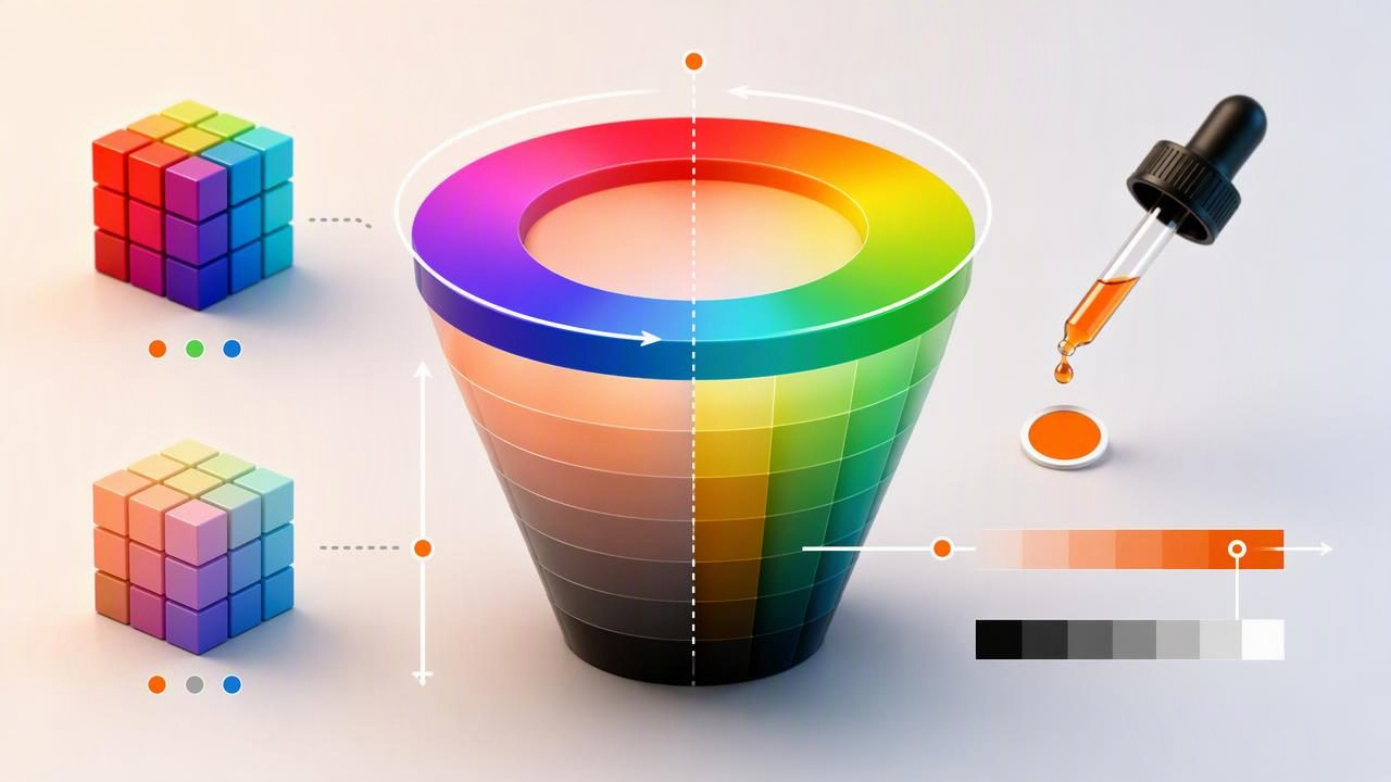
HSB color is a color model that describes a color through three visual qualities: Hue, Saturation, and Brightness. Unlike RGB values, which define how much red, green, and blue light is present, HSB is designed around the way people often think about color while making creative decisions.
For graphic designers, interior designers, photographers, illustrators, and anyone building color palettes, HSB can make color adjustment more intuitive. Instead of changing three channels of light independently, you can keep a color family consistent while making it warmer, softer, darker, brighter, or more muted.
This guide explains what HSB color means, how it compares with RGB and HSL, how to read HSB values, and how to use it in practical design workflows.
What Is HSB Color?
HSB is a color model with three numerical components:
- Hue (H): The basic color family, such as red, orange, blue, or green.
- Saturation (S): The intensity or purity of that hue.
- Brightness (B): How light or dark the color appears.
HSB is sometimes called HSV, where the V stands for Value. In many design tools, the two labels are used for closely related controls. The terminology can vary, but the practical idea is the same: select a hue, decide how vivid it should be, and then set how bright it should look.
| HSB component | Typical range | What it controls |
|---|---|---|
| Hue | 0°–360° | The color family on the color wheel |
| Saturation | 0%–100% | How vivid or muted the color is |
| Brightness | 0%–100% | How much light the color appears to have |
For example, a bright blue might be written as HSB(210°, 75%, 90%). The hue of 210° places it in the blue range, 75% saturation keeps it fairly vivid, and 90% brightness makes it visually light.
Understanding Hue, Saturation, and Brightness
Hue: the color family
Hue is measured around a 360-degree color wheel. Red begins at 0°, green is typically near 120°, blue is near 240°, and the values between those points create colors such as yellow, teal, violet, and magenta.
When building a palette, hue is often the best starting point. A brand based around a deep ocean blue, for instance, may use nearby hues for harmony or use an opposing hue for contrast.
- 0°: red
- 30°: orange
- 60°: yellow
- 120°: green
- 180°: cyan
- 240°: blue
- 300°: magenta
Saturation: the intensity of a color
Saturation determines how strong a hue looks. At 100% saturation, a color is intense and highly colorful. As saturation moves toward 0%, the color loses its visible hue and becomes a shade of gray.
High-saturation colors can be useful for buttons, alerts, sports branding, playful interfaces, and bold editorial graphics. Lower-saturation colors often feel calmer and work well for backgrounds, interior design references, lifestyle brands, and balanced palette systems.
Brightness: the light level
Brightness controls how light or dark a color appears. At 100% brightness, the selected hue is at its brightest expression in the HSB model. At 0% brightness, every hue becomes black.
Brightness is especially useful when creating color scales. You can keep one hue and saturation level relatively stable while creating darker colors for text, borders, shadows, or rich accents.
HSB Color vs. RGB vs. HSL
HSB, RGB, and HSL can all describe digital colors, but they serve different purposes. RGB is fundamental for screens, while HSB and HSL can be easier for human-centered color editing.
| Color model | Best use | Main limitation |
|---|---|---|
| RGB | Screen and web implementation | Less intuitive for visual adjustments |
| HEX | Compact web and design handoff | Does not directly show visual relationships |
| HSB/HSV | Choosing vividness and brightness visually | Brightness does not equal perceived lightness |
| HSL | Creating tints, shades, and CSS color variations | Equal numeric changes may not look equally spaced |
One important distinction is that brightness is not the same as lightness. In HSL, lightness is calculated between black and white. In HSB, brightness is tied more directly to the strongest RGB channel. As a result, two colors with the same HSB brightness can still look different in perceived lightness. A bright yellow may appear much lighter than a bright blue, even if their brightness values match.
For practical work, use HSB to explore and refine colors visually, then save the final color in the format required by your project, such as HEX for CSS or RGB for a digital style guide.
How to Read an HSB Color Value
Consider this HSB value:
HSB(18°, 68%, 82%)Here is what it tells you:
- 18° hue: This falls in a warm orange-red area of the color wheel.
- 68% saturation: The color has noticeable richness but is not neon or fully intense.
- 82% brightness: The color is relatively light and visible without being at maximum brightness.
This could be a useful starting point for a warm clay, terracotta, or sunset-inspired accent in a digital mood board. Reducing saturation to 40% would make it more muted and earthy. Reducing brightness to 55% would produce a deeper, more shadowed variation.
Useful rule: Change one HSB value at a time when evaluating a palette. This makes it easier to understand whether the visual shift comes from hue, saturation, or brightness.
A Practical HSB Color Example for a Website Palette
Imagine you are designing a website for a boutique travel journal. You extract a blue tone from a coastal photograph and identify a starting color close to HSB(202°, 72%, 76%). Rather than using that one color everywhere, build a small working system around it.
| Palette role | Suggested HSB direction | Purpose |
|---|---|---|
| Primary blue | HSB(202°, 72%, 76%) | Links, key graphics, primary accents |
| Deep blue | HSB(202°, 75%, 42%) | Headings, dark UI areas, hover states |
| Soft blue | HSB(202°, 28%, 94%) | Background panels and subtle cards |
| Warm accent | HSB(28°, 70%, 92%) | Calls to action and visual contrast |
The colors remain intentional because the blue family shares a related hue. The palette gains hierarchy by changing brightness and saturation, while the warm orange accent creates contrast without competing with every element.
Once converted to web-ready values, your CSS might use HEX colors such as:
:root {
  --coastal-blue: #3696C2;
  --deep-blue: #1B536B;
  --soft-blue: #B8DFEF;
  --warm-accent: #EB9446;
}
The exact HEX conversion will depend on the HSB values and the color-management behavior of the software you use. Always copy the final values from the same tool or workflow used for implementation.
How to Use HSB Color in a Design Workflow
HSB works best as a decision-making model rather than an isolated technical specification. Use it to inspect relationships within a palette and make focused adjustments.
- Choose a reference color. Start with a brand color, photograph, material image, illustration, or existing interface element.
- Identify the hue family. Note whether the color leans blue-green, yellow-orange, red-violet, or another direction.
- Adjust saturation for mood. Increase it for energy and visual emphasis; lower it for restraint and a softer atmosphere.
- Adjust brightness for hierarchy. Darker versions can support text and depth, while brighter versions can create open backgrounds or highlights.
- Check the final RGB or HEX values. Use these values when handing colors to developers or applying them in software that expects RGB-based color.
- Test combinations in context. A color that looks appealing alone may not provide enough contrast next to text, photos, or other interface elements.
Important Limitations of HSB Color
HSB is useful, but it does not solve every color problem. First, equal changes in brightness do not always create equal perceived changes in lightness. Human vision is more sensitive to some hues than others, particularly yellow and green.
Second, a color can look different across screens because of display calibration, brightness settings, ambient light, and color profiles. An HSB value is a digital description, not a guarantee that every device will show an identical visual result.
Finally, digital color values should not be treated as exact physical paint, fabric, wall finish, or print matches. If a creative project depends on a physical material or printed outcome, review real samples and consult the appropriate production process.
Frequently Asked Questions About HSB Color
Is HSB the same as HSV?
HSB and HSV are commonly used to describe similar color controls. HSB uses the word brightness, while HSV uses value. Software labels and conversion details may vary slightly, so check the format used by your specific tool.
Can I use HSB color in CSS?
CSS commonly uses HEX, RGB, HSL, and newer color functions, but not a standard hsb() function. Choose your color in HSB if that is easier, then convert it to HEX, RGB, or HSL for CSS.
Is HSB better than HSL?
Neither model is universally better. HSB is often helpful for controlling color intensity and brightness, while HSL can be convenient for creating web color variations. The best choice depends on the adjustment you need to make.
Make HSB a More Useful Part of Your Palette Process
HSB color gives you a practical language for making intentional palette changes. Hue defines the family, saturation controls intensity, and brightness supports visual hierarchy. When you use those three controls separately, it becomes easier to turn a reference color into a flexible system for graphic design, interior mood boards, digital products, and other creative projects.
If you want to inspect HSB alongside HEX, RGB, and HSL values from a photo, Color Viewfinder’s guide to picking HEX colors from photos explains a simple image-based color extraction workflow.
