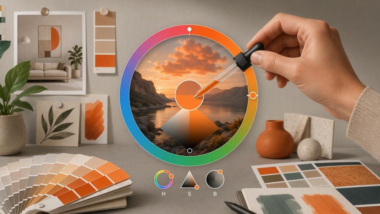
Accurate color sampling is one of the most important parts of building a reliable design palette. Whether you are matching a brand color, documenting a wall paint shade, creating digital artwork, or drawing inspiration from a photograph, small color differences can affect the final result. An HSB color picker for accurate color sampling gives designers a practical way to identify, compare, and adjust colors with more visual control than a HEX value alone.
HSB stands for Hue, Saturation, and Brightness. This model organizes color in a way that closely matches how people describe what they see: a color family, its intensity, and how light or dark it appears. When used alongside RGB, HEX, and HSL values, HSB can make color extraction from images more useful for graphic design, interior design, and other creative projects.
This guide explains how HSB works, why it is valuable for sampling colors from photos, and how to use it to create accurate, repeatable color palettes.
What Is an HSB Color Picker?
An HSB color picker is a design tool that lets you identify or adjust colors using three visual properties:
- Hue: The basic color family, such as red, orange, yellow, green, blue, or violet.
- Saturation: The purity or intensity of the color. A highly saturated blue looks vivid, while a low-saturation blue appears softer, grayer, or more muted.
- Brightness: How much light a color appears to contain. Higher brightness produces a lighter-looking color, while lower brightness creates a deeper or darker one.
Most HSB controls show hue as a circular color wheel or horizontal spectrum, then use separate sliders or fields for saturation and brightness. This layout helps you make intentional changes. For example, you can preserve the same warm terracotta hue while reducing saturation for a more neutral interior palette or increasing brightness for a lighter digital background.
Unlike a random color selection process, an HSB color picker makes it easier to understand why two sampled colors look different. One may have the same hue but less saturation. Another may be similarly saturated but significantly darker.
Why HSB Is Useful for Accurate Color Sampling
Photos contain complex color information. Lighting, shadows, camera processing, reflections, screen calibration, and image compression can all change the color values you see. An image may show one painted wall as several slightly different colors because some areas are in direct light and others are in shadow.
An HSB color picker helps separate these visual changes into understandable parts. Rather than treating every sampled pixel as a completely unrelated color, you can evaluate its hue, saturation, and brightness independently.
| HSB Component | What It Tells You | Practical Use |
|---|---|---|
| Hue | The primary color family | Match a brand blue, sage green, clay red, or warm neutral |
| Saturation | How vivid or muted a color is | Create calm interiors, balanced illustrations, or accessible UI states |
| Brightness | How light or dark a color appears | Compare shadows, highlights, contrast, and visual hierarchy |
For example, imagine sampling a deep forest-green chair from a living room photo. The chair may return a different RGB or HEX value in bright areas than in shaded folds. With HSB values, you may see that the hue remains consistently green while brightness shifts across the fabric. That insight lets you choose a representative midtone instead of accidentally selecting an extreme highlight or shadow.
HSB vs. RGB, HEX, and HSL
Each color model serves a different purpose. Strong color workflows often use more than one format rather than relying on a single number or picker.
RGB for screen output
RGB means red, green, and blue. It describes how much of each light channel combines to create a color on a digital display. RGB is essential for web, apps, presentations, and other screen-based work. A sample such as RGB 42, 108, 94 can be useful in code or software settings, but those three values do not immediately reveal whether the color is muted, dark, or highly saturated.
HEX for quick sharing
HEX is a compact hexadecimal representation of RGB values, such as #2A6C5E. It is widely used in web design, graphic design systems, and developer handoff documents. HEX is efficient for copying and pasting, but it is not especially descriptive when you are visually refining a palette.
HSL for lightness-based adjustments
HSL uses hue, saturation, and lightness. It resembles HSB but handles the light-to-dark range differently. HSL can be useful when creating systematic tints and shades in interface design. However, many designers find HSB especially intuitive for sampling because brightness corresponds more directly to the perceived intensity of a sampled color.
HSB for visual decision-making
HSB is particularly helpful when you need to answer questions such as: Is this blue too vivid? Is this neutral too dark? Are these colors in the same family? How can I keep the mood of this photo while improving contrast? It gives you direct controls for the attributes people most often notice first.
Best practice: Use HSB to evaluate and refine a sampled color, then save the final choice in HEX or RGB when it needs to move into a digital design system.
How to Sample Colors Accurately From a Photo
Accurate sampling requires more than tapping the first appealing pixel. Follow a consistent process to get results that are easier to reuse across creative projects.
- Start with a high-quality image. Use a well-lit, sharp image whenever possible. Blurry photos and heavily compressed screenshots can blend neighboring colors together.
- Identify the material or surface you want to sample. Decide whether you are sampling fabric, paint, foliage, skin tone, a logo, packaging, or a digital interface element. Different materials reflect light differently.
- Avoid extreme highlights and deep shadows. A bright reflection may be nearly white, while a shadow can make the same object look almost black. Sample a midtone area for the most representative result.
- Zoom in before selecting. A larger view helps you avoid picking edge pixels, texture noise, or colors from adjacent objects.
- Take multiple samples. Sample three to five points from the same surface. Compare their HSB values to identify the most stable hue and saturation range.
- Choose a representative color. Select a middle value rather than the lightest or darkest sample unless you specifically need a highlight or shadow color.
- Save related variations. Keep a base color plus lighter and darker variants. This creates a more flexible palette for layouts, illustrations, rooms, or social graphics.
Using HSB to Build Better Color Palettes
A useful palette is not simply a collection of attractive sampled colors. It needs enough contrast, variation, and consistency to work in context. HSB gives you a simple framework for organizing a palette after extraction.
Keep a consistent saturation mood
Colors with widely different saturation levels can feel disconnected. A dusty rose, muted olive, and soft cream often work well together because they share a restrained saturation level. Adding an intensely saturated neon blue may create a strong focal point, but it can also disrupt the overall mood if used without purpose.
When sampling from a photo, compare the saturation values of your potential palette colors. If one color is much more vivid than the rest, consider lowering its saturation or reserving it for an accent.
Create brightness levels for hierarchy
Brightness is essential for readable and usable design. A palette should typically include light, middle, and dark values. In graphic design, these values help establish backgrounds, body text, headings, borders, and calls to action. In interior design, brightness differences help balance walls, flooring, textiles, and accent pieces.
For a simple five-color palette, you might include:
- A bright neutral for backgrounds or large surfaces
- A light supporting color
- A midtone primary color
- A darker secondary color
- A deep neutral for contrast, text, or outlines
Use hue relationships intentionally
Hue helps you choose the relationship between colors. Adjacent hues on the color wheel, such as blue and blue-green, create an analogous palette with a calm feel. Opposing hues, such as blue and orange, create contrast and energy. A sampled photo may already contain these relationships, but HSB values make them easier to recognize and refine.
Common Color Sampling Mistakes to Avoid
- Sampling from a screen without considering display settings: Brightness modes, color profiles, and night filters can affect what you see.
- Using one pixel as the final answer: Natural textures and photographs contain variation. Compare several samples first.
- Ignoring lighting conditions: Warm indoor bulbs, cool daylight, and colored reflections can shift a color dramatically.
- Choosing colors only by HEX code: HEX is useful for storage, but HSB offers better visual control during selection.
- Forgetting contrast: A beautiful sampled palette can still fail if text, icons, or important details do not stand out.
- Expecting digital samples to guarantee physical paint results: Paint, fabric, paper, and printing inks require physical testing because materials and light change perception.
A Repeatable Workflow for Designers and Decorators
For reliable results, use the same color extraction workflow each time. First, collect images that represent the mood, material, or visual environment you want to capture. Next, use an HSB color picker to sample several midtone areas from each image. Group colors by hue family, then compare saturation and brightness to remove outliers.
After narrowing your selection, create a palette with clear roles: primary, secondary, accent, light neutral, and dark neutral. Review the palette on the intended surface or medium. A social media graphic, website interface, presentation, and living room will each need different contrast and proportion decisions.
Finally, export your colors in the formats your workflow requires. Keep HEX values for web work, RGB values for screen-based software, and HSB values for future visual adjustments. For physical projects, use the extracted values as an informed starting point, then compare them with real paint chips, textiles, or printed proofs.
Make Color Sampling More Intentional
An HSB color picker for accurate color sampling does more than identify a color under your cursor. It helps you understand the visual structure behind that color. By separating hue, saturation, and brightness, you can distinguish a true palette decision from a temporary lighting effect, build better color relationships, and create designs that feel more cohesive.
For designers who want to extract colors from photographs and review HSB, RGB, HEX, and HSL values in one mobile workflow, Color Viewfinder can be a useful tool for collecting and organizing palette ideas.
