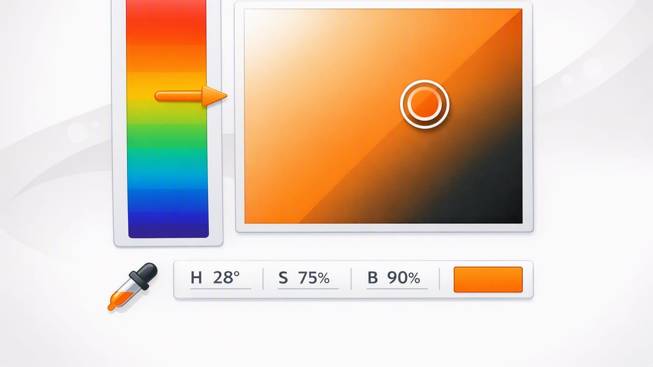
If you’ve ever tried to “make it a bit more vibrant” or “slightly darker but not muddier,” you’ve already been thinking in HSB. An hsb color picker (Hue, Saturation, Brightness) is one of the most intuitive ways to select and refine color—especially when you’re working from photos, moodboards, or real-world materials.
This guide explains how HSB works, when it’s the best model to use, and how to turn HSB selections into practical, repeatable values like HEX and RGB. You’ll also get a simple workflow for building palettes that stay consistent across screens, print, and physical spaces.
What is HSB (Hue, Saturation, Brightness)?
HSB describes color using three components that map closely to how people perceive adjustments:
- Hue (H): the “color family” on a 0–360° wheel (red, yellow, green, cyan, blue, magenta).
- Saturation (S): how intense vs. muted the color is (0–100%). Lower saturation moves toward gray.
- Brightness (B): how light the color appears (0–100%). Lower brightness moves toward black.
Most tools that call themselves “HSB” are extremely similar to “HSV” (Hue, Saturation, Value). In practice, designers can treat them the same for picker-based workflows.
Why use an HSB color picker instead of RGB or HSL?
RGB is great for screens and implementation, but it’s not always great for decision-making. If you change one RGB channel, you often change the perceived hue and intensity in ways that feel unpredictable. HSB is popular because it separates the three most common creative intents:
- Change hue without changing overall brightness.
- Increase saturation to make a color “pop” without necessarily making it lighter.
- Reduce brightness to create shades while staying in the same hue family.
HSL (Hue, Saturation, Lightness) is also intuitive, especially for UI tints and shades, but many people find HSB faster for picking colors from references and photographs, where “brightness” is the more immediate control.
HSB vs HSL vs RGB (quick comparison)
| Model | Best for | What’s intuitive | Common pitfall |
|---|---|---|---|
| HSB | Picking colors, palette balancing, photo-based work | “More vivid,” “darker,” “same color but brighter” | Brightness changes can still affect perceived saturation |
| HSL | Systematic tints/shades for UI design systems | Lightness feels like “mix with white/black” | Saturation behaves differently near very light/dark values |
| RGB | Implementation, digital rendering, dev handoff | Matches device color channels | Hard to adjust “vibrancy” without side effects |
How an HSB color picker typically works
Most interfaces present HSB in two parts:
- Hue slider or wheel: choose the base hue angle (0–360).
- 2D square (Saturation × Brightness): pick the intensity and brightness combination for that hue.
Visually, it’s powerful because you can keep hue fixed and explore an entire “family” of that hue from muted/dark to vivid/bright. This is exactly what you want when building coherent palettes: consistent hues with controlled variation.
When HSB is the best choice (and when it isn’t)
HSB is great for:
- Photo-driven palettes: sampling a wall paint, fabric, packaging, or landscape photo and then refining it.
- Brand color exploration: quickly testing “same hue, different vibrancy” options.
- Interior design coordination: aligning accents, textiles, and finishes by matching hue and adjusting brightness.
- Illustration and digital art: creating shading and highlight variants while maintaining a consistent hue identity.
HSB may not be ideal for:
- Precise perceptual uniformity: HSB isn’t perceptually uniform, meaning equal numeric changes don’t always look like equal visual changes.
- Strict accessibility tuning: contrast is better measured with luminance/contrast ratios than with HSB numbers alone.
Use HSB to choose and shape colors. Use contrast metrics to validate readability.
A practical workflow: build a palette with an HSB color picker
Here’s a reliable approach for turning a single great color into a usable palette for UI, graphics, or a room concept.
1) Lock the hue, explore saturation and brightness
Start by finding a base color you like (often your “primary”). In an hsb color picker, keep Hue steady and test:
- Muted alternatives (lower saturation) for backgrounds and large areas
- Vivid accents (higher saturation) for calls to action or small decorative elements
- Darker variants (lower brightness) for borders, hover states, or shadow tones
2) Create a structured set (not random swatches)
Instead of collecting unrelated colors, create roles:
- Primary (brand/anchor)
- Secondary (supporting hue family)
- Accent (high attention)
- Neutrals (warm/cool grays)
- Status colors (success/warning/error) if needed
HSB helps you keep these roles coherent because you can intentionally control intensity and brightness rather than “eyeballing” everything in RGB.
3) Convert to HEX/RGB for real-world use
Even if you choose colors via HSB, you’ll typically implement them as HEX (web) or RGB (most design/dev contexts). Many pickers display all values at once; if yours doesn’t, convert after you finalize choices.
4) Check contrast (especially for UI)
HSB values don’t guarantee accessibility. After picking candidate colors, test contrast ratios for text and critical UI elements. A common pattern is:
- Use high brightness + low saturation for light backgrounds
- Use low brightness variants for text and icons
- Reserve high saturation for small accents, not body text
HSB in practice: quick “tuning” recipes
These micro-adjustments are where an hsb color picker shines.
Make a color “cleaner” (less muddy)
- Increase Brightness slightly
- Increase Saturation slightly (but avoid neon)
- Optionally nudge Hue a few degrees to avoid brown/gray bias
Create a subdued background from a vivid brand color
- Keep Hue the same
- Lower Saturation significantly
- Raise Brightness to keep it airy
Generate a darker “pressed/active” state for UI
- Keep Hue the same
- Keep Saturation similar or slightly higher
- Lower Brightness (often enough on its own)
Example palette (HSB → HEX) you can adapt
The following is a sample structure you can replicate. Values are illustrative; your exact conversions may vary slightly depending on the color engine.
| Role | HSB (H°, S%, B%) | Notes |
|---|---|---|
| Primary | 210, 70, 85 | Strong blue; good for buttons and highlights |
| Primary Dark | 210, 75, 55 | Hover/pressed state, headings on light bg |
| Primary Soft | 210, 20, 95 | Background panels; keeps hue identity without intensity |
| Accent | 35, 90, 95 | Warm contrast for CTAs or key decor accents |
| Neutral | 210, 5, 92 | Cool near-gray background; avoids “dirty” whites |
Tip: if your palette feels chaotic, it’s often because hues are drifting. Try narrowing your palette to one or two dominant hues and varying only saturation/brightness for most supporting colors.
Code: convert HSB/HSV to RGB (then to HEX)
If you store colors as HSB/HSV but need RGB/HEX for export, here’s a compact JavaScript snippet you can reuse in tools or scripts:
// h in [0,360), s and v in [0,1]
function hsvToRgb(h, s, v) {
  const c = v * s;
  const x = c * (1 - Math.abs(((h / 60) % 2) - 1));
  const m = v - c;

  let r1 = 0, g1 = 0, b1 = 0;
  if (h < 60)      [r1, g1, b1] = [c, x, 0];
  else if (h < 120)[r1, g1, b1] = [x, c, 0];
  else if (h < 180)[r1, g1, b1] = [0, c, x];
  else if (h < 240)[r1, g1, b1] = [0, x, c];
  else if (h < 300)[r1, g1, b1] = [x, 0, c];
  else            [r1, g1, b1] = [c, 0, x];

  const r = Math.round((r1 + m) * 255);
  const g = Math.round((g1 + m) * 255);
  const b = Math.round((b1 + m) * 255);
  return { r, g, b };
}

function rgbToHex(r, g, b) {
  const toHex = (n) => n.toString(16).padStart(2, '0');
  return `#${toHex(r)}${toHex(g)}${toHex(b)}`.toUpperCase();
}

// Example:
const rgb = hsvToRgb(210, 0.70, 0.85);
console.log(rgb, rgbToHex(rgb.r, rgb.g, rgb.b));
This is helpful when you’ve picked colors with an hsb color picker but want to export consistent HEX codes for CSS, Figma variables, or a design tokens file.
Common mistakes when using an HSB color picker
1) Maxing saturation for everything
High saturation everywhere creates visual noise and reduces hierarchy. Keep most surfaces and large areas lower saturation; reserve high saturation for accents and interactive states.
2) Using brightness alone to create “tints”
Raising brightness can push colors toward a “neon” look if saturation stays high. For softer tints, reduce saturation as brightness rises.
3) Ignoring environment and medium
A color that looks perfect on a bright phone screen can feel too intense in print or on a matte wall. Build a palette with at least one muted variant of each key hue so you can adapt to different contexts.
Photo-to-palette tip: sample, then normalize in HSB
When extracting colors from a photo, raw samples can be inconsistent due to lighting, shadows, and camera white balance. A strong method is:
- Sample multiple points from the same “intended” color (e.g., three spots on a fabric)
- Compare their HSB values
- Normalize hue (choose a representative hue)
- Adjust saturation/brightness to match the feeling rather than the lighting artifact
This is one of the most practical reasons designers rely on an hsb color picker: it gives you direct control over what’s “real color” vs. what’s “lighting.”
Wrap-up
An hsb color picker is ideal when you want fast, human-friendly control over color decisions—especially when you’re shaping palettes from real-world references. Use hue to maintain cohesion, saturation to control intensity, and brightness to build a clear hierarchy. Then convert to HEX/RGB for implementation and validate contrast for accessibility.
If you’re building palettes from photos on iPhone or iPad, tools like Color Viewfinder can help you extract accurate values and refine them into structured palettes—but the core skill is understanding how to steer hue, saturation, and brightness with intent.
