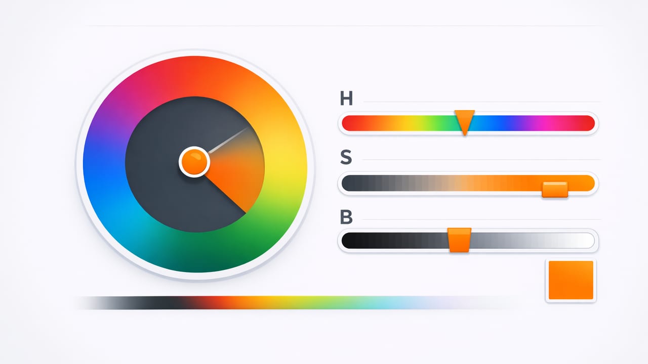
An HSB color picker is one of the most practical ways to choose, adjust, and communicate color—especially when your goal is to make a palette feel “right” quickly. HSB stands for Hue, Saturation, and Brightness. Instead of thinking in technical light values (like RGB) or print formulas (like CMYK), HSB aligns with how many people naturally describe color: “make it more vivid,” “darken it,” or “shift it slightly toward teal.”
This guide explains what HSB means, when it’s the best model to use, and how to apply it in real workflows like UI design, branding, illustration, and interior palettes—especially when you’re extracting colors from photos.
What is HSB (Hue, Saturation, Brightness)?
HSB represents a color in three intuitive sliders:
- Hue (H): The “base” color family on a 0–360° wheel (red, yellow, green, cyan, blue, magenta, back to red).
- Saturation (S): How intense or “pure” the color is (0% is gray; 100% is vivid).
- Brightness (B): How light the color appears (0% is black; 100% is the brightest version of that hue).
Practical translation: Hue chooses the color, Saturation chooses how colorful it is, and Brightness chooses how much light it has.
Why use an HSB color picker instead of RGB or HEX?
RGB and HEX are essential for digital output, but they’re not always pleasant for humans to edit. With an HSB color picker, you can make targeted, predictable adjustments:
- Keep the same hue and create a full set of tints/shades by moving Brightness up/down.
- Reduce saturation to create calmer neutrals without changing the hue identity.
- Shift hue slightly to fix “muddy” colors while keeping brightness consistent.
This is why HSB is popular in art tools, mobile pickers, and photo-based palette workflows: it supports the way people actually refine palettes.
HSB vs HSL vs RGB: quick comparison
HSB is often confused with HSL. They look similar, but the “lightness/brightness” behavior differs—especially around mid-tones. Here’s a practical comparison for designers and decorators:
| Model | Best for | What the sliders feel like | Common pitfall |
|---|---|---|---|
| HSB/HSV | Fast palette tuning, vivid UI colors, photo sampling | “Make it darker/brighter” feels direct | Very bright colors can get neon quickly at high saturation |
| HSL | Systematic palette building, tints/shades around a mid-lightness | Lightness centers around mid-tone | Adjusting Lightness can change perceived saturation unexpectedly |
| RGB/HEX | Implementation (web/app), precise output, dev handoff | Channel mixing (red/green/blue) | Hard to predict how edits affect “vibe” |
How to read HSB values from a photo (and why it helps)
When you pull colors from an image, you typically get several candidates: shadows, highlights, skin tones, foliage, textiles, painted walls, UI screenshots, and so on. HEX values alone don’t tell you which samples are “accent-ready” or which are muddy mid-tones. HSB values make that decision faster.
A simple photo-to-palette method using HSB
- Sample 8–12 colors from different regions (highlight, mid-tone, shadow, key objects).
- Group by Hue: cluster similar hues together (e.g., warm neutrals, greens, blues).
- Filter by Saturation:
- Use lower saturation samples for backgrounds, surfaces, and large areas.
- Use higher saturation samples for accents, buttons, or focal decor.
- Balance Brightness: ensure you have at least one dark, one mid, and one light value for contrast.
This approach turns “random nice colors” into a usable system: neutrals + accents + contrast.
Choosing roles in a palette with HSB (background, text, accent)
HSB makes it easier to assign roles because Saturation and Brightness map well to how colors behave at different sizes.
1) Background and surfaces
For large areas (app backgrounds, walls, cards), choose colors that are:
- Moderate-to-high brightness (so the UI/room doesn’t feel heavy)
- Low saturation (so the space doesn’t feel noisy)
Rule of thumb: If a color looks great as a tiny swatch but overwhelming on a full screen, its saturation is probably too high for a background role.
2) Text and critical contrast
Text depends more on contrast than on hue. Still, HSB helps you quickly test dark-versus-light options:
- For light backgrounds, look for low brightness text colors.
- For dark backgrounds, look for high brightness text colors.
After choosing candidates, validate contrast with accessibility checks (HSB is great for choosing, but contrast math is still necessary for compliance).
3) Accents and calls-to-action
Accents usually need higher saturation or a distinct hue separation. With an HSB color picker, you can:
- Keep the same hue and increase Saturation for a stronger version.
- Keep saturation but raise Brightness to make it feel more “clickable.”
- Shift Hue slightly to differentiate actions (e.g., teal primary, purple secondary) while keeping Brightness consistent.
Practical HSB recipes designers use (that you can copy)
Recipe A: Create a calm neutral from any color
Start with a sampled color that matches the vibe (say, a warm terracotta). Then:
- Keep Hue the same.
- Lower Saturation until it feels like a “material” (paint, paper, plaster).
- Adjust Brightness for the surface role (lighter for backgrounds, darker for dividers).
Recipe B: Build a 5-step ramp for UI states
For buttons, badges, charts, and components, you often need a ramp (light → dark). With HSB:
- Pick your base Hue.
- Set a single Saturation you like (often medium-high for UI).
- Create 5 Brightness steps (e.g., 92, 80, 68, 56, 44).
This keeps colors consistent while giving you predictable hierarchy and hover/pressed states.
Recipe C: “Fix” a muddy color from a photo
Photo sampling often yields colors with low saturation and mid brightness that look grayish. Try:
- Increase Saturation slightly (often +5 to +15) to restore clarity.
- Decrease Brightness a little to add richness, or increase it for an airy look.
- Shift Hue by a few degrees if it leans too yellow/green/gray.
HSB to HEX: how conversion works (and a tiny code example)
Even if you choose colors in HSB, you’ll usually deliver them as HEX for web/app implementation. Most tools convert automatically, but it helps to understand what’s happening: HSB maps your intuitive edits into RGB channels, then HEX encodes those RGB values.
Here’s a compact JavaScript function that converts HSB/HSV to HEX (useful for quick prototyping or palette tooling):
function hsvToHex(h, s, v) {
  // h: 0-360, s: 0-100, v: 0-100
  s /= 100; v /= 100;
  const c = v * s;
  const x = c * (1 - Math.abs(((h / 60) % 2) - 1));
  const m = v - c;

  let r = 0, g = 0, b = 0;
  if (h >= 0 && h < 60) [r, g, b] = [c, x, 0];
  else if (h < 120) [r, g, b] = [x, c, 0];
  else if (h < 180) [r, g, b] = [0, c, x];
  else if (h < 240) [r, g, b] = [0, x, c];
  else if (h < 300) [r, g, b] = [x, 0, c];
  else [r, g, b] = [c, 0, x];

  const toHex = (n) => Math.round((n + m) * 255).toString(16).padStart(2, '0');
  return `#${toHex(r)}${toHex(g)}${toHex(b)}`.toUpperCase();
}

// Example:
console.log(hsvToHex(210, 60, 70)); // e.g., a muted blue
Common mistakes when using an HSB color picker
- Maxing out saturation everywhere: High saturation is powerful for accents, but exhausting for large areas.
- Ignoring brightness contrast: Colors can share a hue but still be unreadable if brightness levels are too close.
- Using hue alone to differentiate: Two different hues at the same brightness and saturation can still feel similar in hierarchy. Adjust brightness to create clear structure.
- Not accounting for context: A color’s perceived brightness changes next to lighter/darker neighbors. Always test in the layout or room scenario.
A quick checklist: evaluate your palette in HSB
Before you finalize, scan your palette and ask:
- Hue coverage: Do you have one primary hue and 1–2 supporting hues, or is it accidentally rainbow?
- Saturation control: Are most colors low-to-medium saturation, with only a couple true accents?
- Brightness range: Do you have at least one dark anchor, one mid-tone, and one light surface color?
- Consistency: Are your UI/brand ramps built from consistent saturation while brightness steps provide hierarchy?
When HSB is the best choice (and when it isn’t)
HSB shines when you’re selecting or refining colors interactively: quick edits, rapid palette building, and photo-based extraction. It’s also excellent for teaching teams a shared language: “same hue, lower saturation, increase brightness.”
HSB is less ideal when you need perceptual uniformity (where equal numeric steps look equally different). In those cases, advanced spaces like Lab/LCH can be more accurate. Still, for everyday design decisions and practical palette work, HSB remains one of the fastest tools to get to a polished result.
Putting it into practice
Next time you’re building a palette, try starting with HSB: pick a hue that matches your concept, control saturation to set the mood (muted vs vibrant), then sculpt brightness to create hierarchy and contrast. If you’re pulling inspiration from real-world images, sampling colors and reviewing them in HSB will help you quickly separate “good accents” from “great backgrounds.”
If you prefer doing this on iPhone or iPad, a photo color tool like Color Viewfinder can show HSB values alongside formats like HEX and RGB, which makes it easier to translate inspiration into usable palettes.
